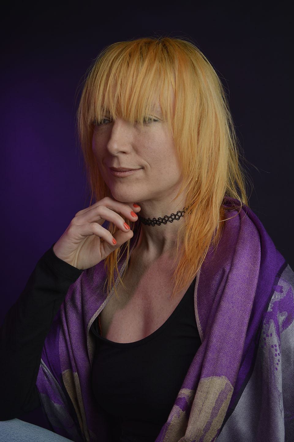
Photoshop

Multiple Exposures

In photography, multiple exposure is where the shutter is opened more than once on the same frame. This is usually of different images superimposed to form one image.

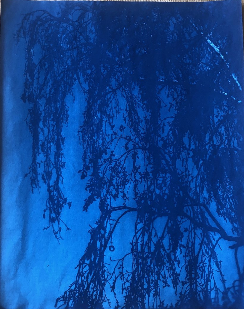
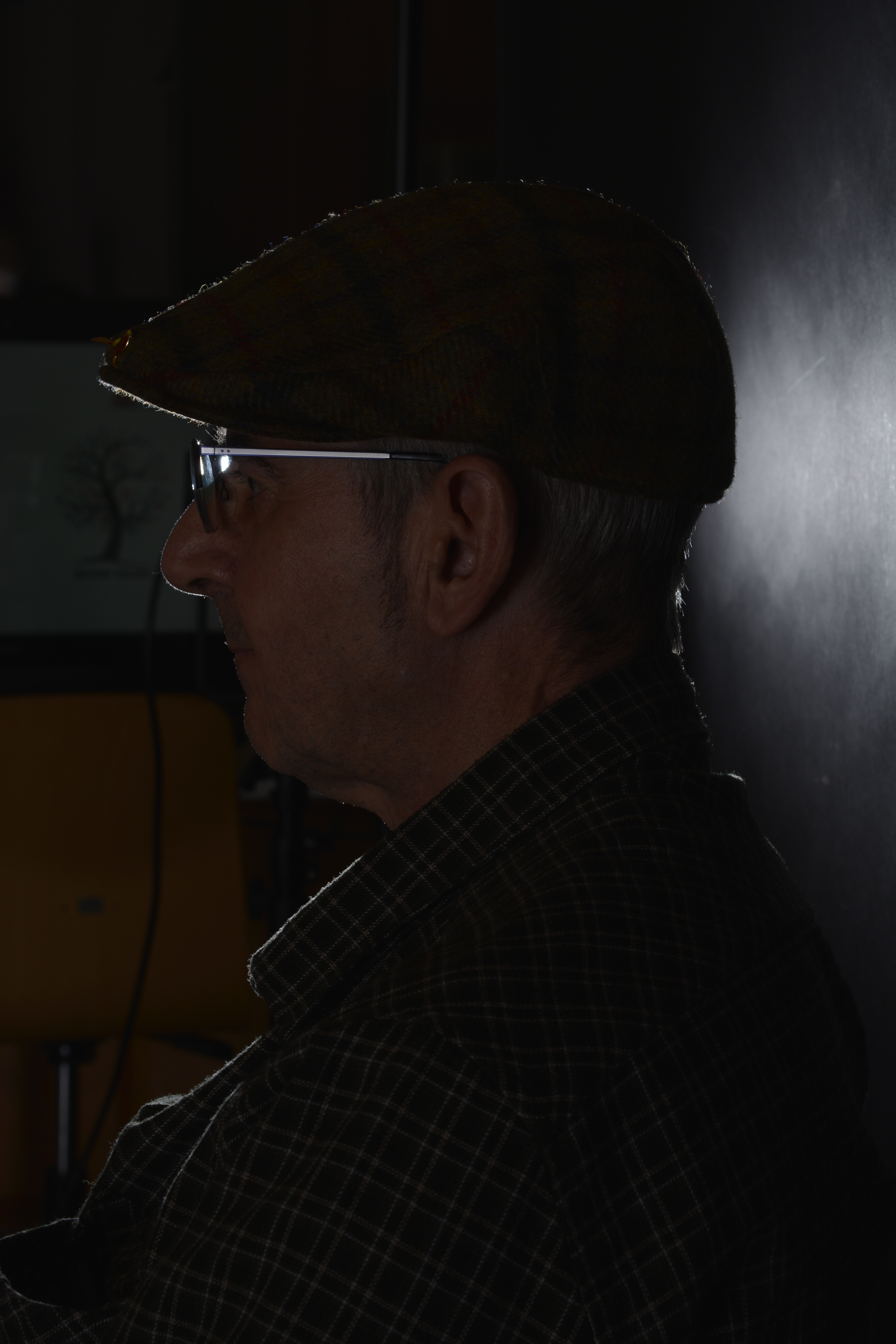
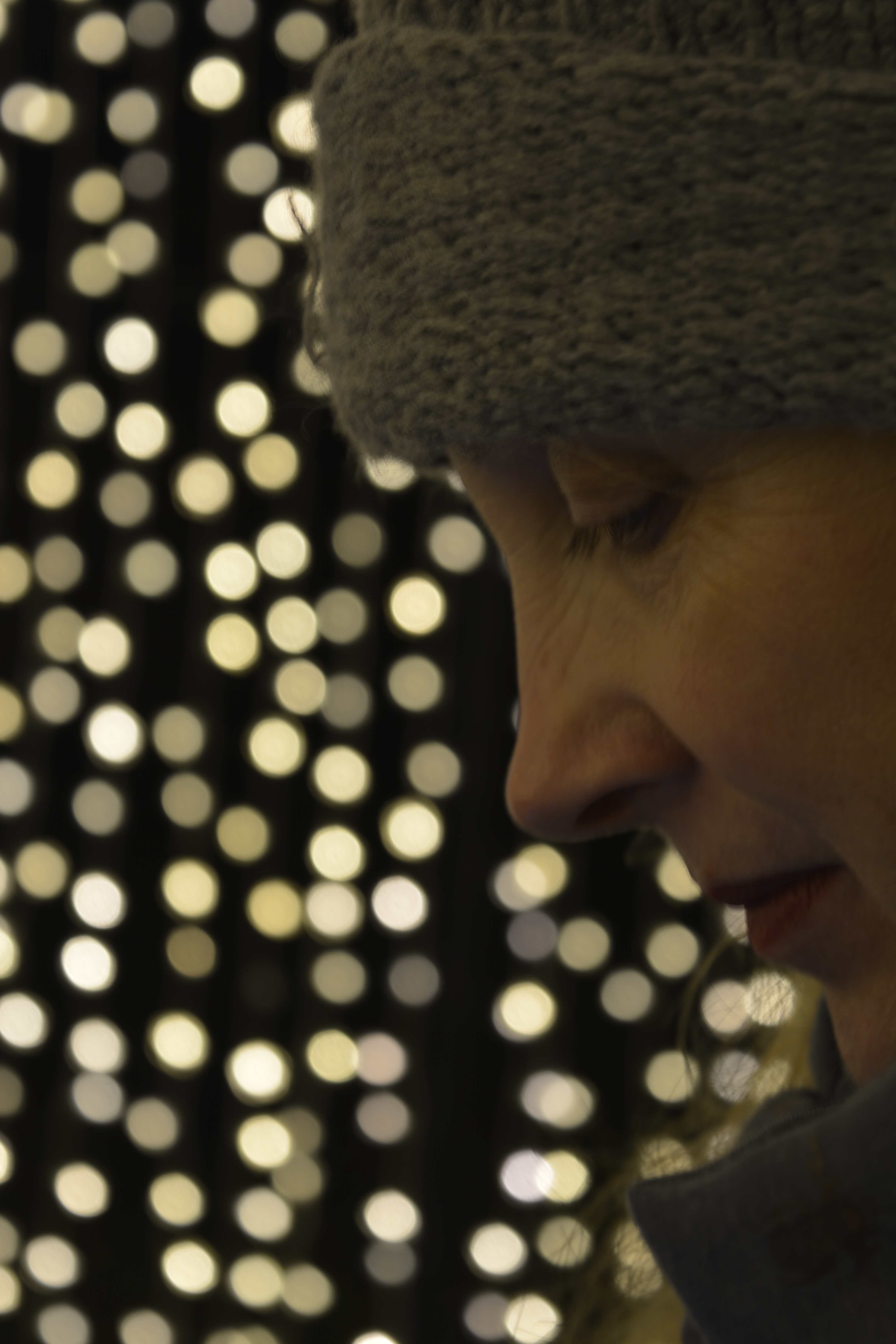
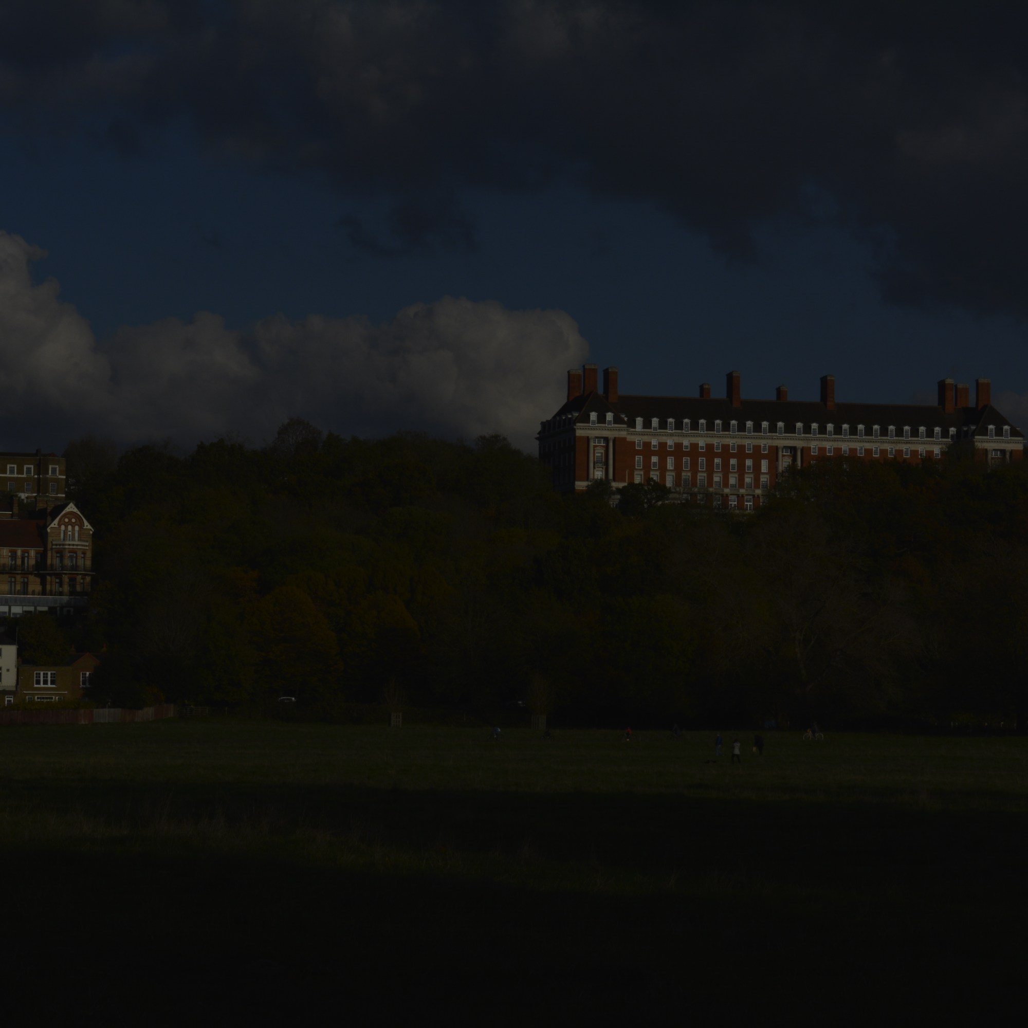
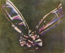
Below is a multiple exposure from 1980.

Composer Karlheinz Stockhausen, double exposure made using a film camera, 1980.

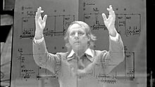
Multiple Exposures can be more than two images. Often used to create artistic visual effect and has been used in some photographic hoaxes involving ghostly figures.

Overlaying

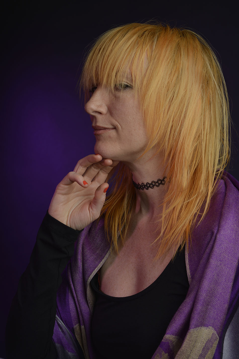
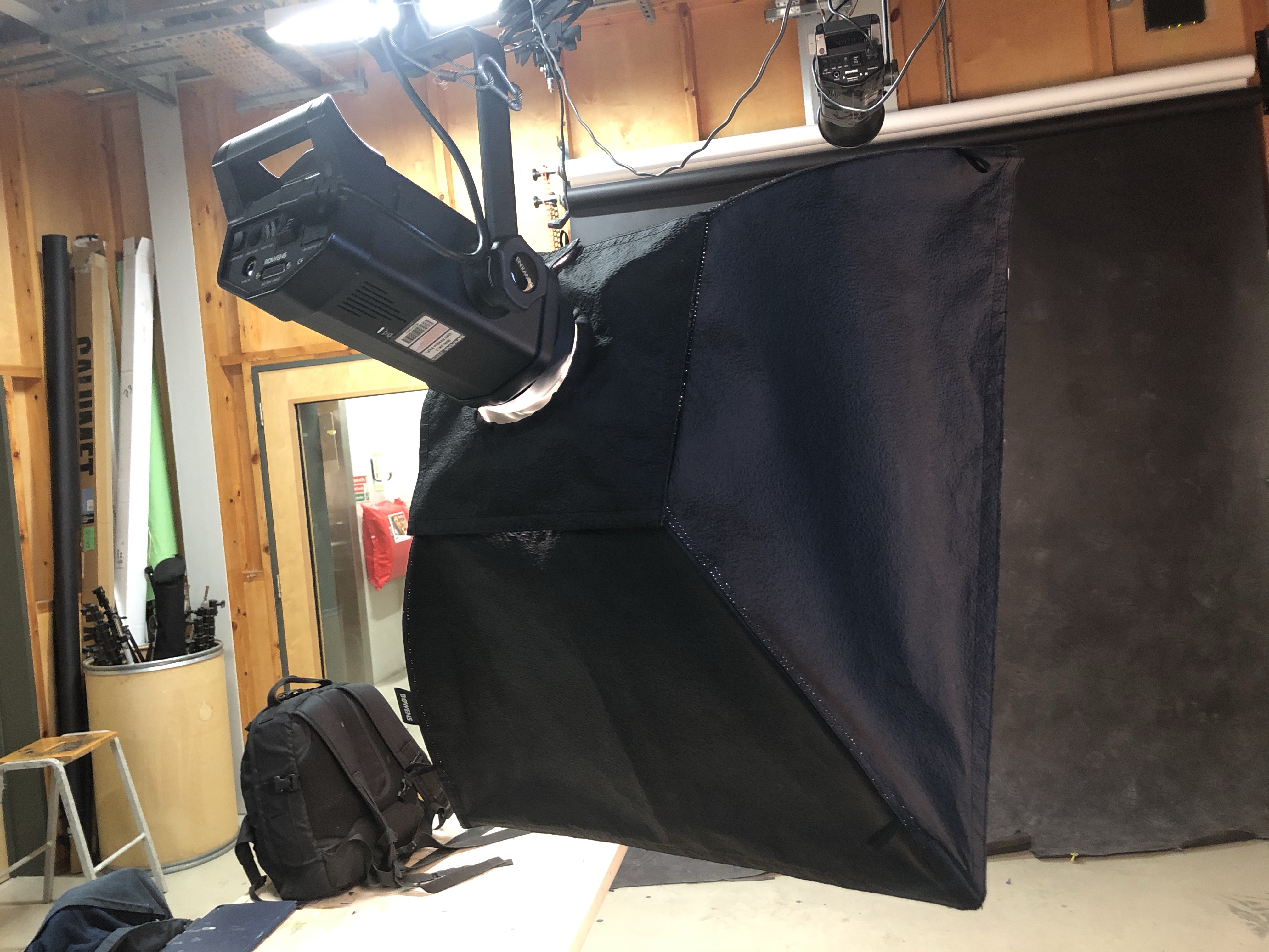
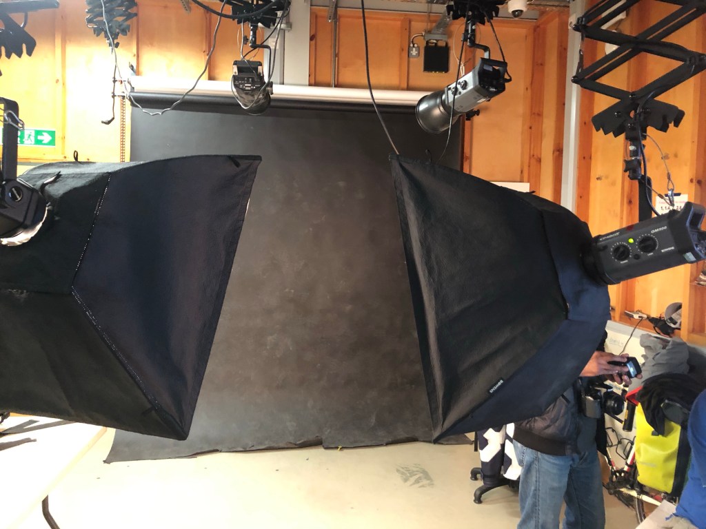
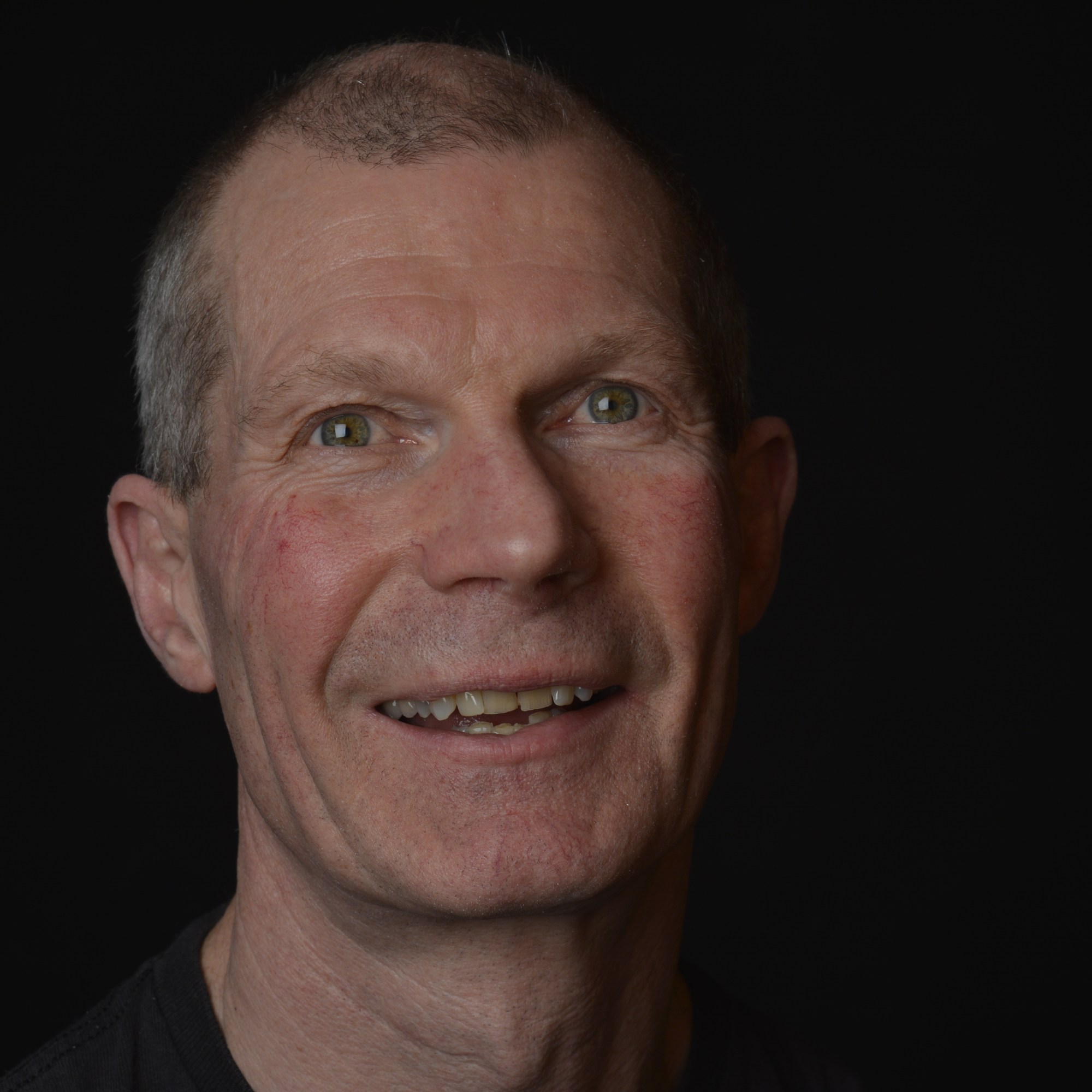
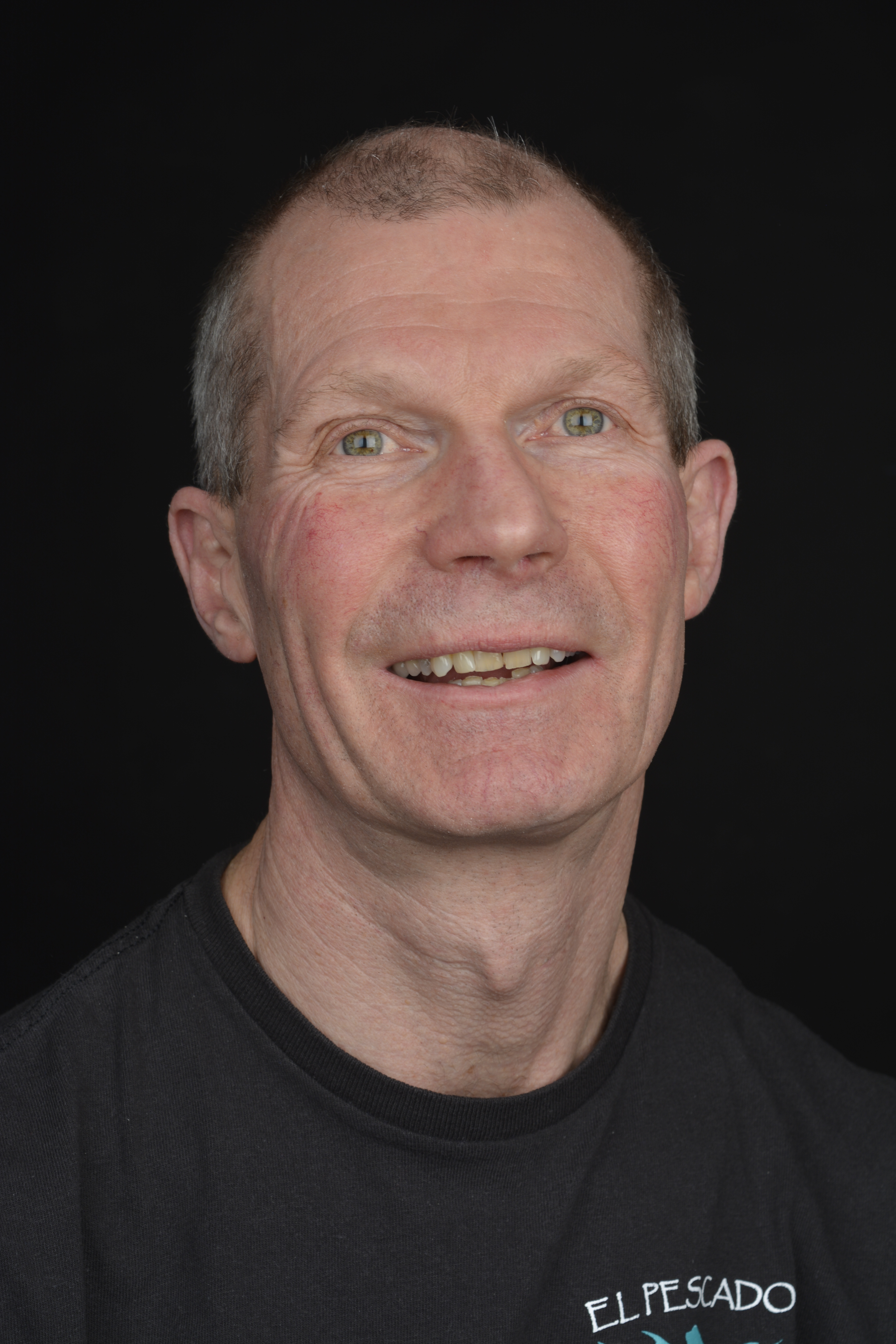
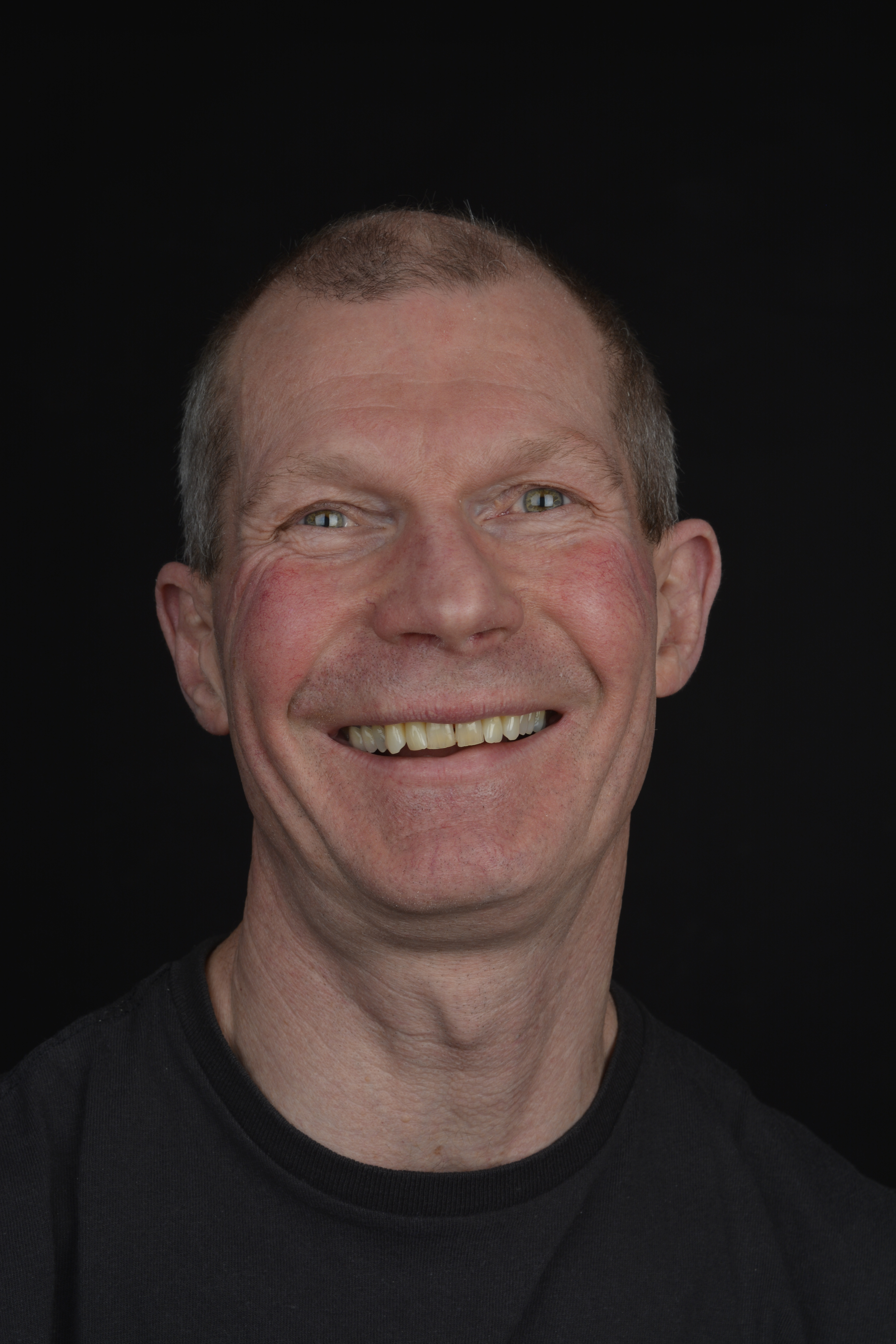
Photographing multiple exposures is a lot easier now with digital cameras and software like Photoshop. Some cameras can capture double or multiple exposures in camera. Mine can’t, so I have used a process called overlaying through Photoshop.

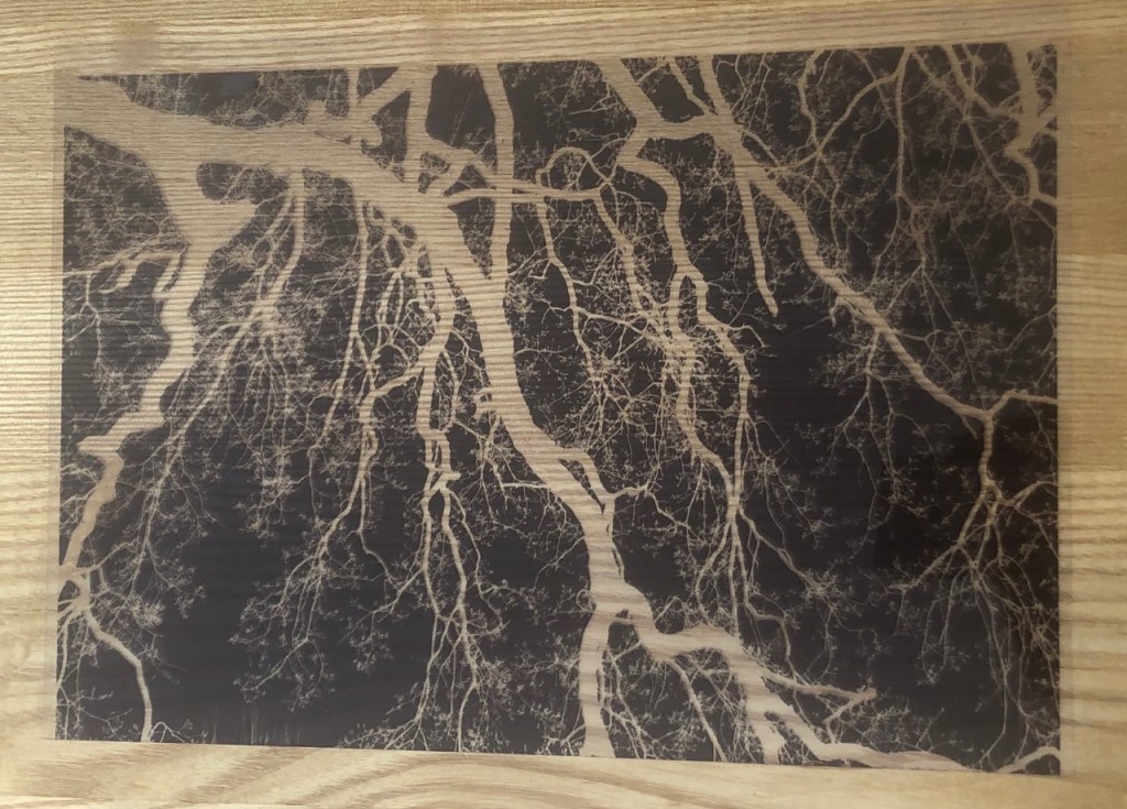
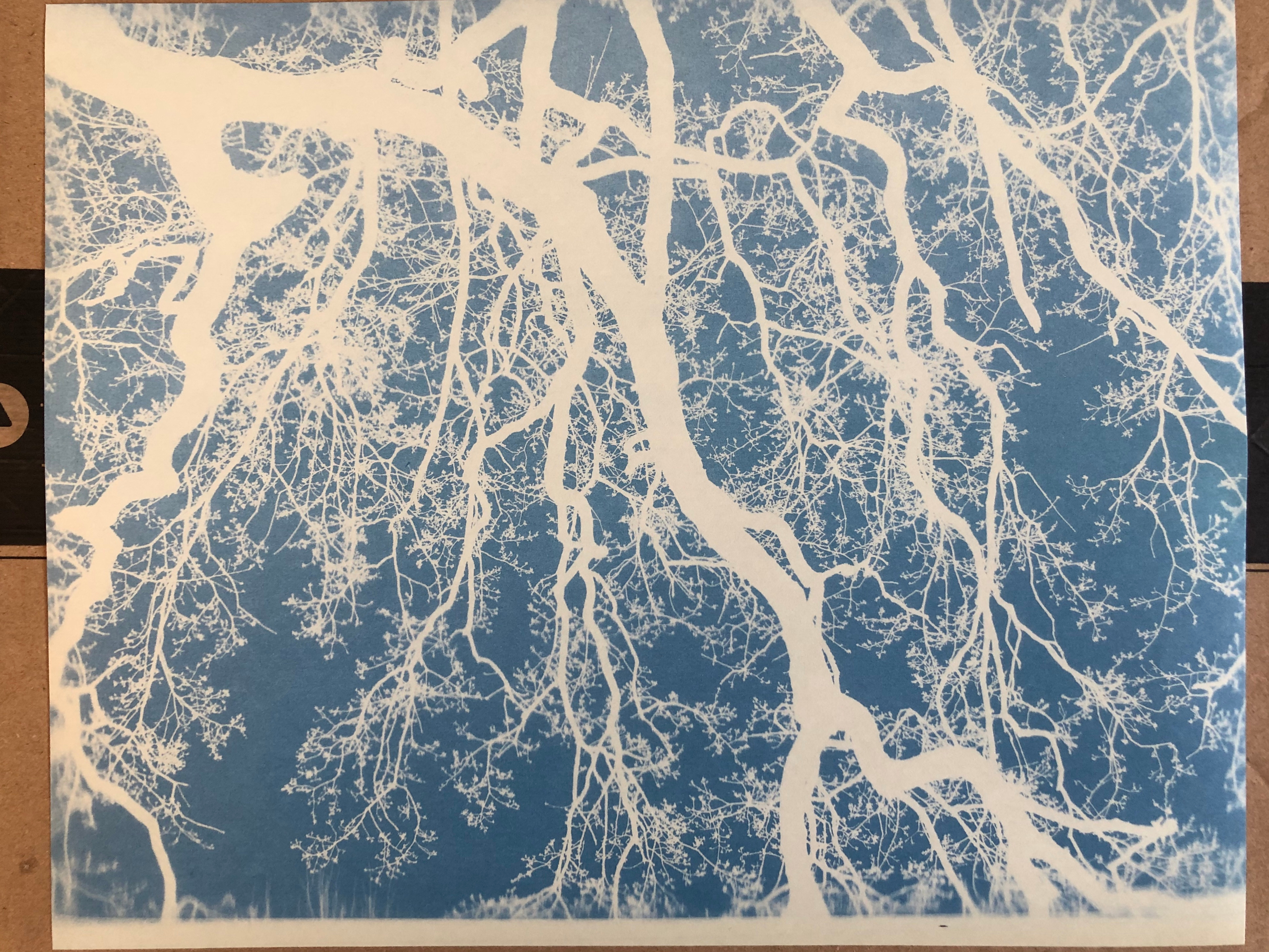
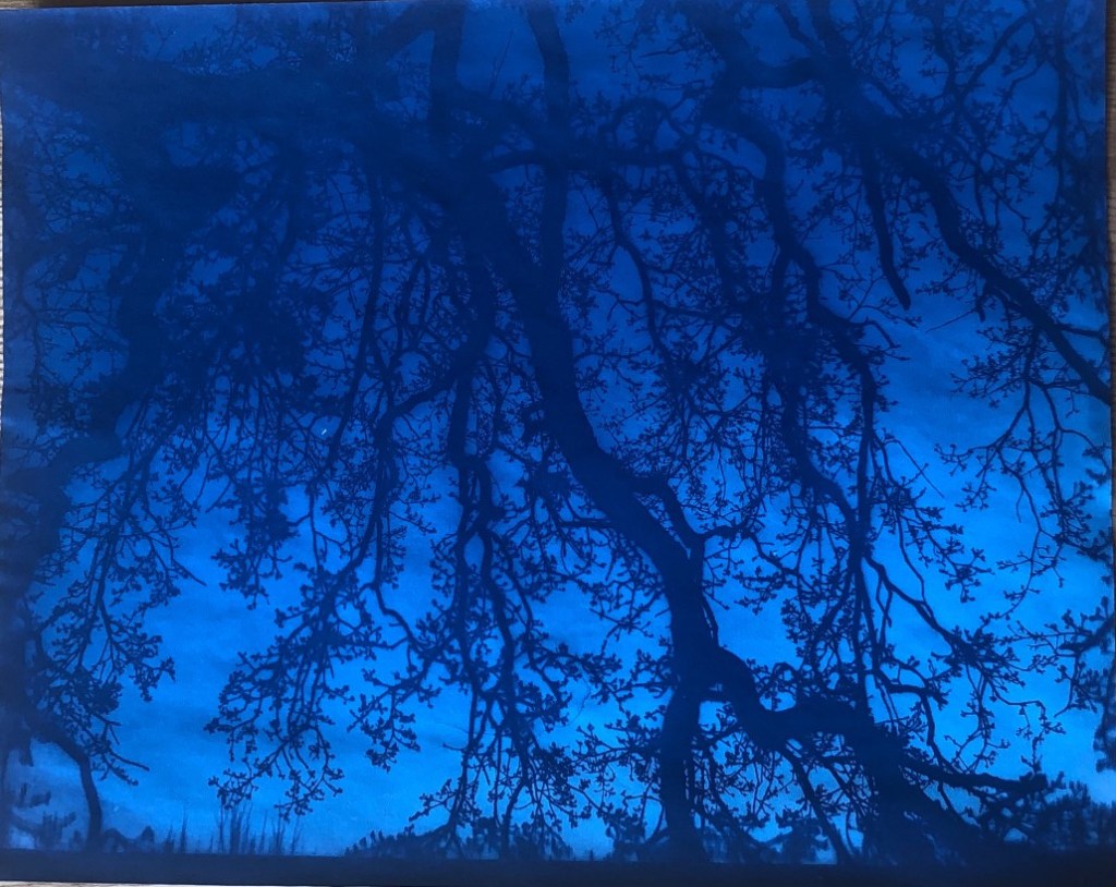
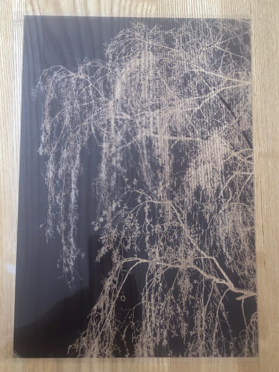
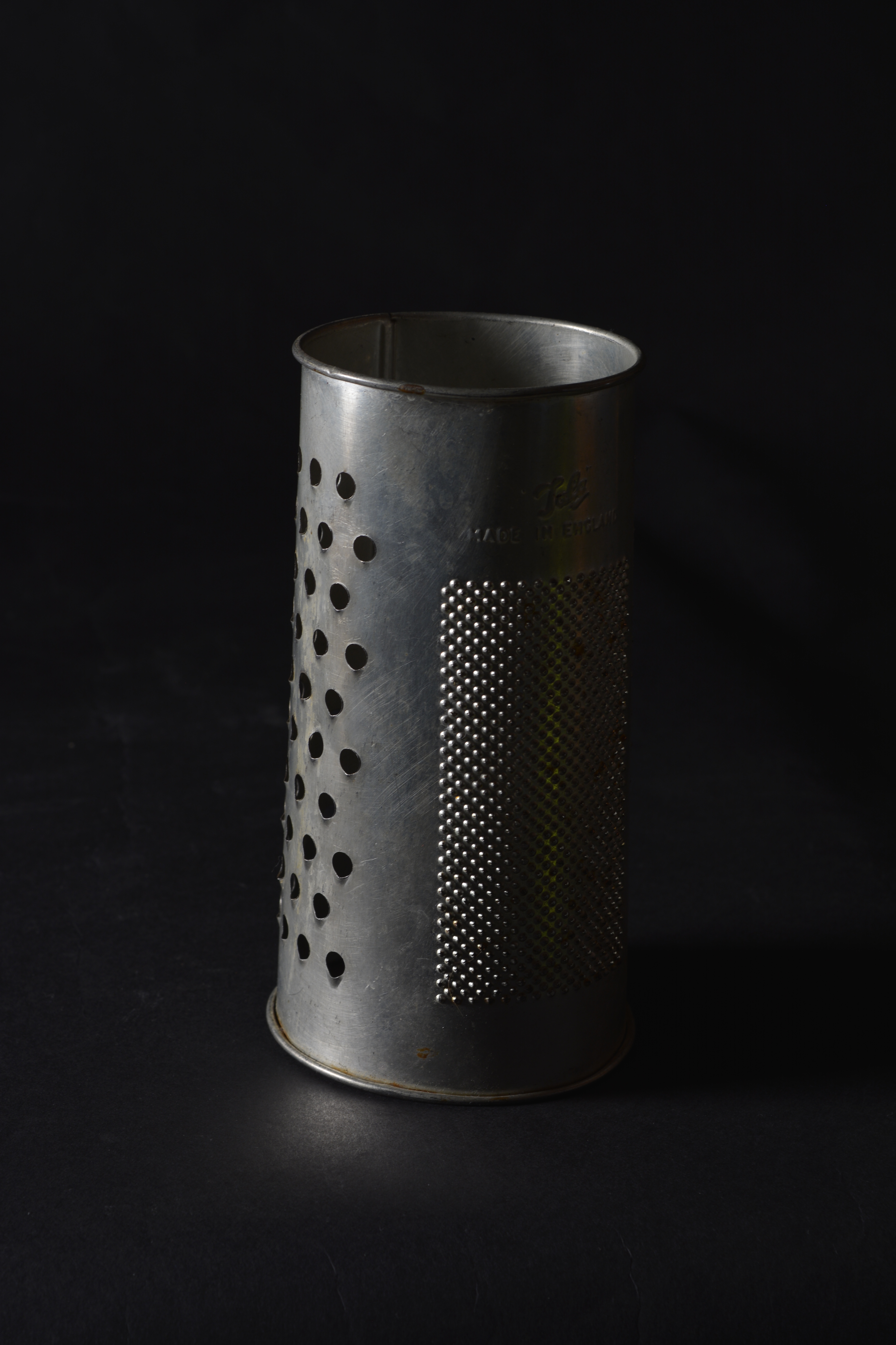
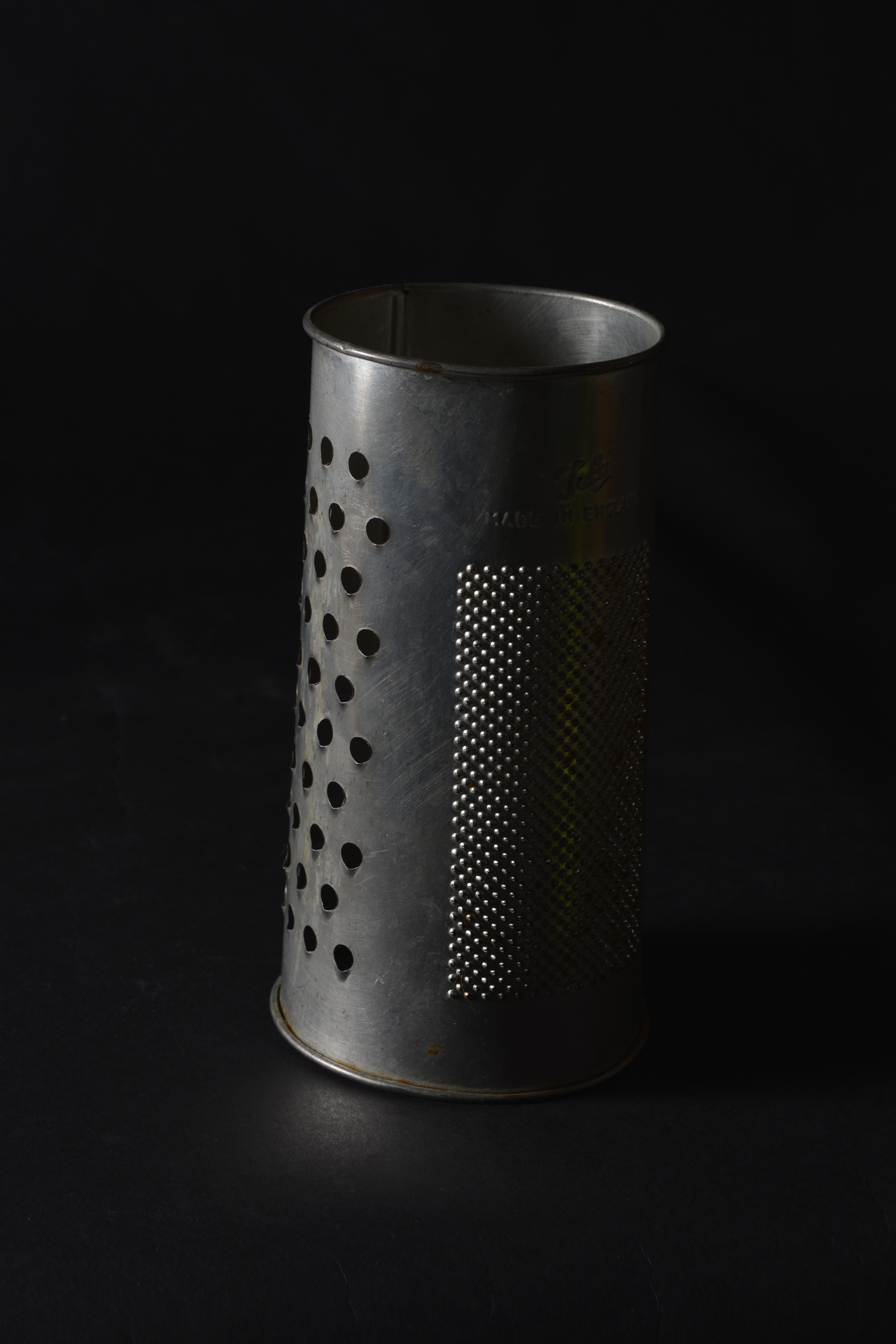
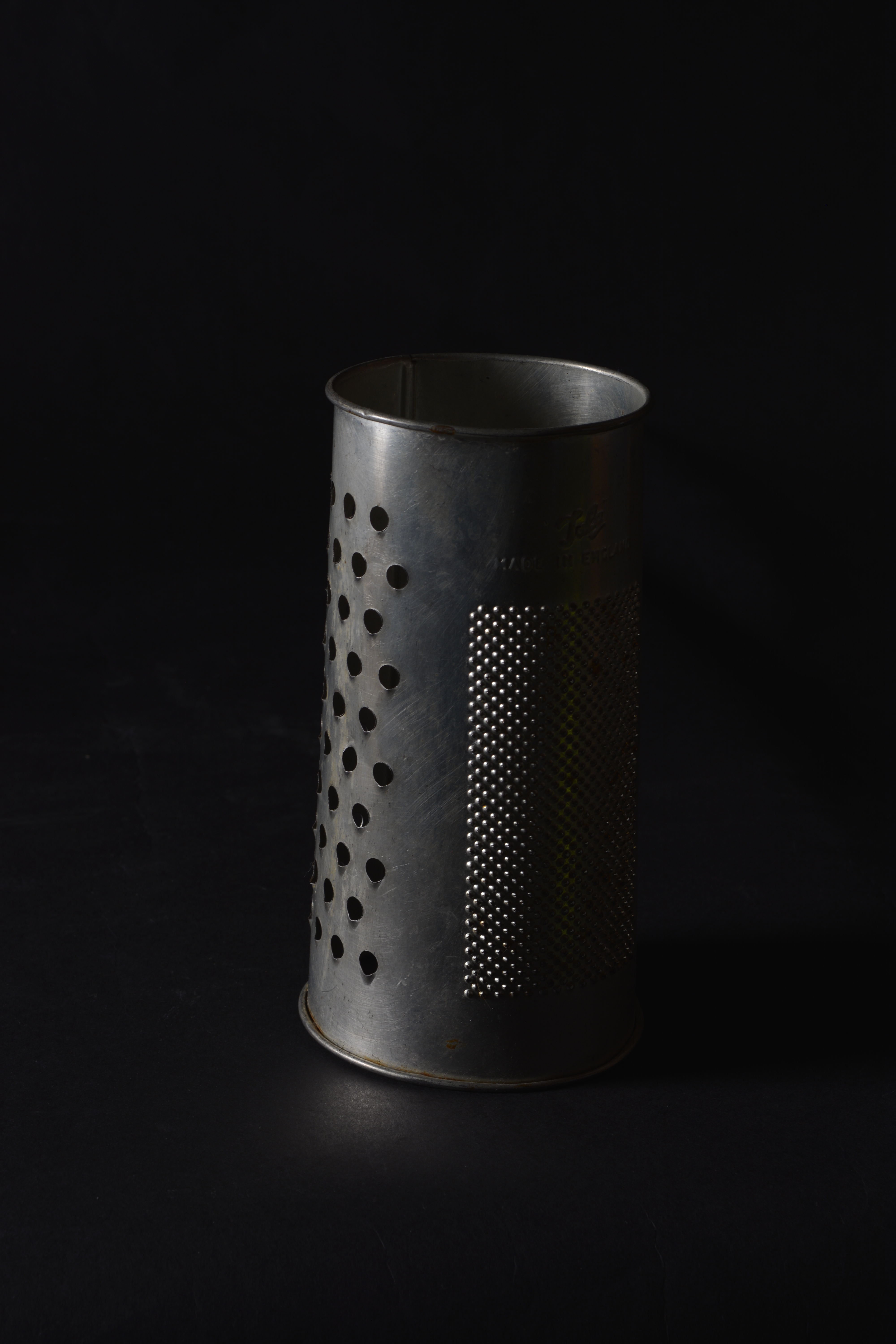
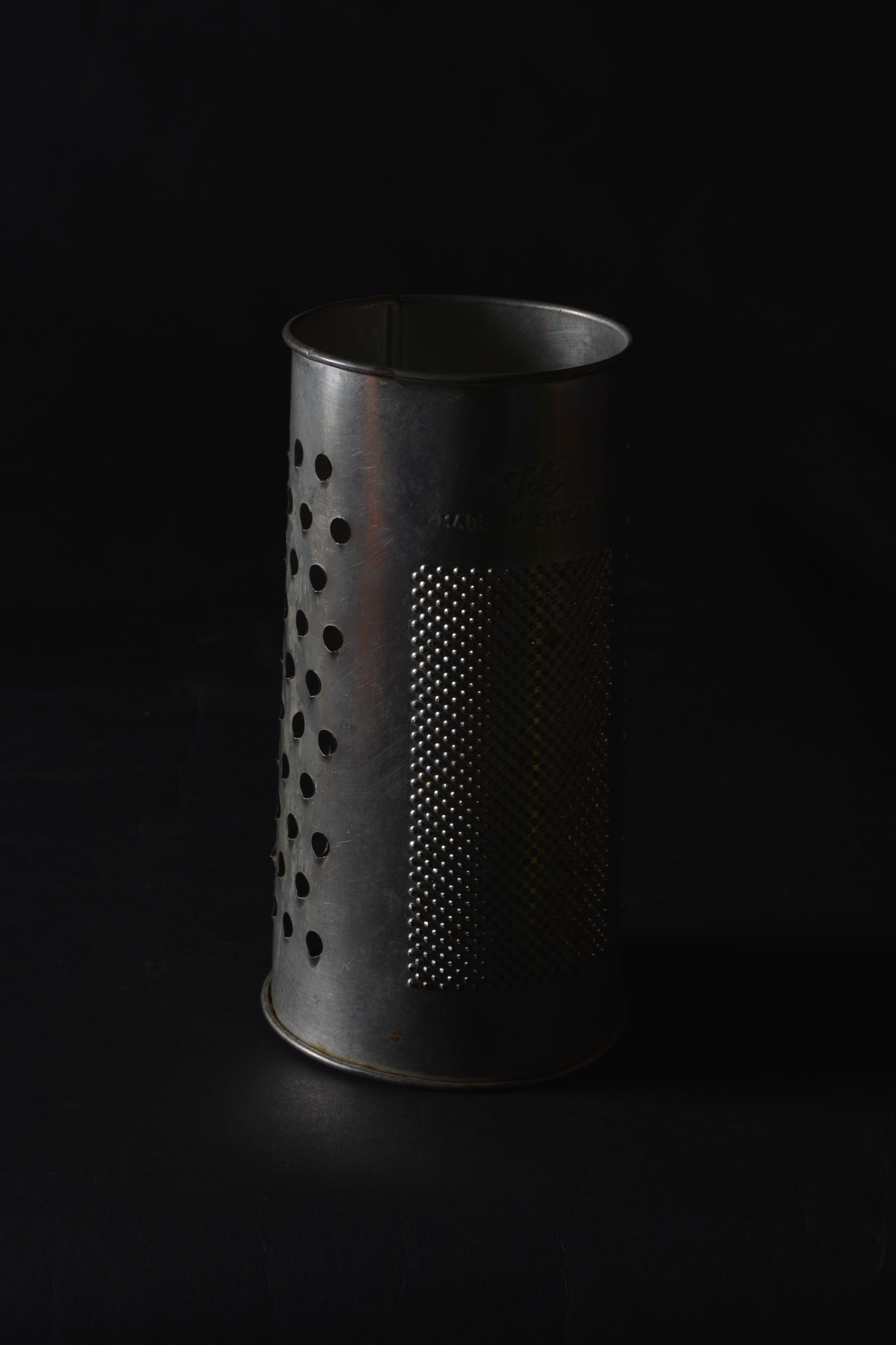
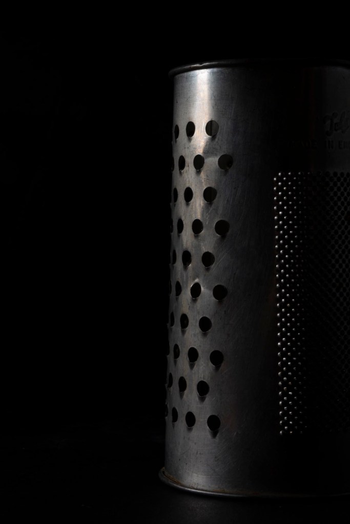
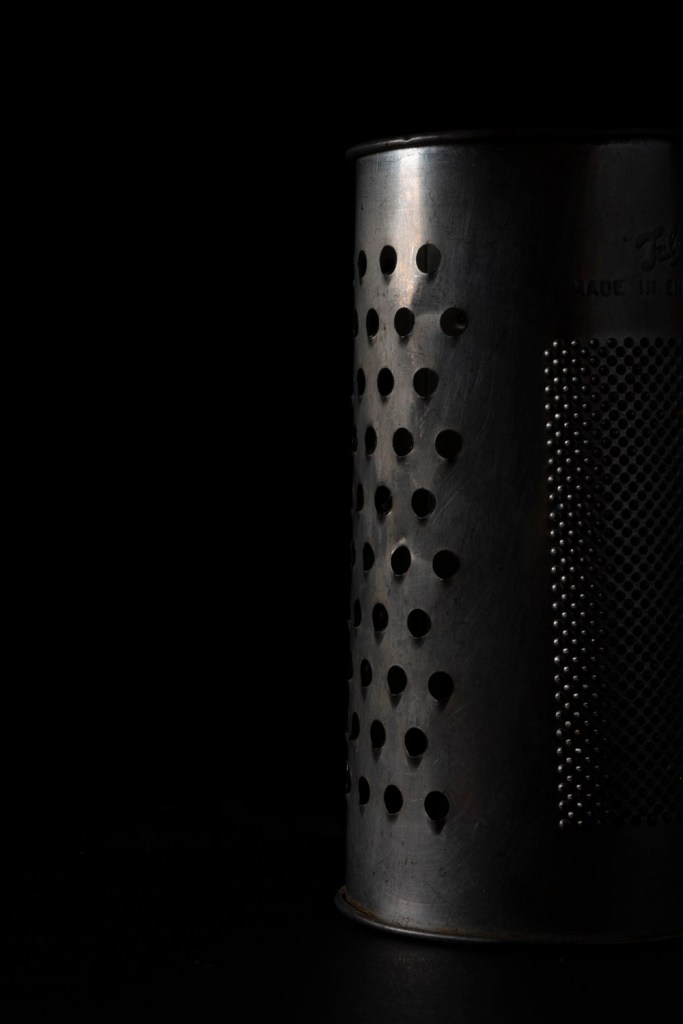
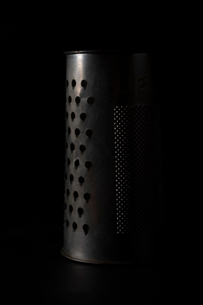
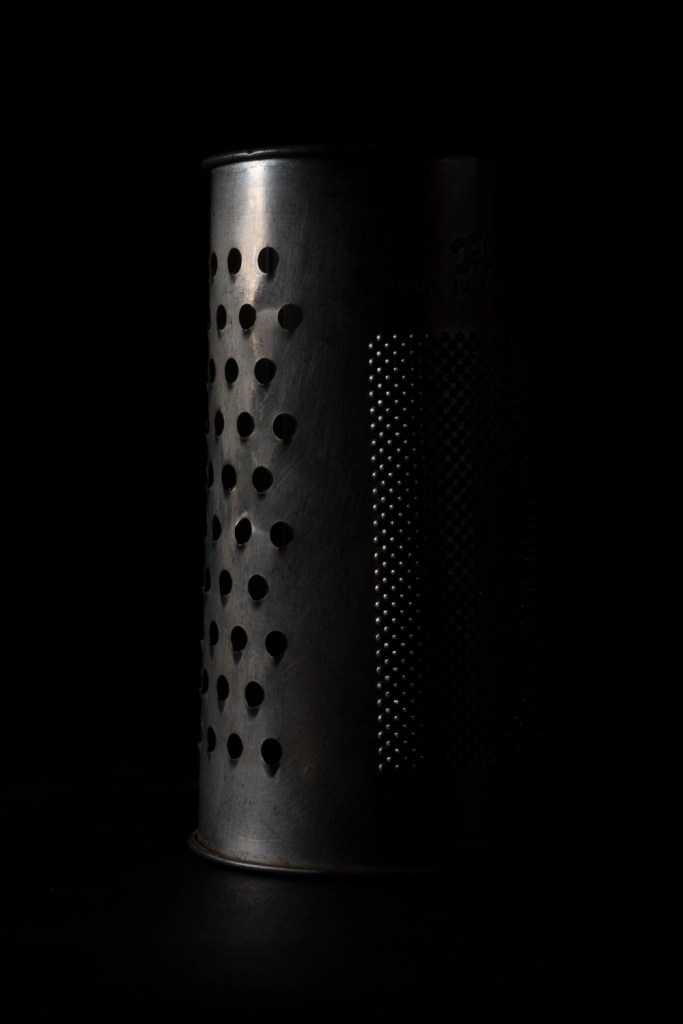
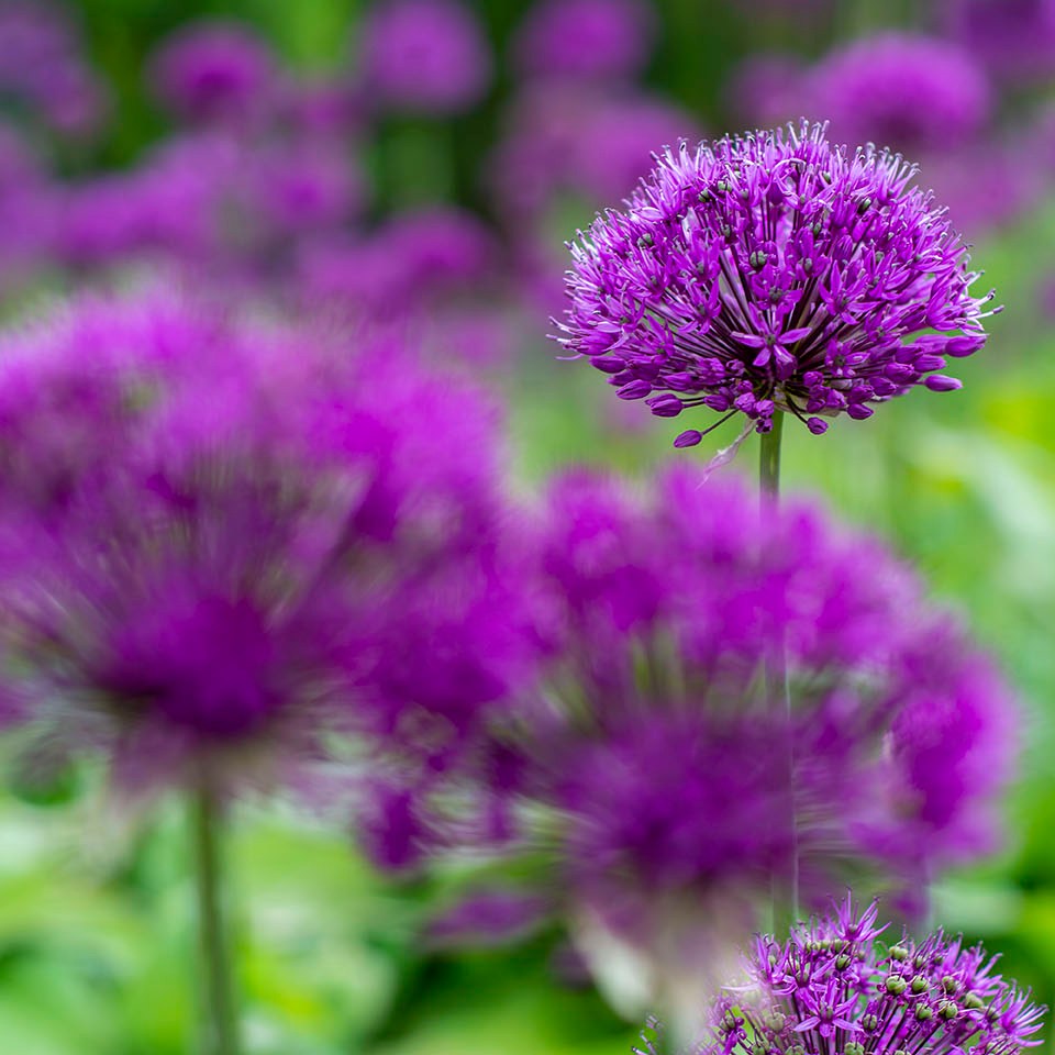
To start trying out this overlaying process I decided to begin with overlaying textures. Below are a selection of textures I have found on the internet and saved onto my computer. With textures and different paper templates you can really create intersting images. For example. make your photographs appear old on old paper, scratched metal or even apply a frame.

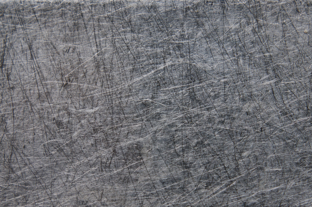
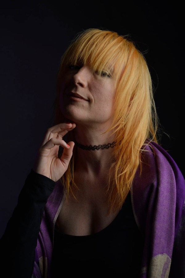
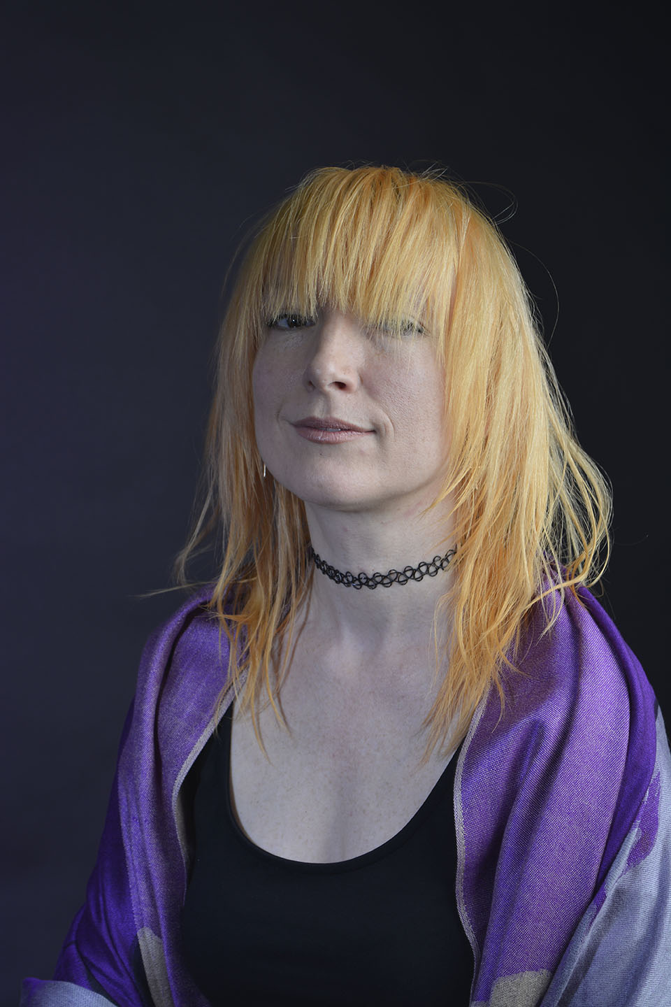
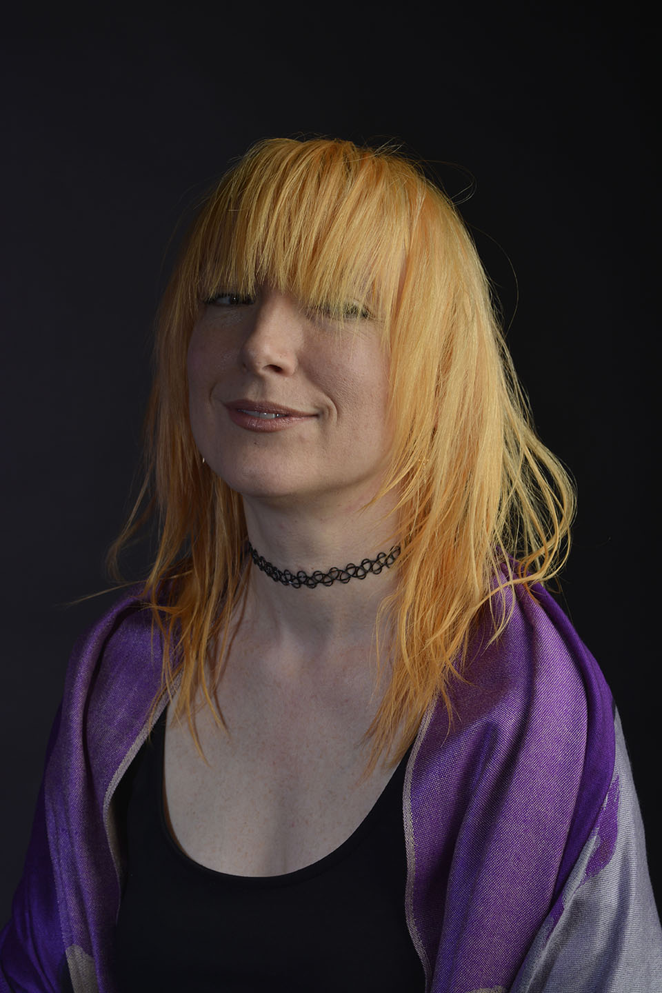
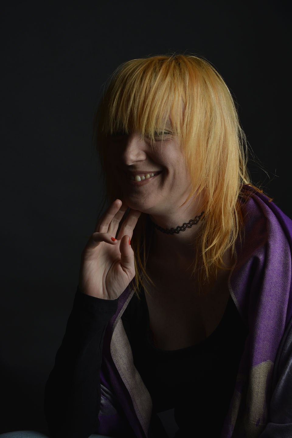
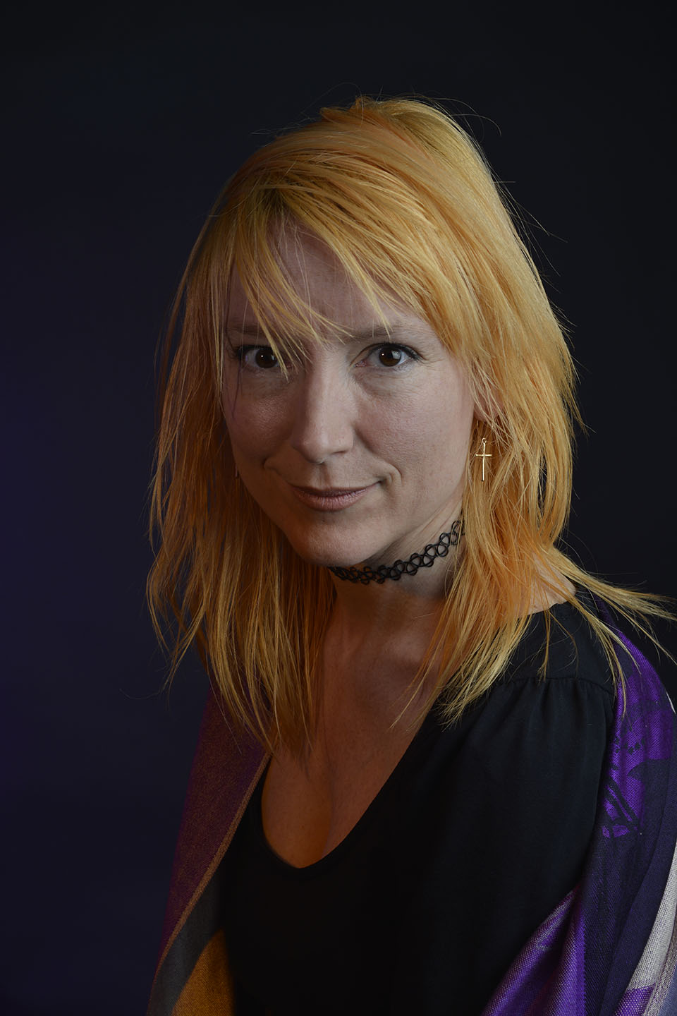
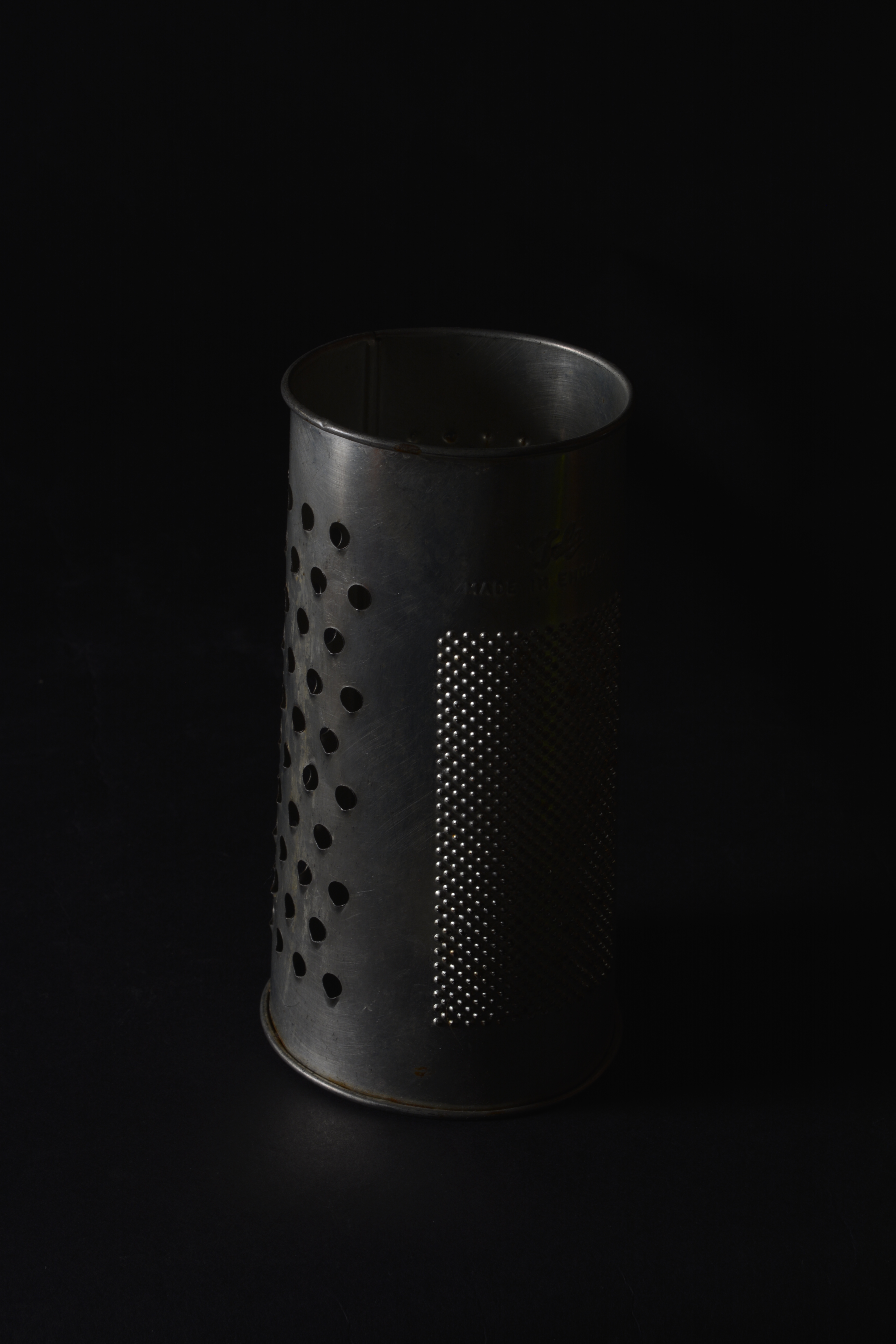
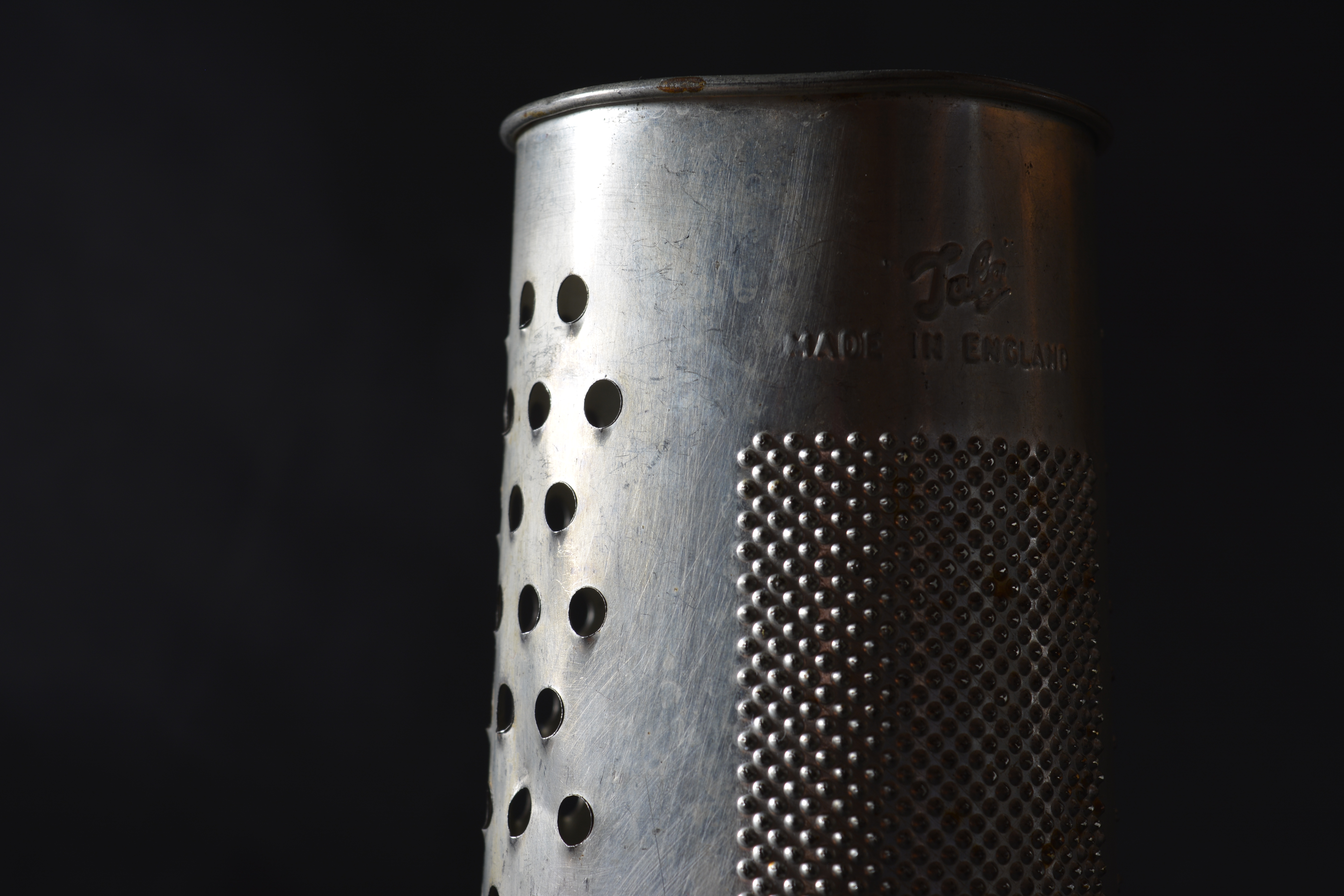
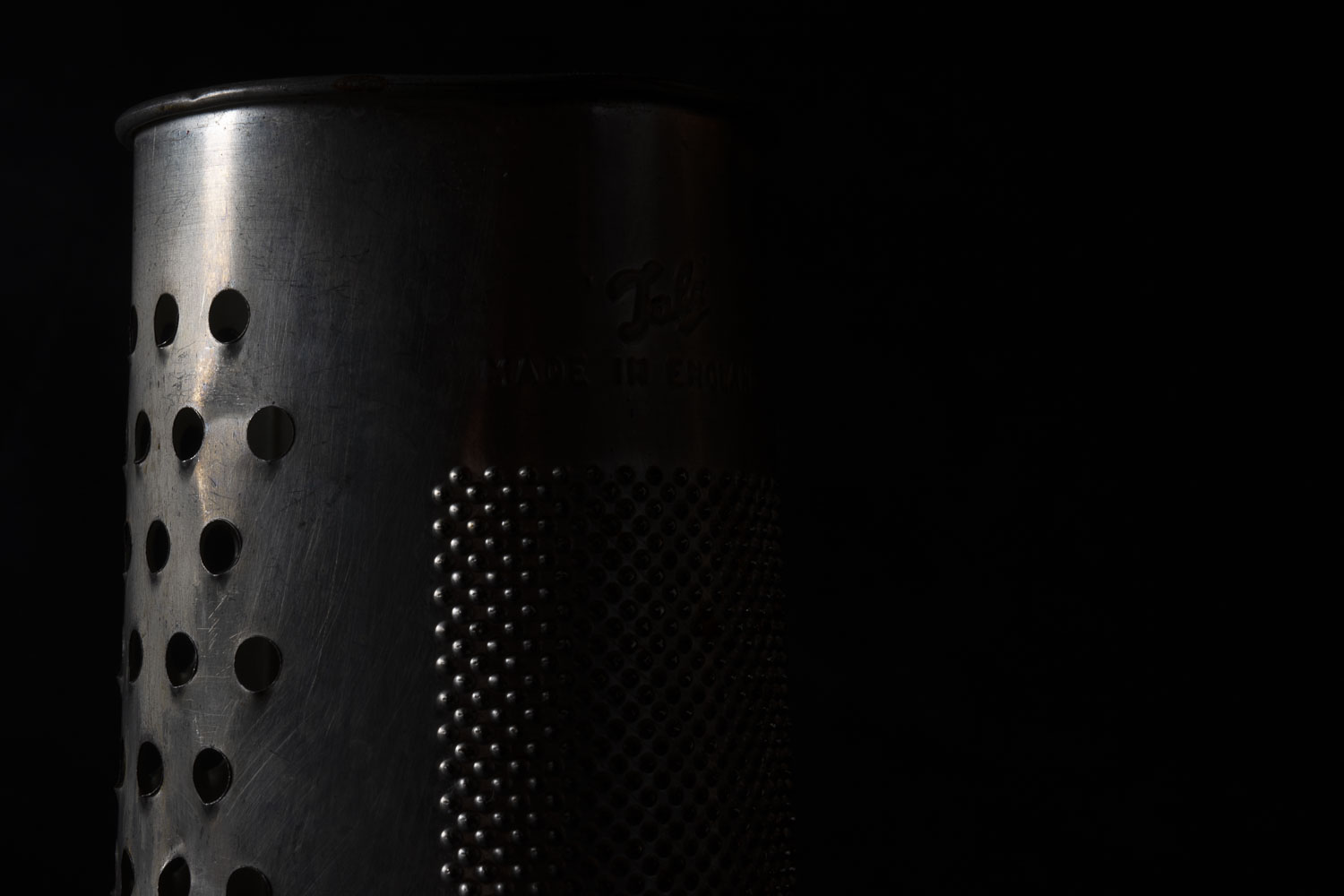
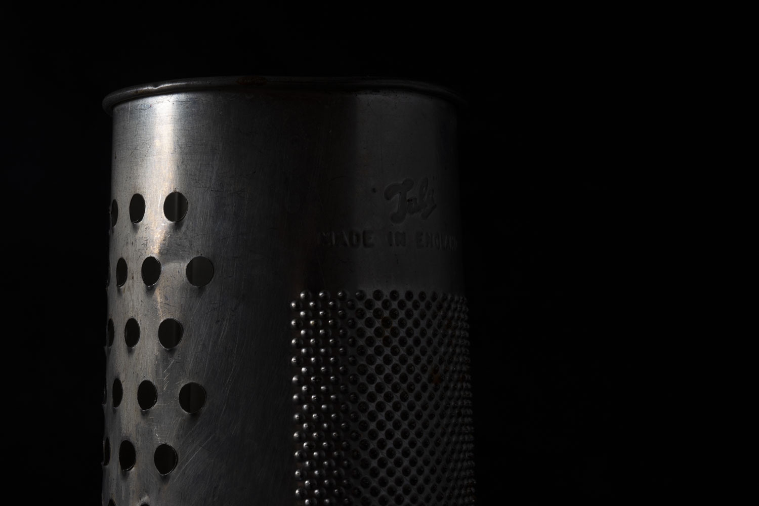
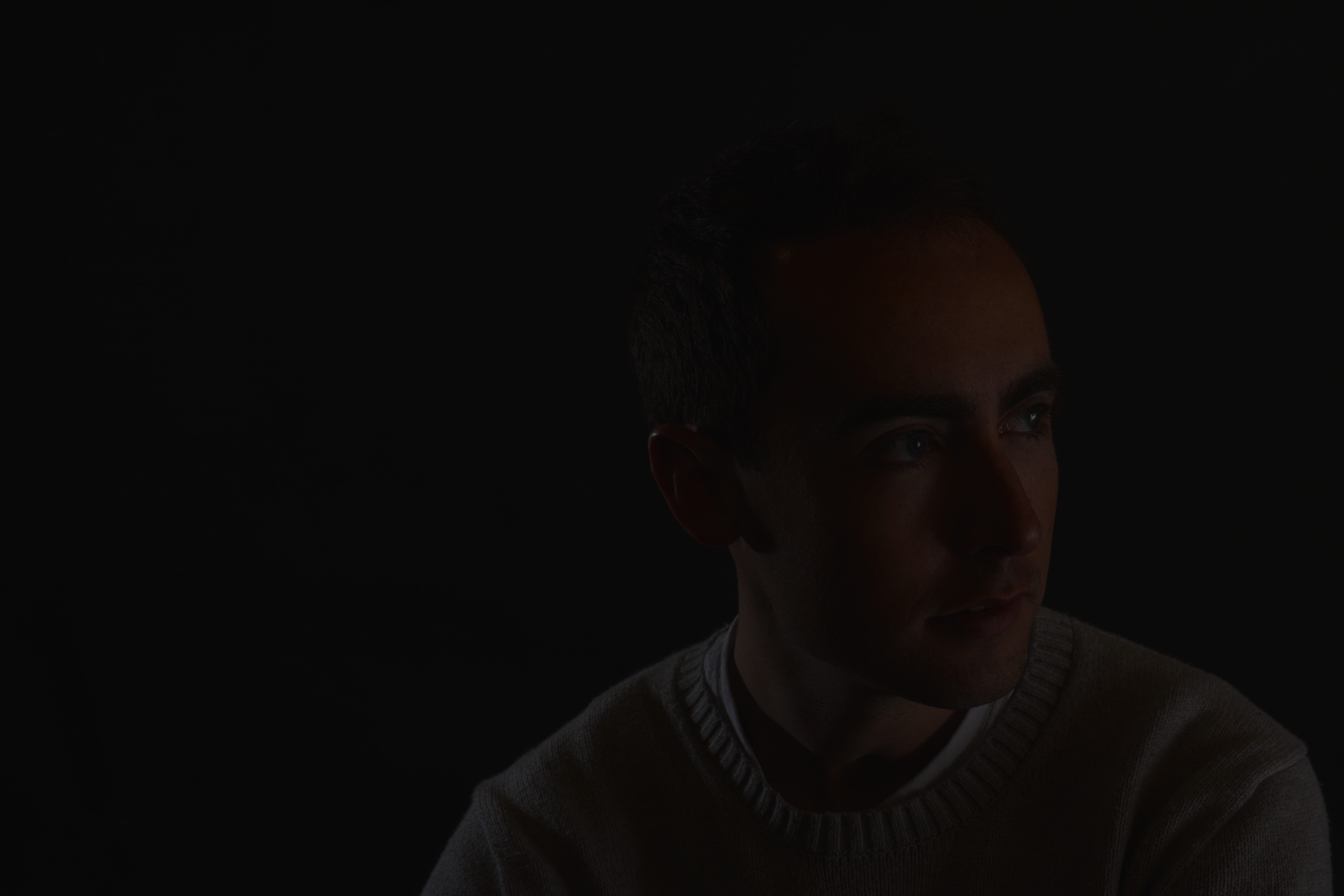
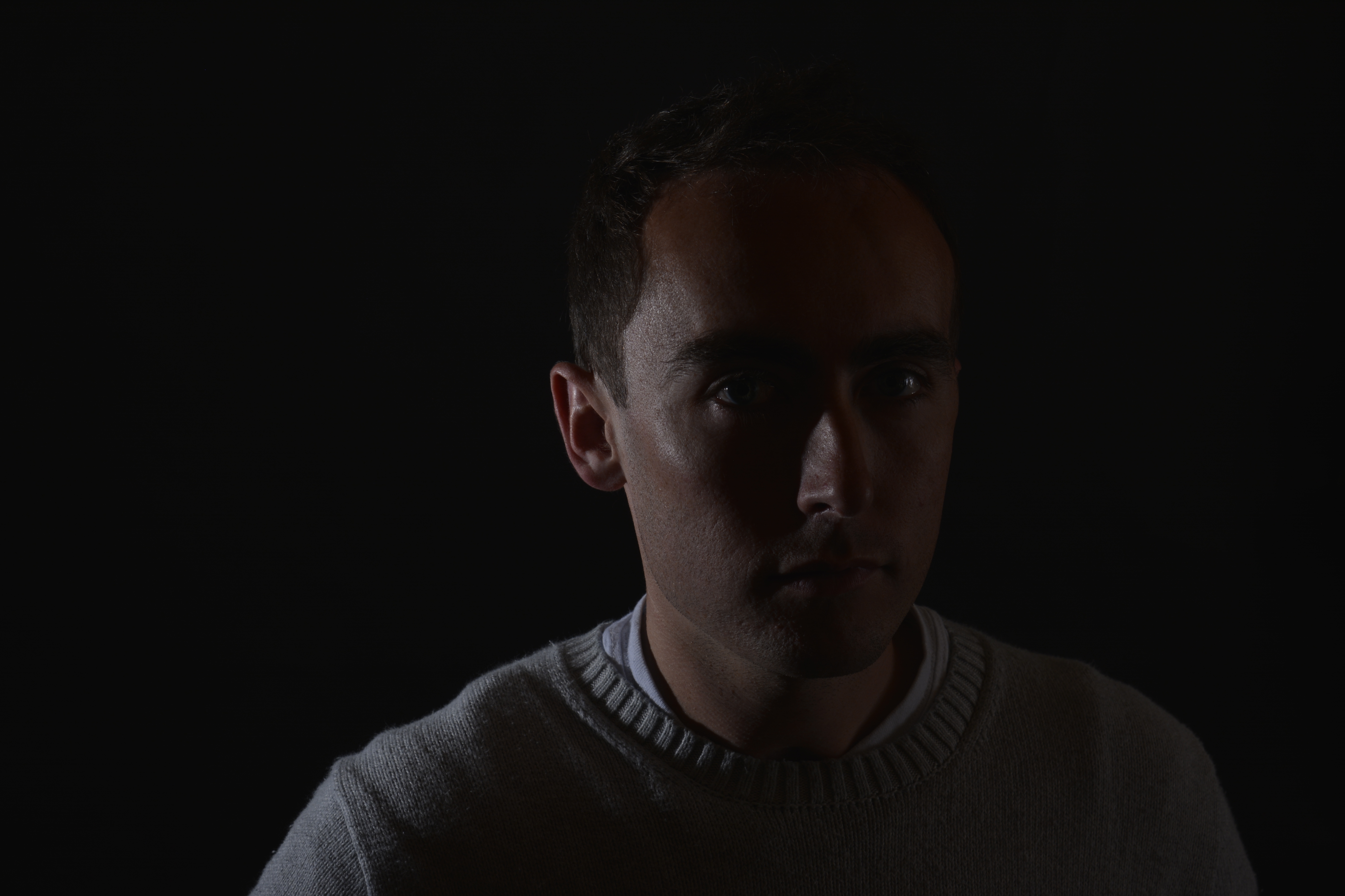
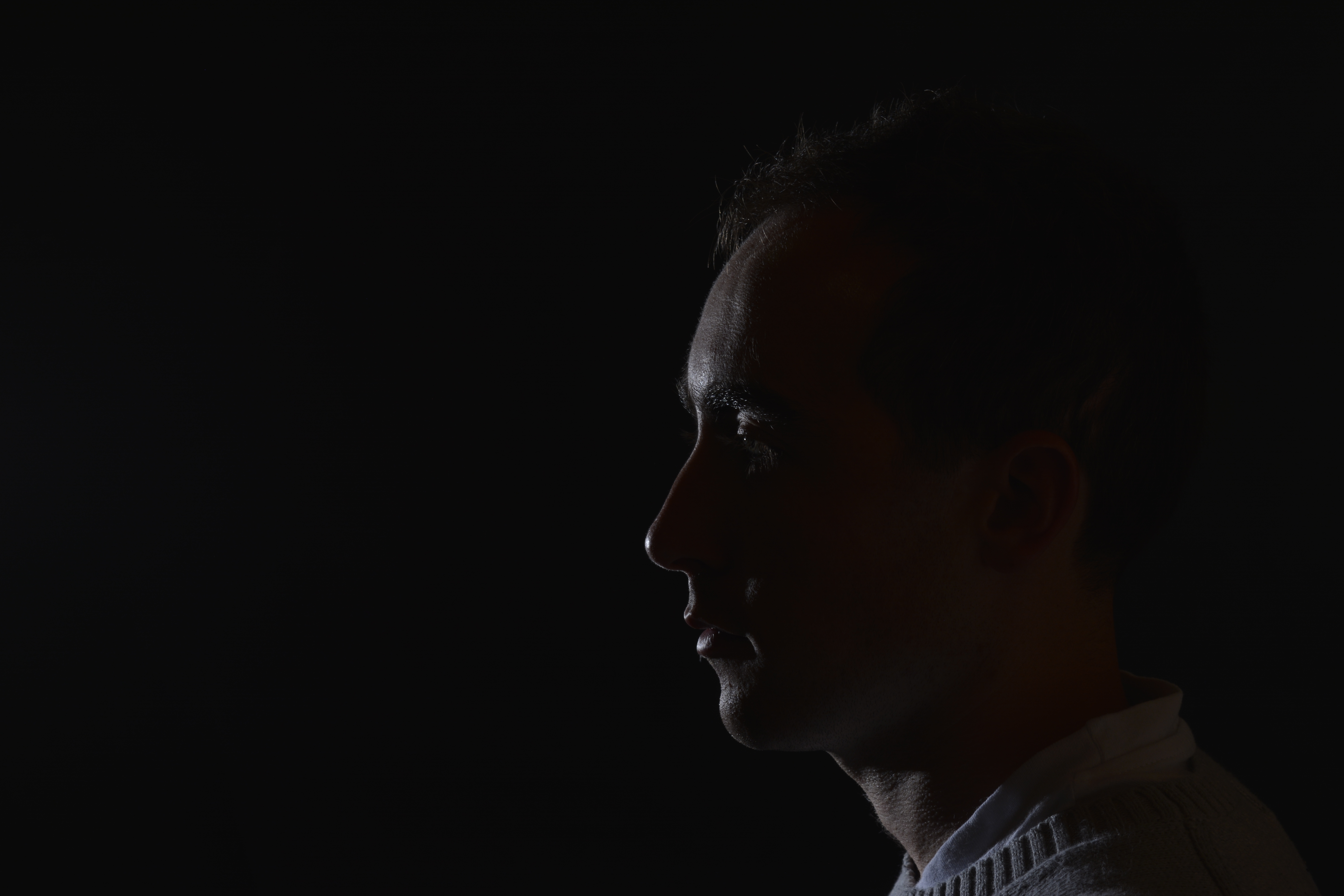
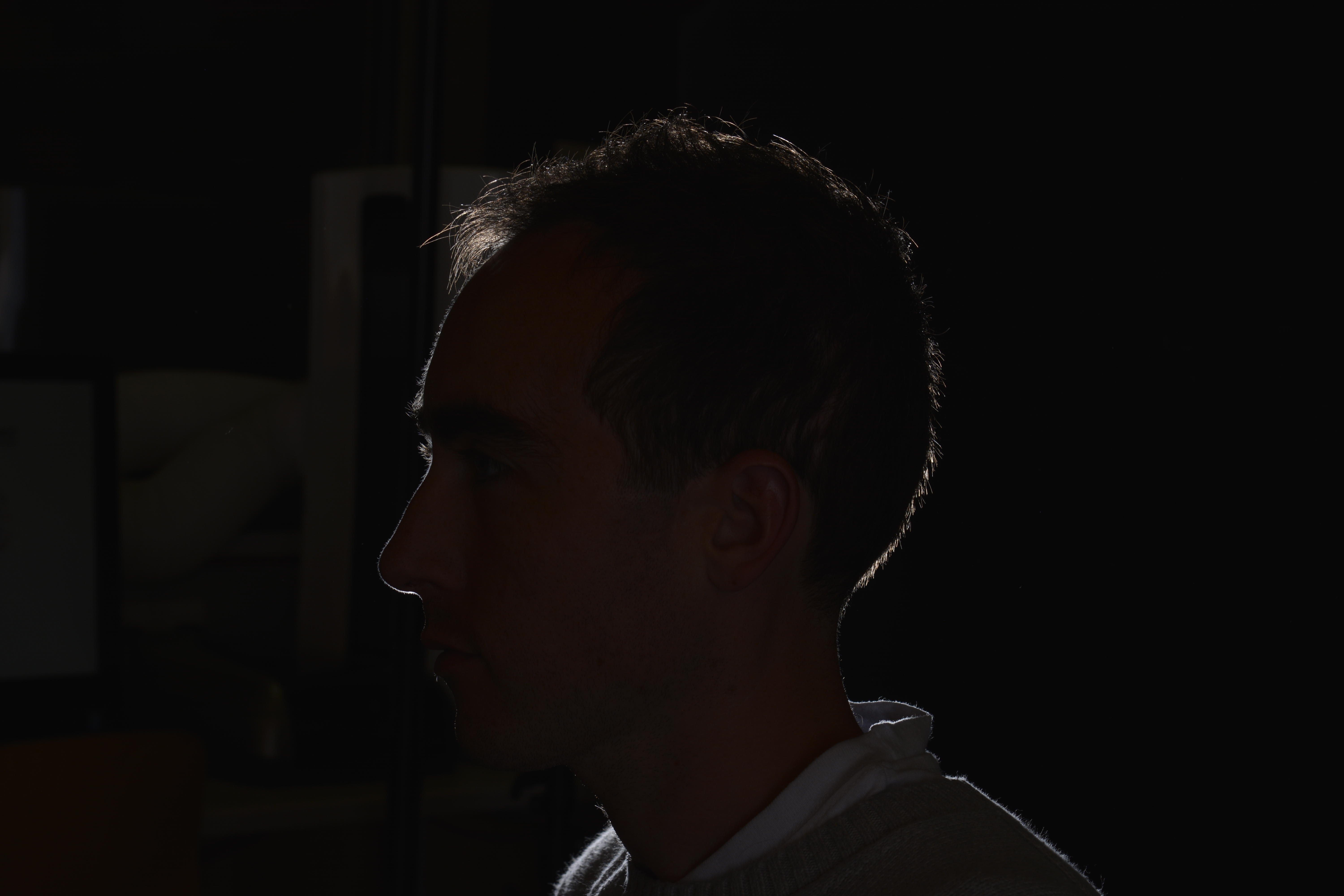
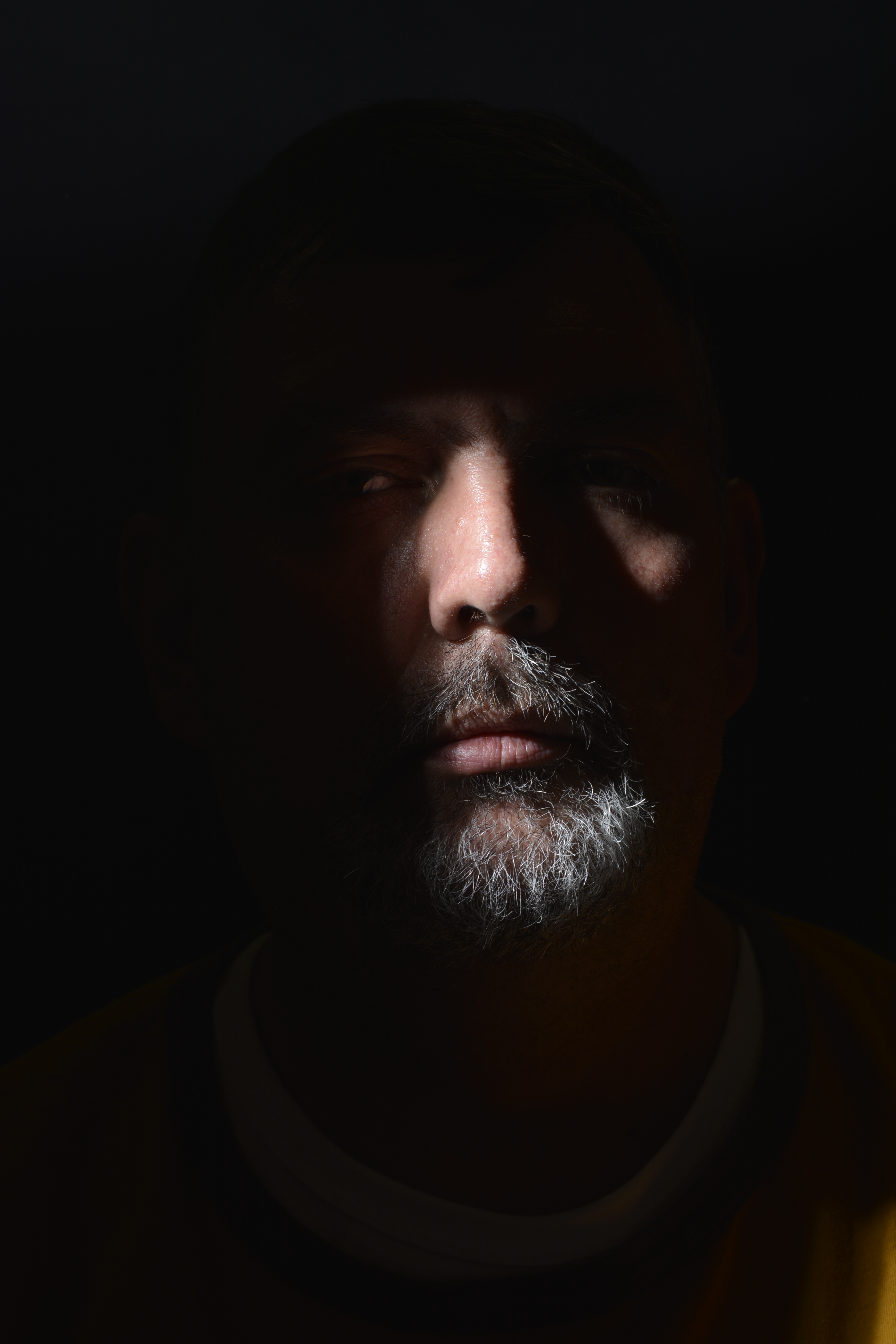
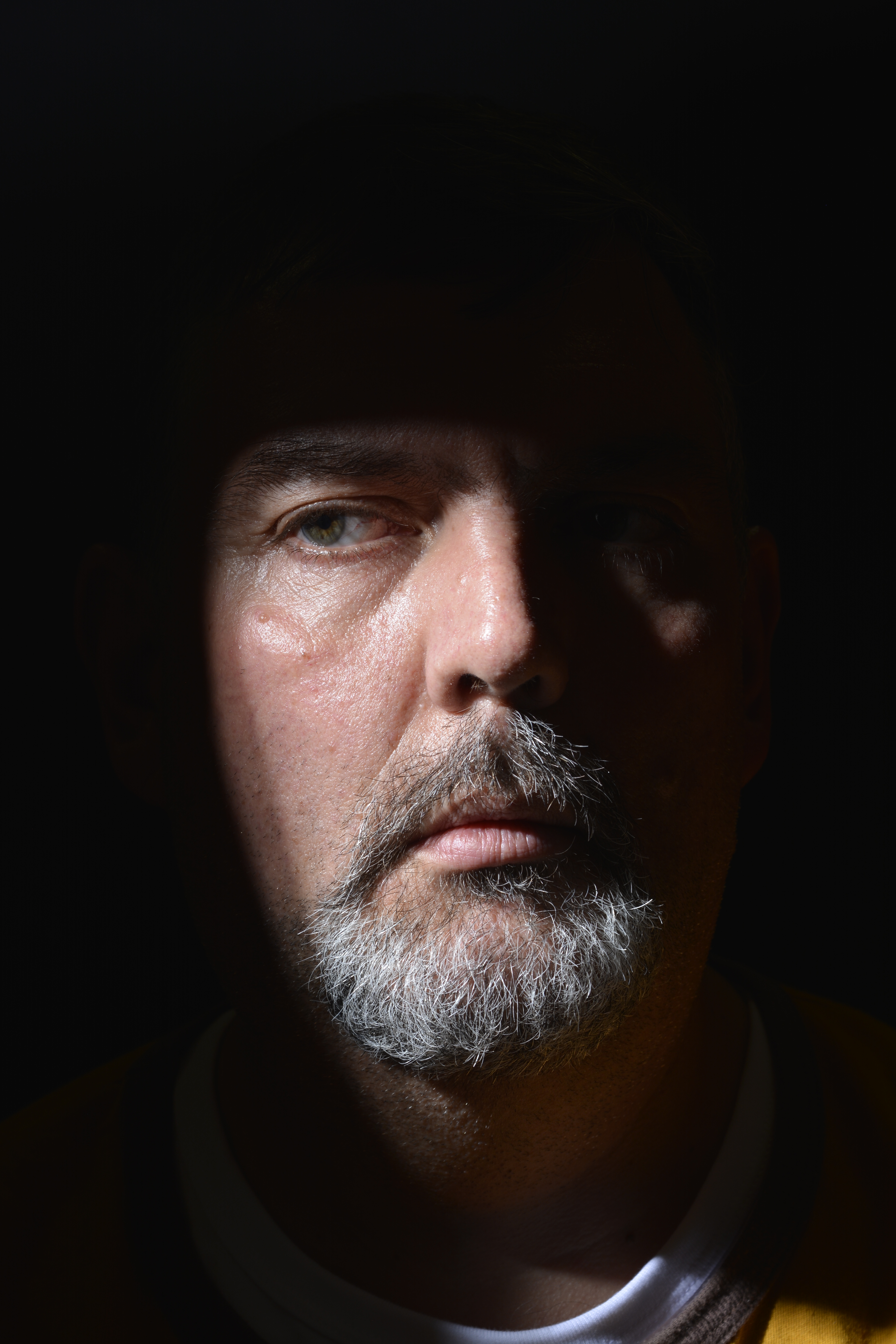
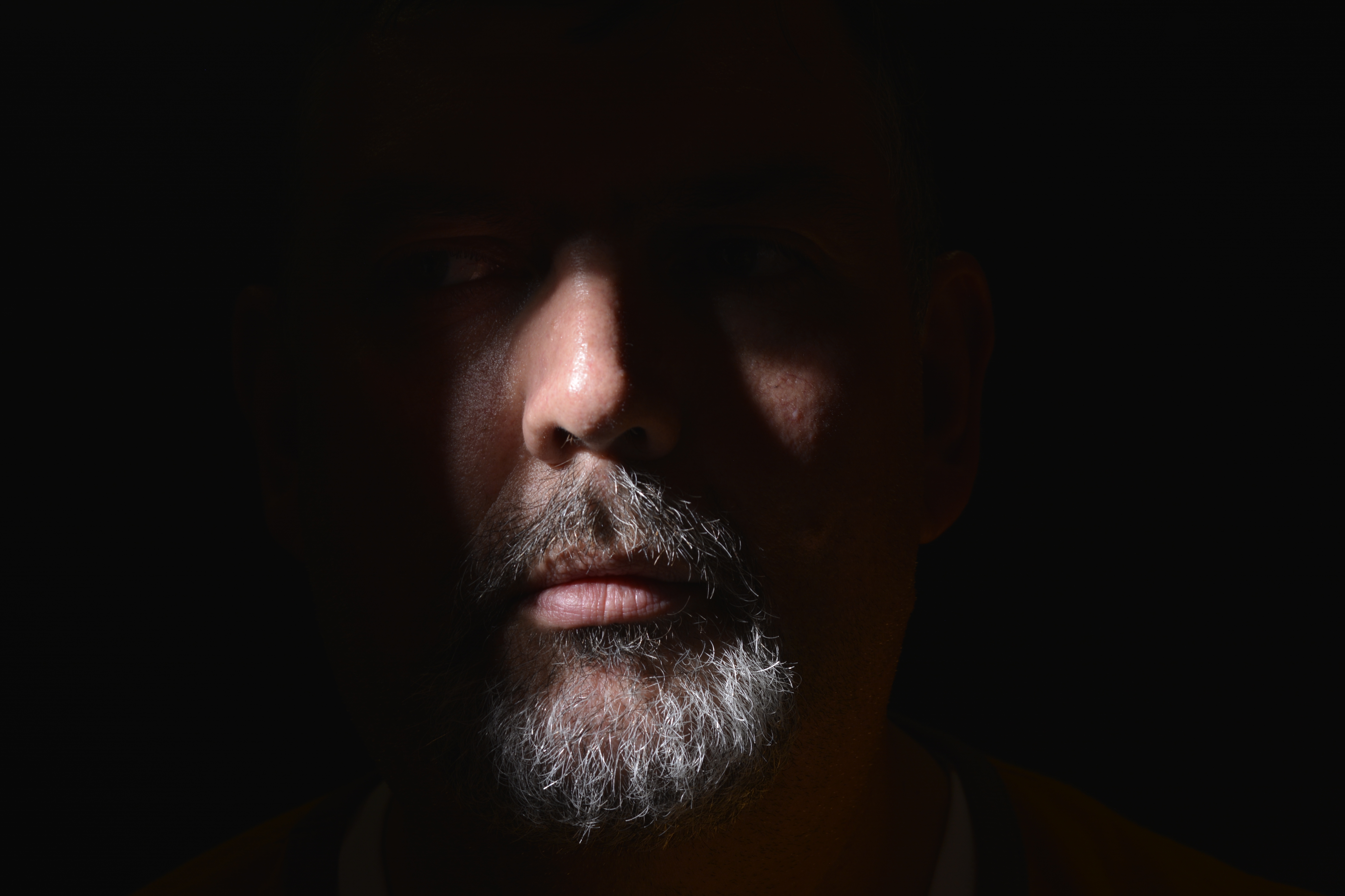
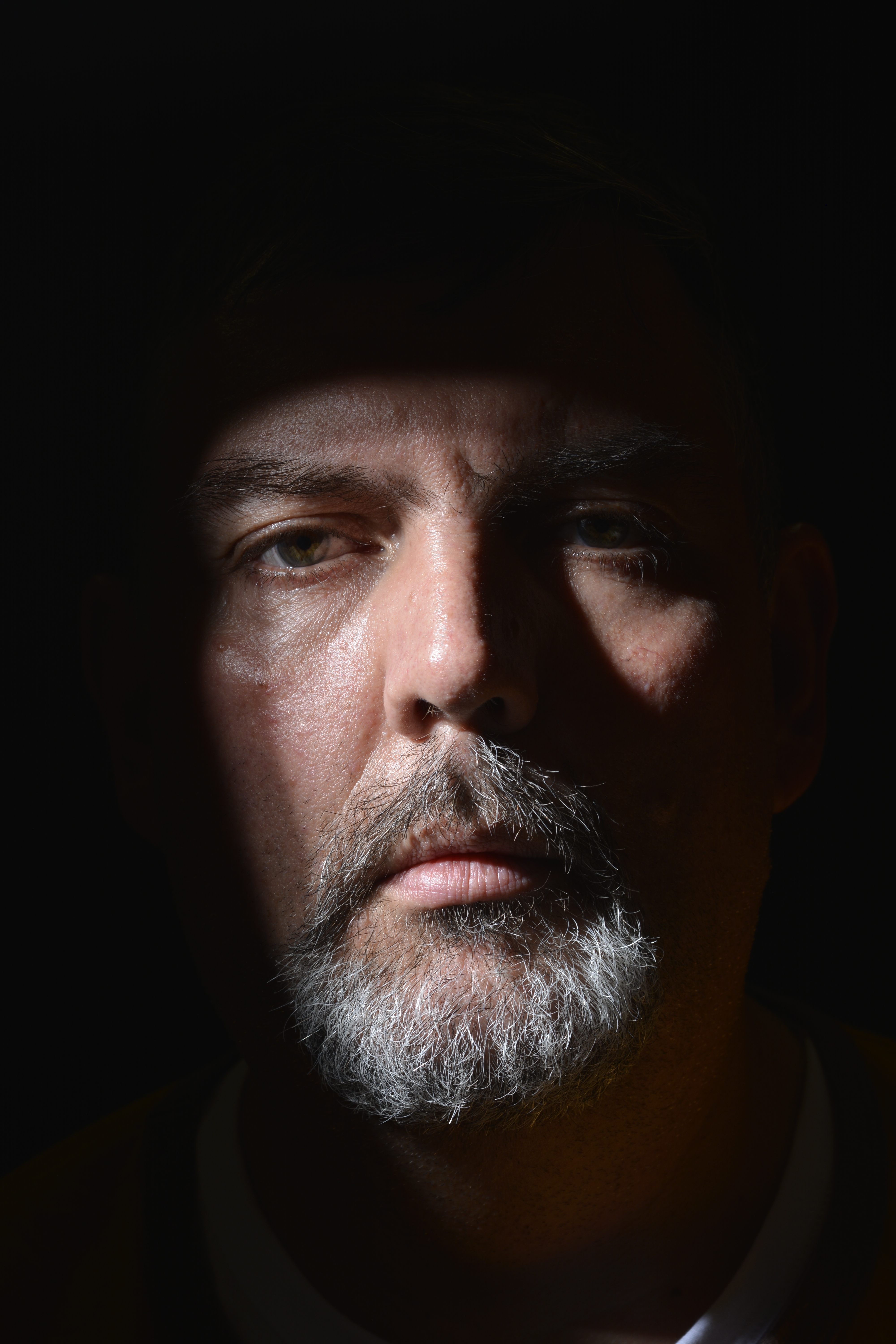
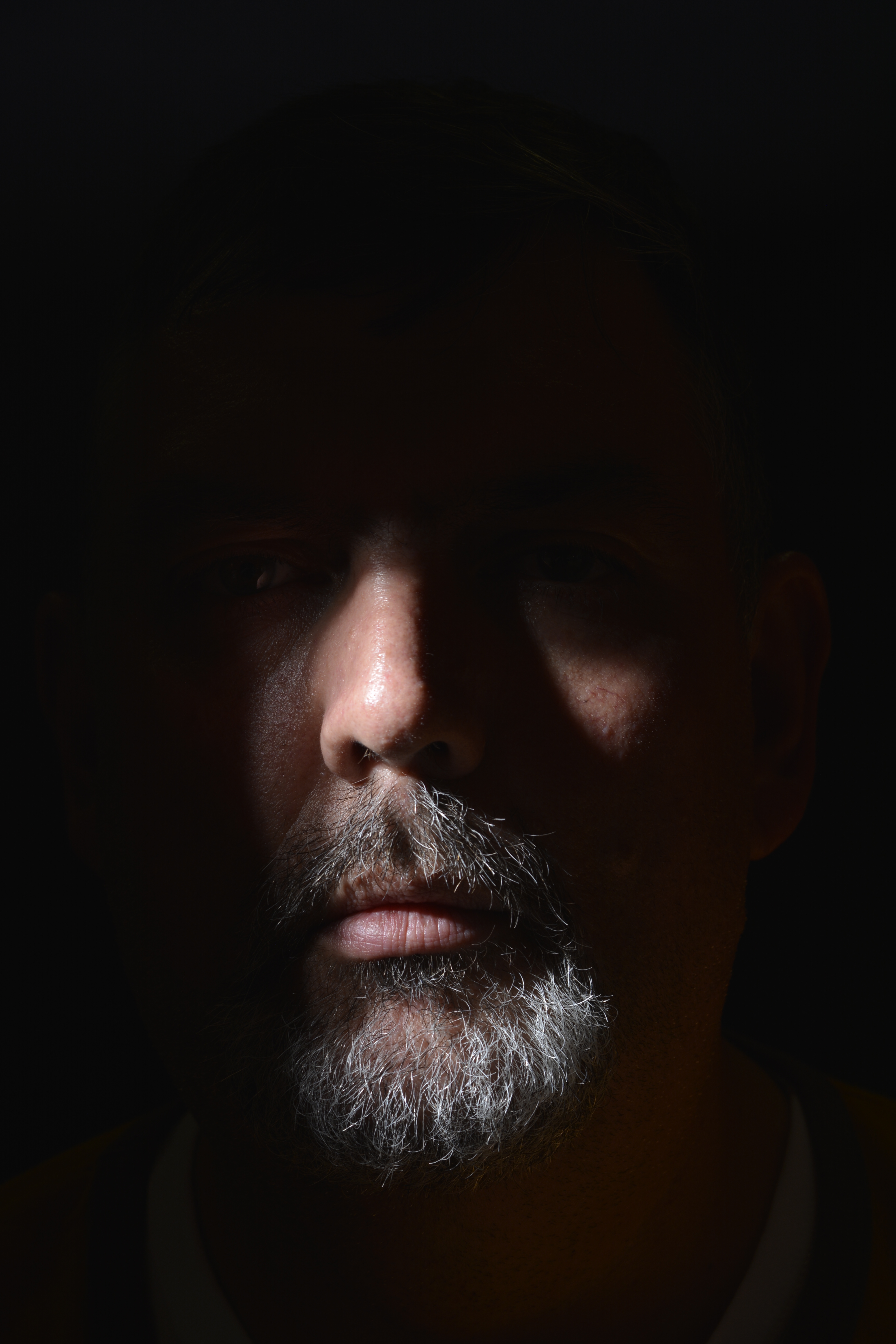
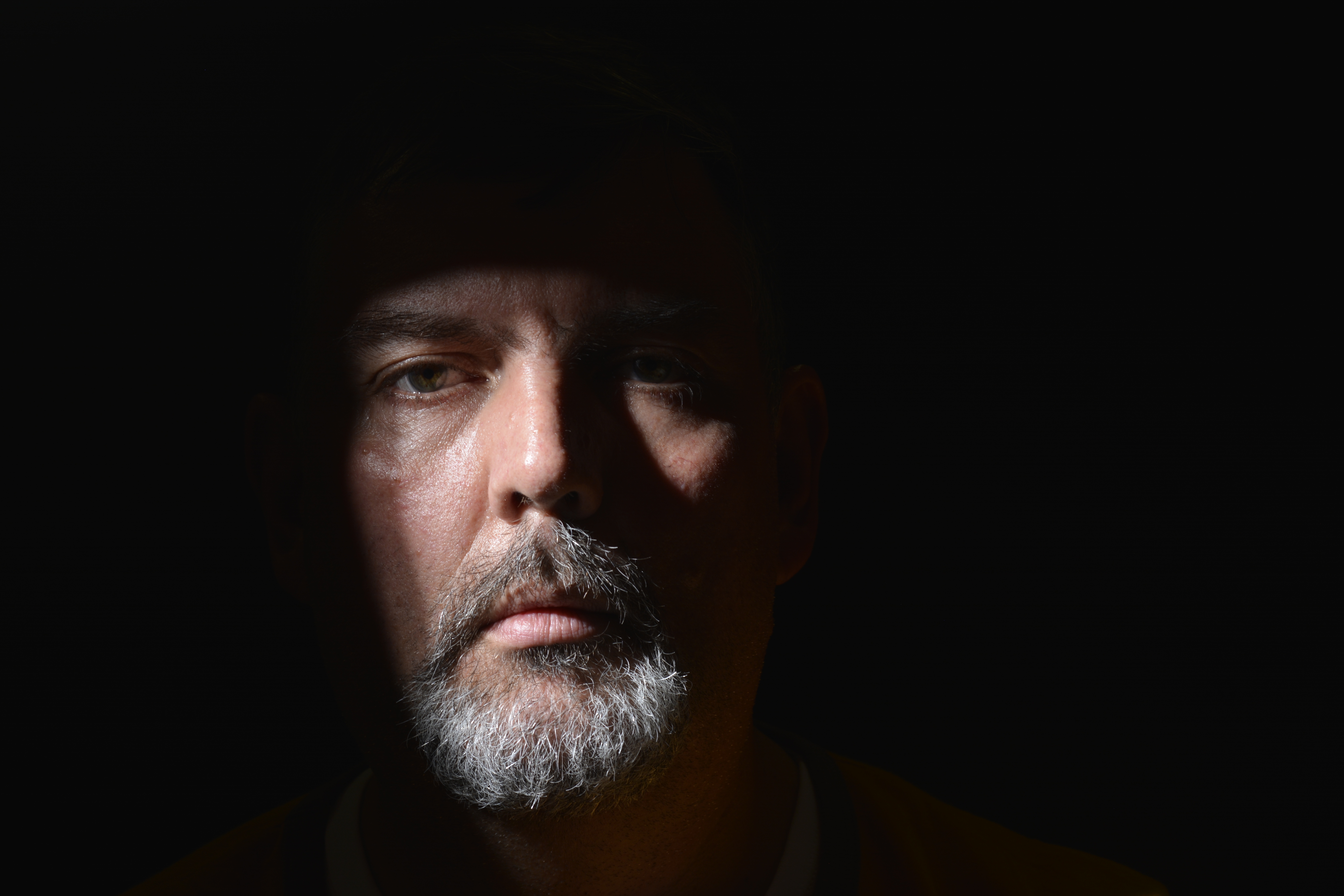
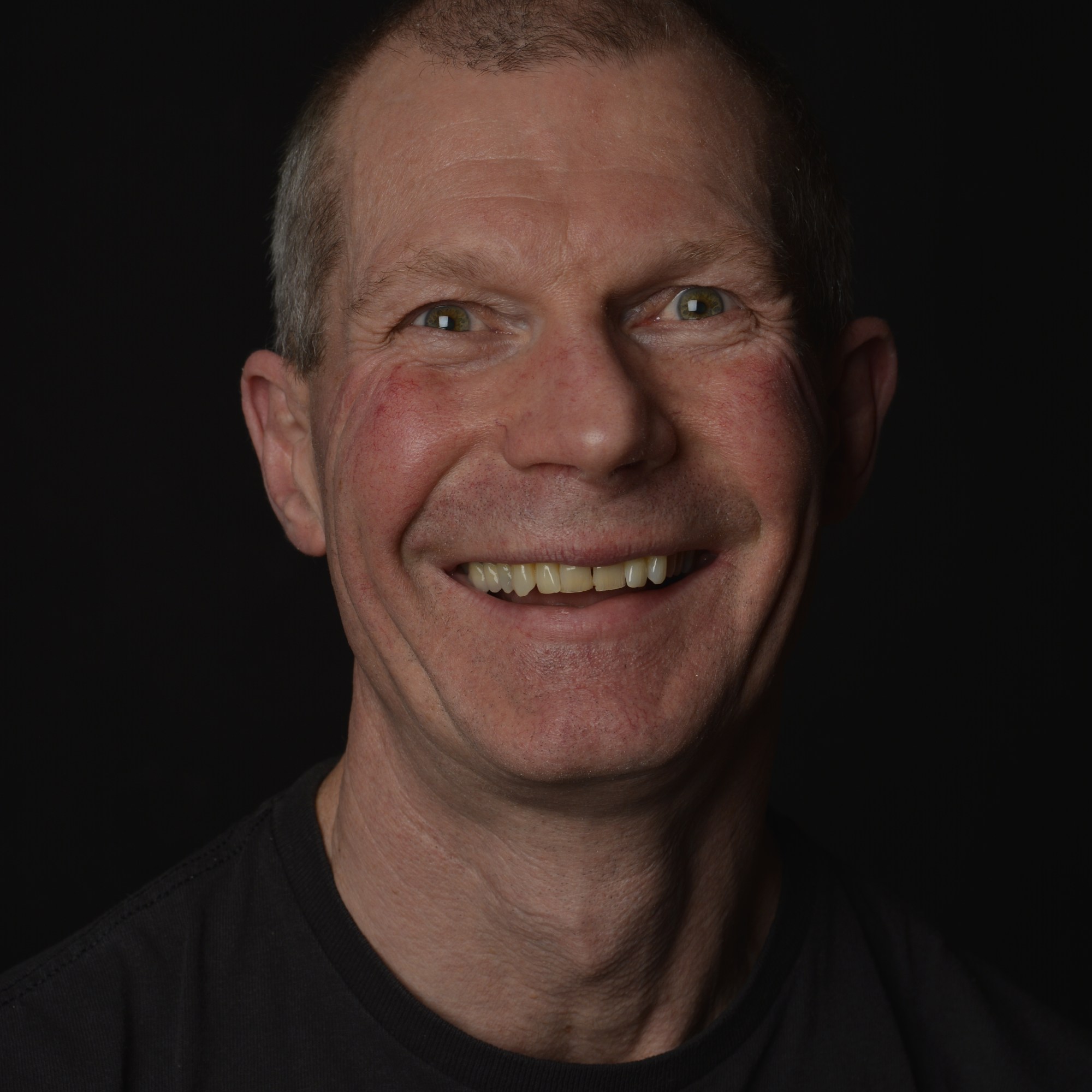
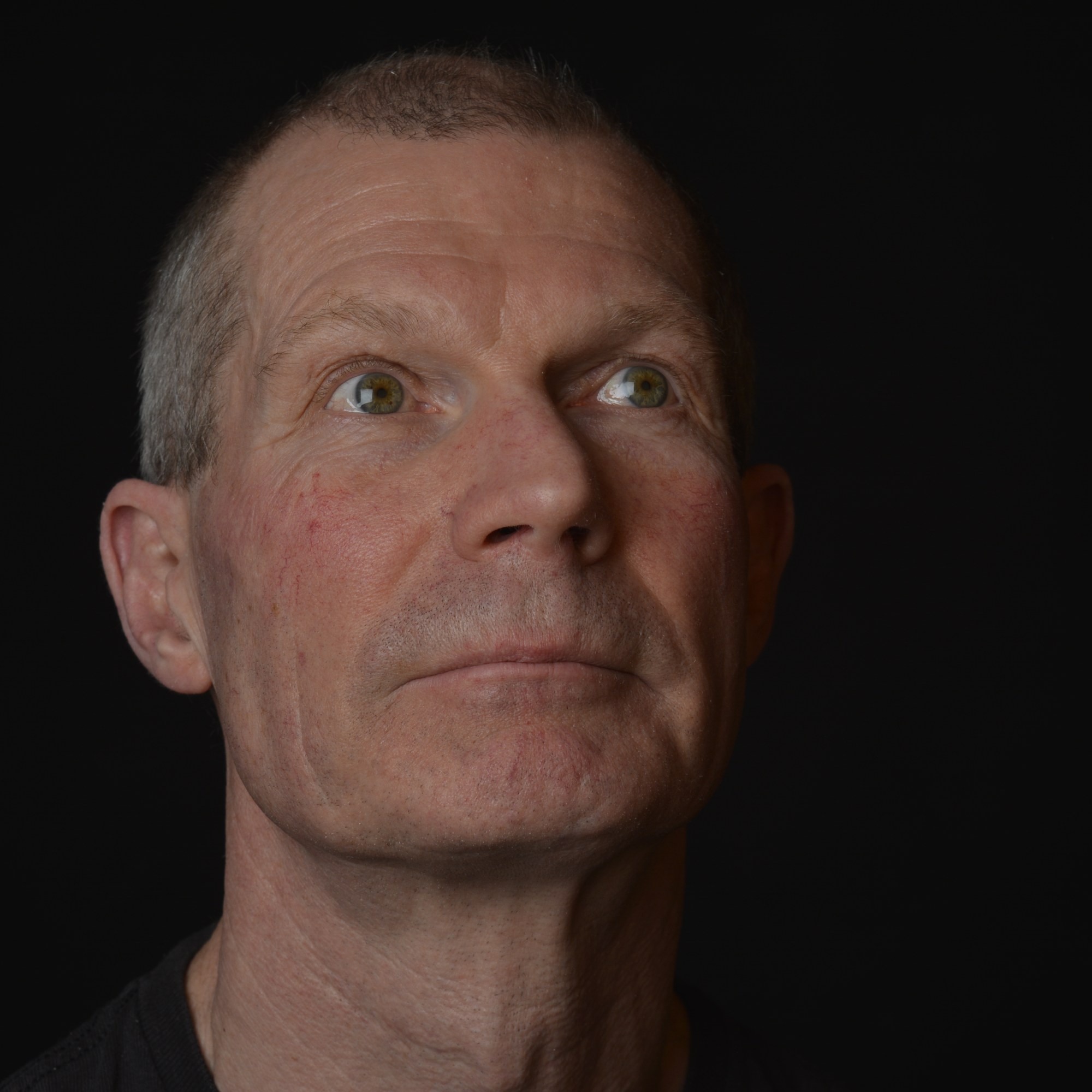
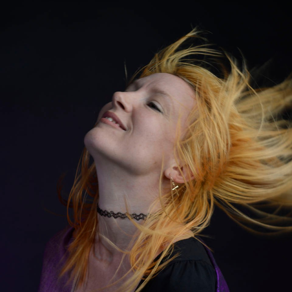
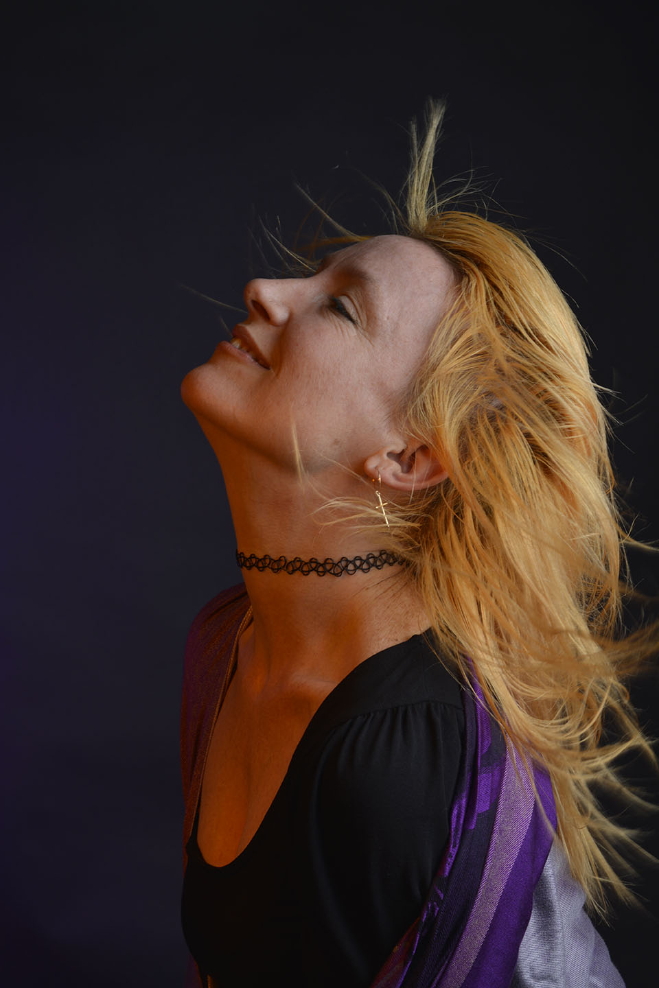
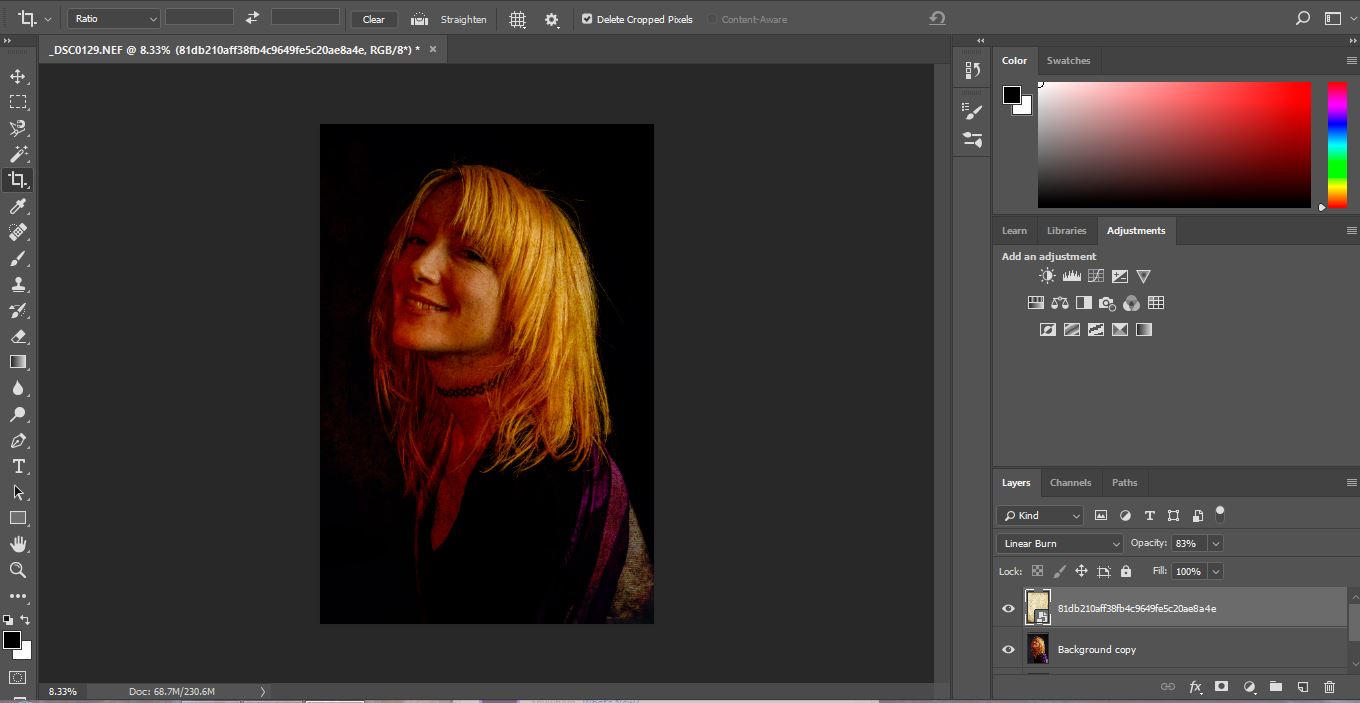
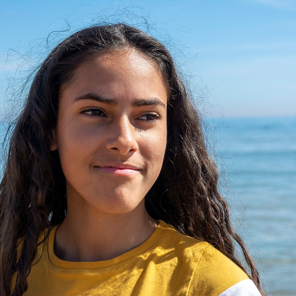
Below, I have taken one of my portraits (right), turned it into Black and White and then applied a scratched metal overlay (left).

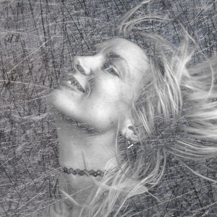
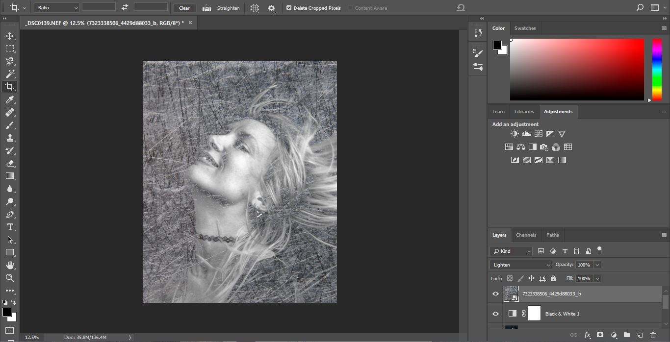
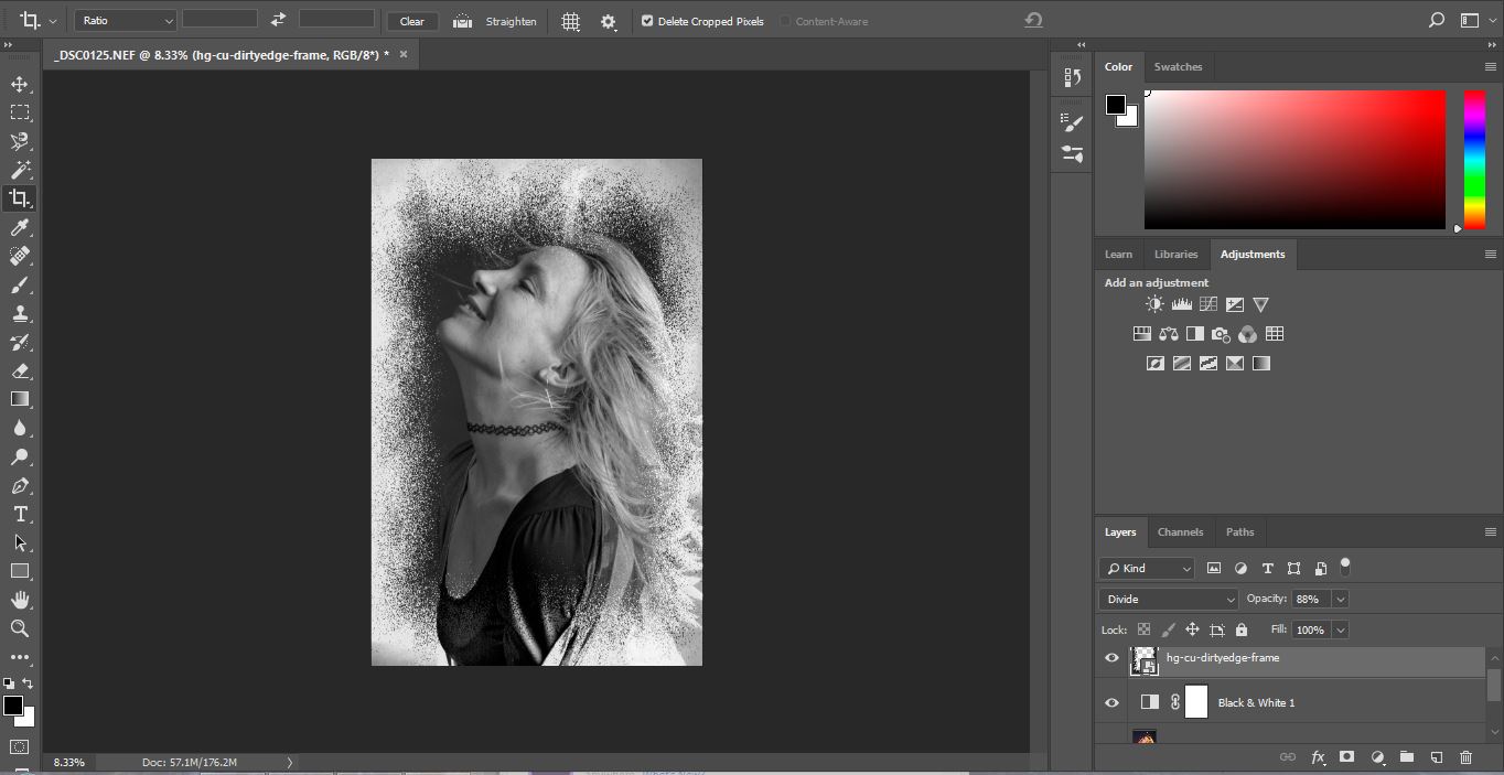
Changing the original image into Black and White gives a greater effect with the scratched metal. Below is a screenshot from Photoshop. With every image you work on in Photoshop, you want to always copy the background layer. This means that if you don’t like what you have changed you are able to to get back to your original image, as this remains unchanged as your background copy. Also, to preserve your original images, converting them into Smart objects will allow you to do non destructive editing.

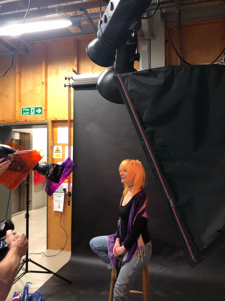
The screen shot below

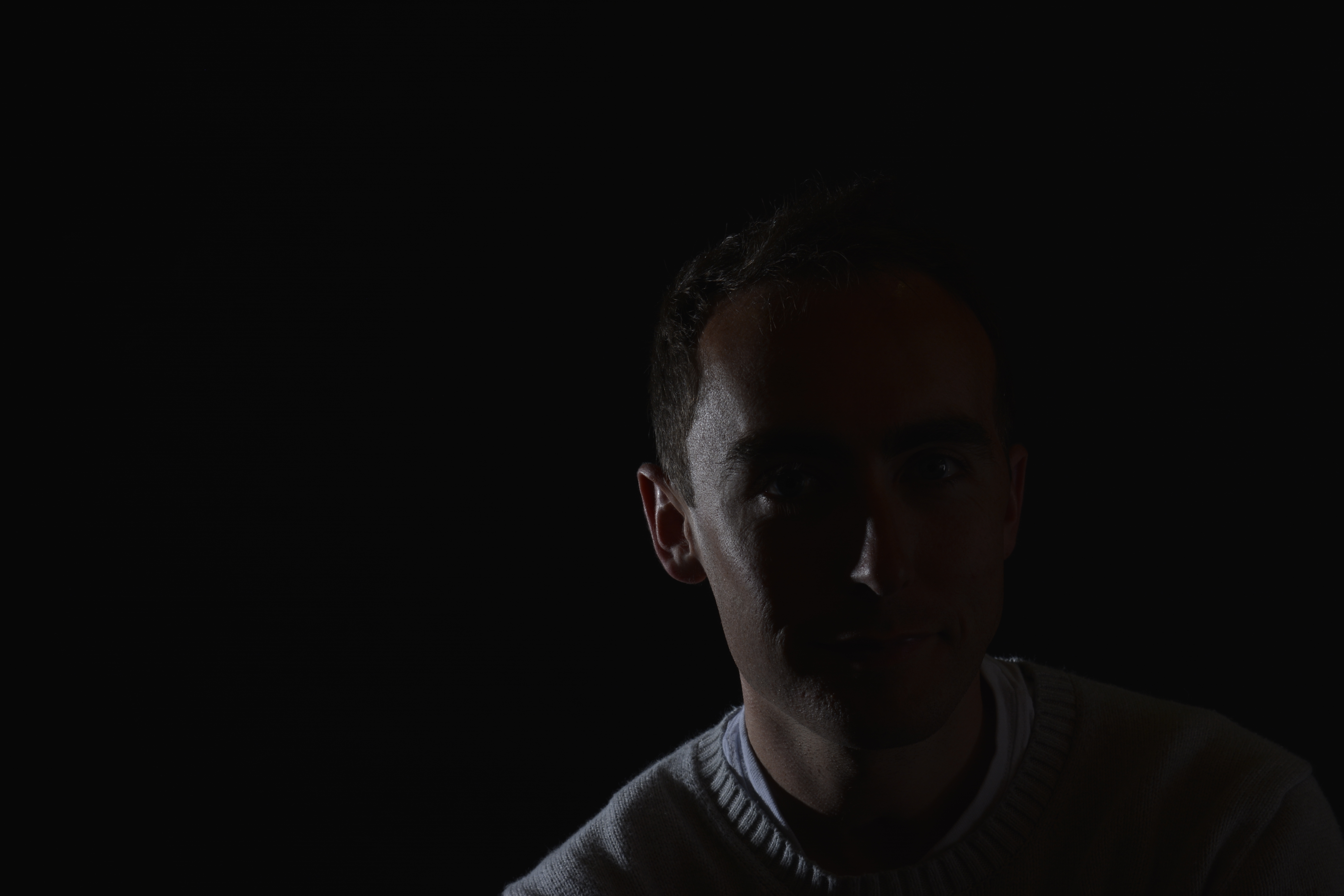
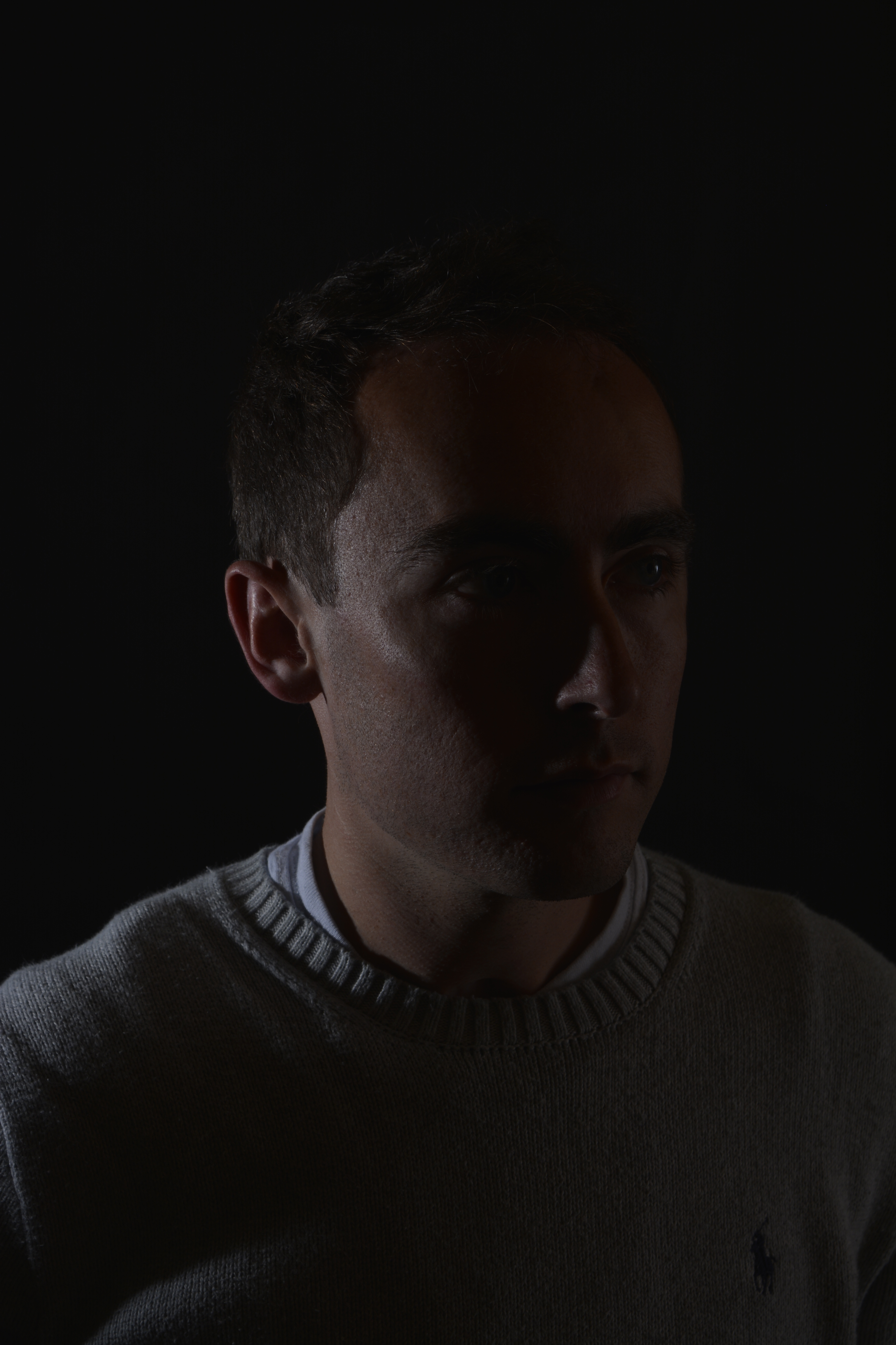
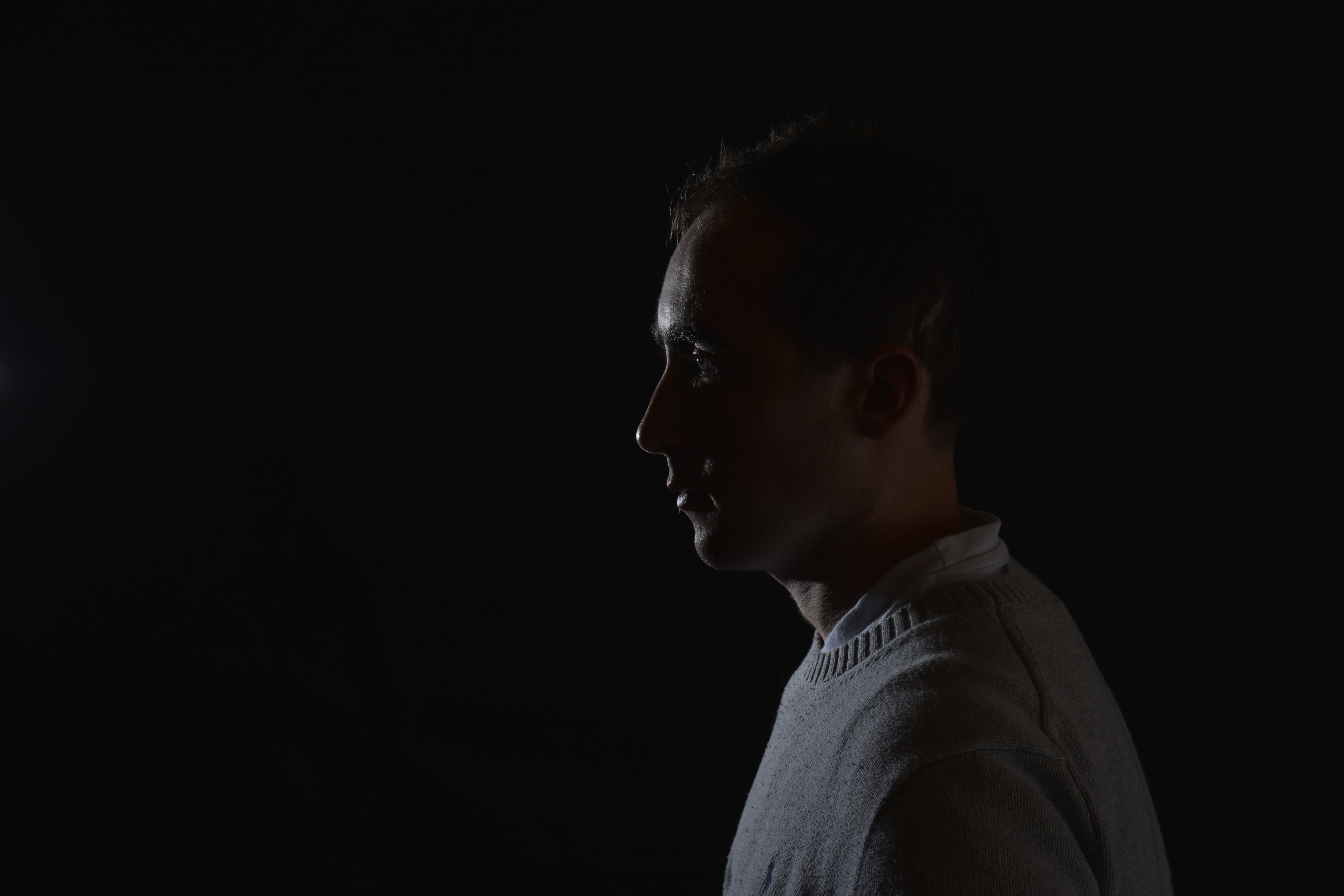
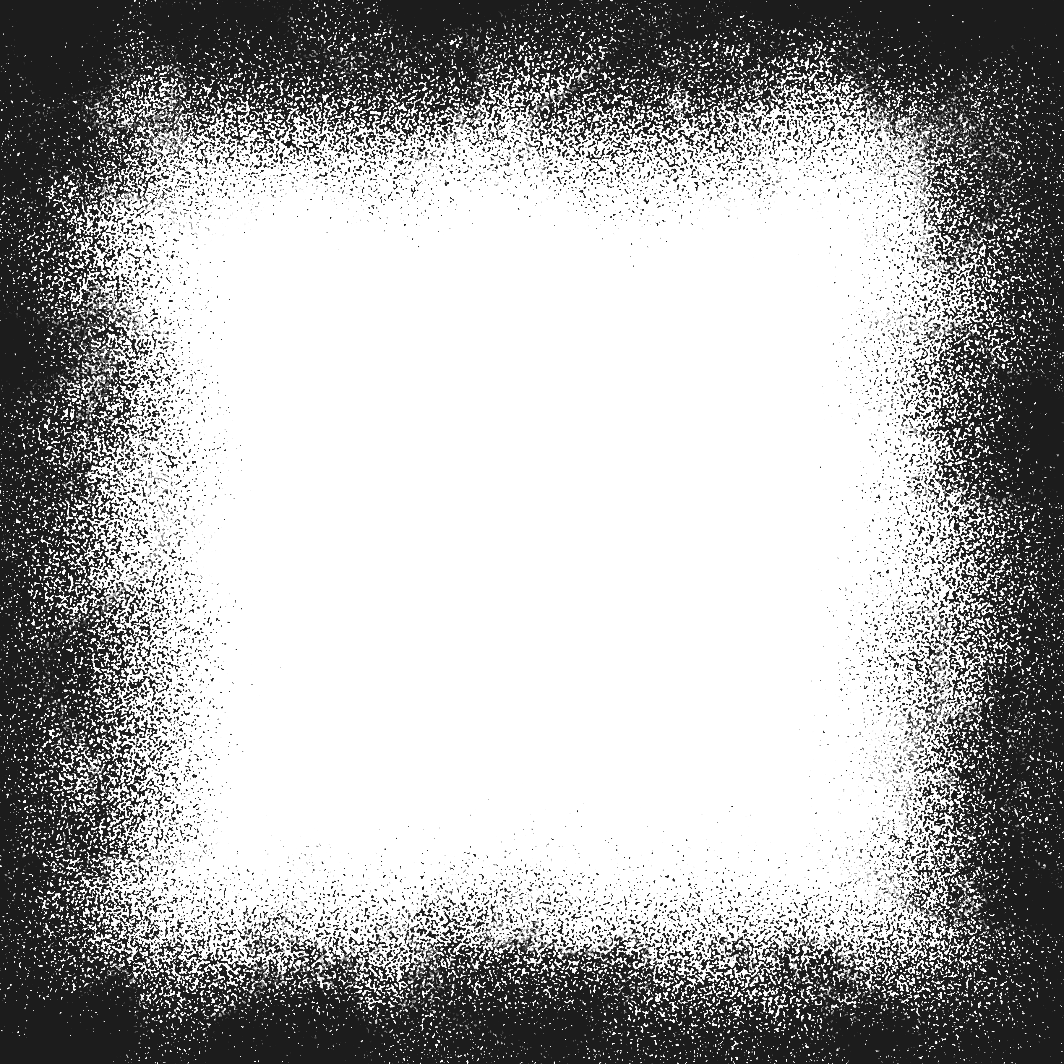
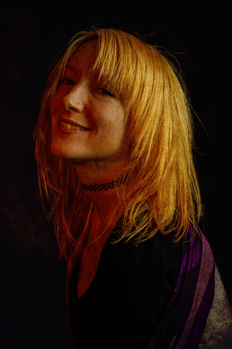
With the same image I have overplayed a frame. Again, converting the image into Black and White as this looked better. This frame I found on the internet, however you can easily create your own or a similar one within Photoshop. Using the Brush Tool, moving over the edges of a blank layer, the same effect can be achieved.

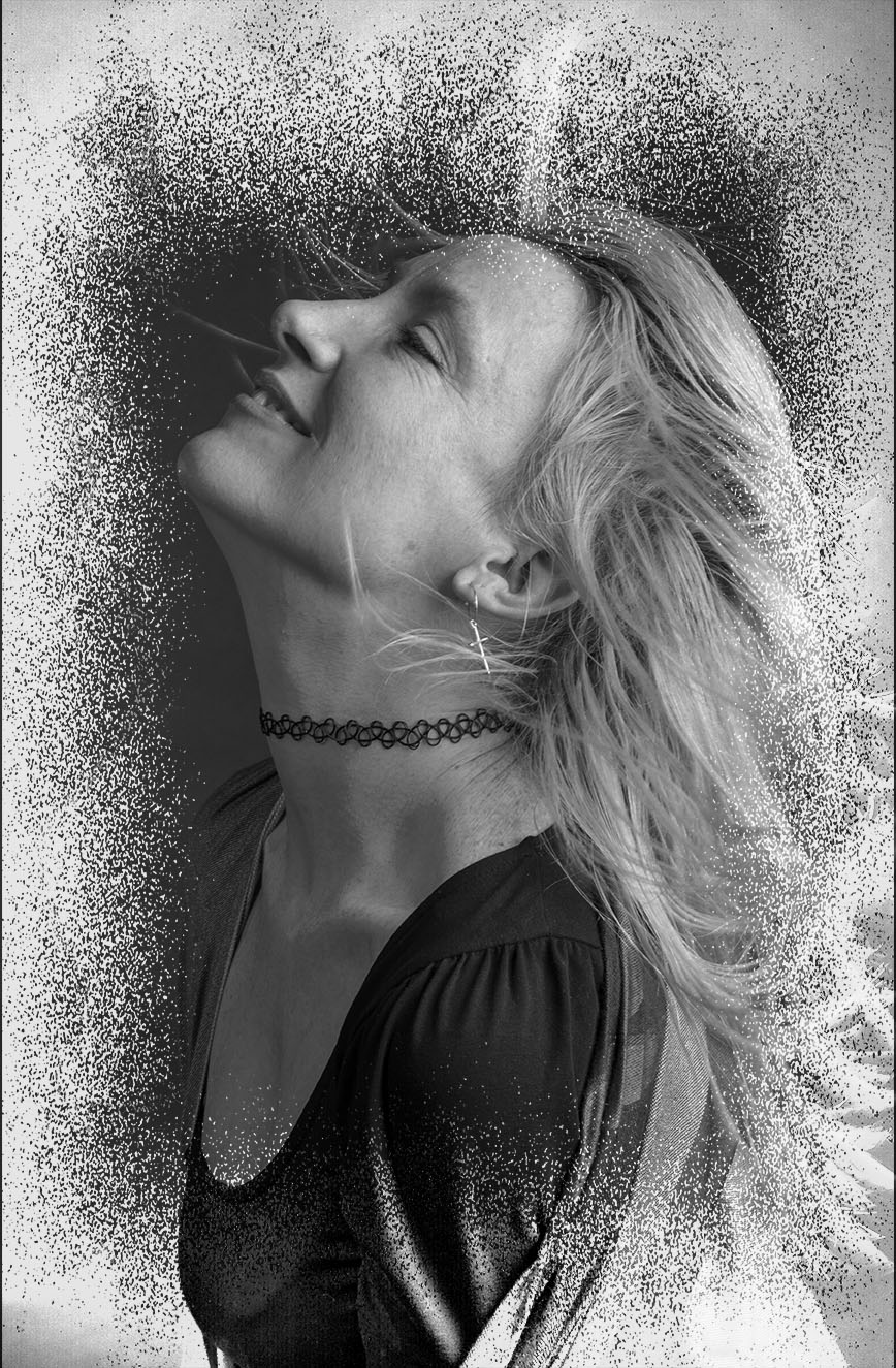
The original frame is black. When I placed it over the portrait image I scrolled through the blending modes. This tool gives slight changes in density, tone and colour to the overplayed image allowing you to create your desired design. I felt with this image, choosing the Divided blending mode with 88% opacity it converted the frame to more negative colours and complimented my portrait.

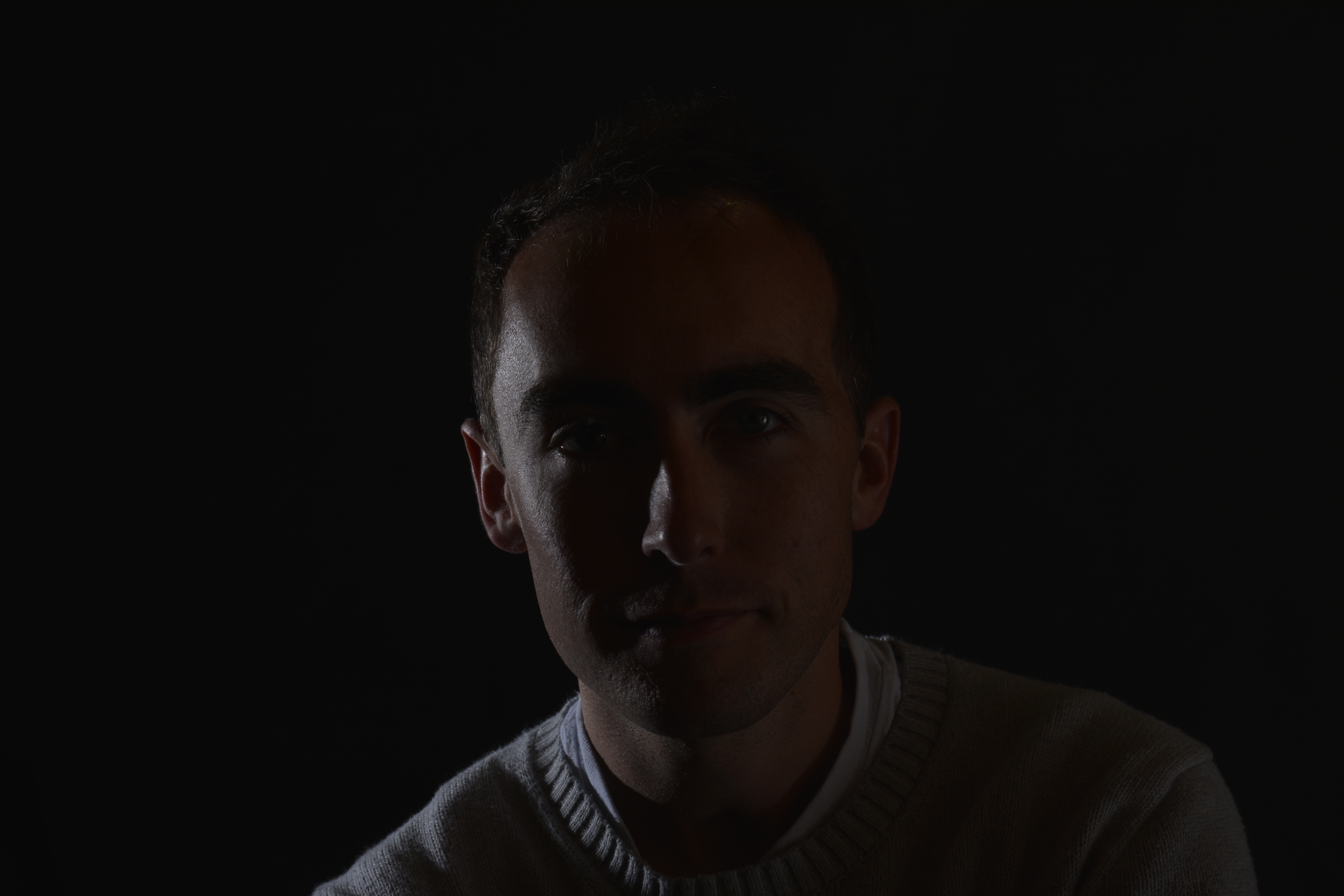
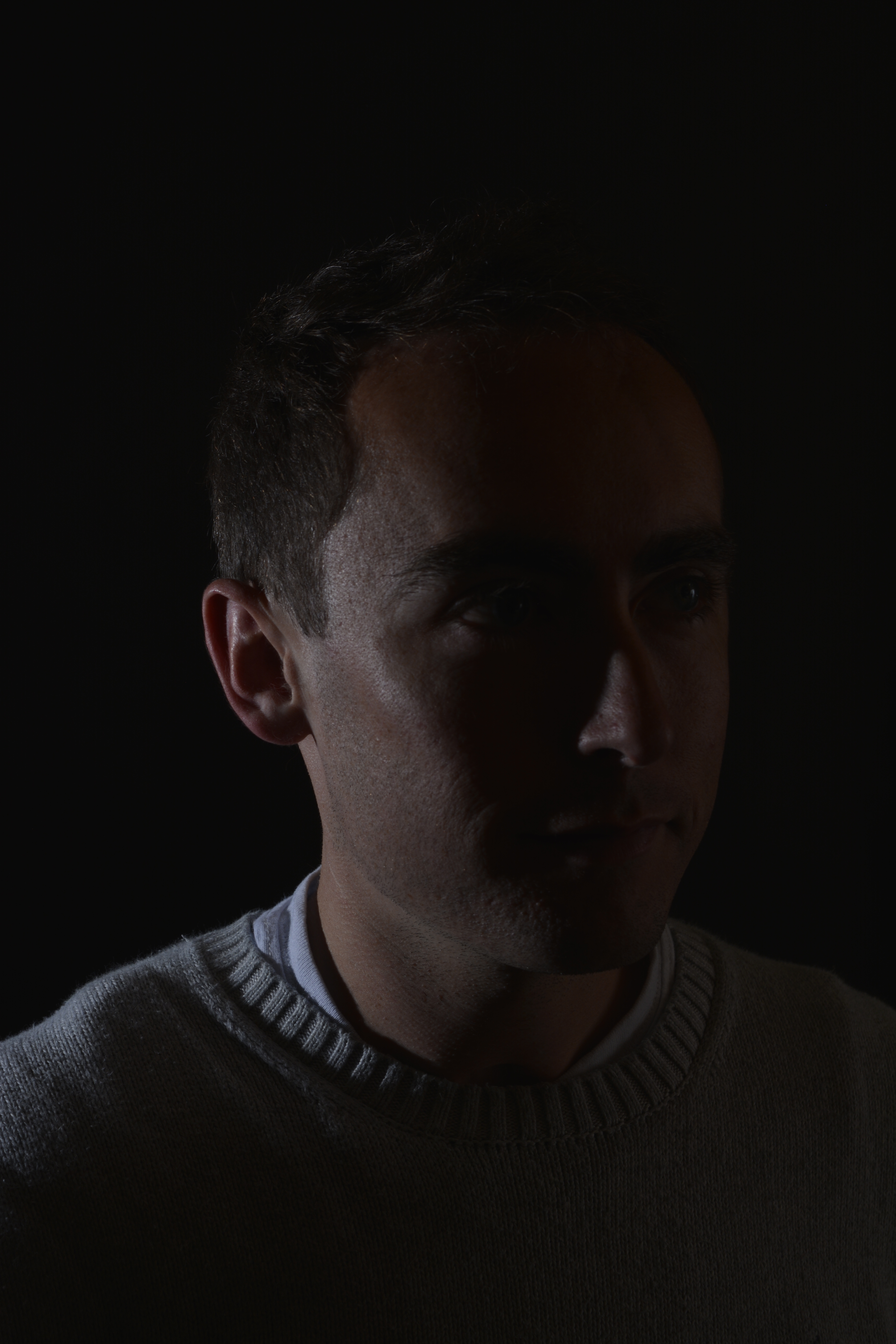
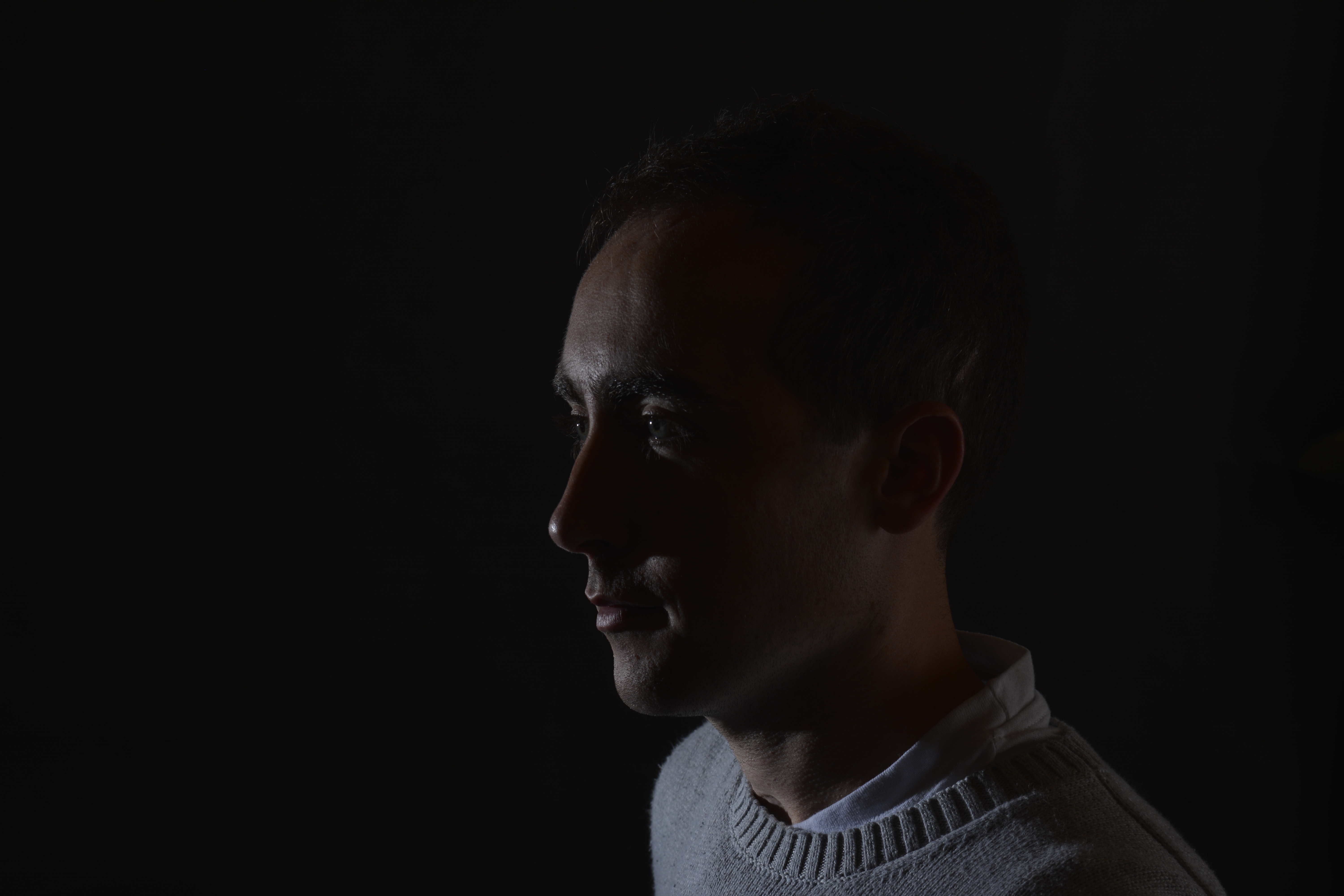
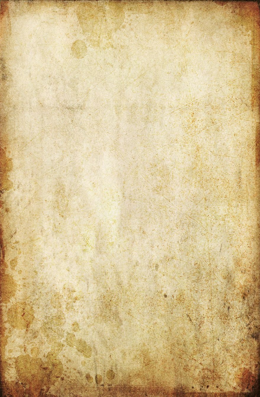
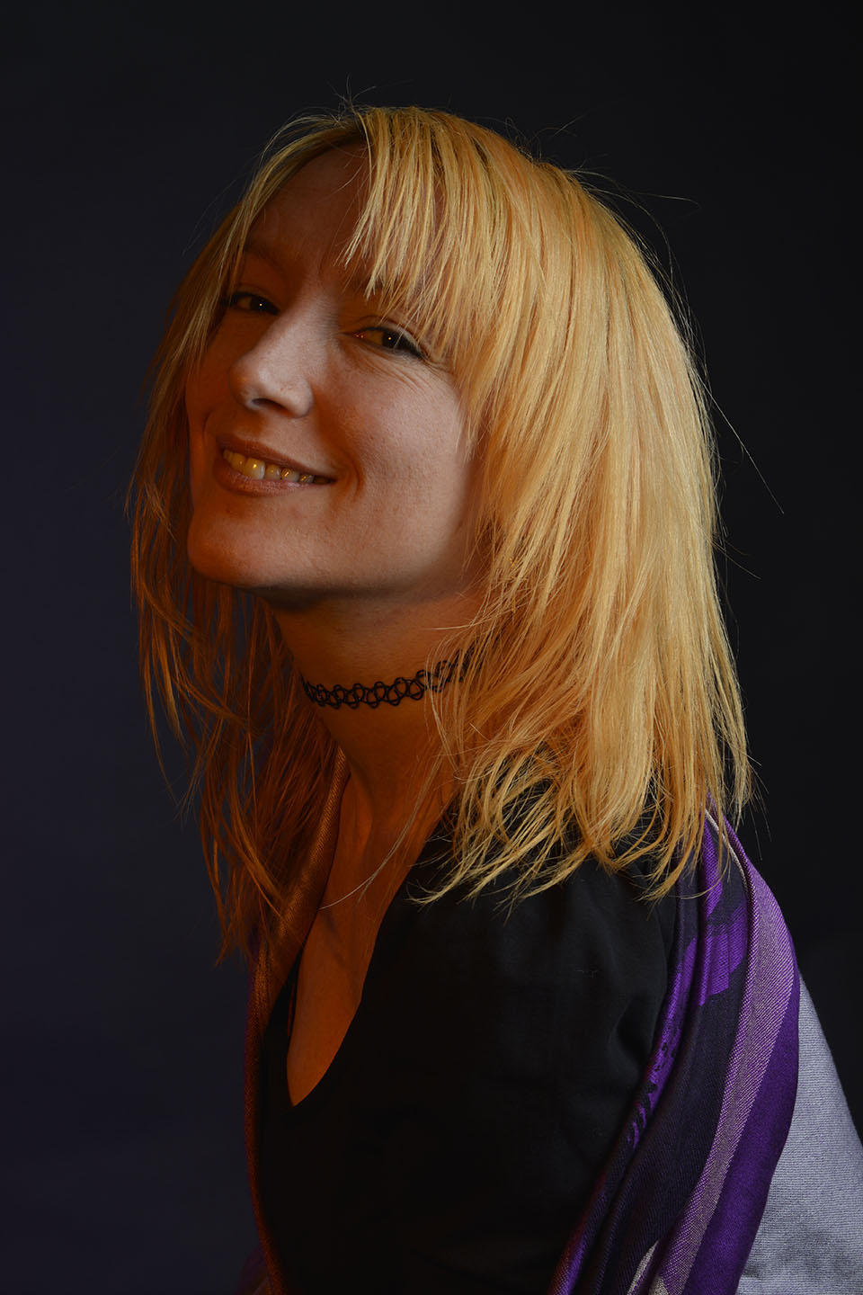
This Brown paper overlay below hasn’t quite worked in my opinion. With the portrait having an warm tinge to it from the orange filter when shooting, as the brown paper lays over it adds more warmth and doesn’t compliment the portrait.
However, it was good practice for me to look at the colours in a photograph, when looking for overlays.

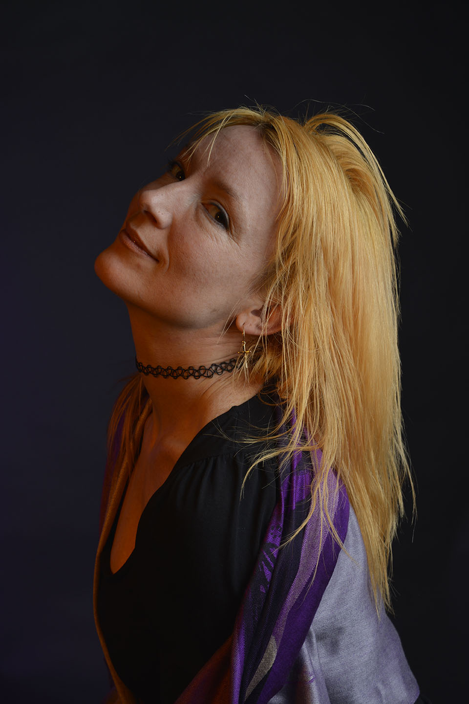
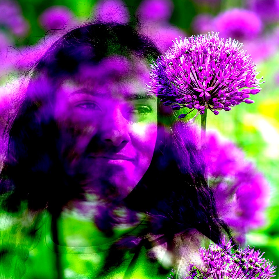
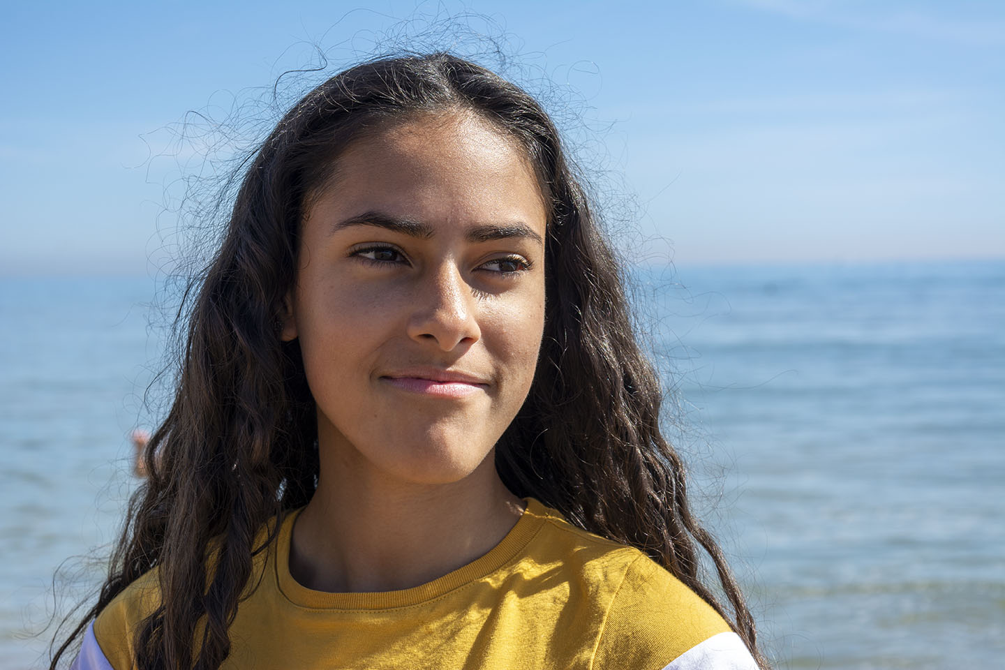
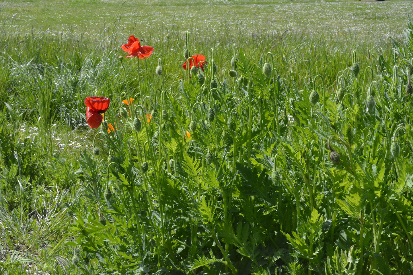
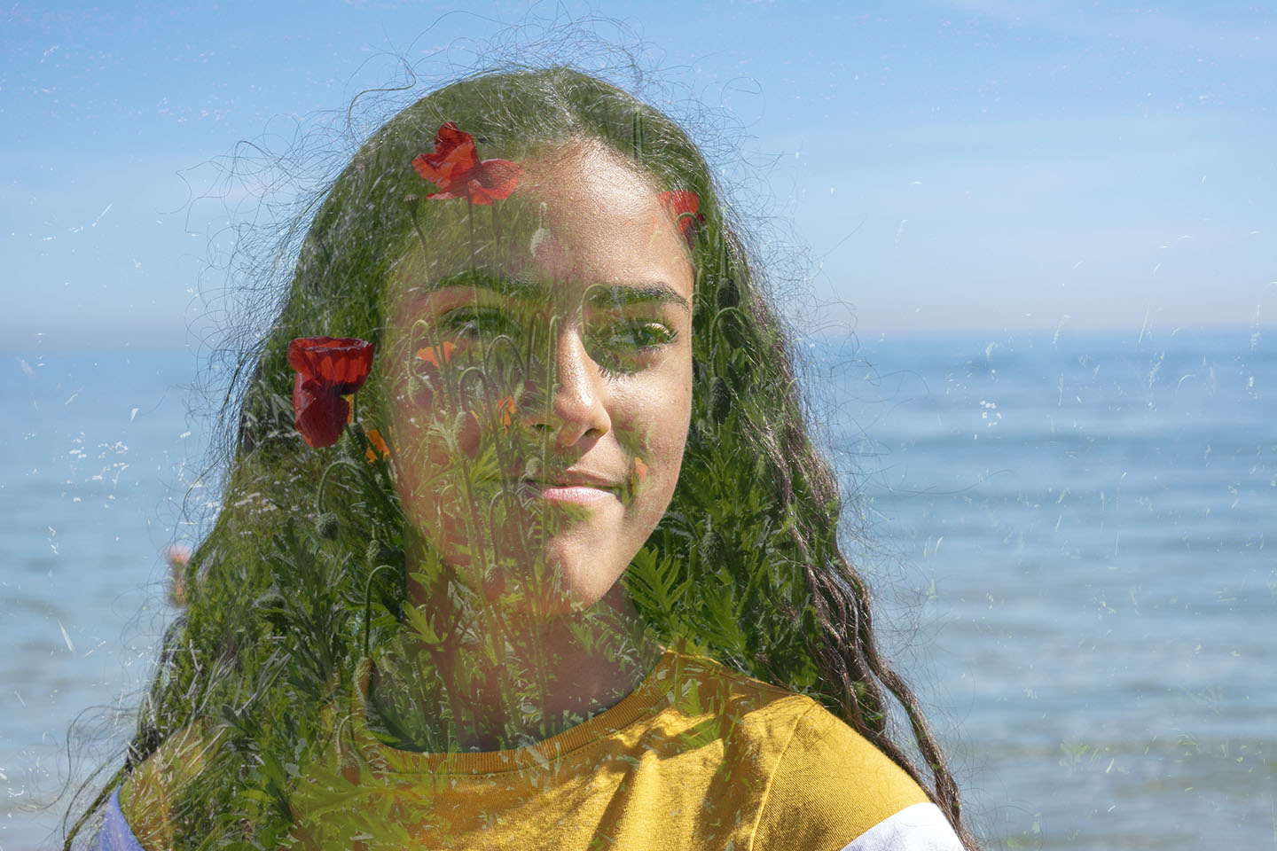
Next, I wanted to try an exagerated example of overlaying. Instead of using frames or textures I wanted to merge two of my own images together.

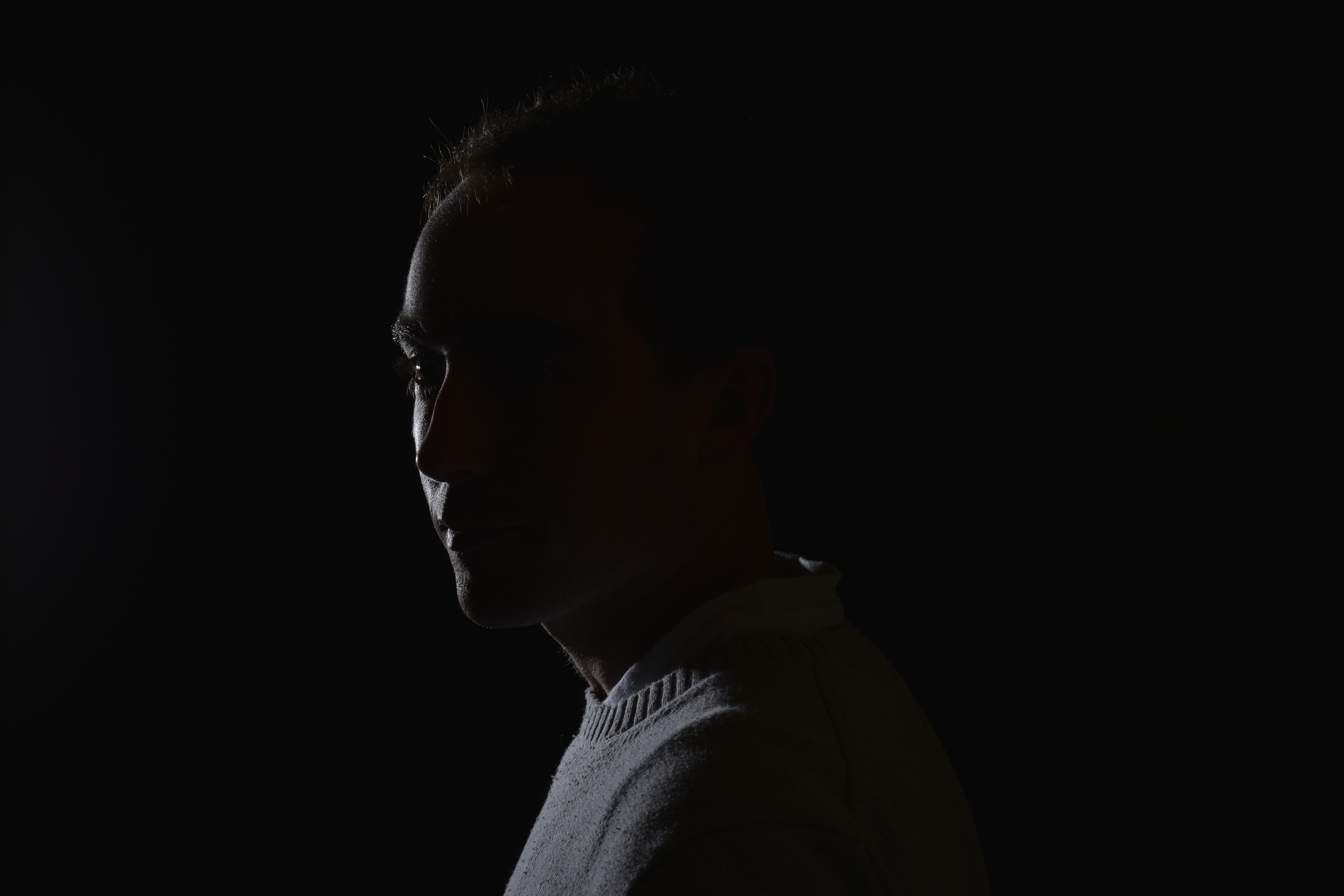
Then with the same portrait image I wanted to try a more subtle effect. To place the Poppies directly over the face area I had to stretch the Poppy image after placing over the portrait. Using a low opacity I have managed to keep the overlayed image to just showing over the face and not the water.

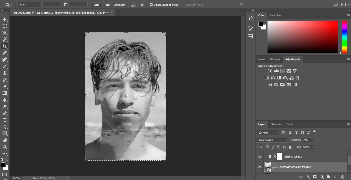
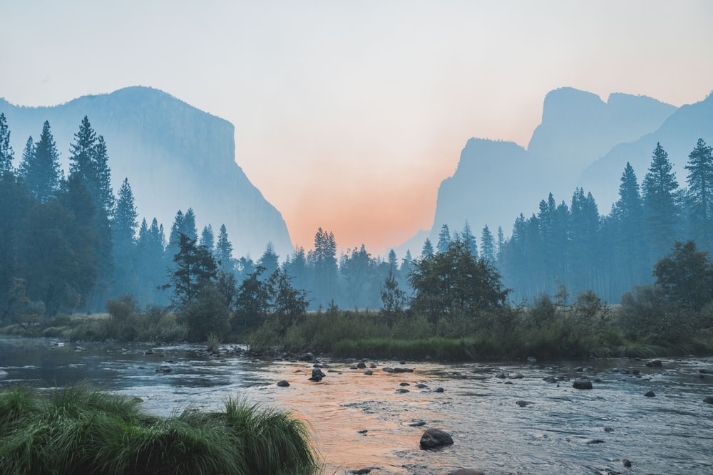
When I have researched overlaying images, I came across images using portraits and mountain or forest scenery. As I hadn’t got any images that I had taken of mountains etc, so I sourced an image from the internet.

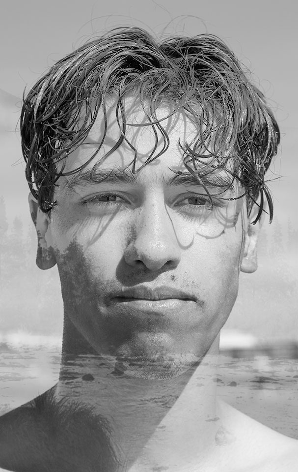
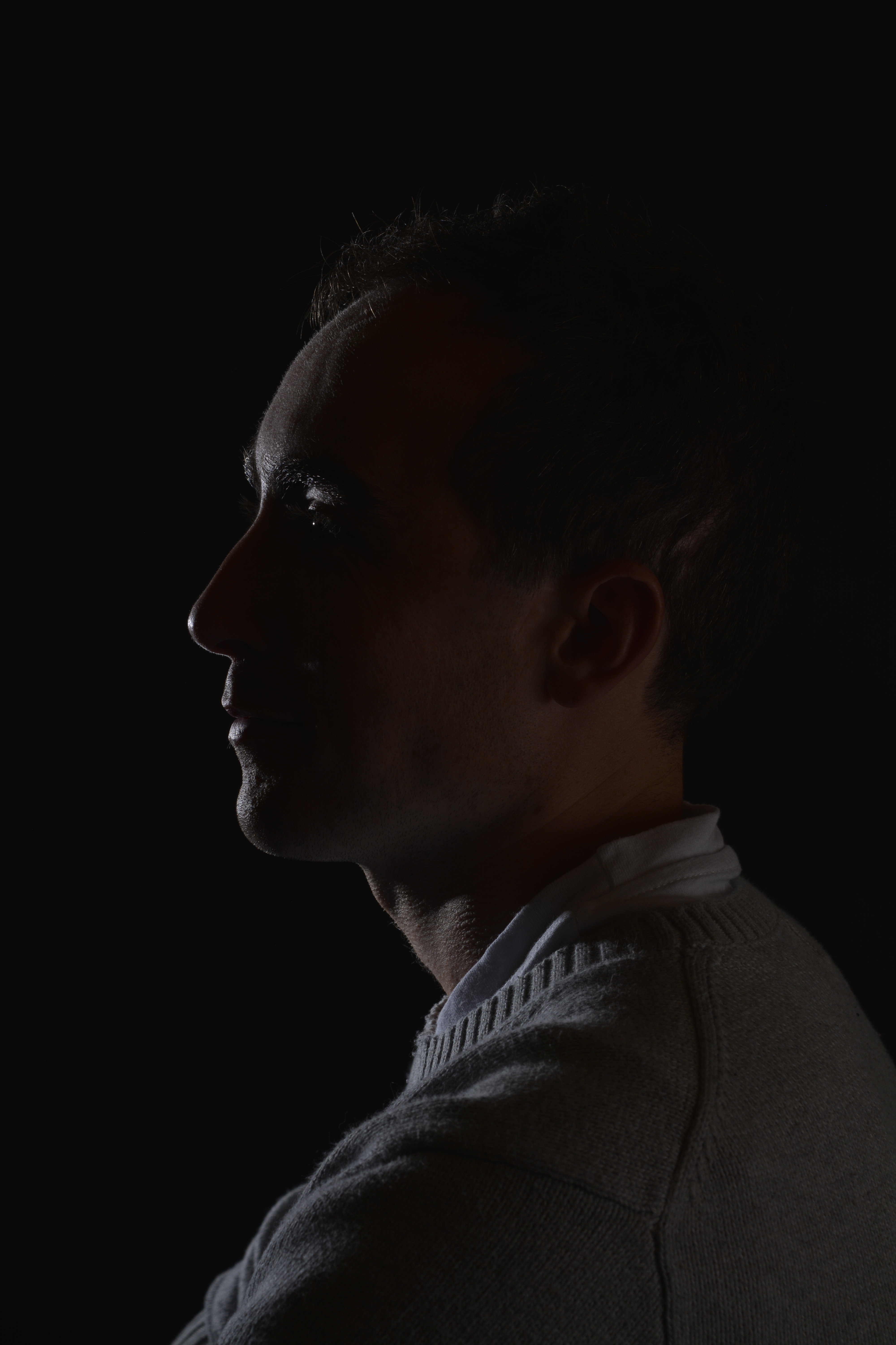
As my portrait image had background in it, I cropped the image to focus on the face. Changed the images into Black and White, then overlay and re-position. Colour Dodge blening mode with 39% opacity was used.

Tilt and Shift photography is the use of movement by the lens to alter your point of perspective and focus. A traditional camera lens will pretty much capture what you are seeing with your eye and project it on to the sensor. But a Tilt and Shift lens will change the position of the image on the sensor, adjusting the lens’ perspective.

“Tilt–shift” encompasses two different types of movements: rotation of the lens plane relative to the image plane, called tilt, and movement of the lens parallel to the image plane, called shift. Taken from Wikipedia

The two images below show how using a Tilt and Shift lens can change the perspective lines. When you stand in front of a building and look, the lines of that building will appear to be getting closer together as you look towards the top. Using a Tilt and Shift lens will straighten those lines.

Example of Tilt and Shift

Landscape or City photographers would use this technique for a more pleasing to the eye outcome.

Below are three examples of other peoples photographs where the Tilt and Shift has been used to create the feeling of a toy town.

Tilt Shift Photography Plane 14 - Full Image
Deep Dive Into The World of Tilt Shift Photography
5 Best Tilt Shift Camera Apps for Android to Take Amazing ...

I don’t have a Tand Shift Lens how ever in post production you can use a filter to produce the same effect. Using the filter in this way on landscapse can give a different illusion of size. It can make the focused area appear to look small and model like.

Below is my first attempt at producing a Tilt and Shift image through Photoshop. I quite like it as it adds a very different perspective on this well known view. However, it hasn’t quite given the desired effect. I should have positioned myself at the top of the hill and shot from looking down. I need to look for more vantage points on the future.

These next photographs I took, I had Tilt and Shift in mind. You can see how the people are starting to look like small model figures.

I have exagerated the gradiant here to see the outcome.

Macro

Macro photography is extreme close up photography. Used a lot to capture images of insects, flowers or anything very small. A Macro Lens or equivalent equipment is needed to magnify a subject. Macro Lenses can come in different focal lengths eg. 60mm, 100mm, 180mm. Longer focal length lenses are ideal for photographing wildlife and harder to get to places enabling you not to disturb your subject. These lenses will allow you to be different distances from the subject but not change the magnification of the subject.

You can reproduce an image of something very small, life size or even bigger. Usually a Macro lens reproduces images with a ratio 1:1, actual size. This is known as the reproduction ratio.

There are other equipment you can use to produce Macro images if you don’t have a Macro lens.

Macro Filter


Macro Filters are screwed into a normal Lens thread just like UV or ND filters also known as secondary lens. Allowing the primary lens to focus more closely.

Macro Filters

Adding one or more Macro filters adds to the magnification.

Reversing Ring

A reversing ring is a good and in-expensive way of achieving Macro photography. The ring allows you to attach your lens on your camera the opposite way to normal. With this you can achieve very close focusing.

diagram of how to use a reversing ring for macro photography
Reversing Ring
reverse lens adaptor with electrical connections

Bellows

A Bellows is a pleated extendable part of the camera. Made for large or medium format cameras. The Bellows allows you to move the lens away from the camera much further than extension tubes.

macro bellow on a Canon body - How to do Extreme Close-Up Photography with a Macro Bellows
Bellows Retracted, the macro bellows creates a smaller magnification.
extended - How to do Extreme Close-Up Photography with a Macro Bellows
Bellows Extended, the macro bellows makes a greater magnification.

Macro Lens

Macro lenses are not just used for Macro photography, they make great portrait lenses too.

Different Macro Lenses

• Focal lengths up to 60mm – Useful in product photography (e.g. jewelry) and small objects that can be approached and lit in a controlled environment.
• 60-150mm – Usable with caution for insects, flowers, and small objects from a greater distance.
•Above 150mm – Ideal for critters where additional working distance and additional lighting options are preferred.

Taken from http://www.digital-photography-school.com

Some of my own Macro shots

I really loved the colours of the Rosemary Beetle on the Lavender, so I cut a piece with a beelte on and placed it on a plate to try and get a better shot. I had to coax the beetle off the plant as they seem to love being face down in the Lavender.

Focus Stacking

Macro photography is fantastic and I love the detail that can be magnified. This photograph below shows I have captured this beautiful beetle using a Macro lens. The beetle that is just bigger than a ladybird and appears to be a lot larger. The focus point is on its legs and everything else(the beetles back etc) are slight out of focus.

With Macro photography the depth of field is very shallow, so to be able to photograph this beetle fully I need to do some Focus Stacking. This is where many shots are taken of a subject but each time the focal point is changed. Then all of the images are stacked together in Photo shop. This will allow a larger area of the photograph to be in focus.

These three images above, show how you can achieve a better Macro image using focus stacking. The first image the focus point is the front of the fly(the eyes), the second image the focus point is the back of the fly(the wings) and the last image is the two images stacked together. I definitely am going to try this technique if I can get a subject to be still enough.

Cyanotype

Cyanotype is a photography printing process that produces a Cyan-Blue print. It was used by engineers to create low cost copies of designs and drawings well into the 20th century, known as blueprints.
This process was first introduced by a man called Sir John Herschel in 1842. Two chemicals are used in this process, ferric ammonium citrate and potassium ferricyanide.
A blueprint is categorised by White lines on a Blue background. This would have been a negative image of the original image. Although this process is not now used for Blueprints (as they are all done digitally) the name still refers to floor plans.

Below is an example of an early Blueprint.

Architectural drawing, Blueprint
Canada, 1936

Anna Atkins 1799-1871

Born in Britain, Anna Atkins had an interest for all things scientific from a young age as her father was a scientist. Through her father’s connections she made friends with Sir John Herschel and he probably introduced Atkins to the process, Cyanotype.
She had a passion for botanicals and in 1841 she found a book by English physician William H Harvey to be visually insufficient. This book had listed and described all the new algae specimens to be found. This inspired her to produce her Cyanotypes of algae. From this, she went on to record several different species of algae and plants using this process.
Anna Atkins is said to be one of the first to publish a book with photographic images.

Dictyota dichotoma
1849-50
Anna Atkins
Spiraea aruncus (Tyrol)
Anna Atkins
Ferns
1840’s
Anna Atkins

I stumbled across this photographic process while I was doing some research for my new project, Transformations. It was the colour that grabbed my attention first. Producing images in one colour with options of different tone.
There are many Cyanotype kits available to buy to produce prints at home. As it was my first time trying this process, I opted to get pre-treated Cyanotype paper. This paper has the chemicals on each sheet, all that is need to do, is expose to the sun, wash off with water and then leave to dry.

I laid each object or plant on a piece of cyanotype paper in a slightly dark room. Then used a piece of Perspex from a photo frame to lay over the top. This is to help the objects lay flat to give better definition when exposed to the sun. I think that a sheet of glass would be better as it’s heavier to press down better (I need to get one).

Below are some of my first attempts at Cyanotype. I’m really pleased with the outcome and I love the process.

As you can see, the flatter objects or plants like the feather and grass left strong lines as they were flush to the paper. Softer lines were created when the objects rise slightly from the paper when exposing.

Washing off the chemicals to stop the process

I have pressed some of the flowers and leaves I had used before and tried again. Below are my results. Much sharper lines and edges. This is because the foliage is flatter and therefore lets less light seeping in.

I need to perfect my technique as you can see water marks on some of my prints. This is from laying flat drying and not removing the excess water. Drying flat helps to stop the crinkles and kinks. Also, when completely dry leaving under some heavy books for a few days helps to be flat again.

Laying objects on the paper is not the only way to create Cyanotype images, you can transfer your own images. Converting your chosen image into a negative in post production then print onto some acetate. When printing, be sure to print on the slightly misty side not the shiny side. If not, the ink will not dry and the result in smudging. Then, place the printed acetate on top of the Cyanotype paper, weigh down with glass and the expose.

Negative
Drying
Finished Cyanotype

Studio Lighting Practice 2 P1, P2, P3, P4

Today in class I took the opportunity to take some portrait photographs of another students model.

Below is a photo of the set up. Quite complicated with four lights. One, to light the background slightly and the other three to light the model.

Colour gels/filters were used in these next set of photographs. To complement the models purple shawl and slightly orange hair, purple and orange cellophane have been taped across separate lights. The set up photograph above shows the colours on the lights.

The colours add warmth to the photographs.


Care had to be taken when taping the cellophane to the lamps as the can get very hot. We also had to be careful of the lead from one of the lights. It was on a free standing tripod and not a pantograph like the rest.

Trying to have a go at capturing some movement shots. Initially I wasn’t able to capture the model mid hair flick. My shutter button wasn’t pressing down. I quickly realised I had the focus on automatic. This meant the lens was searching for a focusing point that was constantly moving, therefore not able to be pushed down. After I switched to manual focus, I captured these below.

Still Life Practice in the Studio

Camera settings ISO-100 SS-100

Changing Aperture only

F-11 F-8

F-8 F-9

F-10 F-11

To try to correctly expose the still life, I took several shots at different Apertures. As you can see, the higher the Aperture, the darker the photograph.

F-8 F-9 F-10

F-11 F-13

F-11 F-13 F-14

I think that using an aperture of F-11 achieves the best exposure for the left hand side of this still life set up, however it does leave the right hand side slightly under exposed. I don’t mind it too much, as it’s like the light is shinning bright from the apple. Also the catch lights on the shinny surfaces are just right.

F-11 F-11

Below, I needed a really high Aperture so not to over expose the white Budda.

F-11

F-13 F-14

F-16 F-18

I quite like to photograph old metal and different textures. I seperated the grater from the bottles.

Light to dark with Apeture

F-7.1 F-8 F-9

F-10 F-11 F-13

F-7.1 with silver reflector

with out refector

With a reflector -moving

central composition, slight reflector

with reflector

Below, playing with different angles and one light source.

Studio Lighting P1, P3, P4

General go to settings when doing a studio shoot are as follows, Shutter Speed 100, F-Stop 8, ISO 100. After finding and setting your correct lighting, changing your Aperture will also help with getting a correctly exposed photograph.

Initial camera settings

Black Background

For this set up I used a black paper backdrop , one light source and a stall for the model to sit on. (See photo below).

Lighting set up with Snoot attatchment


To achieve a harsh light, source I have added a snoot attachment to the modelling lamp. This has a smaller opening which controls the beam of light, ideal for directing the light on specific areas.

Snoot attachment

In a studio set up, most lights are suspended from the ceiling on pantographs. However if this is not available to you, or you wish to make a studio set up, most modelling lamps or flashguns can be mounted on a suitable tripod with an adapter. The hazard with using a tripod is tripping over. The lead and the legs can cause this, so make sure excess wires are taped down and tripods positioned safely.

Tripod

These three photographs below show the key light gradually getting brighter with each picture. Starting at a low light level of number 1 until the desired lighting level is reached.

Below the key light is getting to a better strength level of level 4. You need to take test shots to see what to adjust to get the desired effect and a correctly exposed portrait.

Rim Lighting

Keeping the model facing the same direction, I moved myself to the right. So from split lighting, I was trying to create some back or rim lighting.
Back or Rim lighting is where the subject is lit from behind, this creates a halo effect around the subject and leaves it in silhouette.

I was just playing with angles to see how it would look. However doing this I have captured the classroom in the background and not the backdrop. If I was going to try and photograph with Rim lighting, I would move the subject forward and place a light behind facing towards the subject and me. As the the diagram below shows.

White Background

For a softer lighting set up I have used a white paper background, one key light, two fill lights and a stall for the model. (see photo below).

White background lighting set up

All the modelling lights are suspended from a ceiling track using pantographs. Using the lights in this way, you eliminate the trip hazards, provided the leads run up towards the ceiling. However you add another hazard of banging your head. I had to be very careful when positioning the lights and making sure the pantographs were secured in the correct height position.

Pantographs on a ceiling track

To create a softer light, umbrellas attached to the modelling lamps with adapters have been used to bounce the light back onto the backdrop. Bouncing the light back softens it as it travels.

Spot Lighting

Spot lighting is a very harsh and concentrated form of lighting usually using a snoot attachment to direct the light.

With these photographs below, two pieces of card have been used at right angles to block some of the light, to create specific shadow shapes across the face. It’s very dramatic but still looks a natural shape, as if not created in a studio.

This portrait of Tony has worked quite well I feel. I like the way he just appears out of the darkness. I also like the idea of shaping and moulding a light source to create shadow shapes in a photograph. I would like to experiment this technique more.

Clam Lighting

The 2 studio lights used for Clam Lighting both with Soft Box attatchments

Clam Lighting set up using 2 x Soft Boxes and a Black backdrop

Starting with Aperture F 8 and one soft box

With one soft box the the face is not lit well enough.

2 x soft boxes F-8
Too bright

With using two soft boxes and Aperture F 8, the face is too bright and therfore the skin loses some of its natural colour. To try to rectify this, changing the Aperture from F 8 to F 11 helps to make the face a little darker.

The images below compares F 8 with F 11

F 8 F 11

Photo Editing

P2, P4

Heeling Tool

The Heeling Brush Tool on Photoshop allows you to fix inperfection such as wrinkles, spots or marks by taking information from the surrounding area.

Above is my lovely friend Vanessa at Kew Gardens. I have tried to gently smooth out some of her wrinkles and tried to keep a natural look.

High Dynamic Range-HDR

P1, P2, P4

In photography, the technique HDR-High Dynamic Range is used to produce an image that is similar to what you would see with your human eye.

For example, if you were inside a beautiful building, like a church, you know that to expose the stained glass windows you would set your camera to a certain aperture. However by doing this you would be under exposing the interior and therefore it would appear dark. And vice versa, if you were to expose correctly for the interior, the stained-glass window would be overexposed. In the end you are always having something over or under exposed in your photograph.

To achieve HDR image you need to capture between five and ten different exposures of the same image. Generally 1 F stop difference for each image. Then all these images are merged together to form one image through light room or photo shop. The correct exposure part of each photograph is used and in the outcome is, you have a correctly exposed image.

Using this technique you can achieve an outcome that is close to how you actually see it. However HDR photography can so easily be exaggerated and therefore your final image may look unnatural.

The image below demonstrates this. Although all the beautiful colours were probably there, it does however look fake and unnatural. Perhaps the colours were pumped up a little during the postproduction process?

Image result for hdr photography
Image taken from the internet

This next image below, shows how you can achieve a more natural look to your photograph using a HDR technique. As a photographer you can see that in one photograph you would never be able to expose for under and over the jetty. So this technique helps you show all that detail from the water and the sky within one image.

Image result for hdr photography
Image taken from the internet

To keep the same view within my frame each time I took a photograph, I used a tripod. The only thing I changed each shot was the aperture, 3 notches (1 Fstop) each time. I started very underexposed and worked towards being over exposed.

Below is the final outcome. Within Lightroom, I highlighted all the images I needed, clicked on the PHOTO menu, then MERGE and then HDR.

HDR Image of Marble Hill House

Marble Hill House-HDR

I am pleased with the result! The view has come out exactly as I saw it. A very natural scene with the foliage and trees all equally exposed well, even at the different depths of the photograph.

On the same day as shooting Marble Hill I took photographs across Petersham Meadow, of Petersham Hotel. It was a bright day, so needed to take lots of different exposure shots to capture tall the colours from the sky and trees.

HDR Image of Petersham Hotel

Petersham Meadow-HDR

Contact sheet

Water mark

Colour Theory

P1

The 3 Primary colours in digital imagery are Red, Green and Blue. RGB. Not the primary colours as we know them to be, Red, Yellow and Blue. This is because Red, Green and Blue are the colours found in the human eyes colour photoreceptors.

If you shine a Red torch slightly overlapping a Green torch, then slightly overlapping a Blue torch, shining 3 equal parts of the primary colours will create white colour. The photography below shows this.

Adding equal parts of the primary colours, white is seen, this is the basis of Additive colour. When working on a computer screen the colours are created with light. Additive colour mixing begins with black and ends with white. Taking away these colours the black is seen. By combining different quantities of these primary colours, brighter colours are made.

The chart above shows the primary colours and secondary colours that can be created with 2 equal parts of primary colours.

Blue + Green = Cyan

Green + Red = Yellow

Red + Blue = Magenta

The basis of subtractive colour mixing means that you begin with white and end with black. If you look at painting or printing, you start with white paper and add colour. For printers you will generally have 2 cartridges, one tri colour-CMY and one black. CMYK. When mixing Cyan, Magenta and Yellow you achieve a very dark colour, however it isn’t a true black. That is why you need an additional black cartridge. The K from CMYK stands for black (taken from the last letter in black so not to get confused with blue, B in RGB).

Colours that are next to each other on a colour wheel are known as colour harmonies. These colours will sit nicely together and compliment each other. Colours that are opposite each other on the colour wheel create a colour contrast. Contrasting colours are often used in advertising and logos. They compliment each other and create a visual contrast that captures your eye and therefore you notice them.

Colour wheel
Contrasting colours

Yellow is used a lot in advertising due to it being one of the strongest colours. When we see yellow our eyes have to re-adjust. It will always stand out and therefore influence the viewer.

Well known advertising

The First Colour Photographs

James Clerk Maxwell 1831-79

James Clerk Maxwell was a Scottish scientist that produced the first colour photograph in 1861.

Maxwell used the three colour method. Taking a photography with a Red filter, then a Green filter and then a Blue filter. When all three images were super impose together and a white light shone through, colours were seen. The photograph below was that image.

Coloured ribbon
Taken in 1861

Sergey Prokudin-Gorsky 1863-1944

Sergey Prokudin-Gorsky really expanded on Maxwell’s colour vision and produced many early colour photographs.

This photograph below was taken in 1911 by Gorsky as part of his documentary work on the Russian Empire.

File:Rgb-compose-Alim Khan.jpg
The Emir of Bukhara
1911

Three separate black-and-white photographs were taken through Red, Green then Blue filters. Then on a projection screen, these three photographs were combined to create a full colour Image.

Blog at WordPress.com.

Up ↑

Design a site like this with WordPress.com
Get started