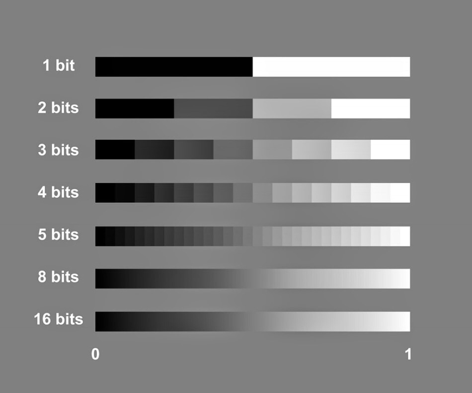
The term bit depth or colour depth refers to the range of colour available in an image.
The image below shows the possible scale of grays for different bit images.
The more bits you have the more shades of grey you can display.
To work out how many shades of gray you will have in an image you use the formula 2 to the power of. For example, an 8 bit image, 2 to the power of 8=256. Black, White and 254 shades of gray.
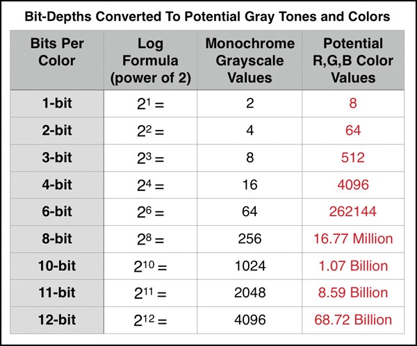
The table below shows the potential grayscale amount for each size image.
The third column in this table shows the available colour possibilities for the different bit size images. With the 3 channels of colour, Red, Green and Blue.
Red X Green X Blue = Available colour possibilities.
Banding is where you can see a abrupt changes between shades of the same colour. This happens on lower bit depth images.
For example, above you can see two photographs showing shades of the colour purple. The one on the left has a lower bit depth than the one on the right. You can see that the changes in the shades jump and form bands of colour. Whereas the one on the right that has a higher bit depth and shows a gradual change from dark purple to light, with no banding.
The title people and the environment leaves me with quite a lot of room to explore. First thoughts are about the word People. I don’t often lean towards portraits but maybe this could be a challenge for me?
The recent environmental protests that have been happening in central London sprung to mind, however I feel I’m thinking too literally about the title and want to explore a bit more.
Thinking about the environment around me there are a lot of beautiful buildings in and around London. With the daily grind of life and work we take them for granted and don’t stop to appreciate them.
Photographer Research
Alexey Titarenko
I came across this photographer in my level two photography course, when another student was researching his work.
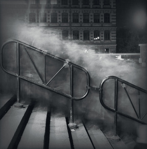
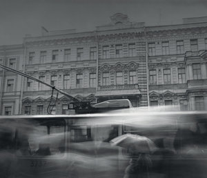
This photo below was the first of his work I had seen. I love the contrast between movement and stillness in this photograph. The scenery is frozen in time, yet the motion of people (ghost like figures) moving within the frame.
In City of Shadows the cloud of people are a lighter shade of grey with the hand rail and background buildings dark.
City of Shadow 1991-94 Alexey Titarenko
He was trying to portray the change in St Petersburg at that time and how it was affecting the people. Smiley happy people turning into shadows.
I feel in this series of photographs they have a definite spooky feel about them. They could be scenes from a horror movie, where a black monster seeps through the town.
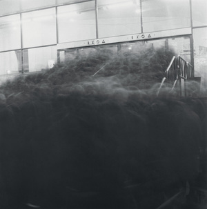
City of Shadow 1991-94 Alexey Titarenko
Looking through more of his work, I really liked his own take on street photography. Using long exposures and ICM (Intentional Camera Moment) as a way of high lighting the suffering and change in people.
City of Shadows 1991-94 Alexey Titarenko
Alexey Titarenko produced his prints in a dark room. Each print is unique as he used bleaching and toning techniques in the printing process to add depth to his photographs.
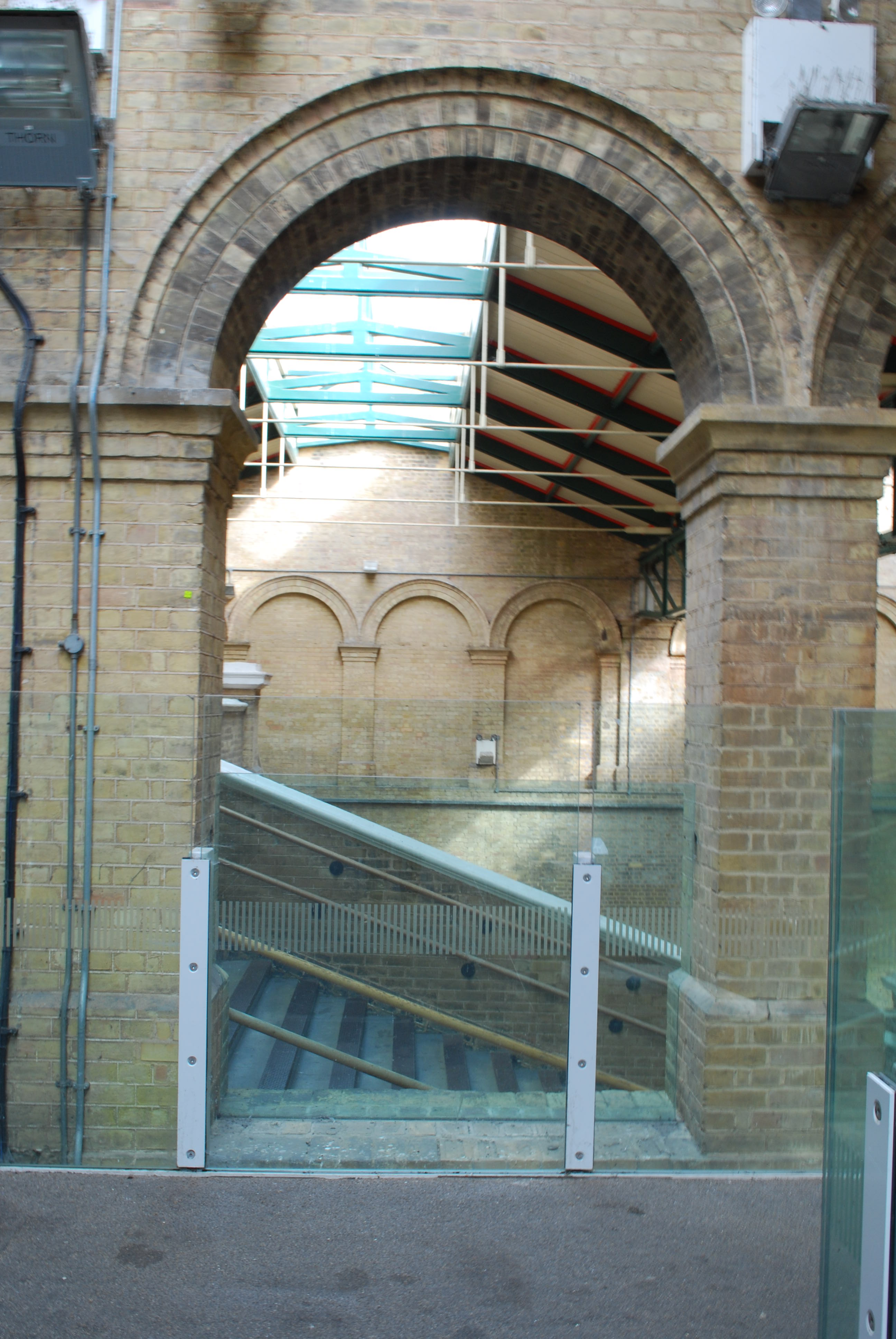
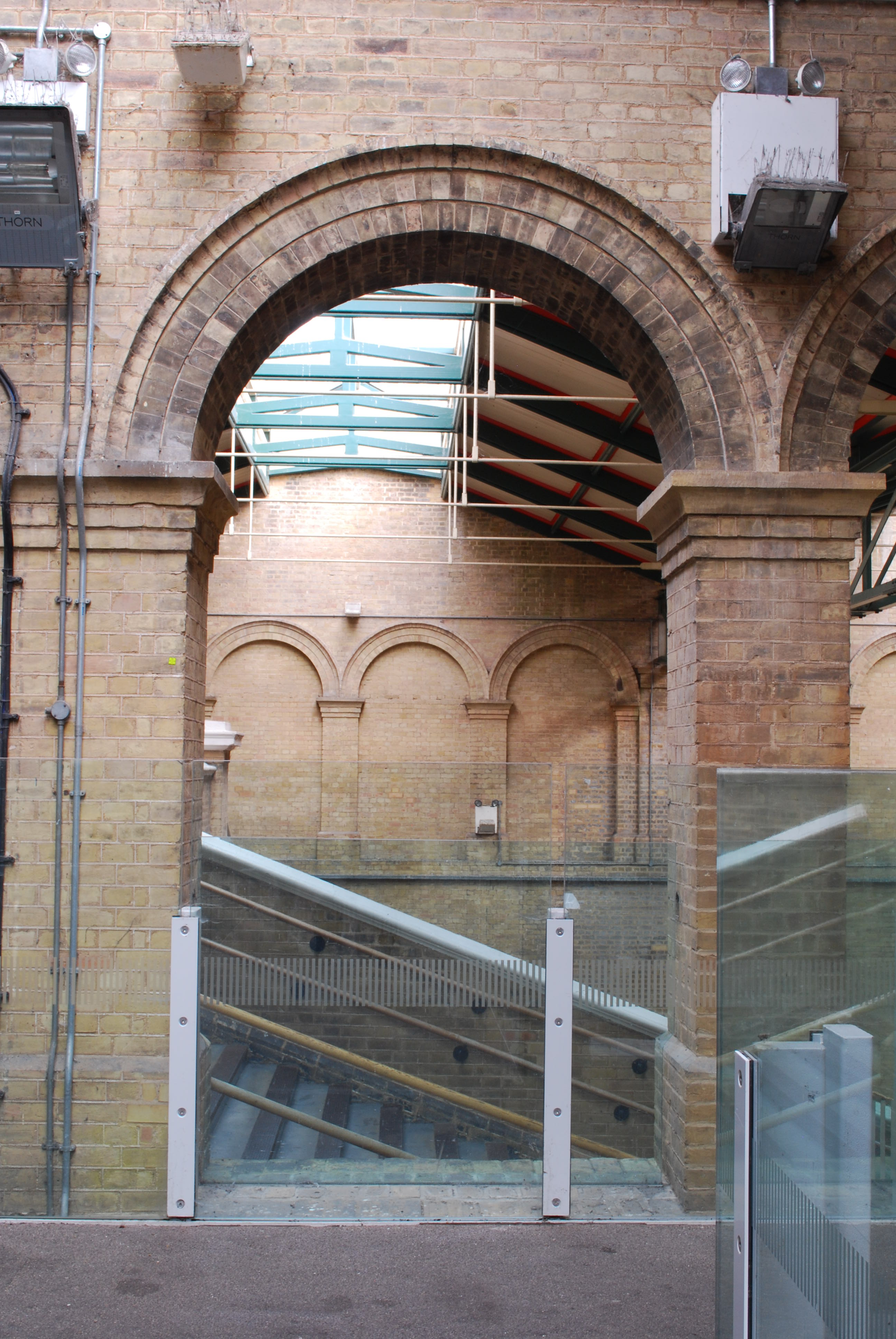
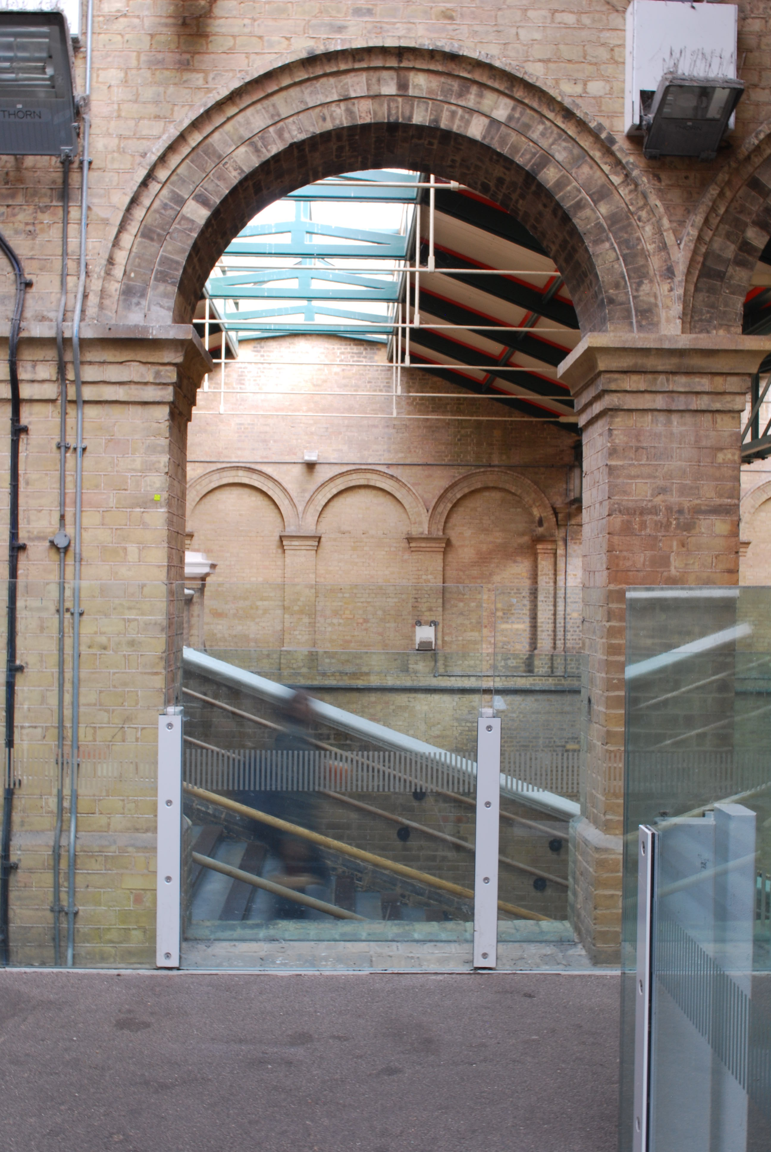
Crystal Palace Station
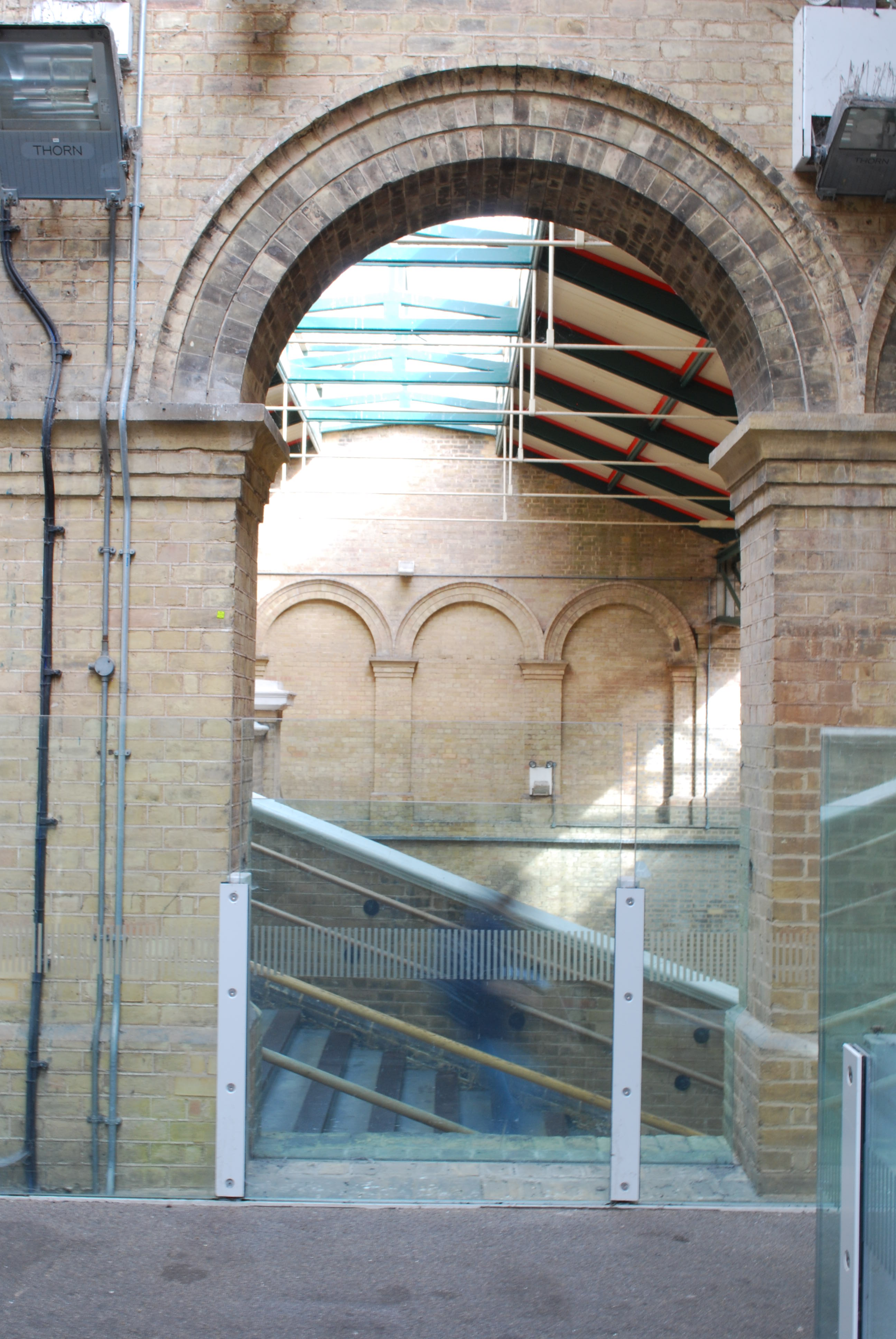
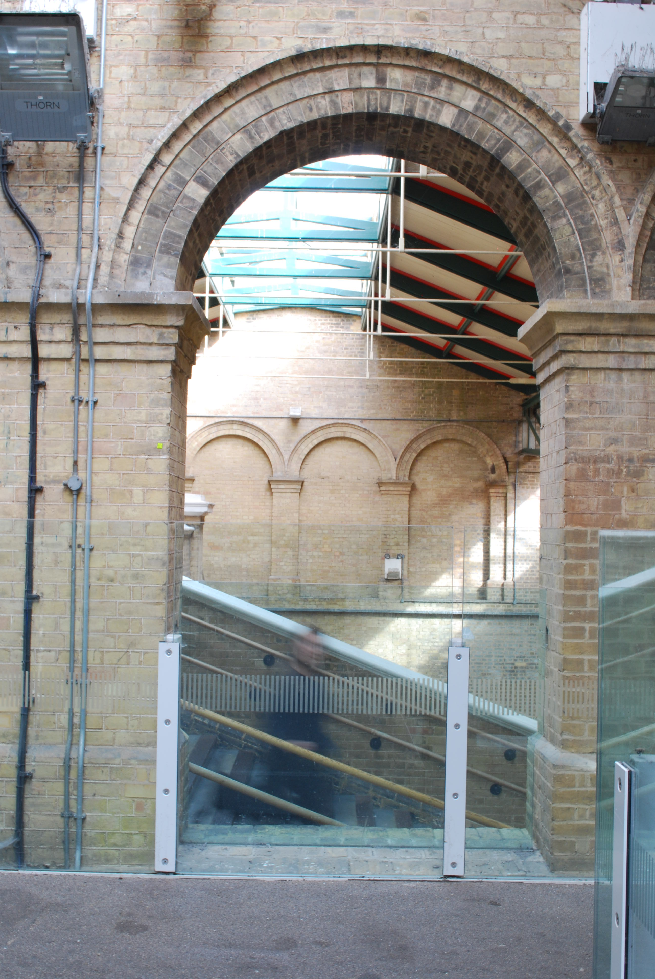
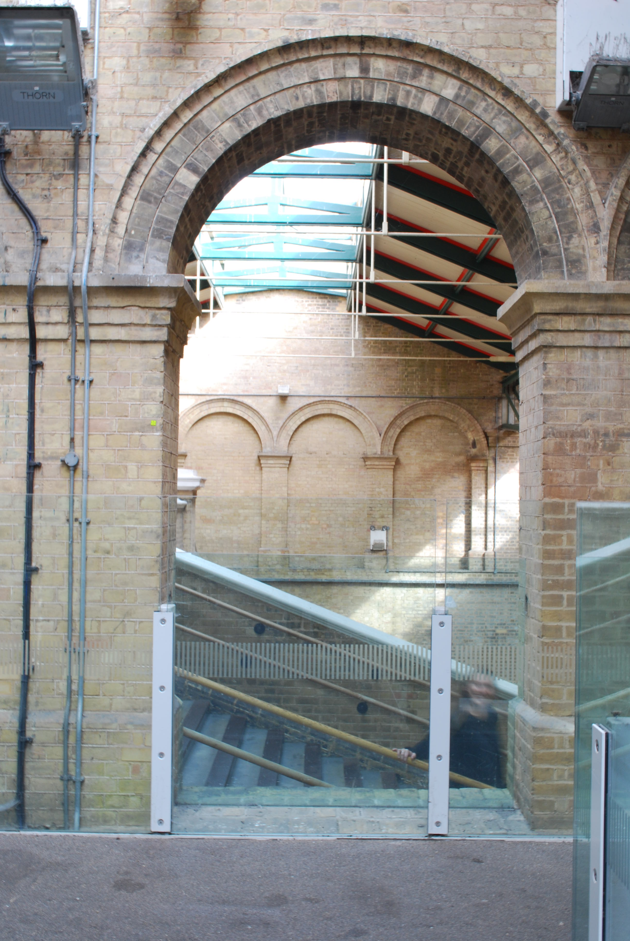
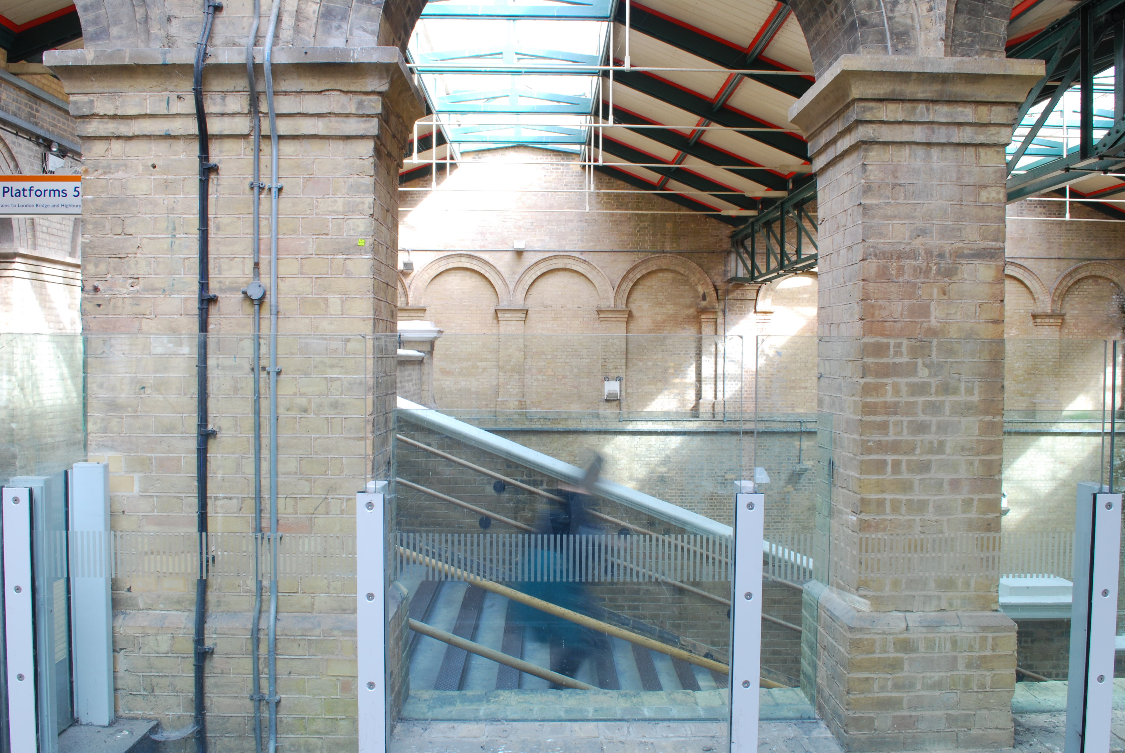
A friend told me about how structurally beautiful Crystal Palace train station was and she was correct. I loved the brick work and height it had inside. I came across this great brick archway. On the other side were steps. I had a vision of capturing a cloud of people hurrying up or down the stairs framed by the archway. Alas when I was there it was the middle of the day and very empty. It was somewhere I wanted to revisit.
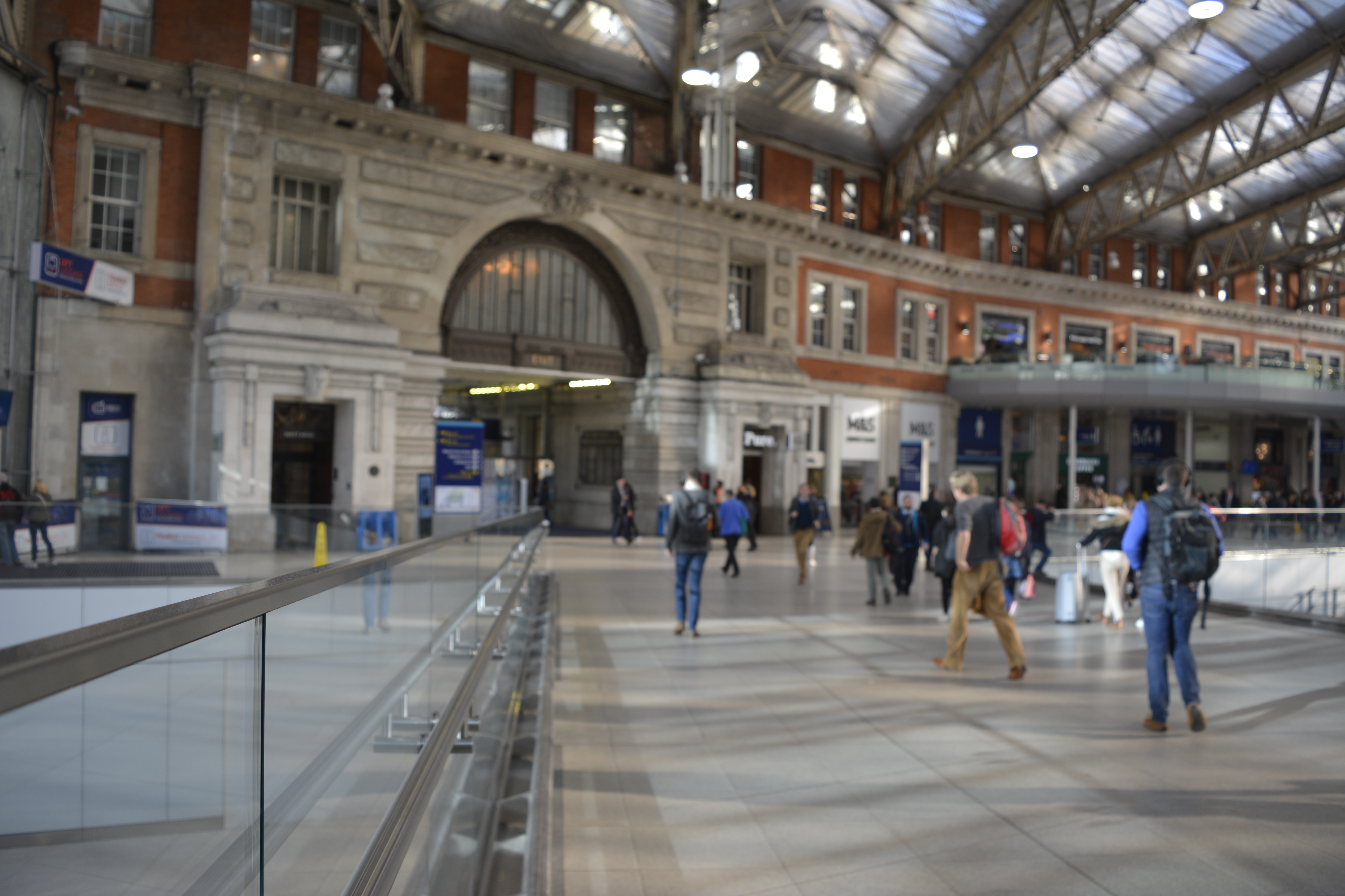
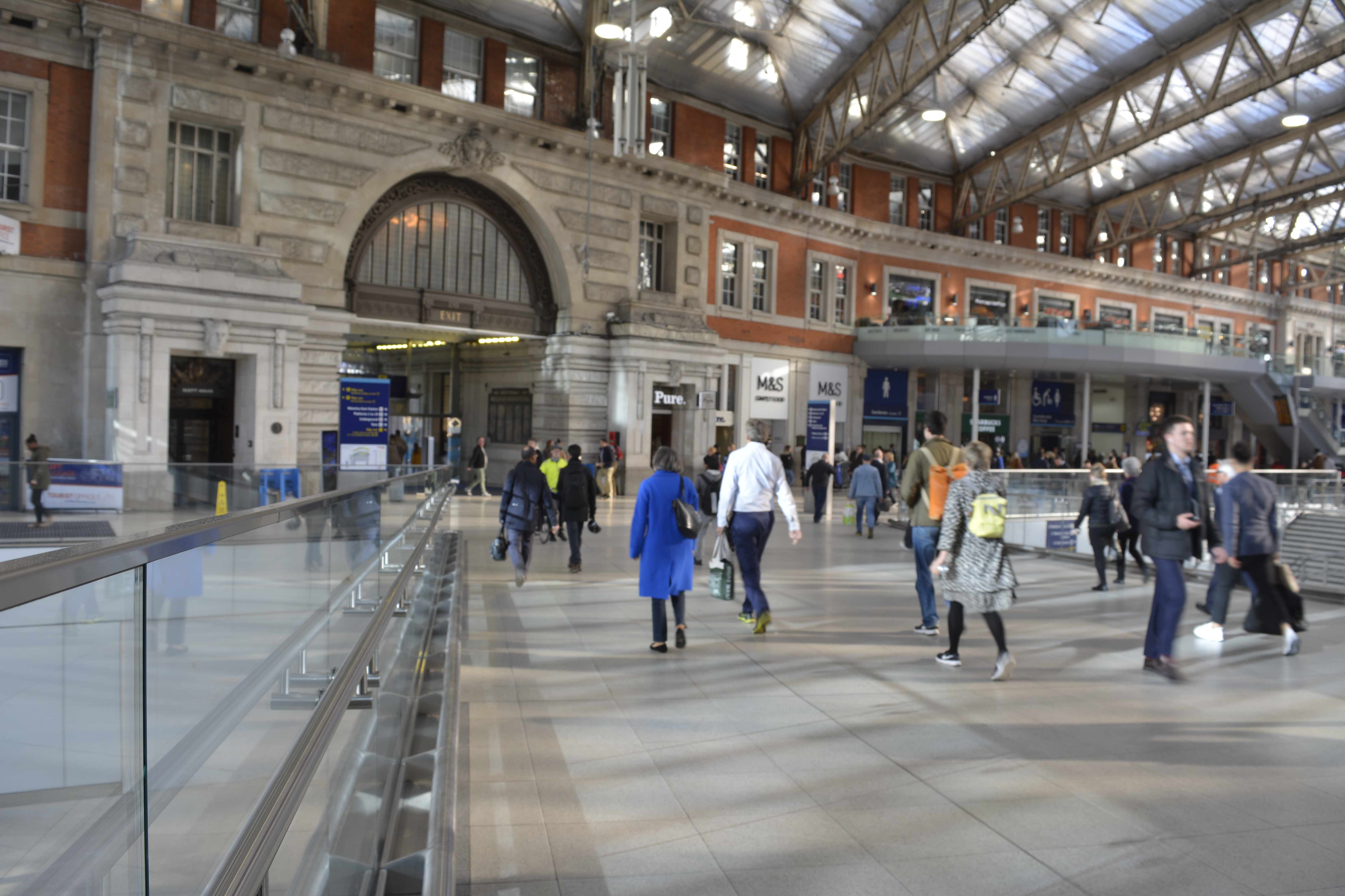
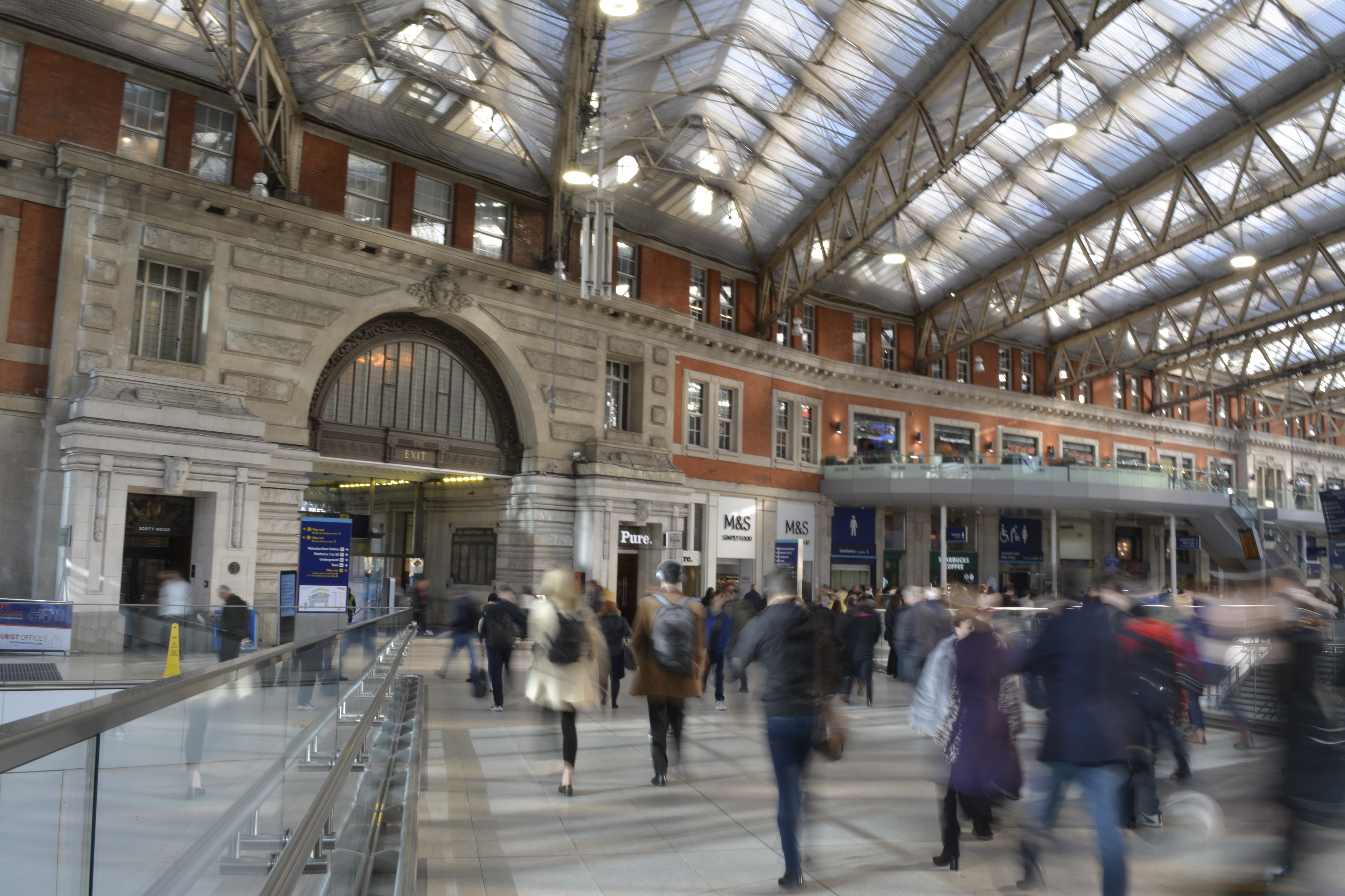
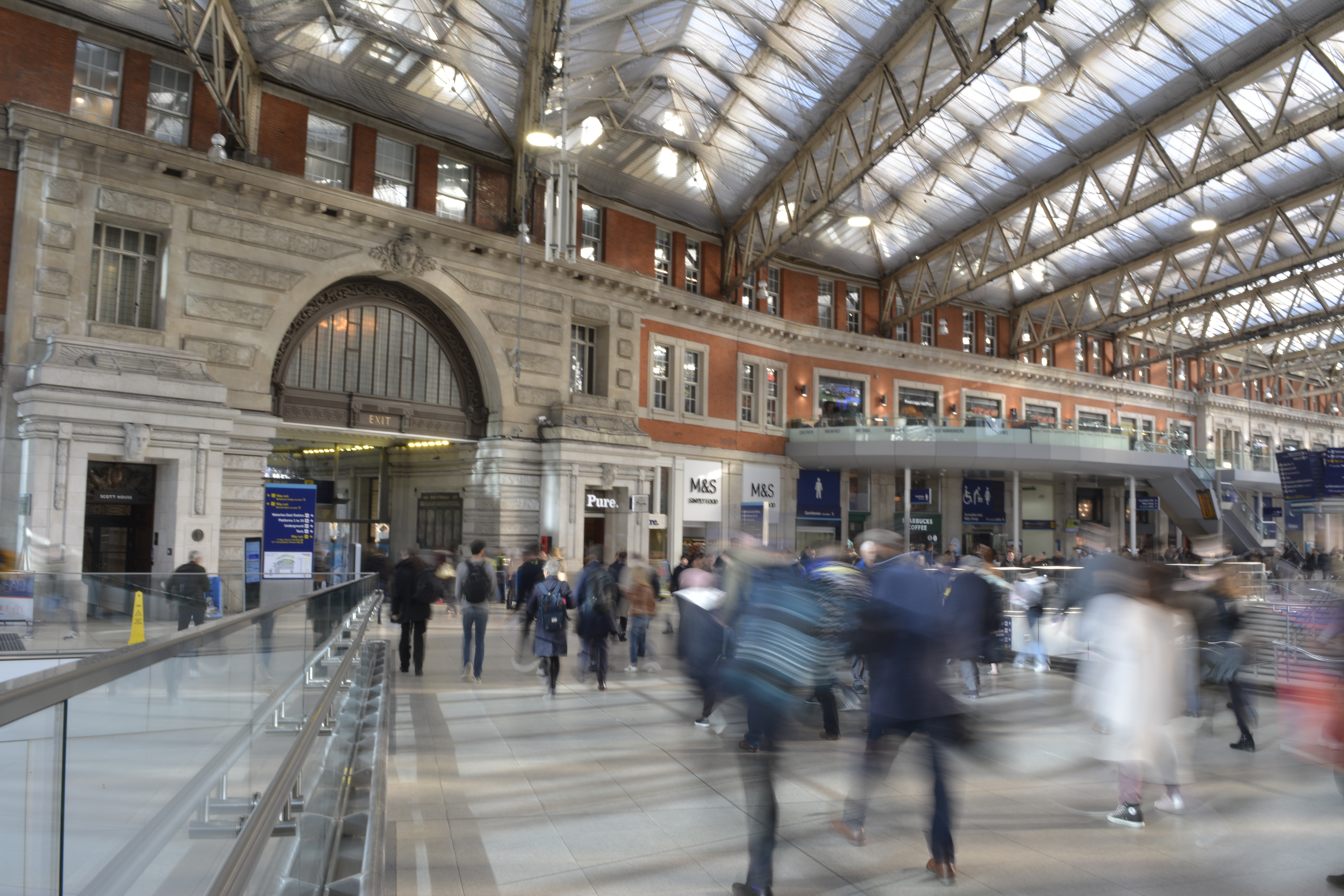
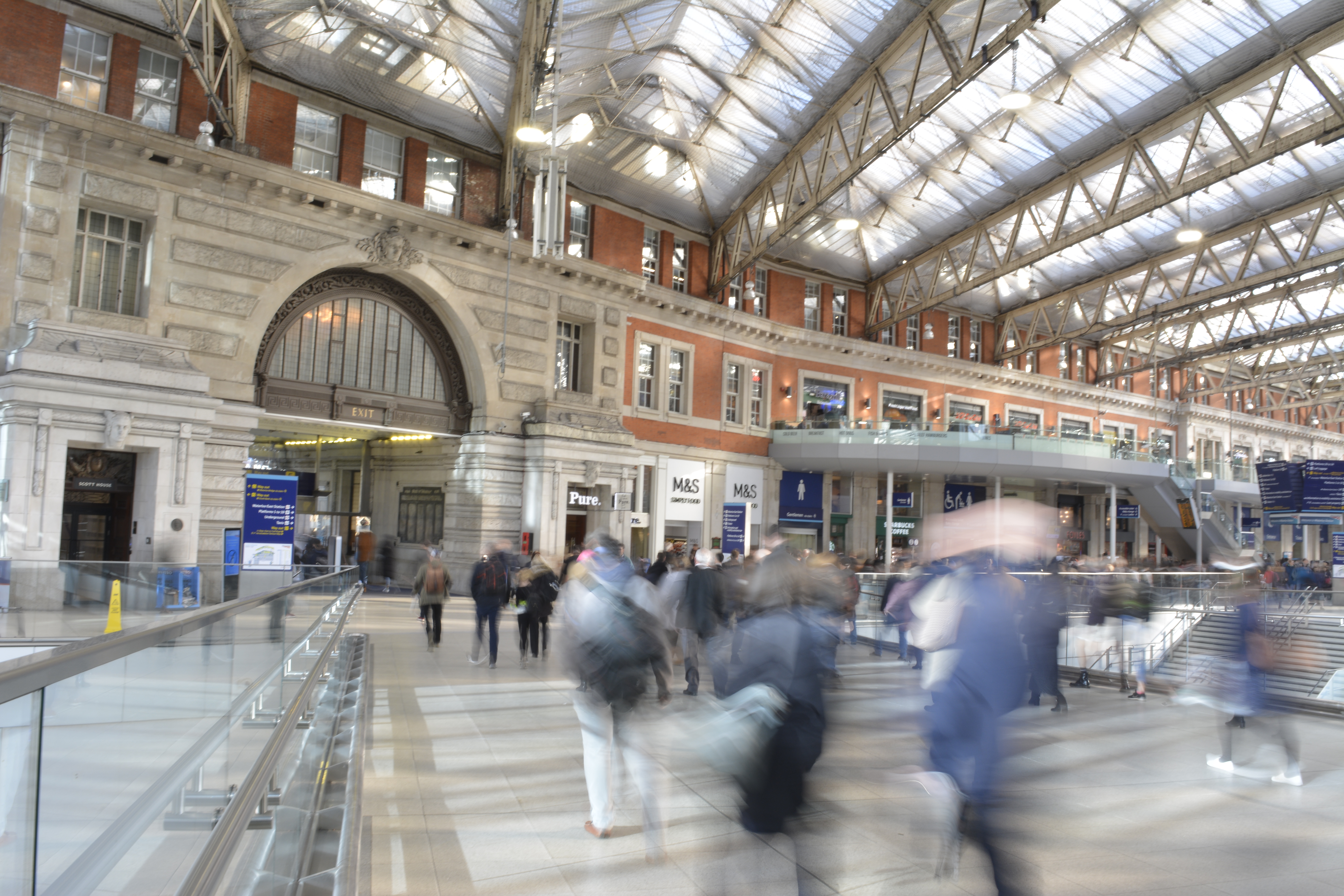
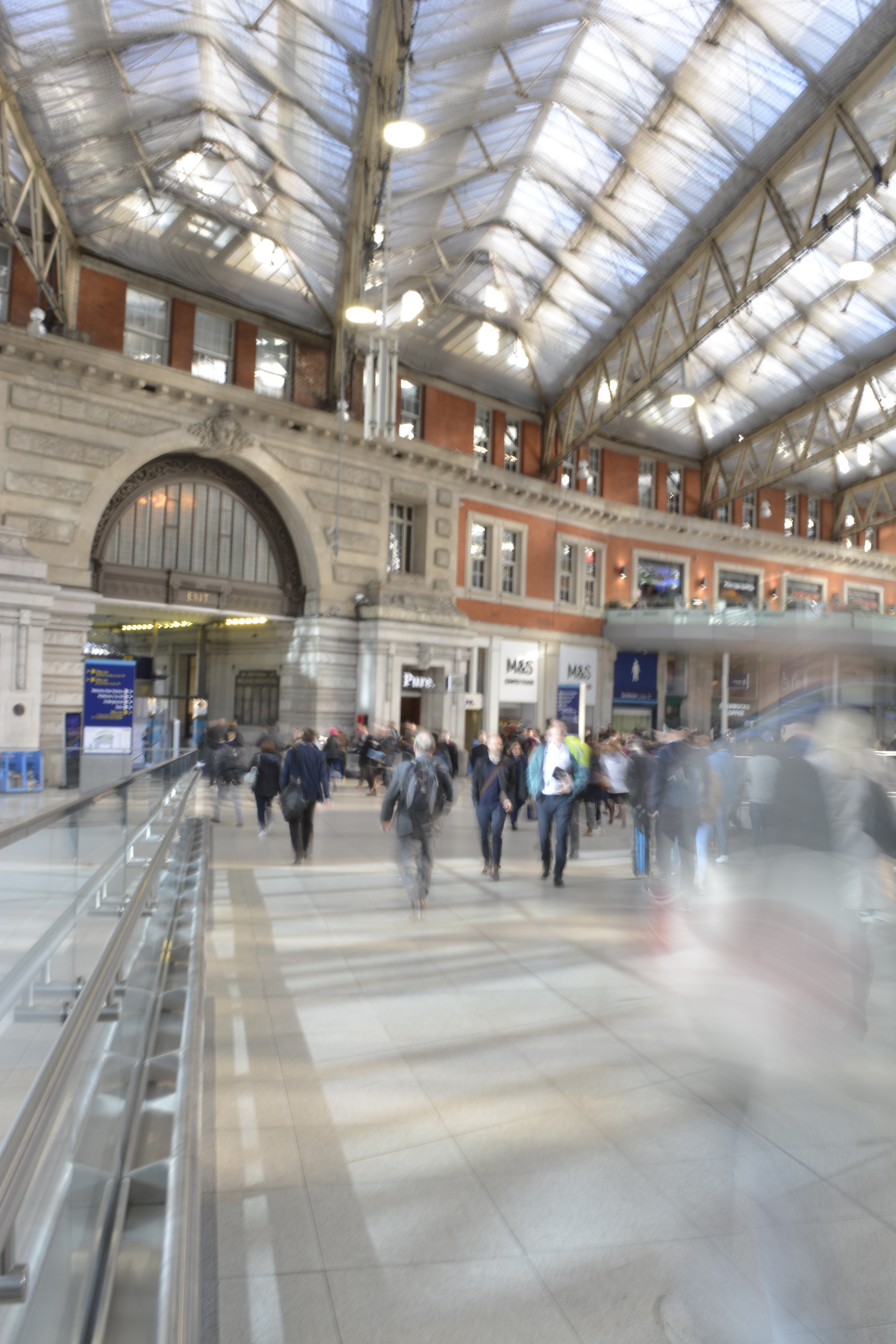
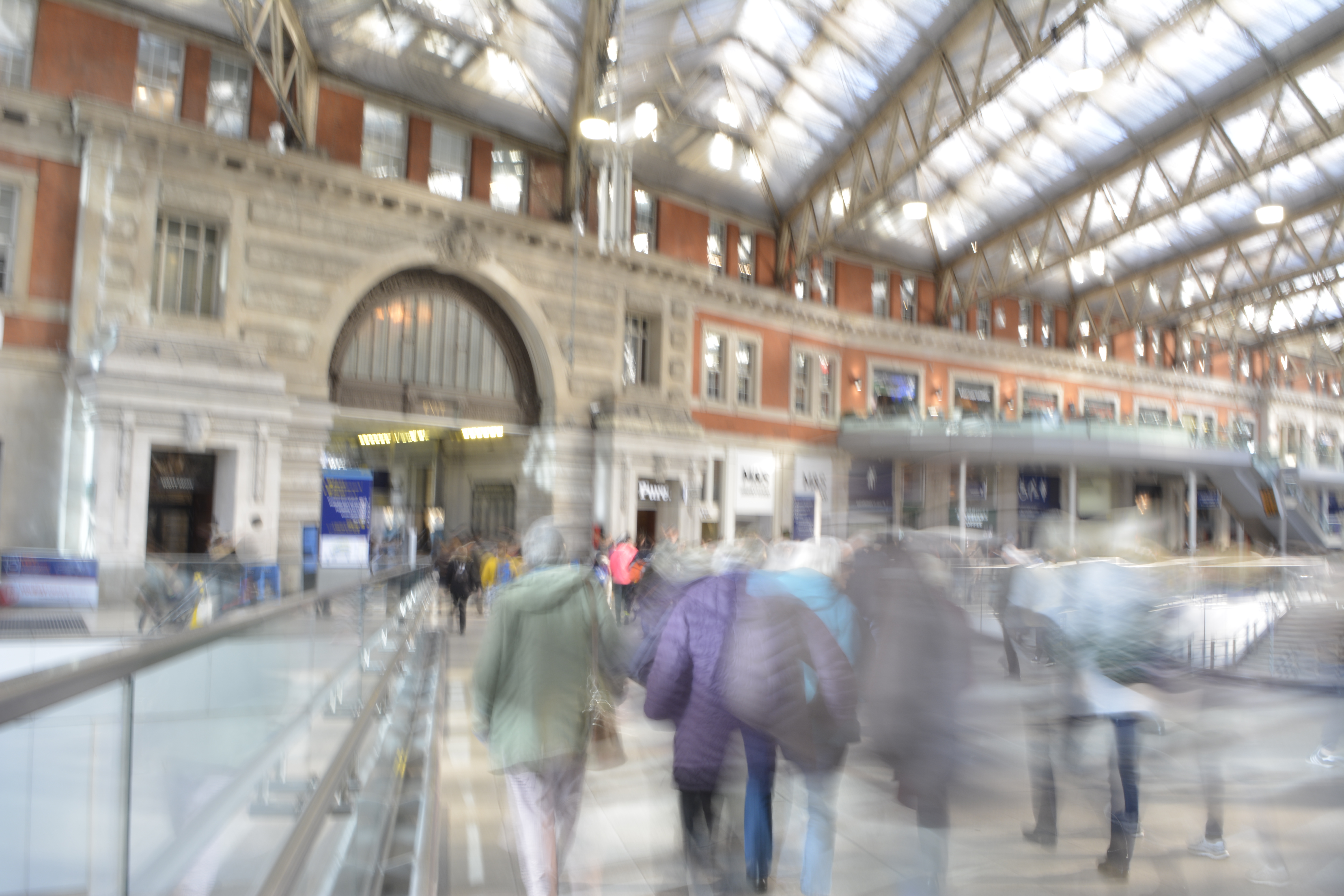
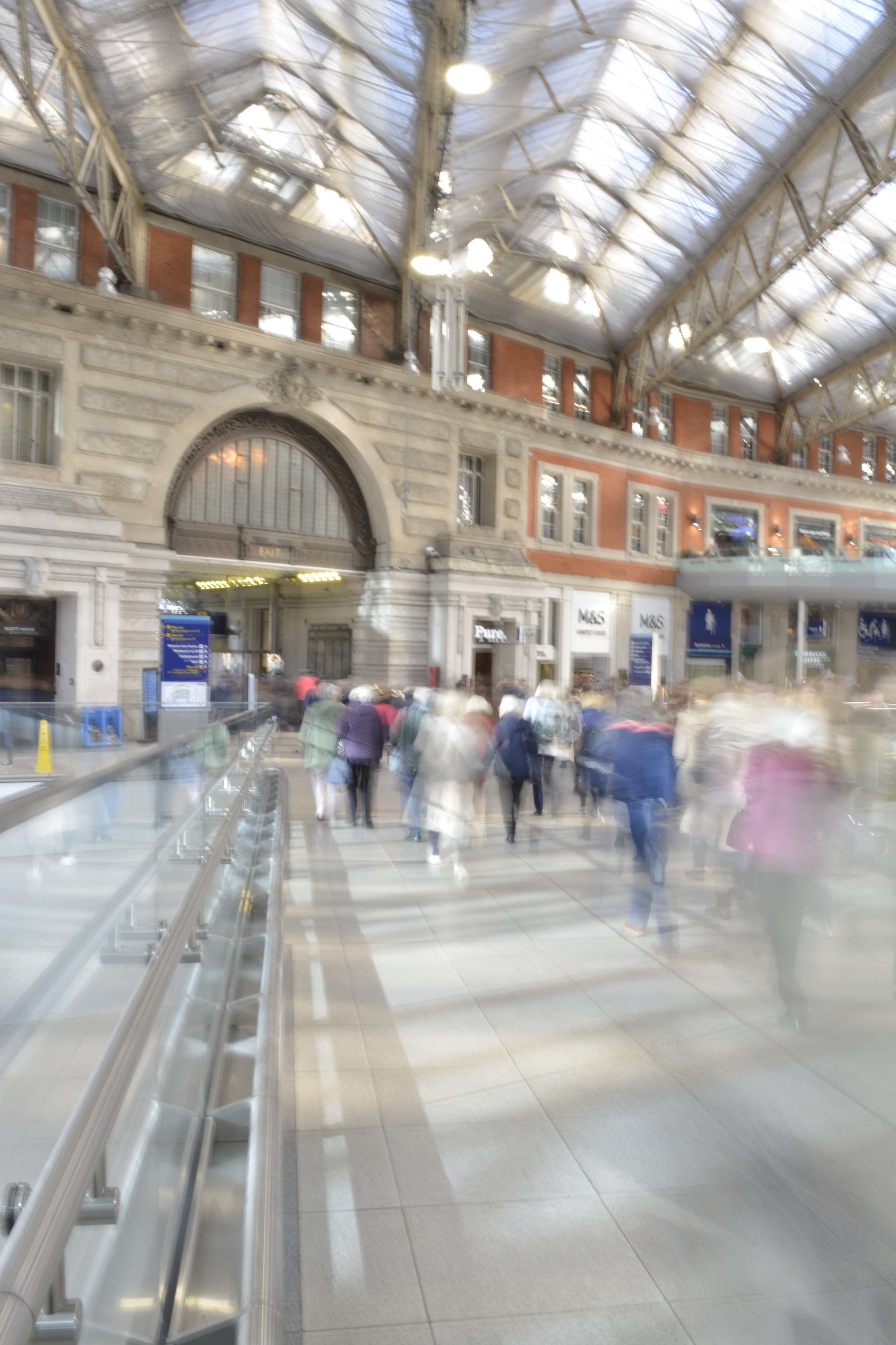
Waterloo Station
I knew that in Waterloo station I wouldn’t be able to set up my tripod but I wanted to try and get some shots to see what would work. Moving to the side of a walkway I tried to steady the my camera on a rail to reduce the camera shake.
I managed to capture some motion blur from the passengers however still incurred some camera shake, so the background wasn’t sharp enough.