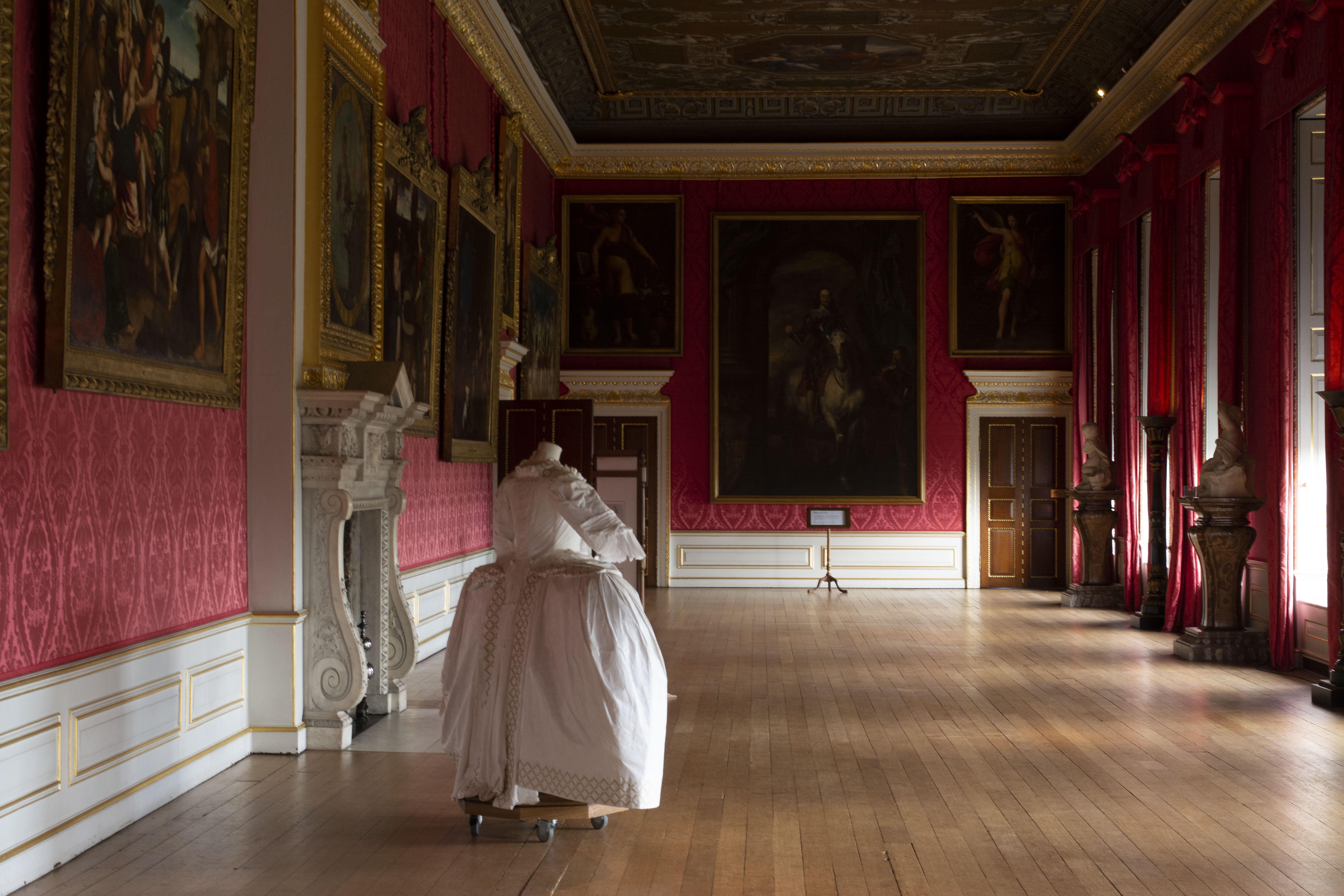
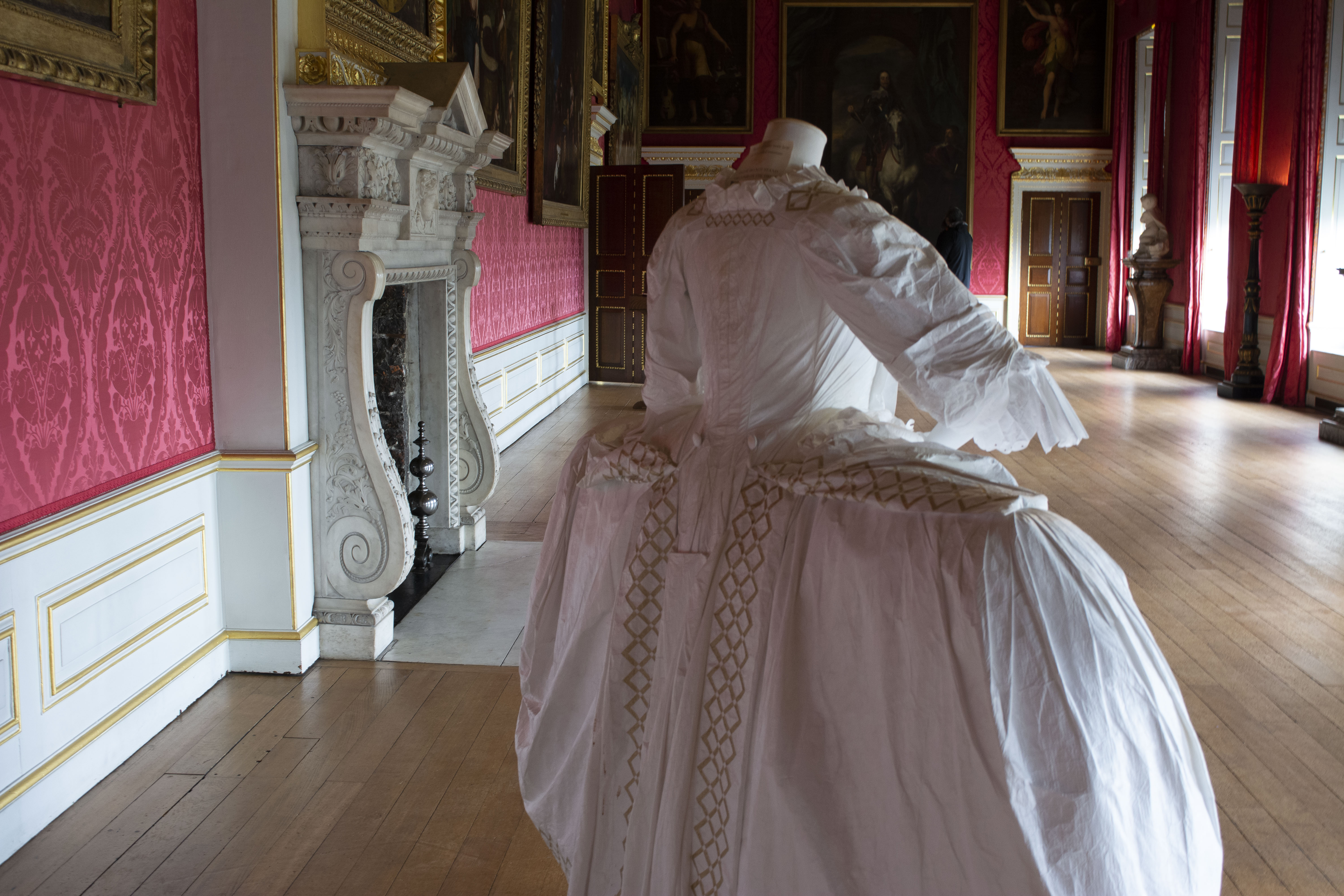
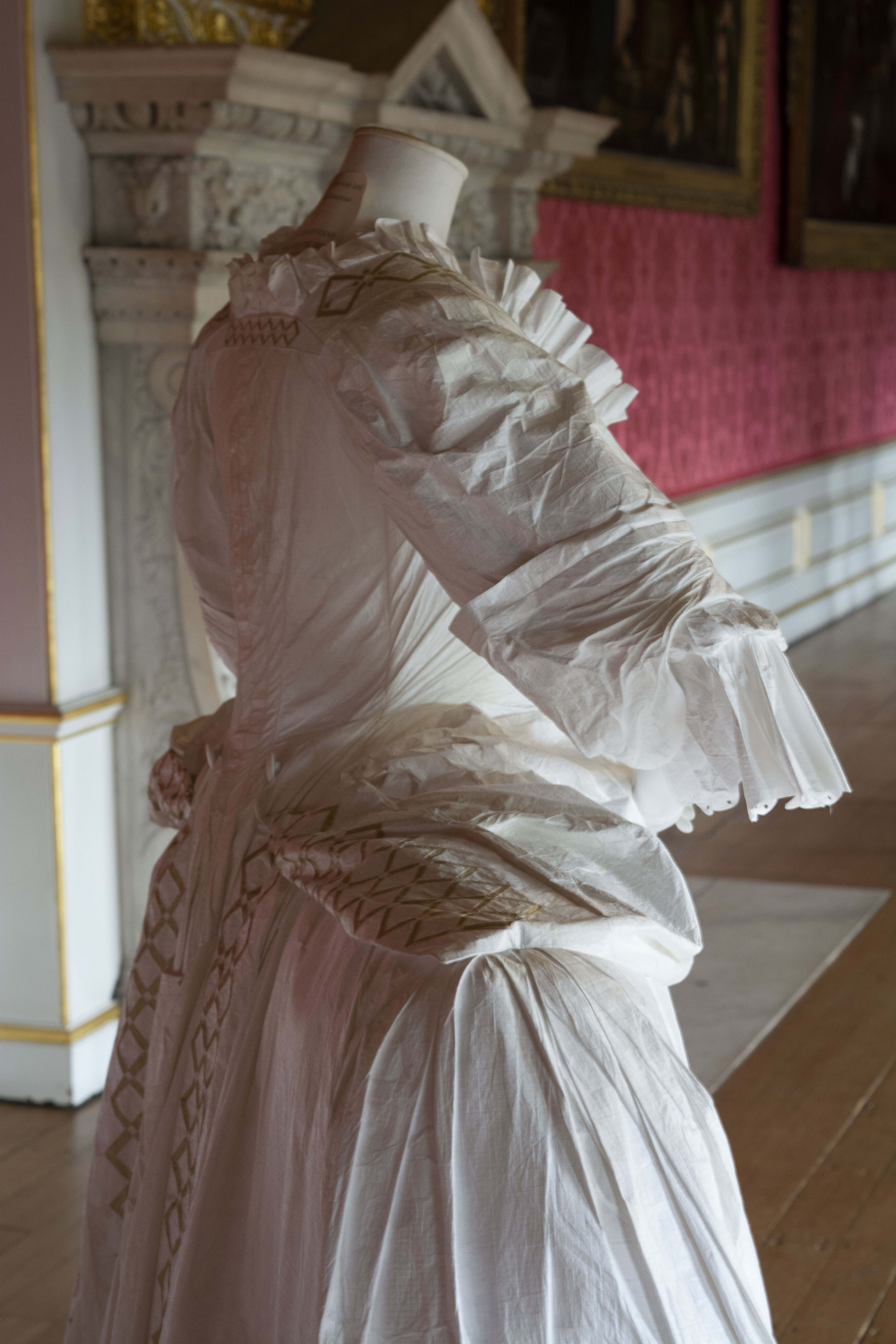
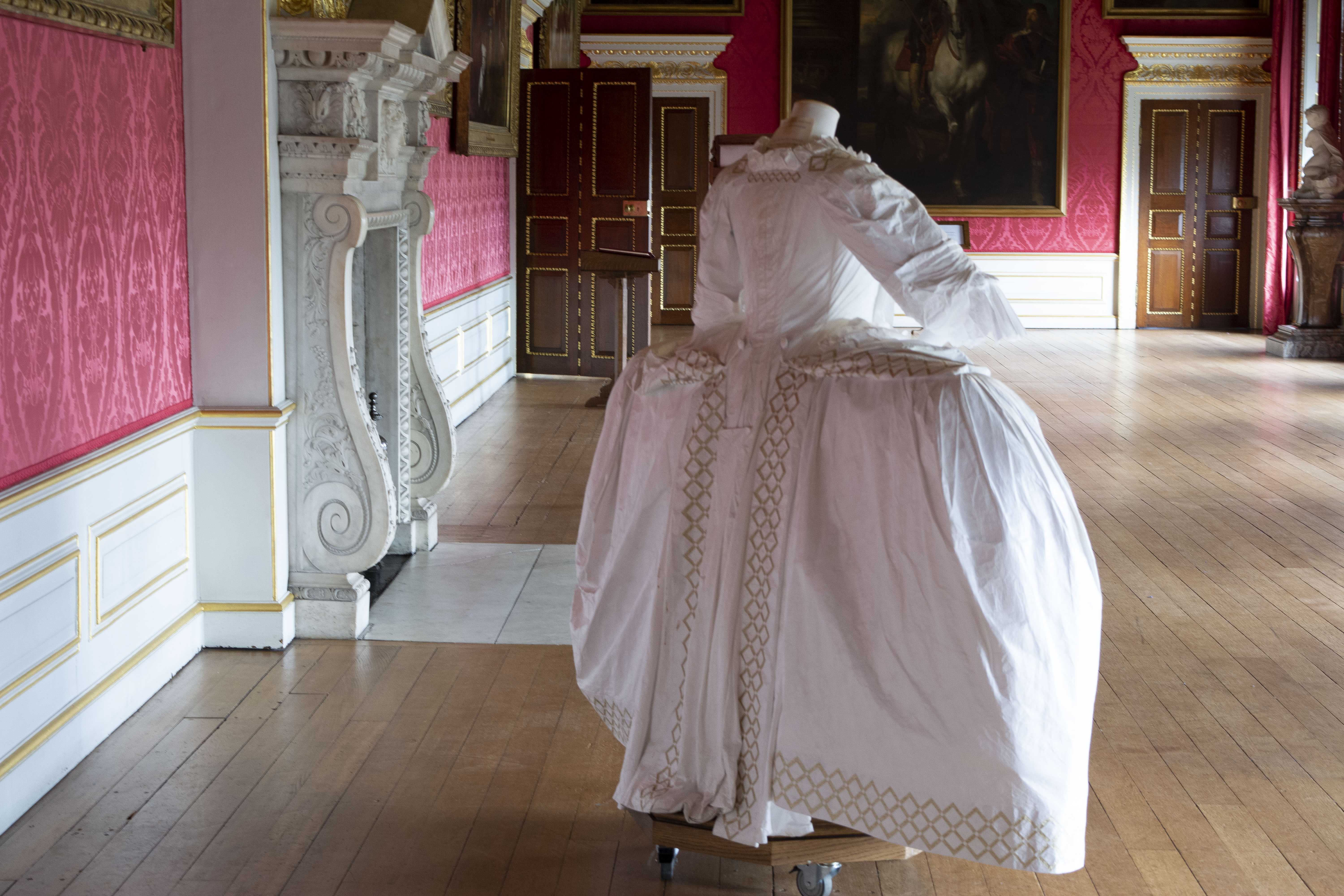
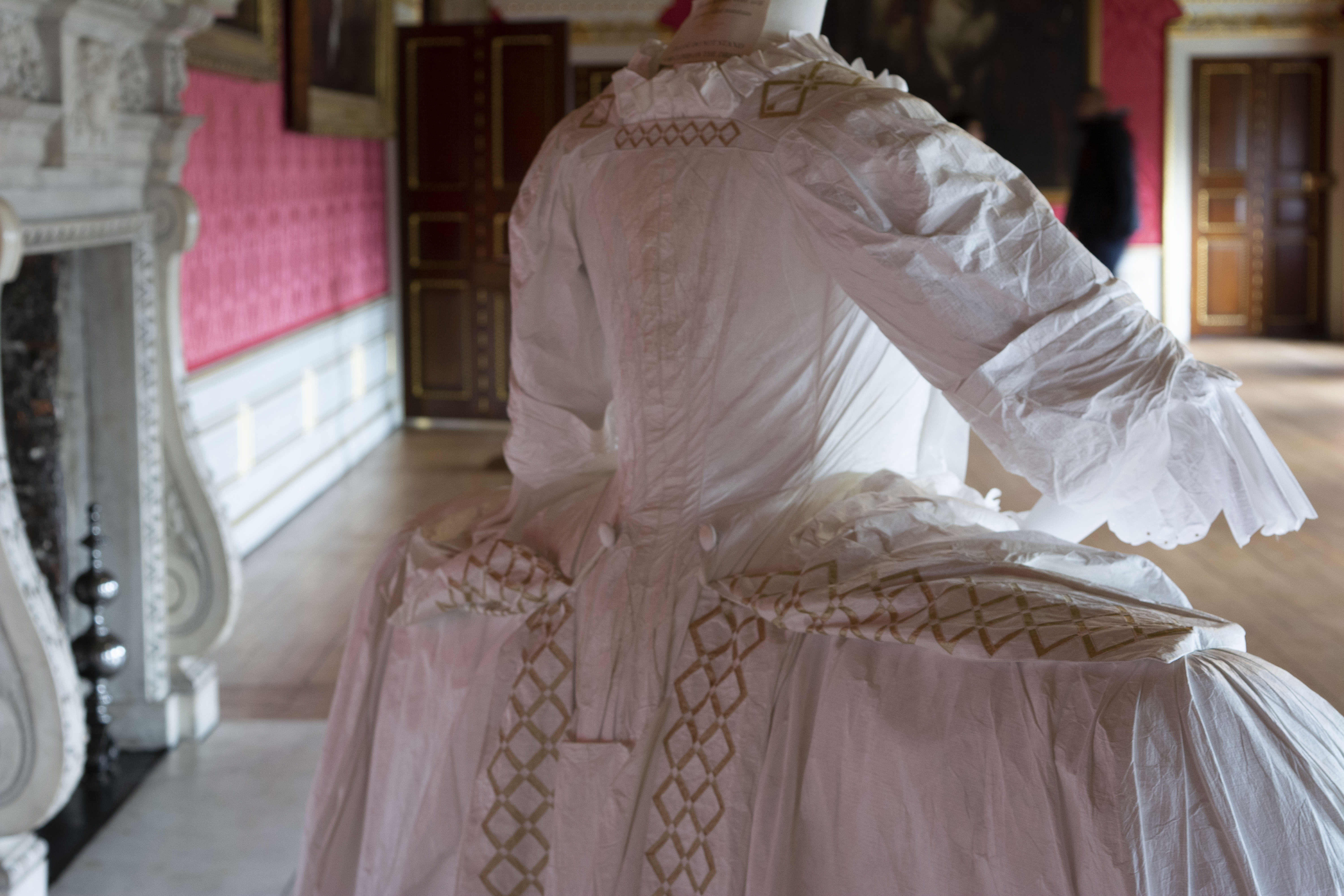
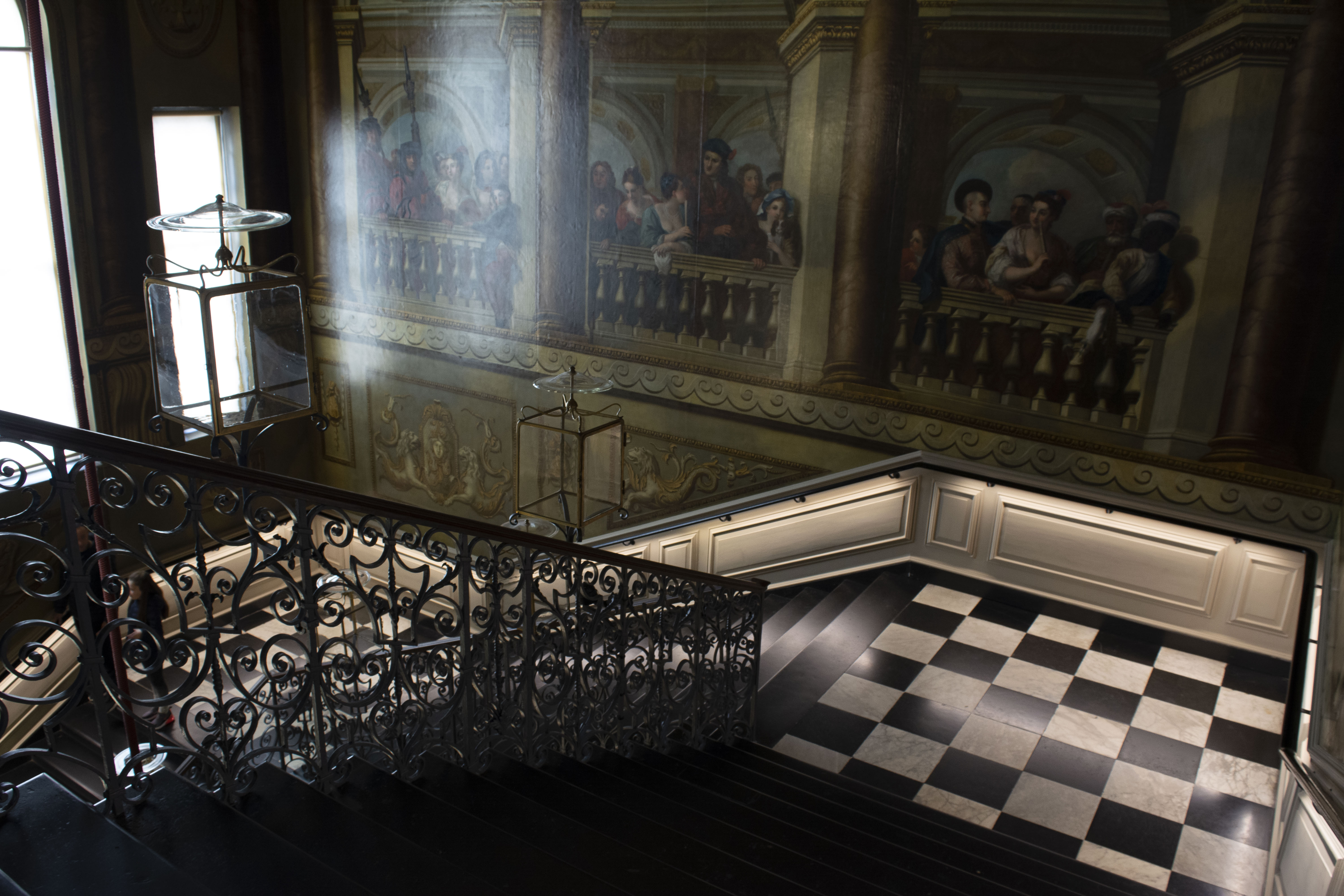
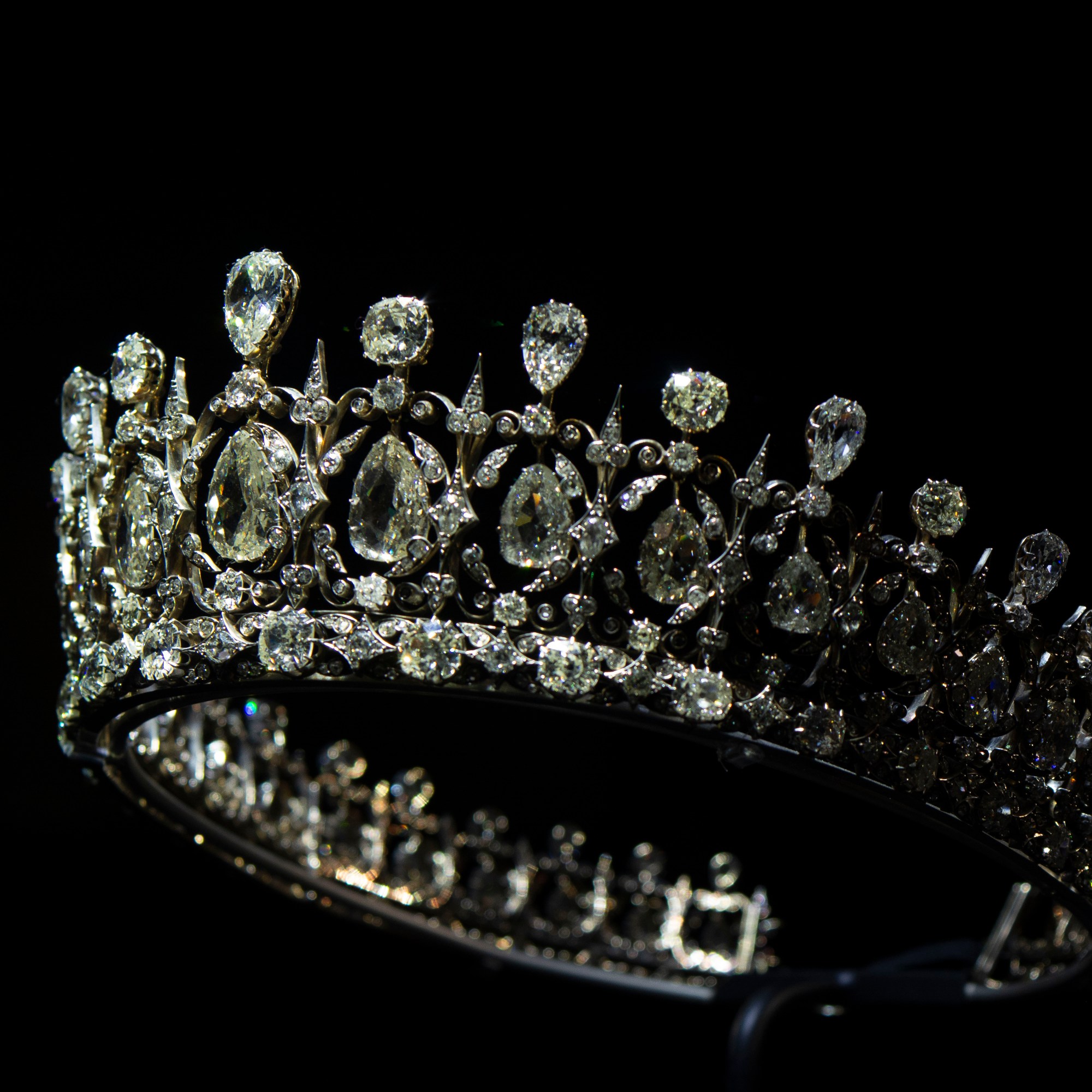
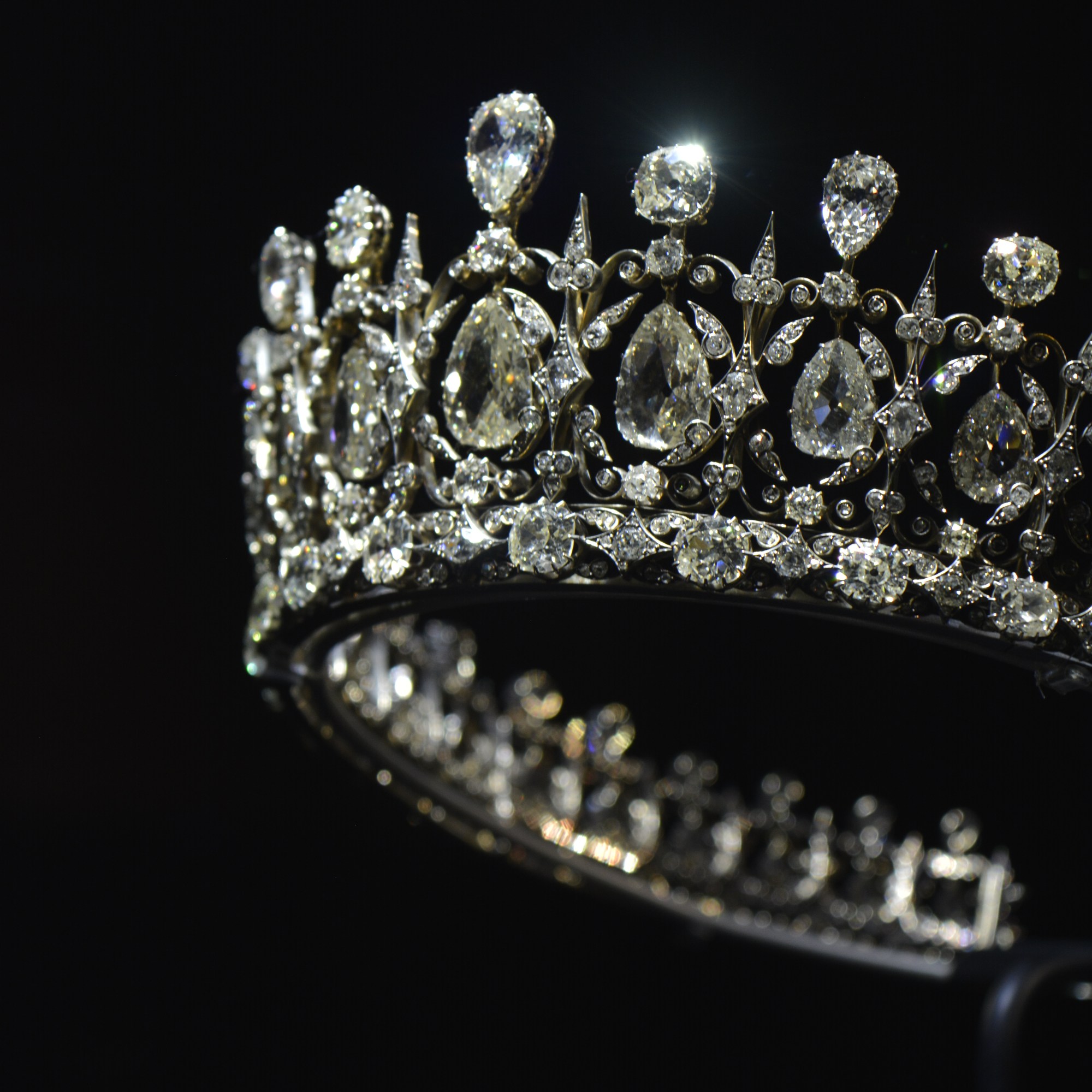
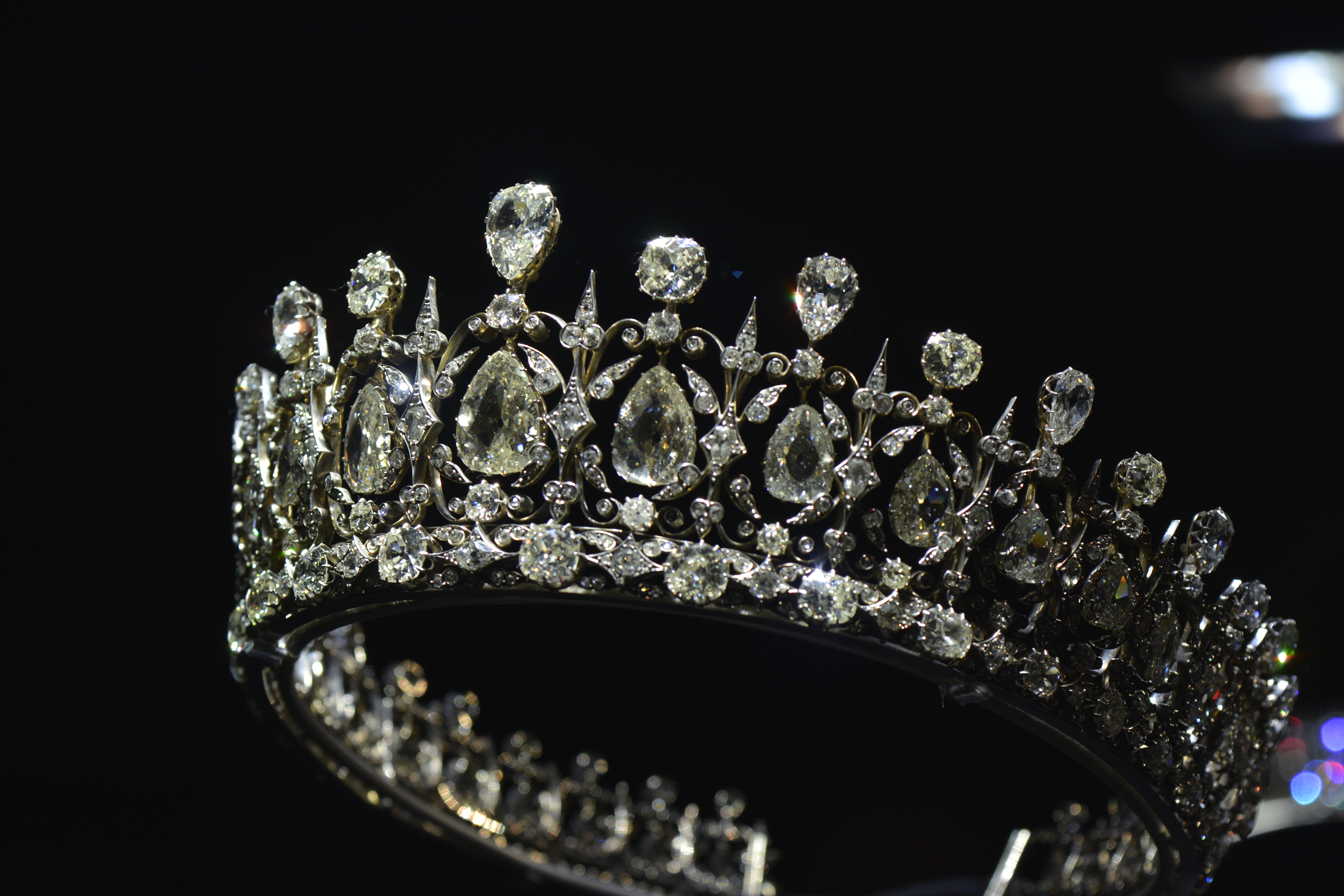
I have taken these photographs on a trip to Kensington Palace with my family.
Kingsington Palace was the birthplace for Queen Victoria. She grew up there and showcases the history of her time at the palace.
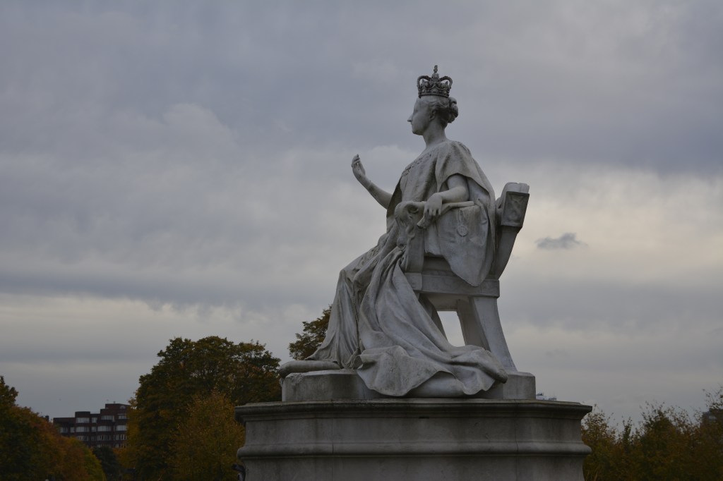
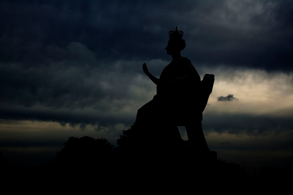
This last photograph is taken of a statue of Queen Victoria. You can see the before and after. Quite a grey photograph. I wasn’t quite happy with the way the photograph came out colour wise, however I still liked the statue. So I decided to manipulate it a little in photo shop.
I wanted to bring out the sky more. Really emphasise the clouds.
In photography, the technique HDR-High Dynamic Range is used to produce an image that is similar to what you would see with your human eye.
For example, if you were inside a beautiful building, like a church, you know that to expose the stained glass windows you would set your camera to a certain aperture. However by doing this you would be under exposing the interior and therefore it would appear dark. And vice versa, if you were to expose correctly for the interior, the stained-glass window would be overexposed. In the end you are always having something over or under exposed in your photograph.
To achieve HDR image you need to capture between five and ten different exposures of the same image. Generally 1 F stop difference for each image. Then all these images are merged together to form one image through light room or photo shop. The correct exposure part of each photograph is used and in the outcome is, you have a correctly exposed image.
Using this technique you can achieve an outcome that is close to how you actually see it. However HDR photography can so easily be exaggerated and therefore your final image may look unnatural.
The image below demonstrates this. Although all the beautiful colours were probably there, it does however look fake and unnatural. Perhaps the colours were pumped up a little during the postproduction process?
Image taken from the internet
This next image below, shows how you can achieve a more natural look to your photograph using a HDR technique. As a photographer you can see that in one photograph you would never be able to expose for under and over the jetty. So this technique helps you show all that detail from the water and the sky within one image.
Image taken from the internet
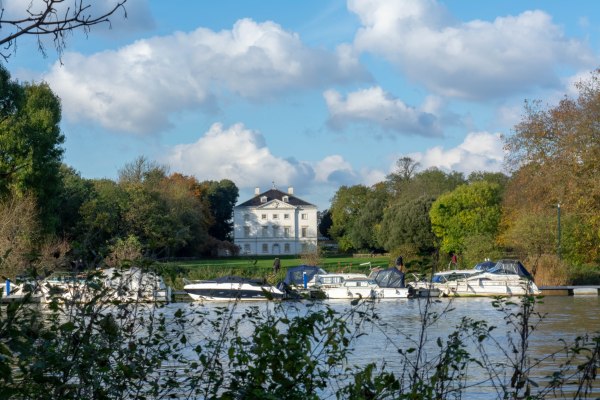
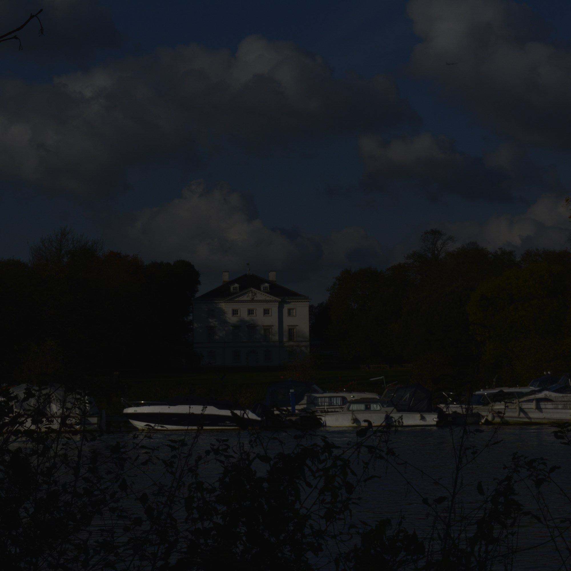
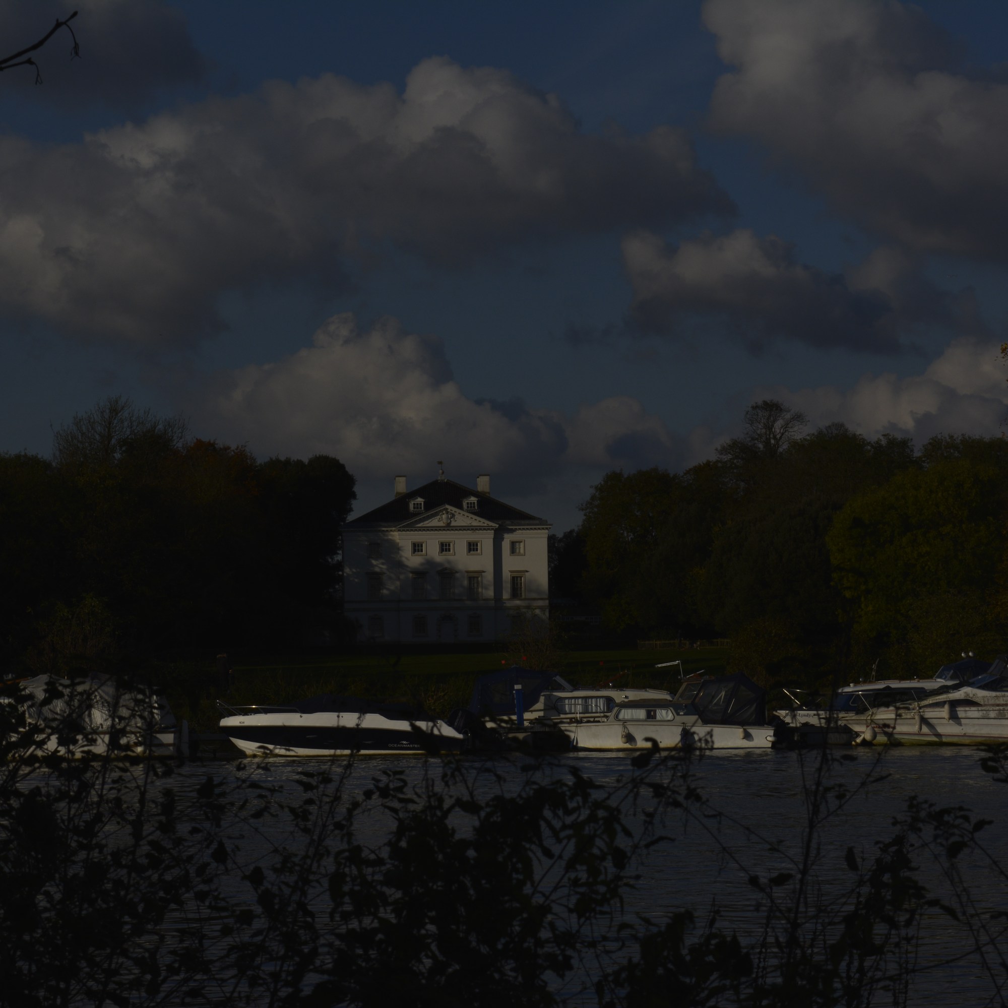
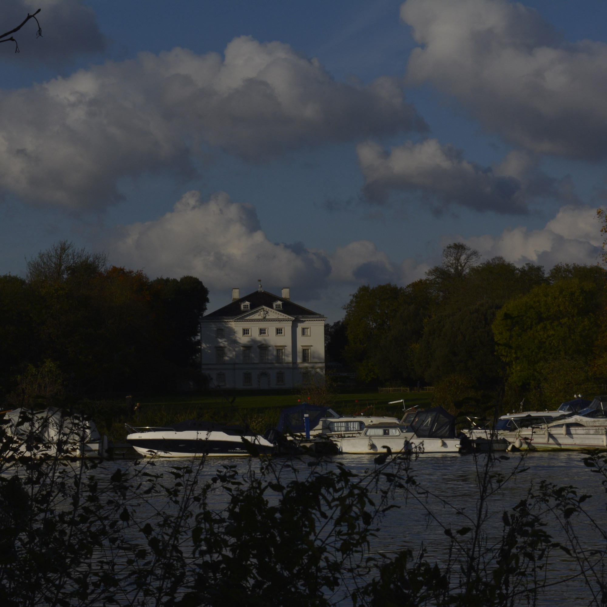
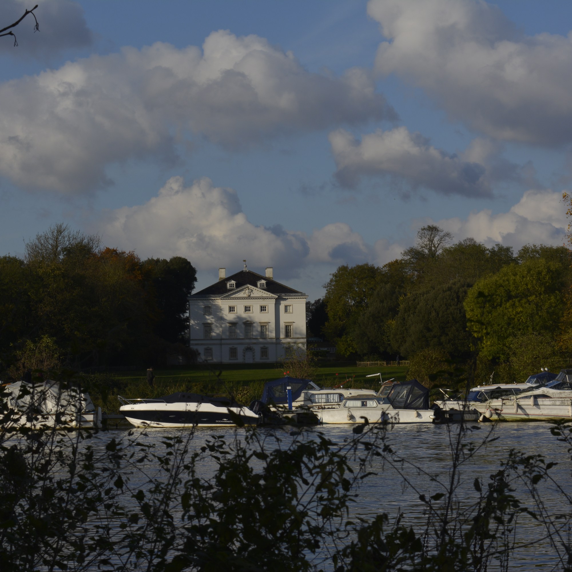
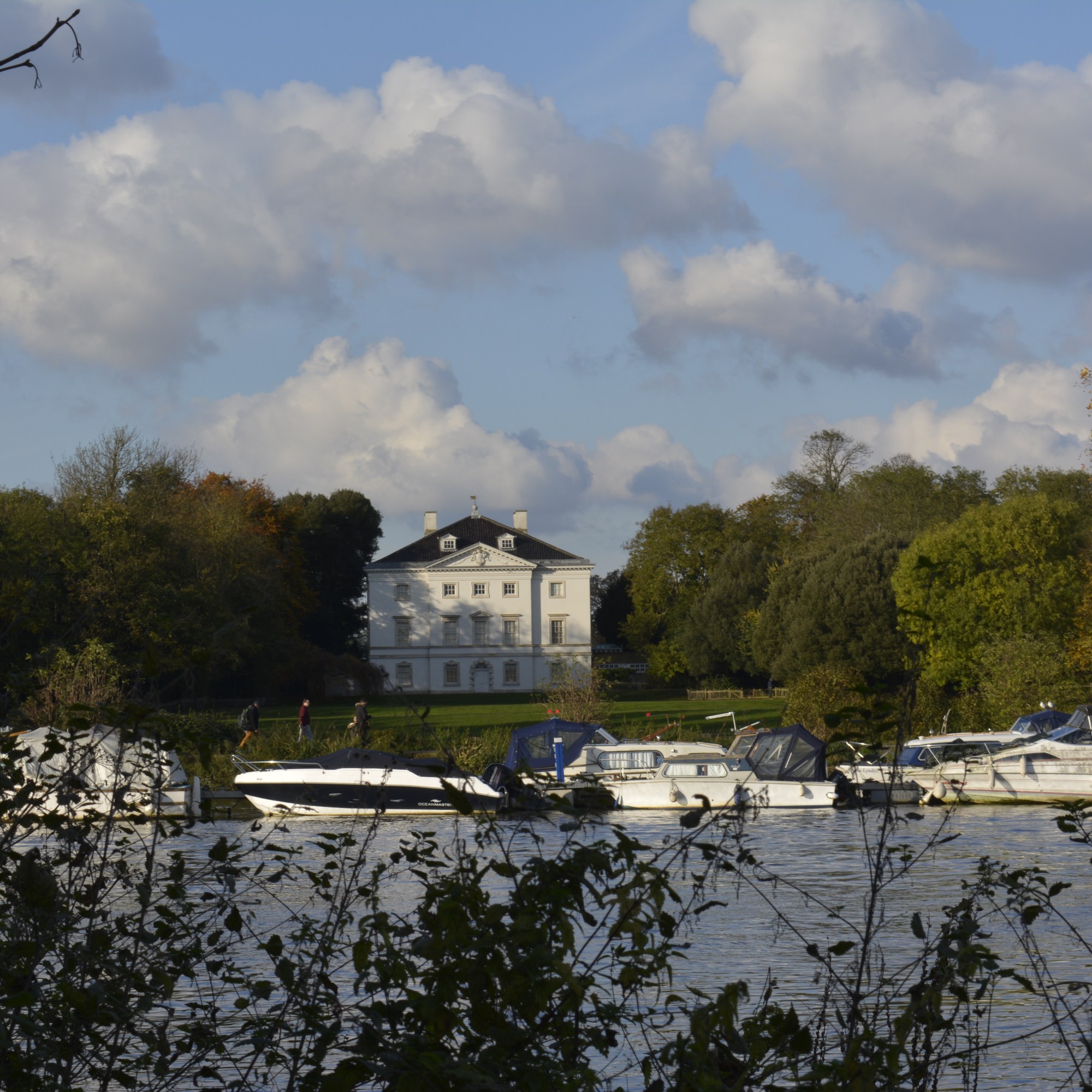
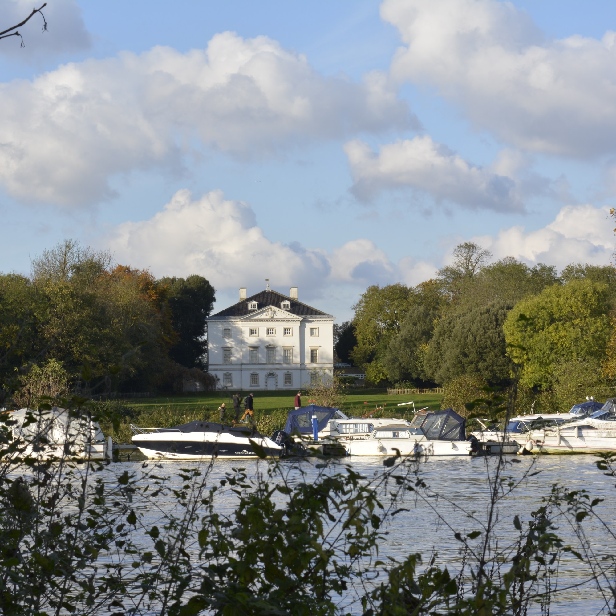
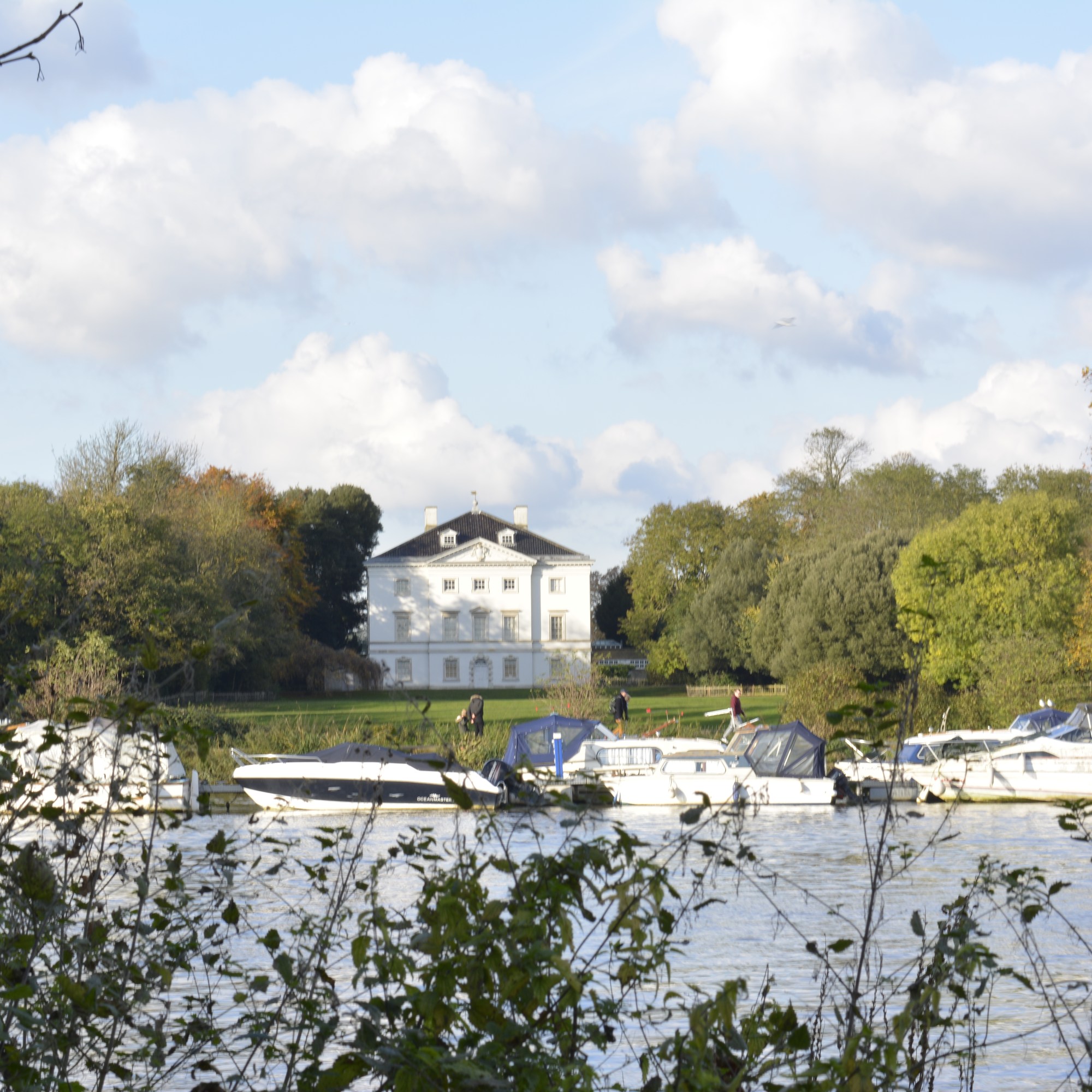
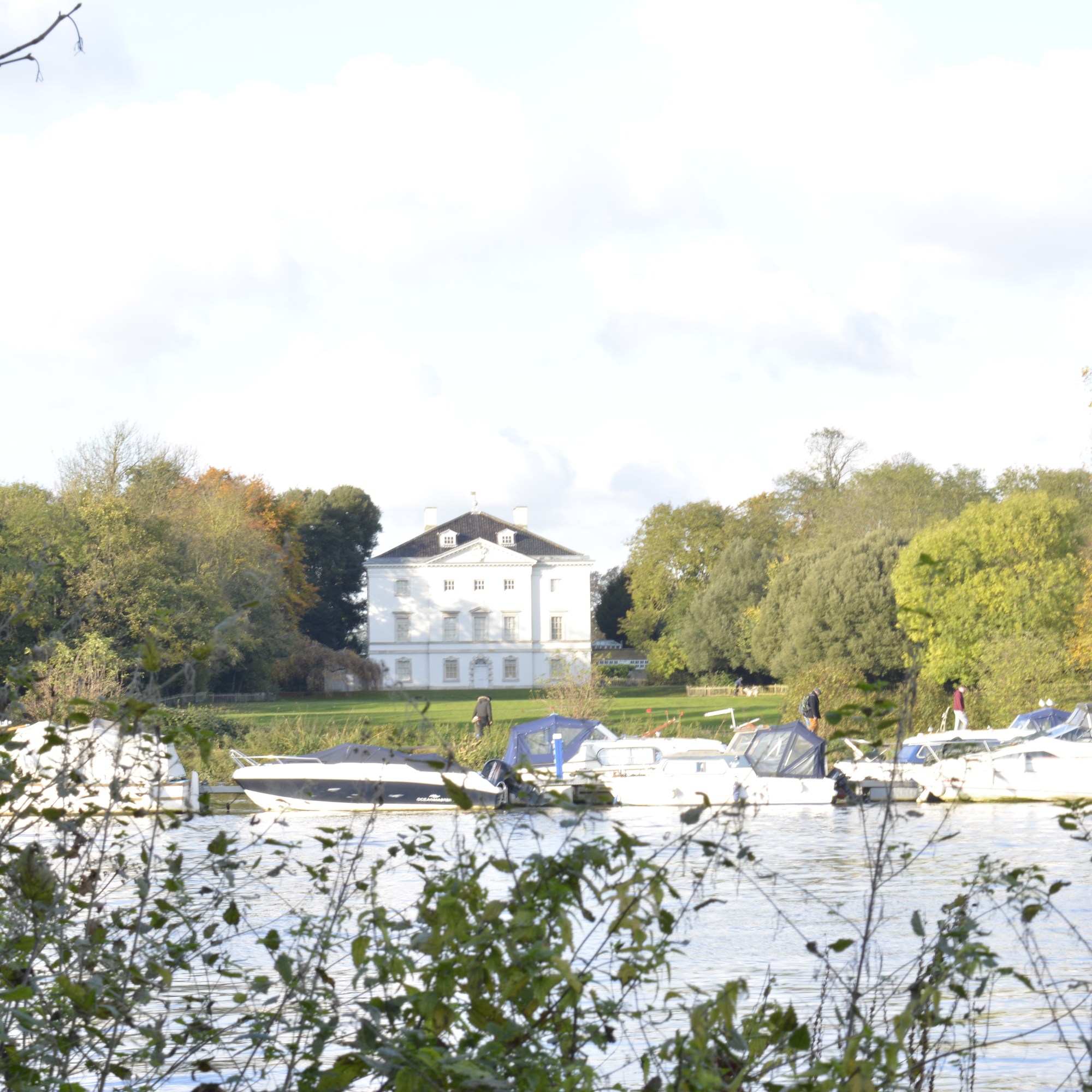
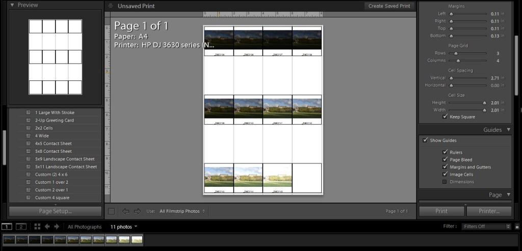
To keep the same view within my frame each time I took a photograph, I used a tripod. The only thing I changed each shot was the aperture, 3 notches (1 Fstop) each time. I started very underexposed and worked towards being over exposed.
Below is the final outcome. Within Lightroom, I highlighted all the images I needed, clicked on the PHOTO menu, then MERGE and then HDR.
HDR Image of Marble Hill House
Marble Hill House-HDR
I am pleased with the result! The view has come out exactly as I saw it. A very natural scene with the foliage and trees all equally exposed well, even at the different depths of the photograph.
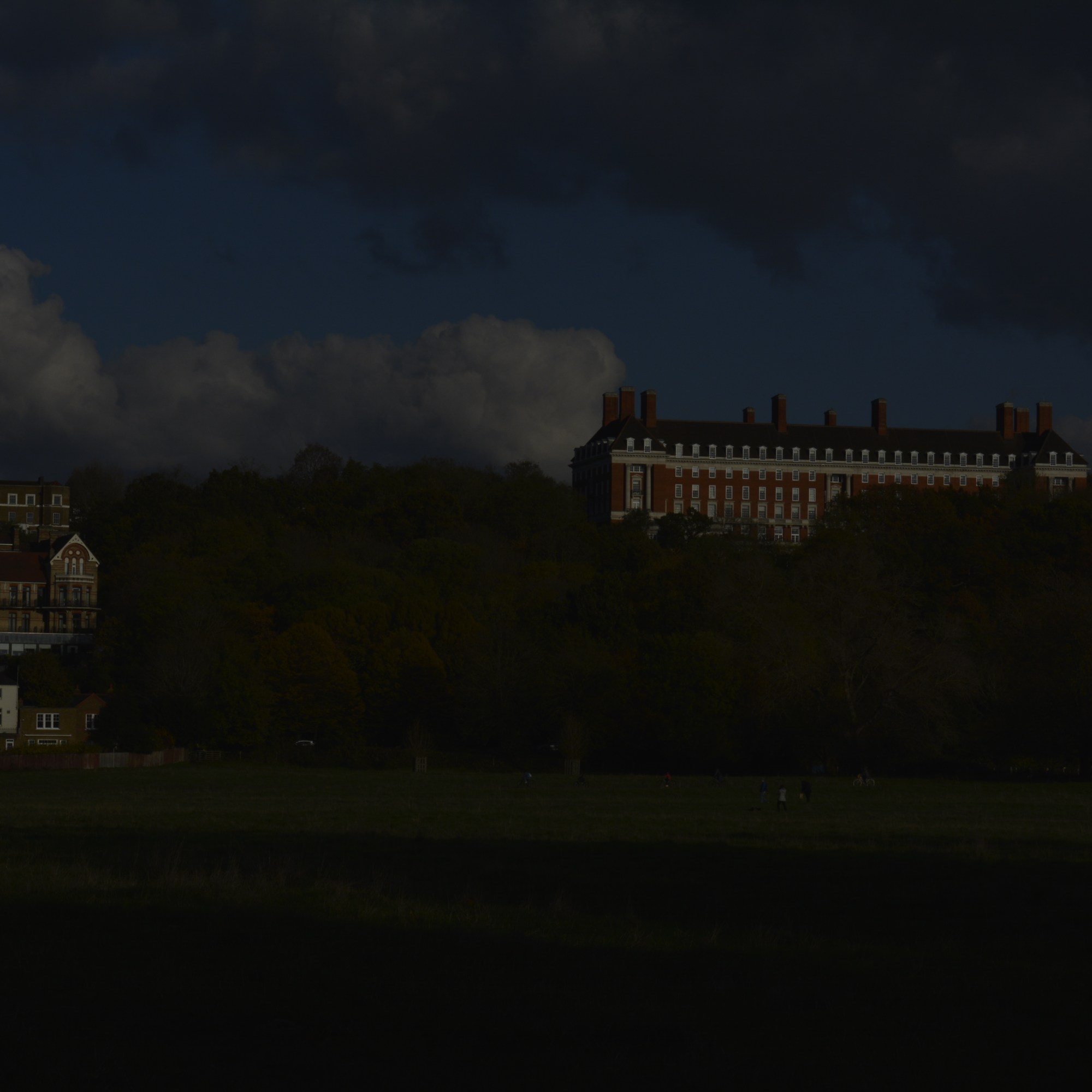
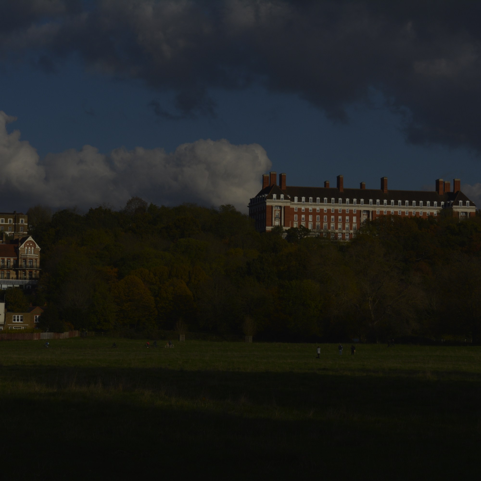
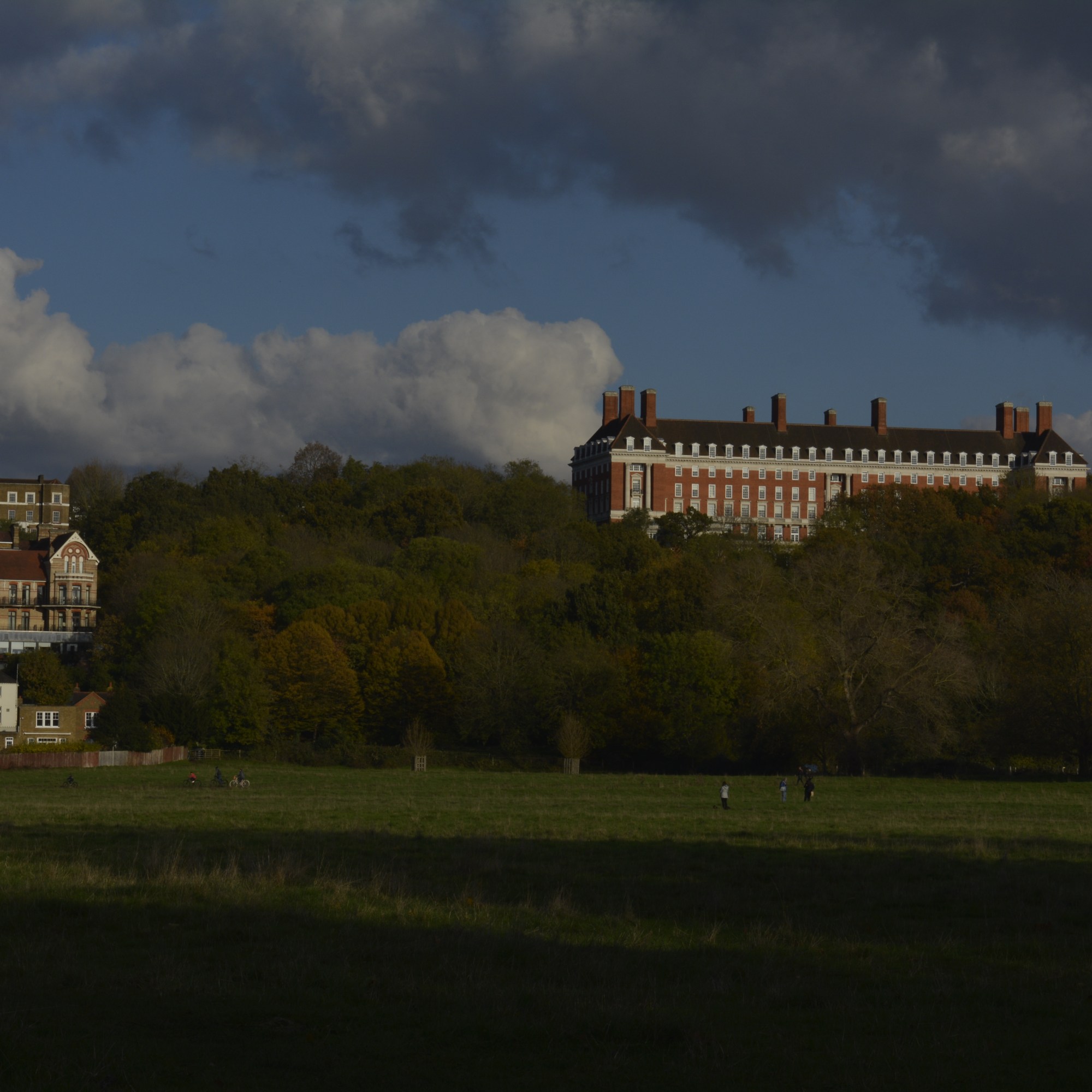
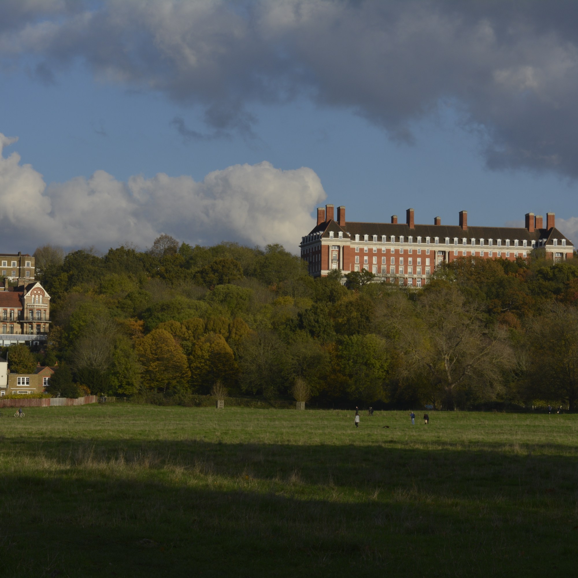
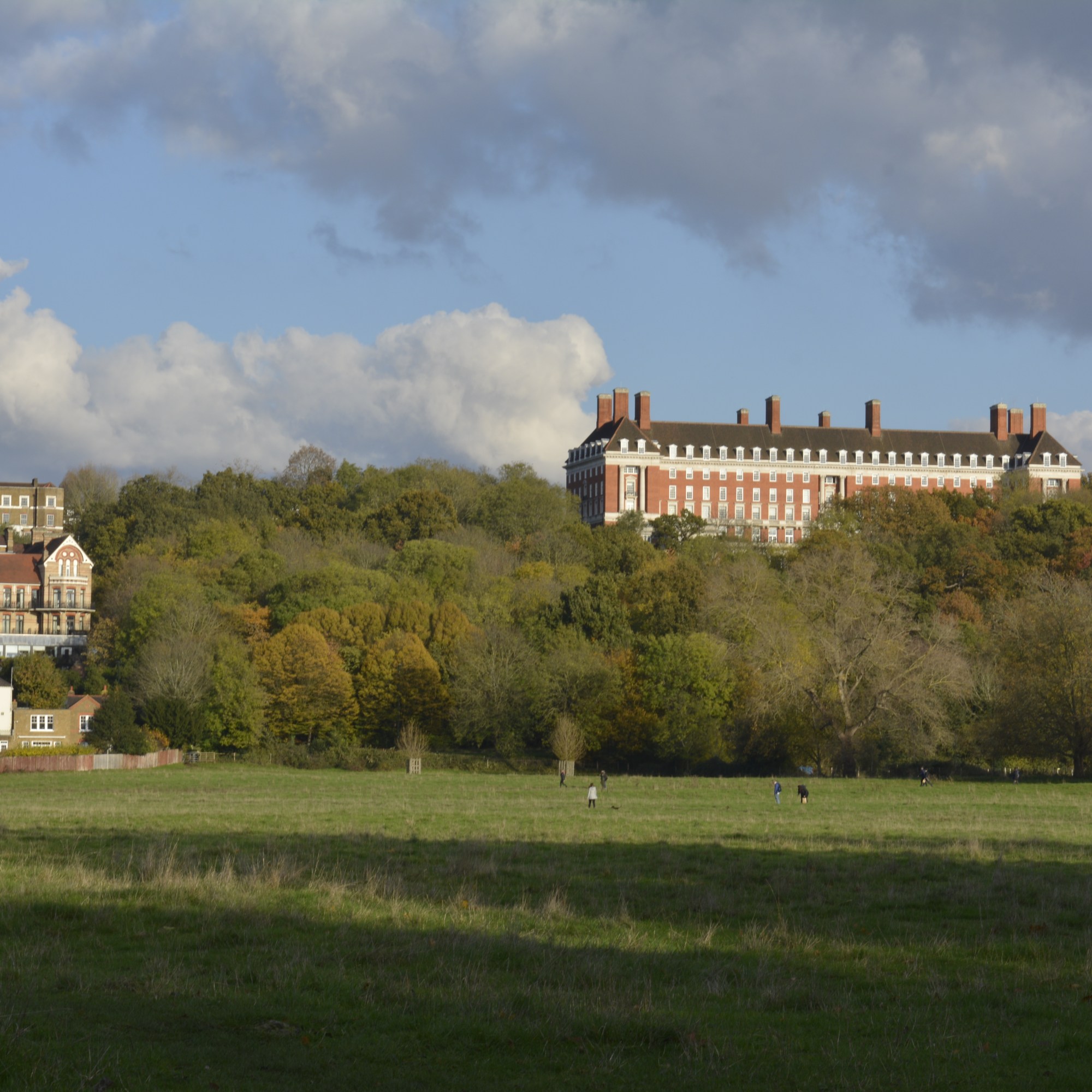
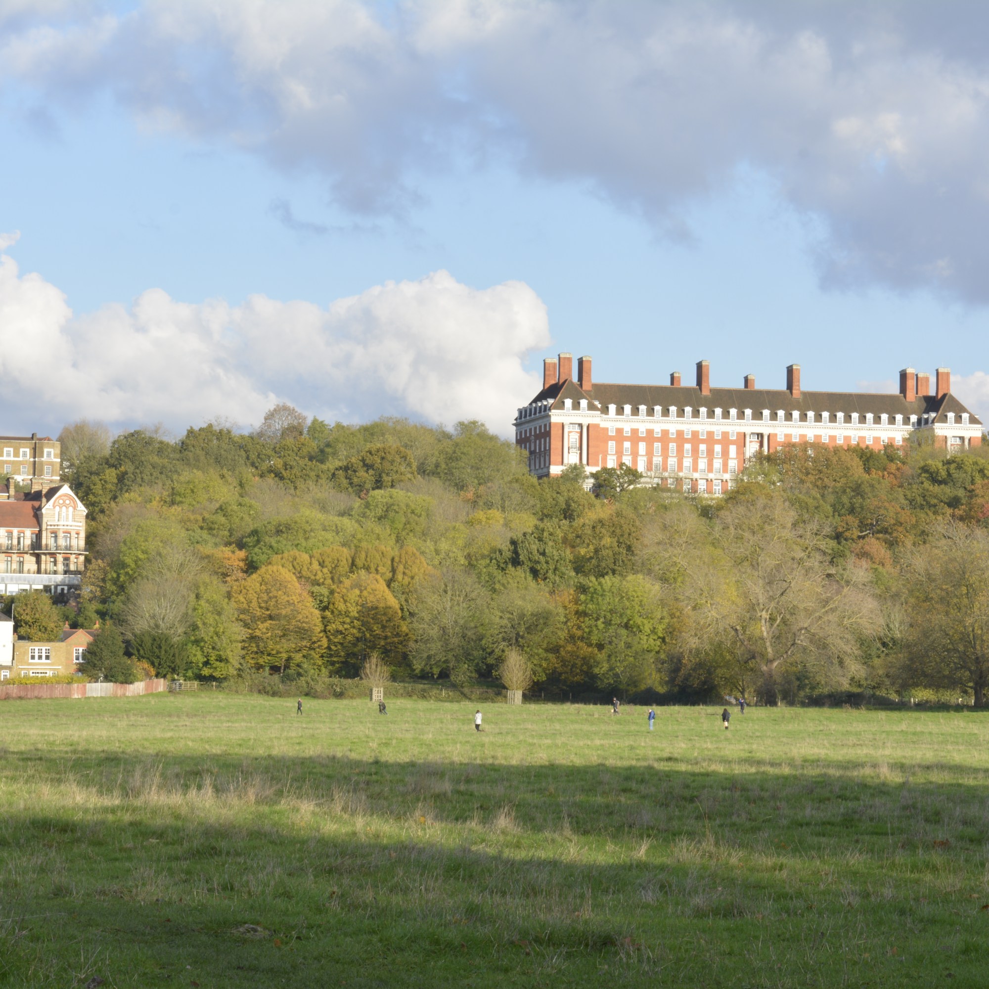
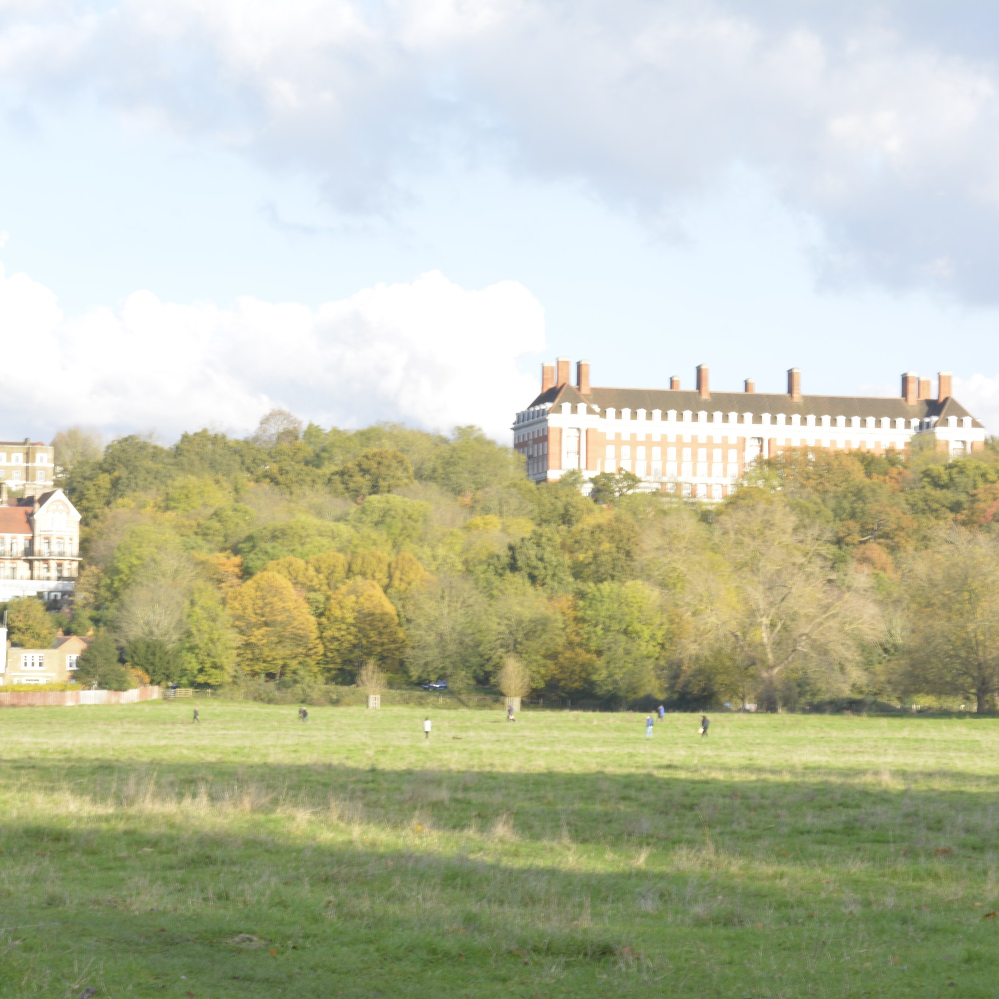
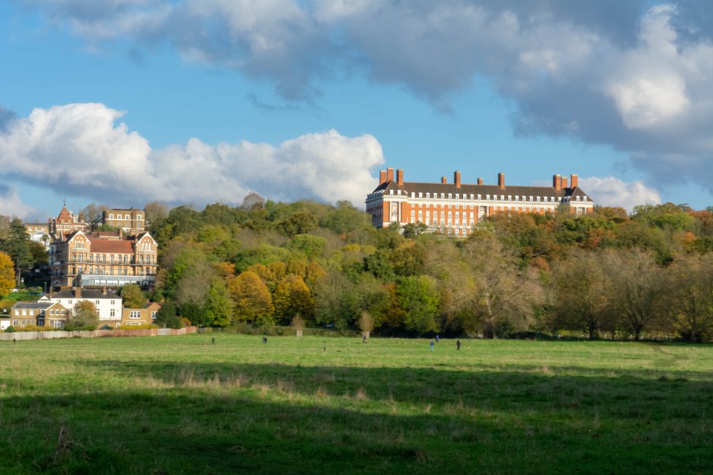
On the same day as shooting Marble Hill I took photographs across Petersham Meadow, of Petersham Hotel. It was a bright day, so needed to take lots of different exposure shots to capture tall the colours from the sky and trees.
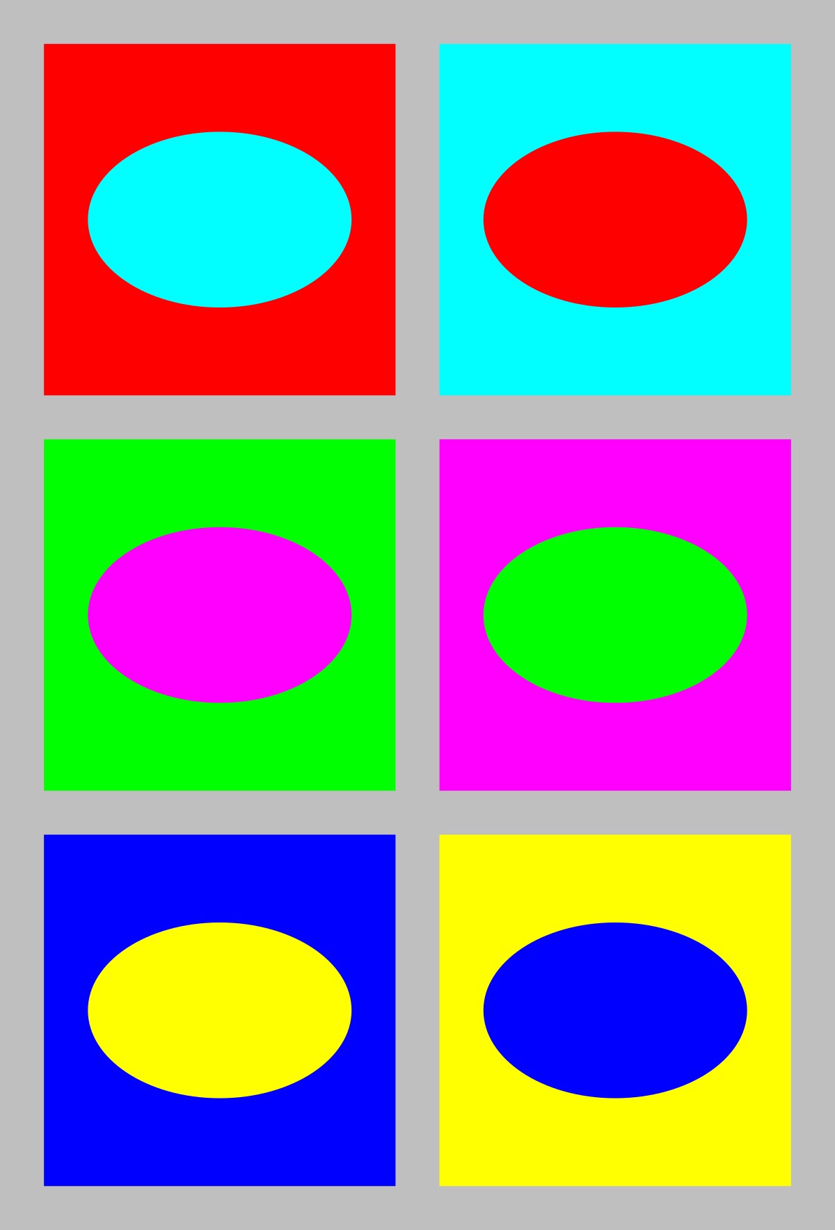
The 3 Primary colours in digital imagery are Red, Green and Blue. RGB. Not the primary colours as we know them to be, Red, Yellow and Blue. This is because Red, Green and Blue are the colours found in the human eyes colour photoreceptors.
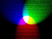
If you shine a Red torch slightly overlapping a Green torch, then slightly overlapping a Blue torch, shining 3 equal parts of the primary colours will create white colour. The photography below shows this.
Adding equal parts of the primary colours, white is seen, this is the basis of Additive colour. When working on a computer screen the colours are created with light. Additive colour mixing begins with black and ends with white. Taking away these colours the black is seen. By combining different quantities of these primary colours, brighter colours are made.
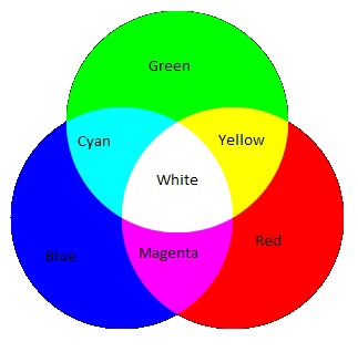
The chart above shows the primary colours and secondary colours that can be created with 2 equal parts of primary colours.
Blue + Green = Cyan
Green + Red = Yellow
Red + Blue = Magenta
The basis of subtractive colour mixing means that you begin with white and end with black. If you look at painting or printing, you start with white paper and add colour. For printers you will generally have 2 cartridges, one tri colour-CMY and one black. CMYK. When mixing Cyan, Magenta and Yellow you achieve a very dark colour, however it isn’t a true black. That is why you need an additional black cartridge. The K from CMYK stands for black (taken from the last letter in black so not to get confused with blue, B in RGB).
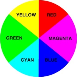
Colours that are next to each other on a colour wheel are known as colour harmonies. These colours will sit nicely together and compliment each other. Colours that are opposite each other on the colour wheel create a colour contrast. Contrasting colours are often used in advertising and logos. They compliment each other and create a visual contrast that captures your eye and therefore you notice them.
Colour wheelContrasting colours
Yellow is used a lot in advertising due to it being one of the strongest colours. When we see yellow our eyes have to re-adjust. It will always stand out and therefore influence the viewer.
Well known advertising
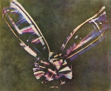
The First Colour Photographs
James Clerk Maxwell 1831-79
James Clerk Maxwell was a Scottish scientist that produced the first colour photograph in 1861.
Maxwell used the three colour method. Taking a photography with a Red filter, then a Green filter and then a Blue filter. When all three images were super impose together and a white light shone through, colours were seen. The photograph below was that image.
Coloured ribbon Taken in 1861
Sergey Prokudin-Gorsky 1863-1944
Sergey Prokudin-Gorsky really expanded on Maxwell’s colour vision and produced many early colour photographs.
This photograph below was taken in 1911 by Gorsky as part of his documentary work on the Russian Empire.
The Emir of Bukhara 1911
Three separate black-and-white photographs were taken through Red, Green then Blue filters. Then on a projection screen, these three photographs were combined to create a full colour Image.
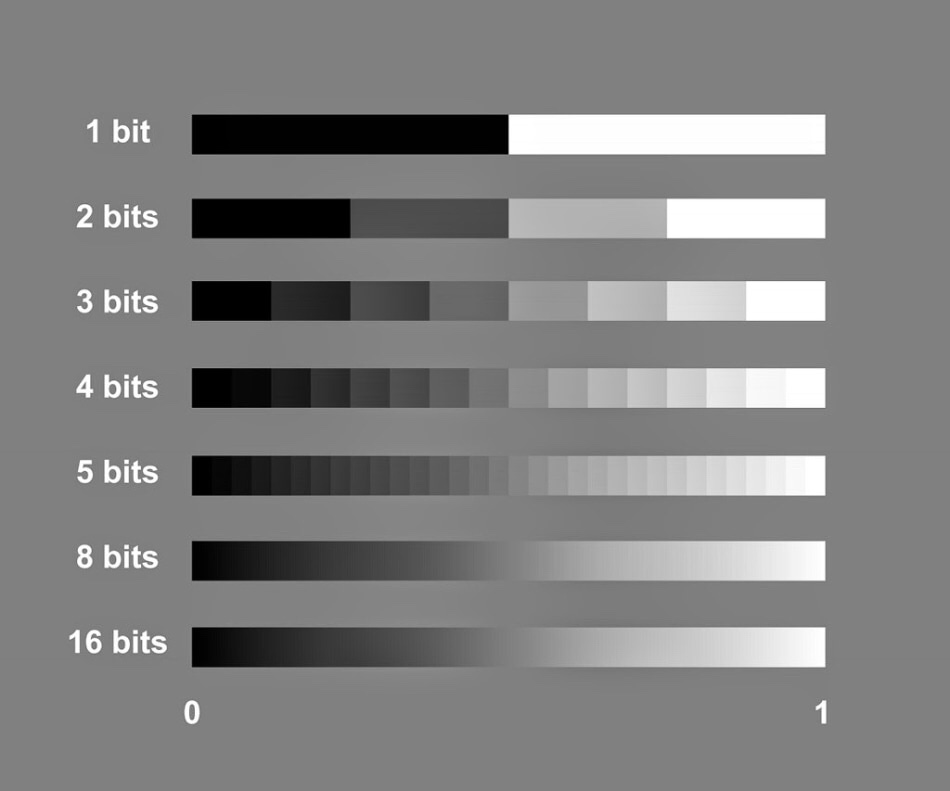
The term bit depth or colour depth refers to the range of colour available in an image.
The image below shows the possible scale of grays for different bit images.
The more bits you have the more shades of grey you can display.
To work out how many shades of gray you will have in an image you use the formula 2 to the power of. For example, an 8 bit image, 2 to the power of 8=256. Black, White and 254 shades of gray.
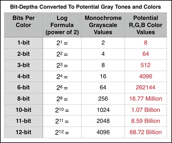
The table below shows the potential grayscale amount for each size image.
The third column in this table shows the available colour possibilities for the different bit size images. With the 3 channels of colour, Red, Green and Blue.
Red X Green X Blue = Available colour possibilities.
Banding is where you can see a abrupt changes between shades of the same colour. This happens on lower bit depth images.
For example, above you can see two photographs showing shades of the colour purple. The one on the left has a lower bit depth than the one on the right. You can see that the changes in the shades jump and form bands of colour. Whereas the one on the right that has a higher bit depth and shows a gradual change from dark purple to light, with no banding.
The title people and the environment leaves me with quite a lot of room to explore. First thoughts are about the word People. I don’t often lean towards portraits but maybe this could be a challenge for me?
The recent environmental protests that have been happening in central London sprung to mind, however I feel I’m thinking too literally about the title and want to explore a bit more.
Thinking about the environment around me there are a lot of beautiful buildings in and around London. With the daily grind of life and work we take them for granted and don’t stop to appreciate them.
Photographer Research
Alexey Titarenko
I came across this photographer in my level two photography course, when another student was researching his work.
This photo below was the first of his work I had seen. I love the contrast between movement and stillness in this photograph. The scenery is frozen in time, yet the motion of people (ghost like figures) moving within the frame.
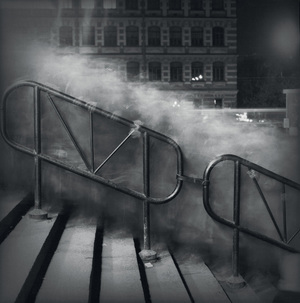
In City of Shadows the cloud of people are a lighter shade of grey with the hand rail and background buildings dark.
City of Shadow 1991-94 Alexey Titarenko
He was trying to portray the change in St Petersburg at that time and how it was affecting the people. Smiley happy people turning into shadows.
I feel in this series of photographs they have a definite spooky feel about them. They could be scenes from a horror movie, where a black monster seeps through the town.
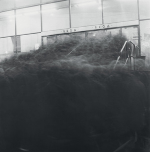
City of Shadow 1991-94 Alexey Titarenko
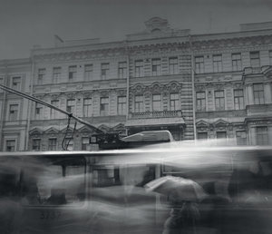
Looking through more of his work, I really liked his own take on street photography. Using long exposures and ICM (Intentional Camera Moment) as a way of high lighting the suffering and change in people.
City of Shadows 1991-94 Alexey Titarenko
Alexey Titarenko produced his prints in a dark room. Each print is unique as he used bleaching and toning techniques in the printing process to add depth to his photographs.
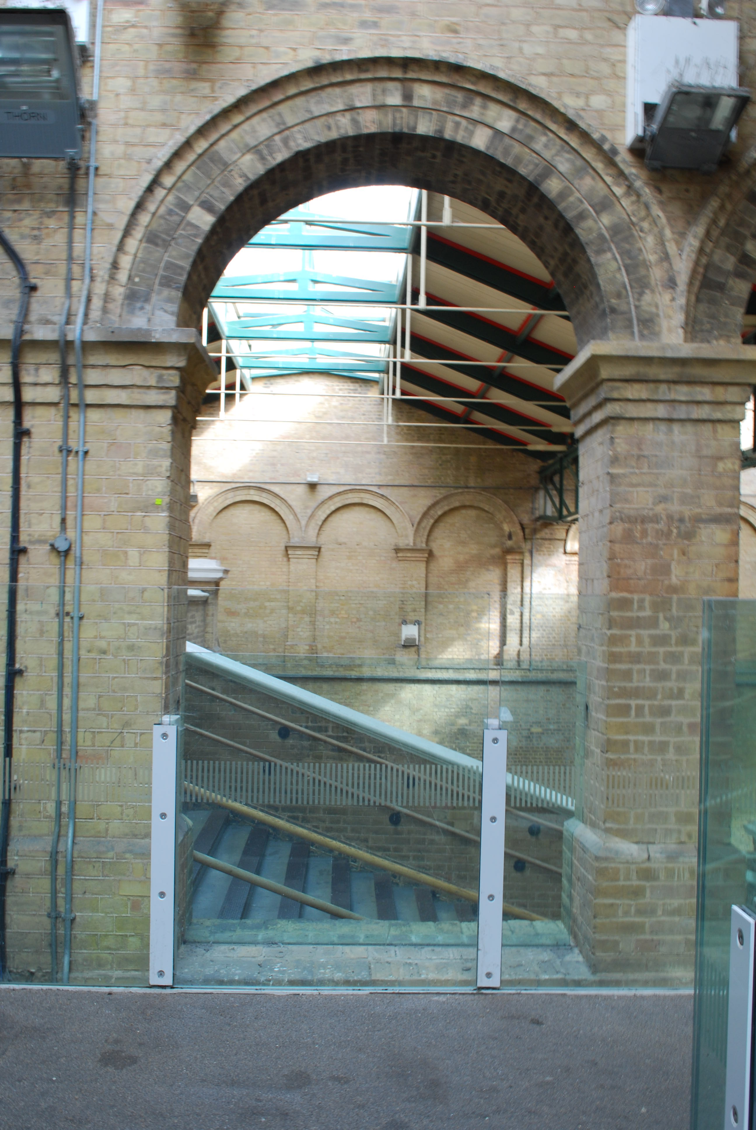
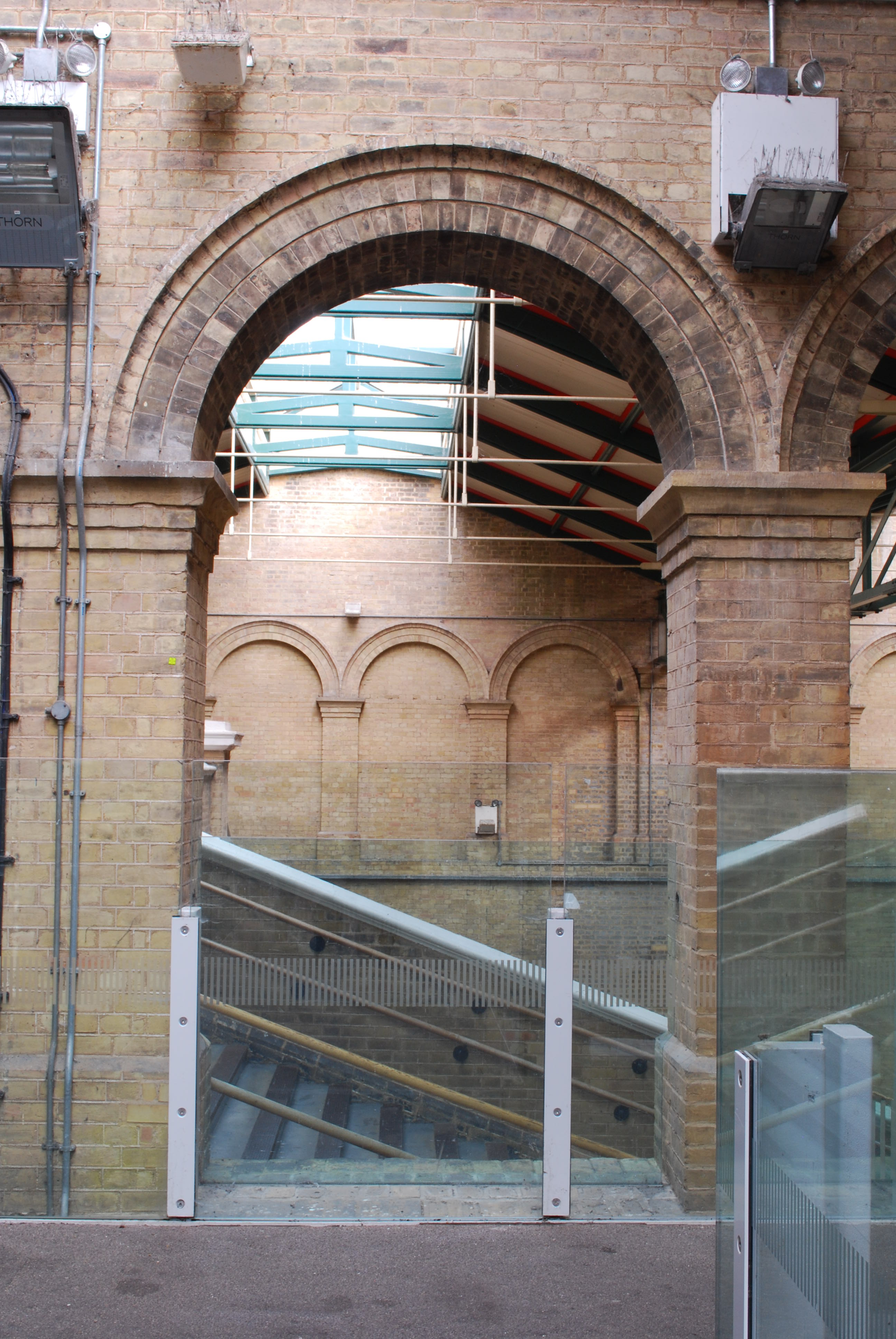
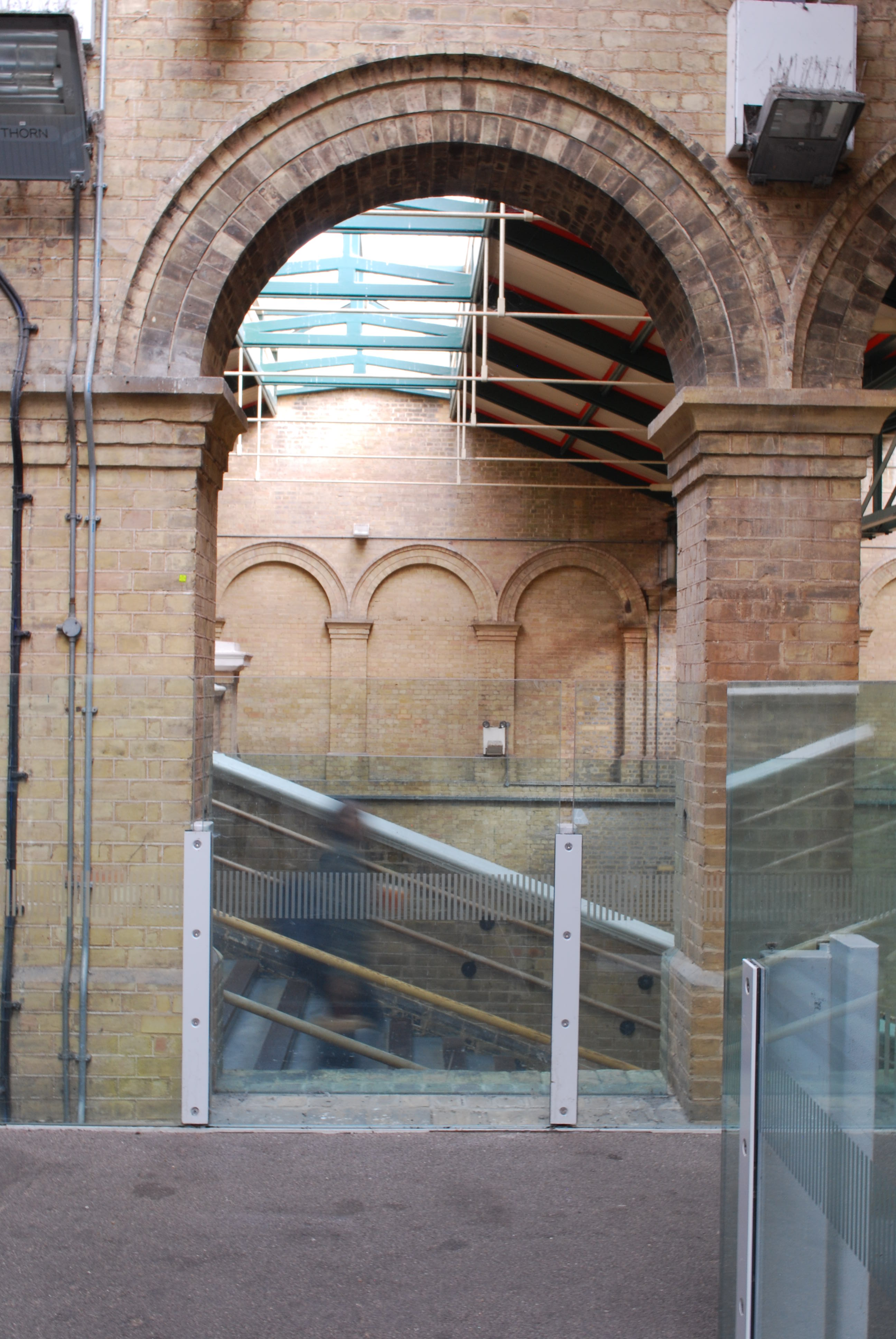
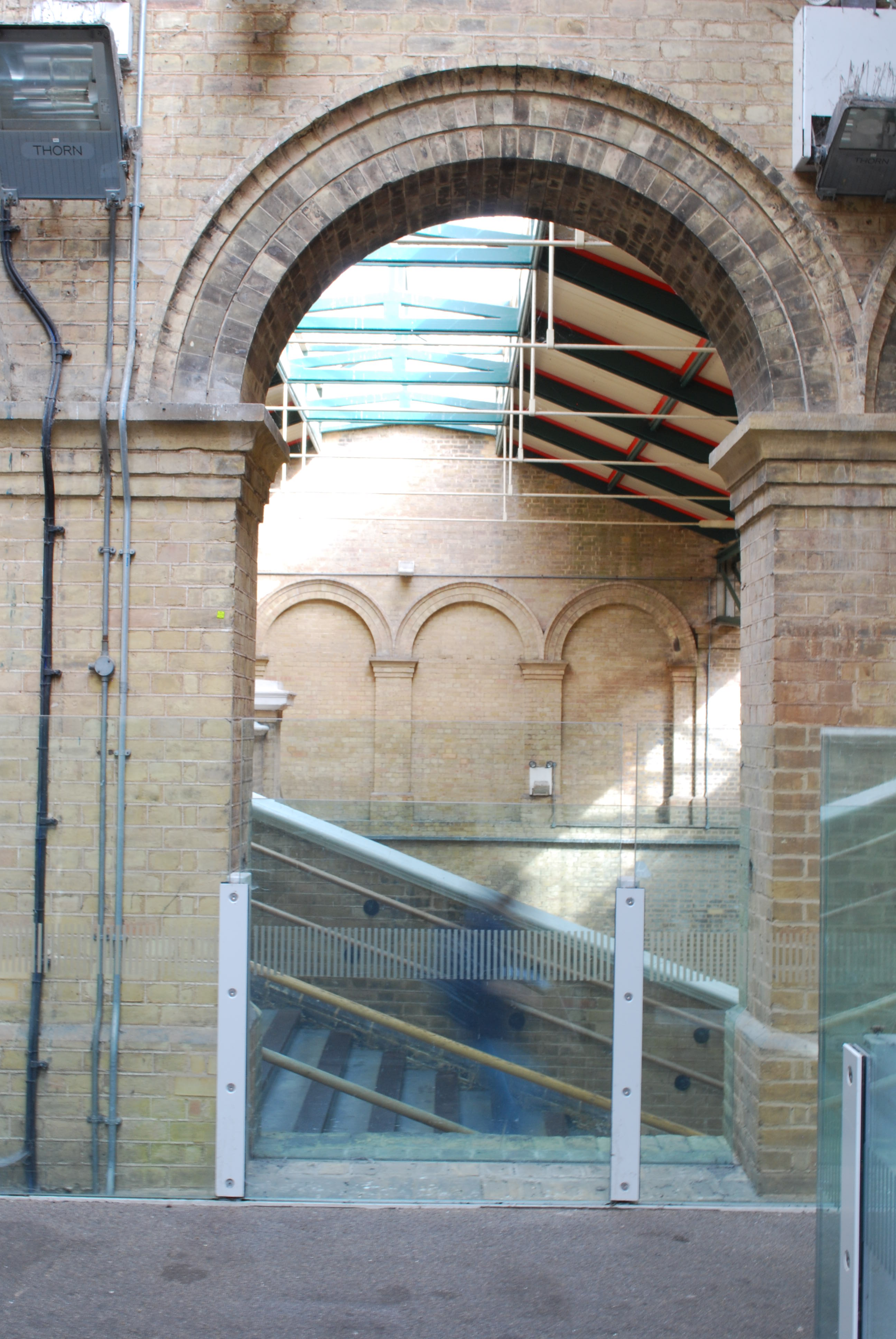
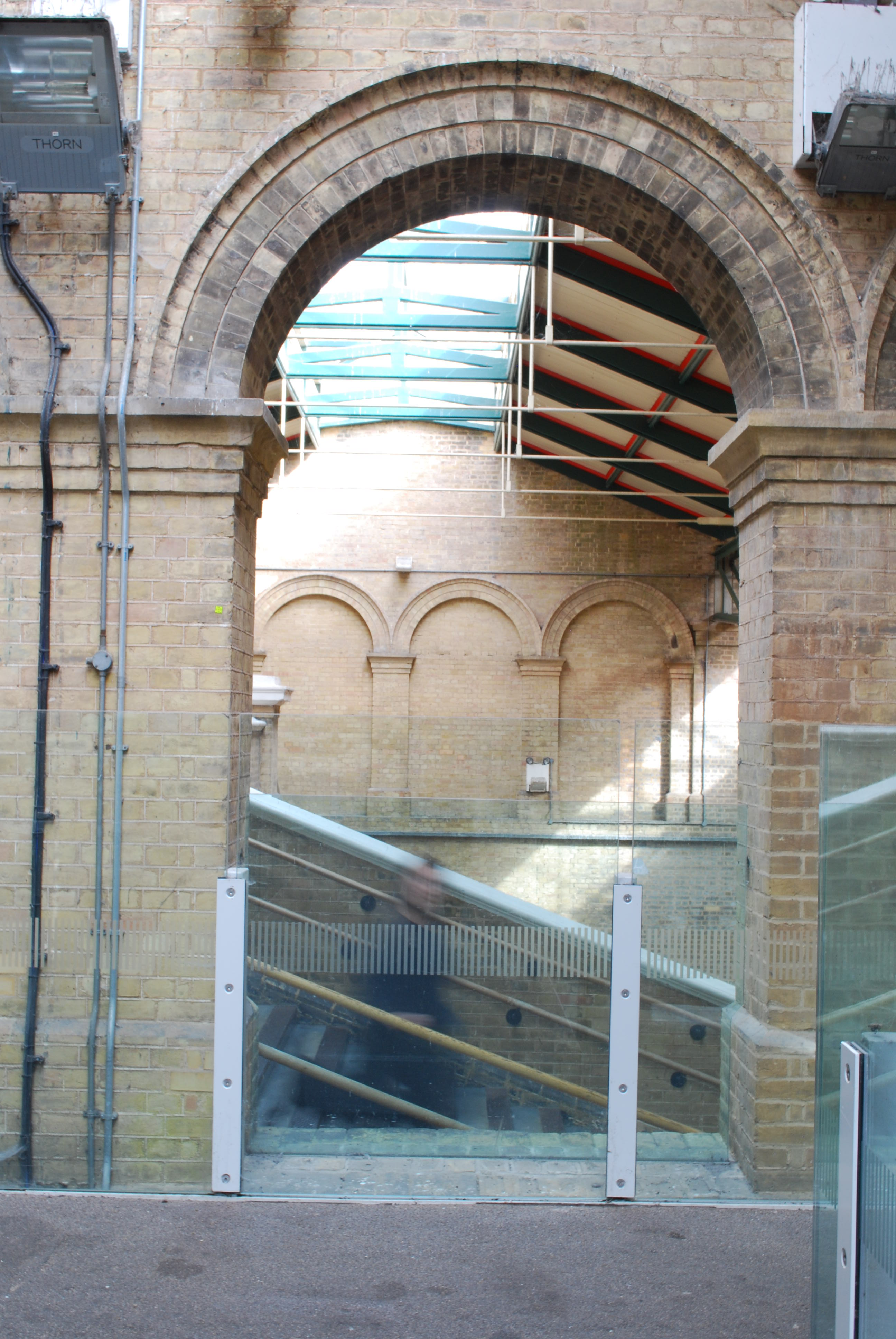
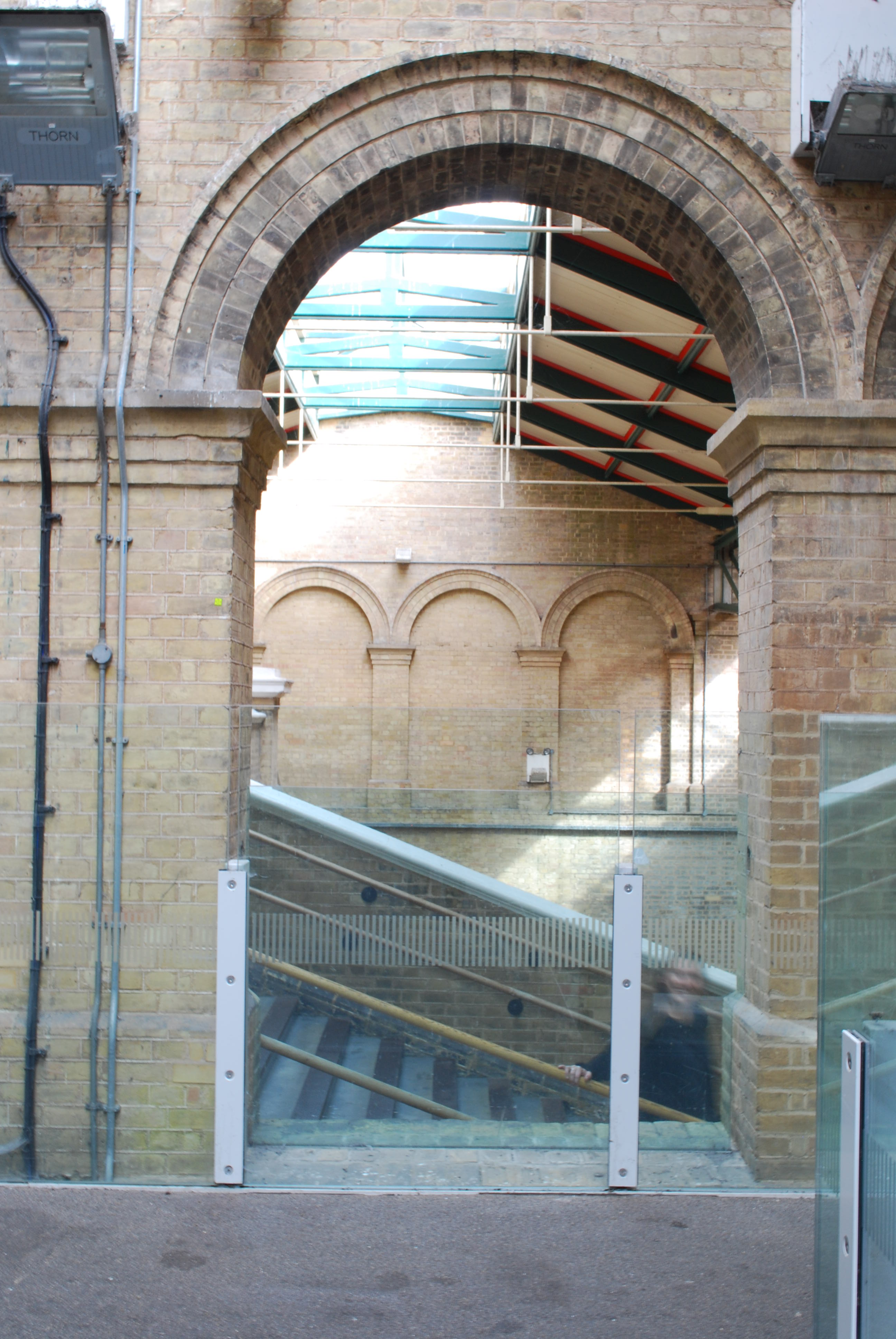
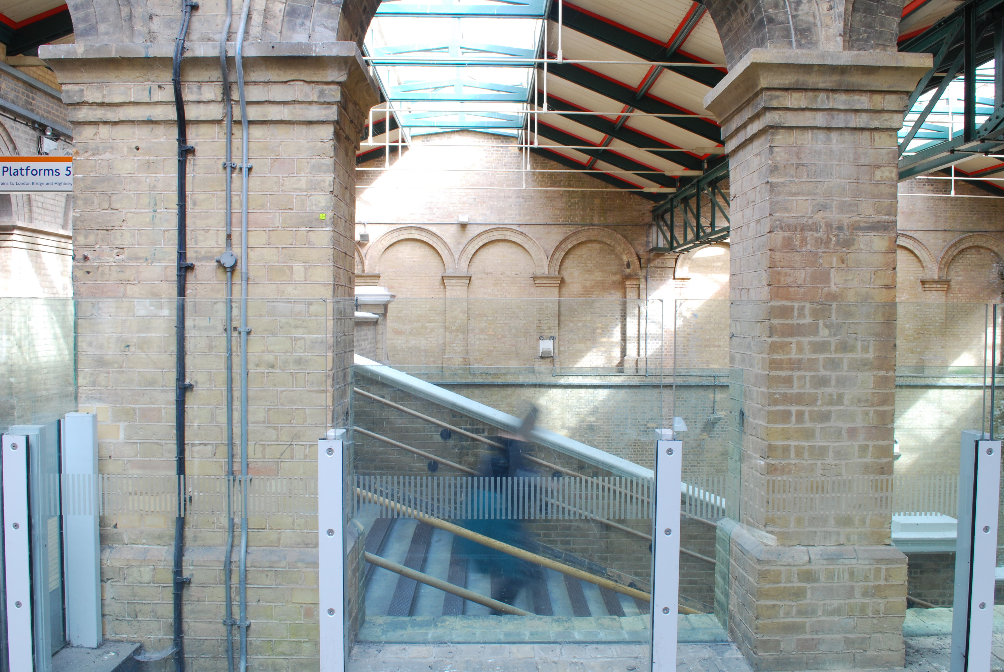
Crystal Palace Station
A friend told me about how structurally beautiful Crystal Palace train station was and she was correct. I loved the brick work and height it had inside. I came across this great brick archway. On the other side were steps. I had a vision of capturing a cloud of people hurrying up or down the stairs framed by the archway. Alas when I was there it was the middle of the day and very empty. It was somewhere I wanted to revisit.
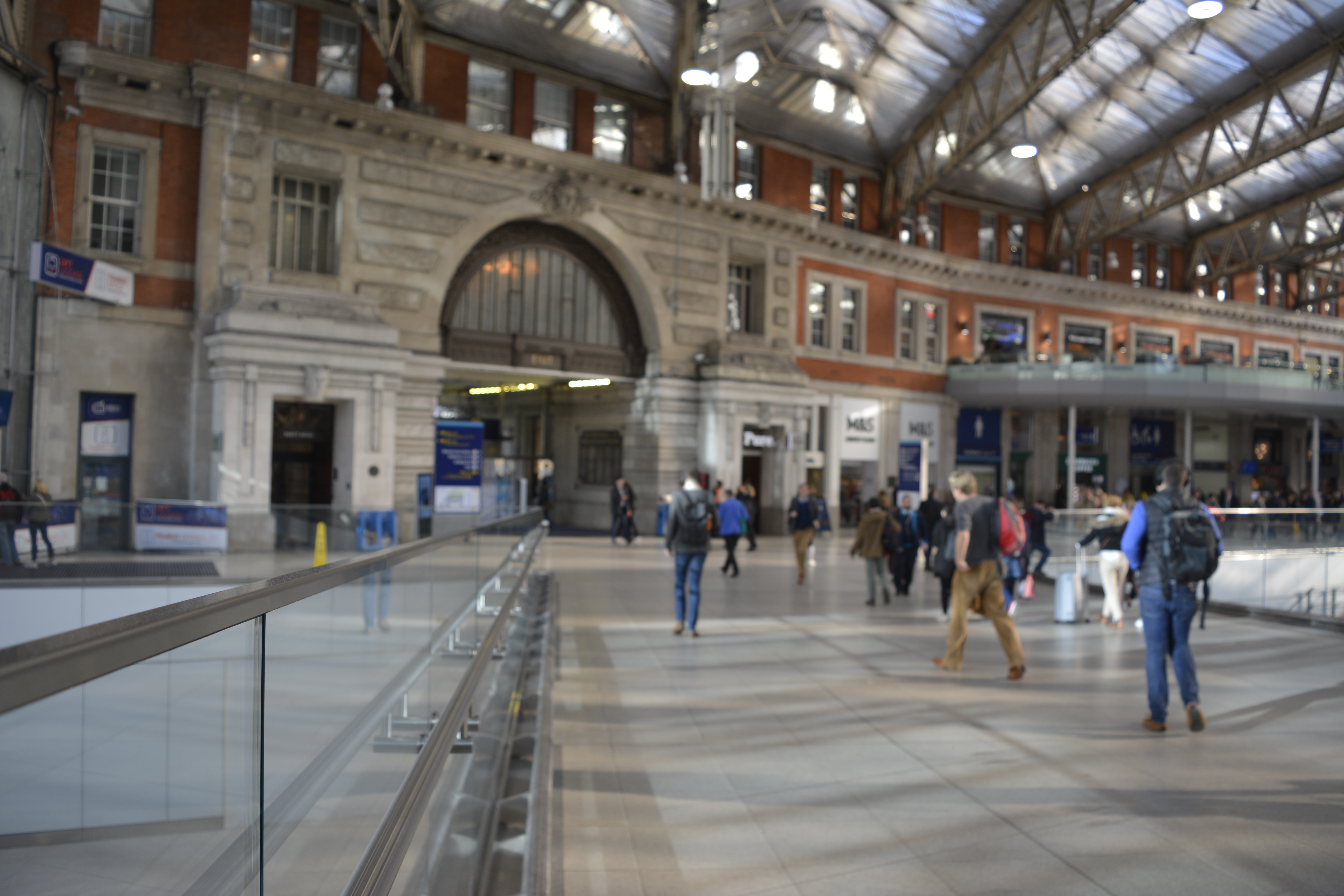
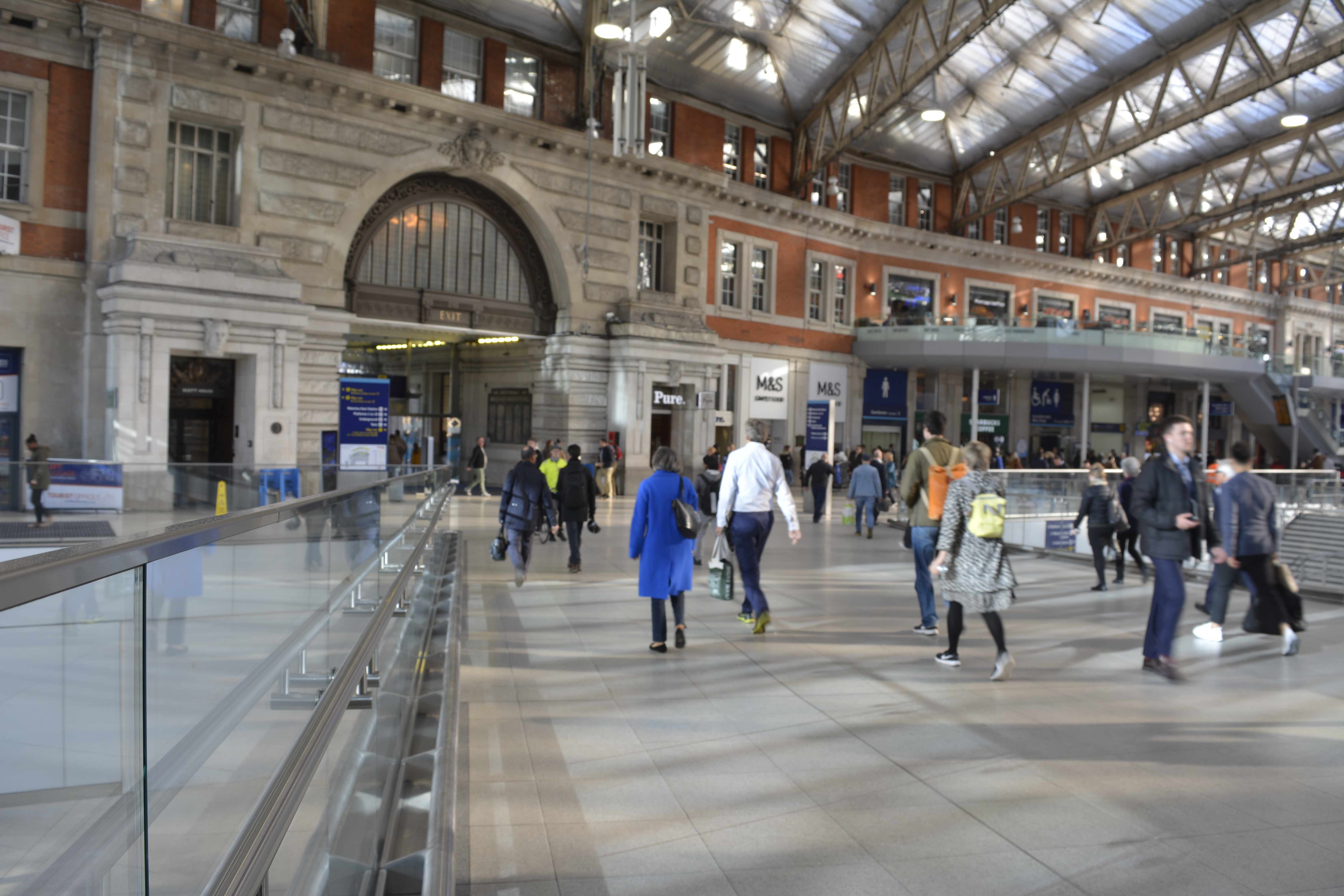
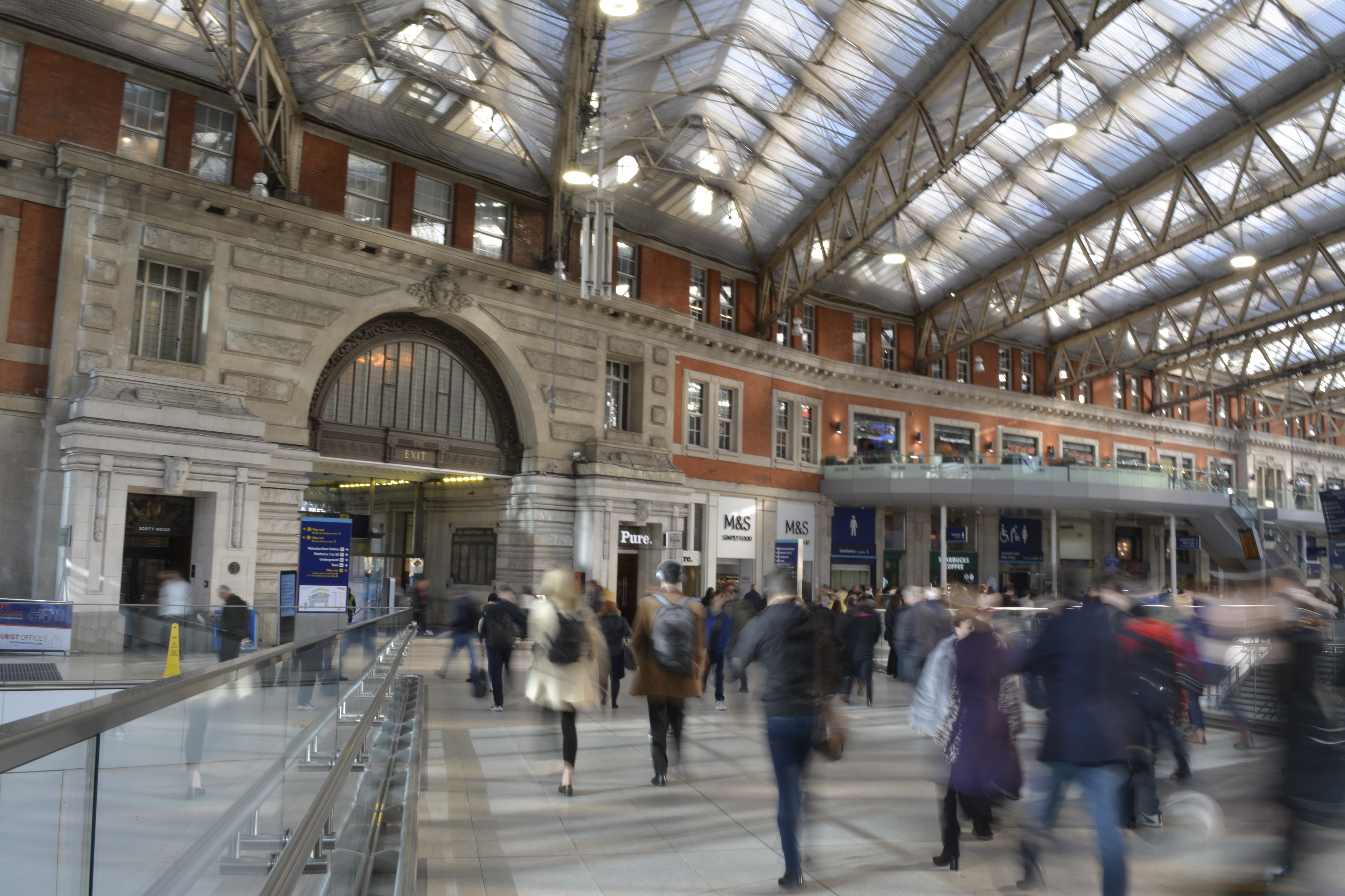
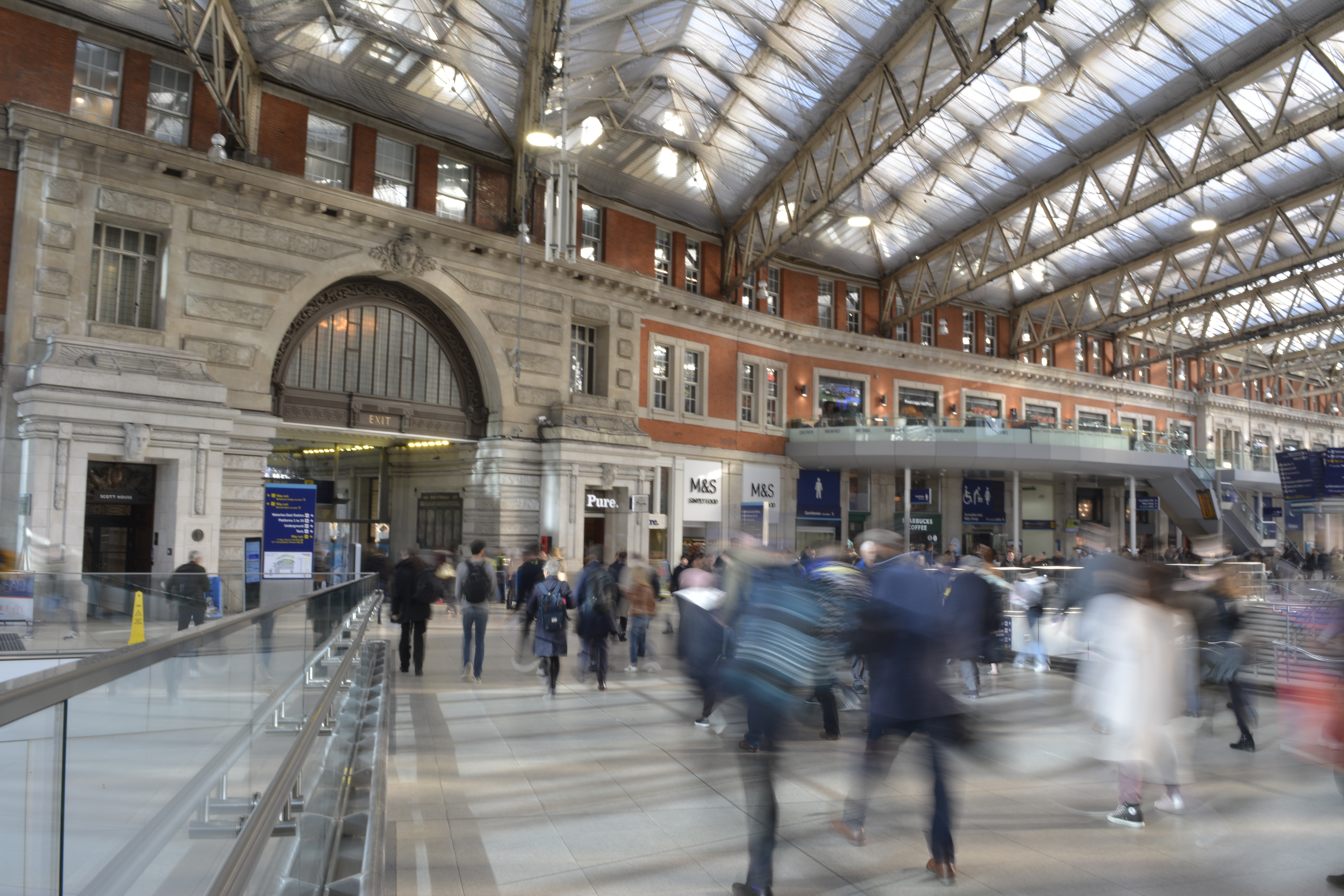
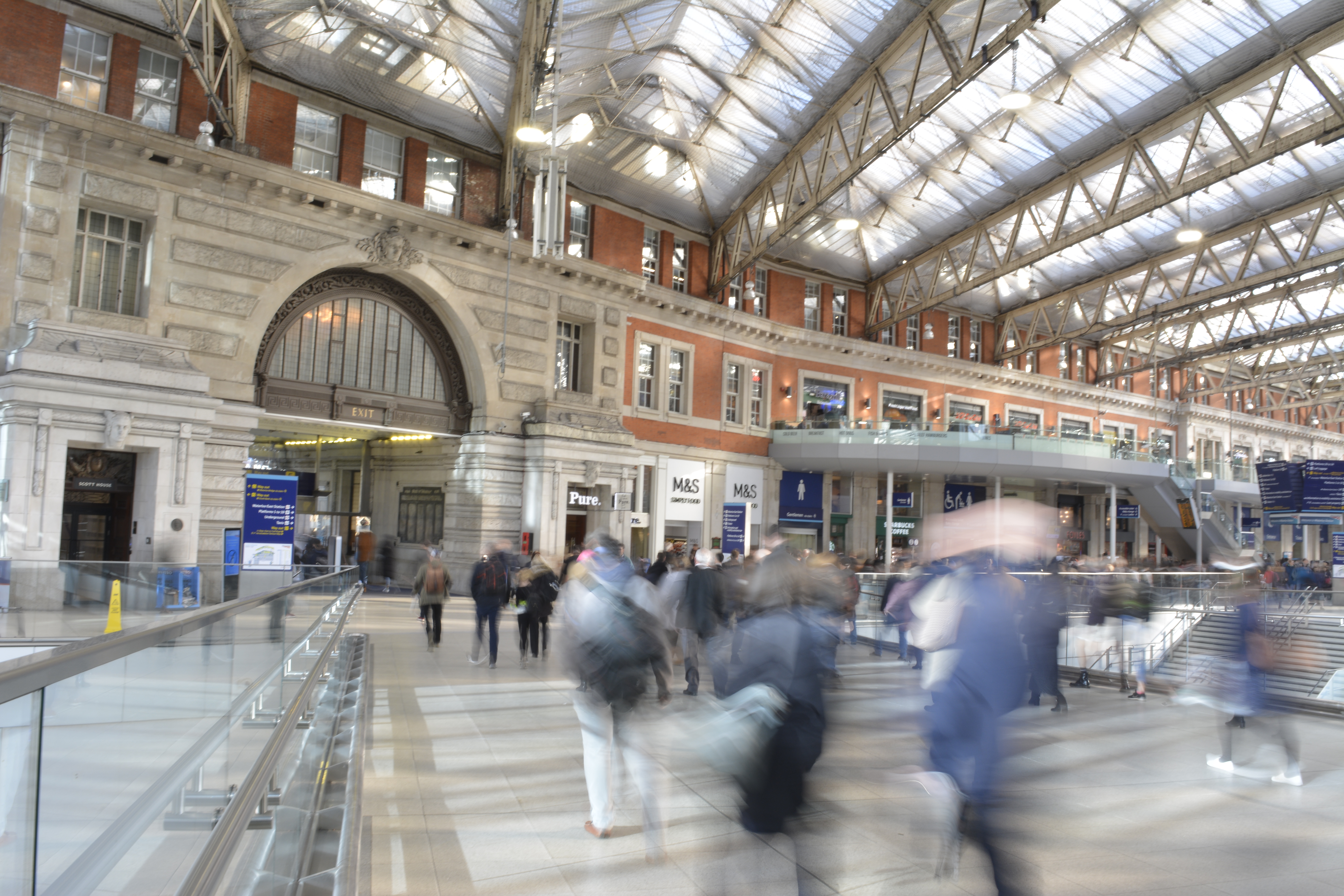
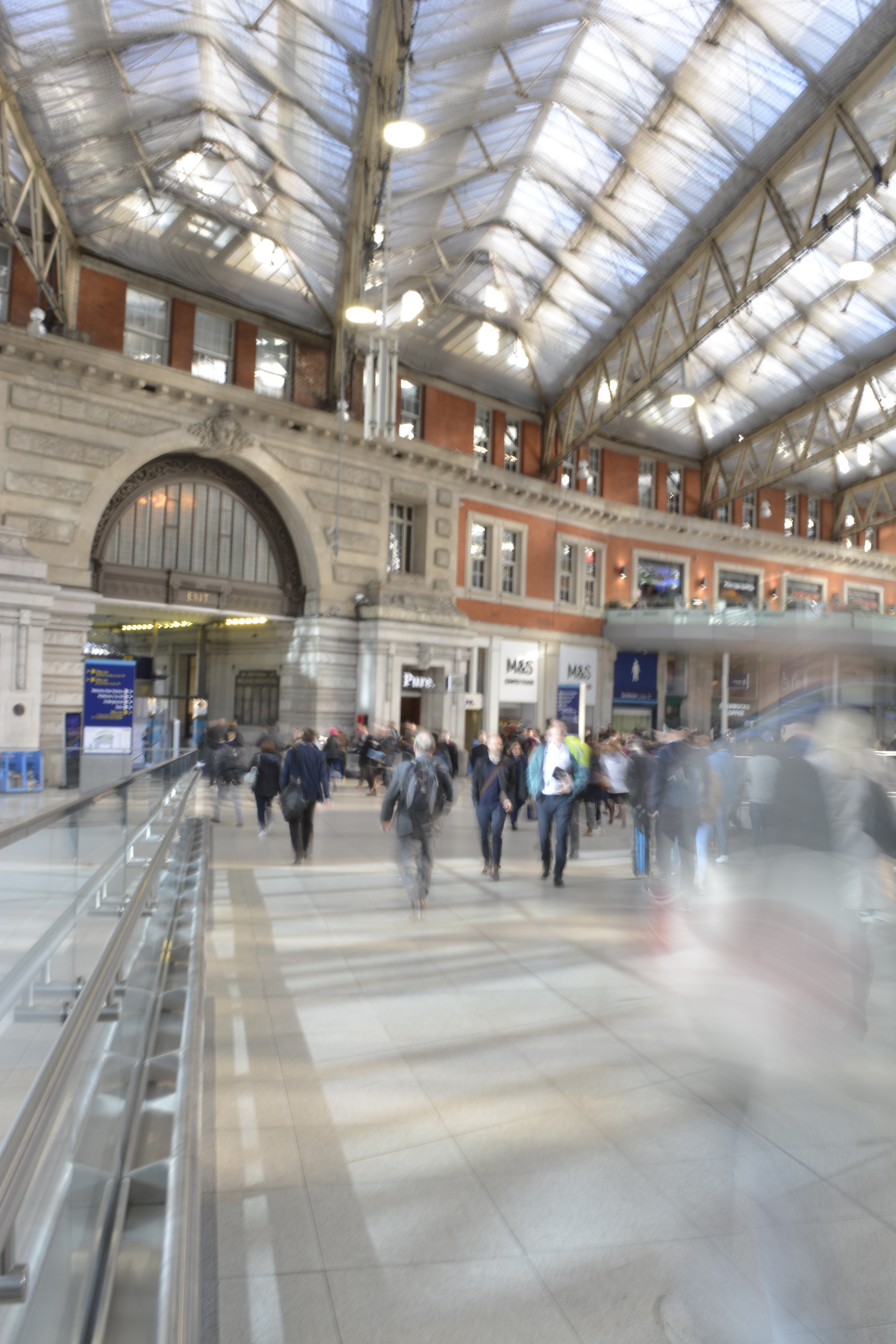
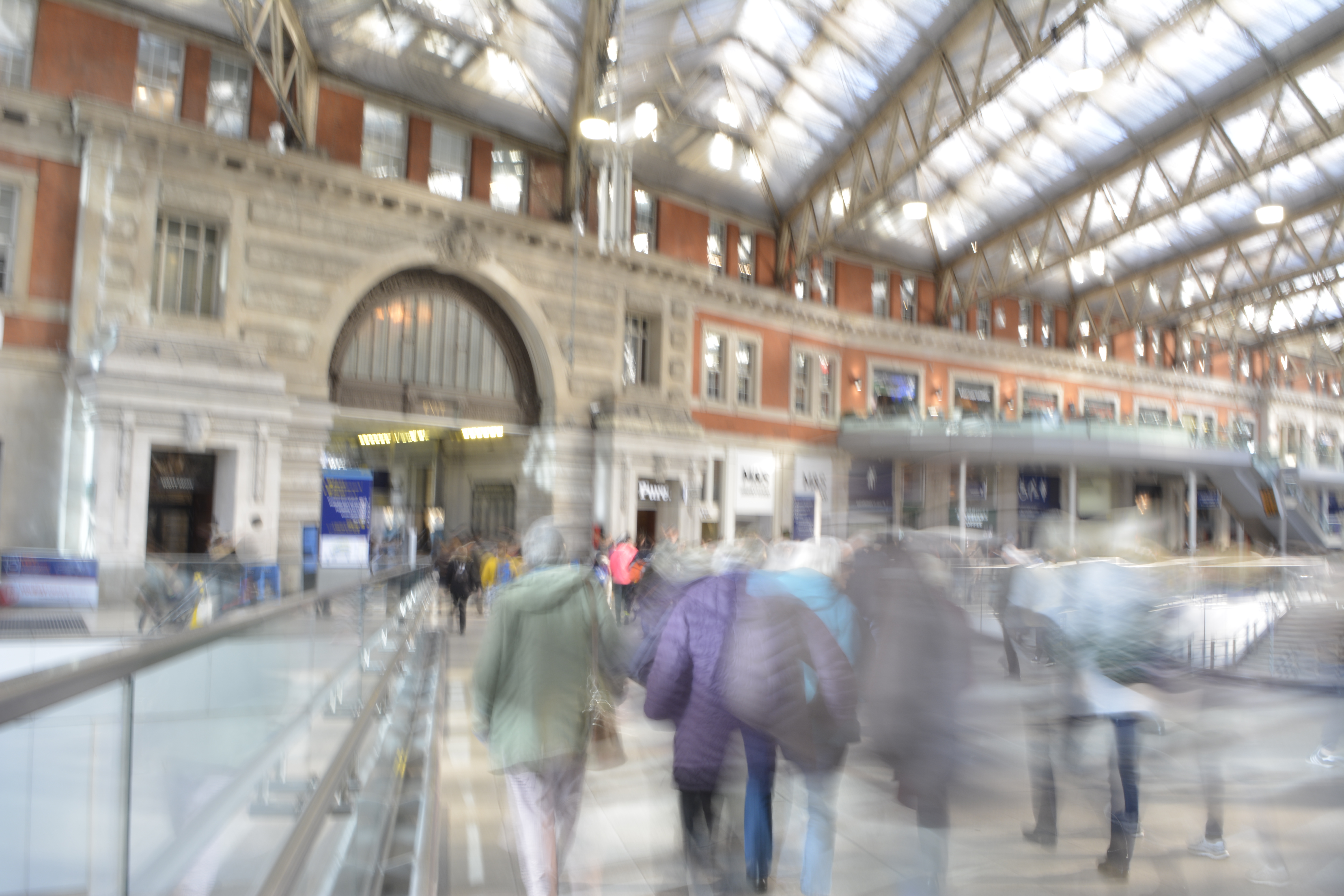
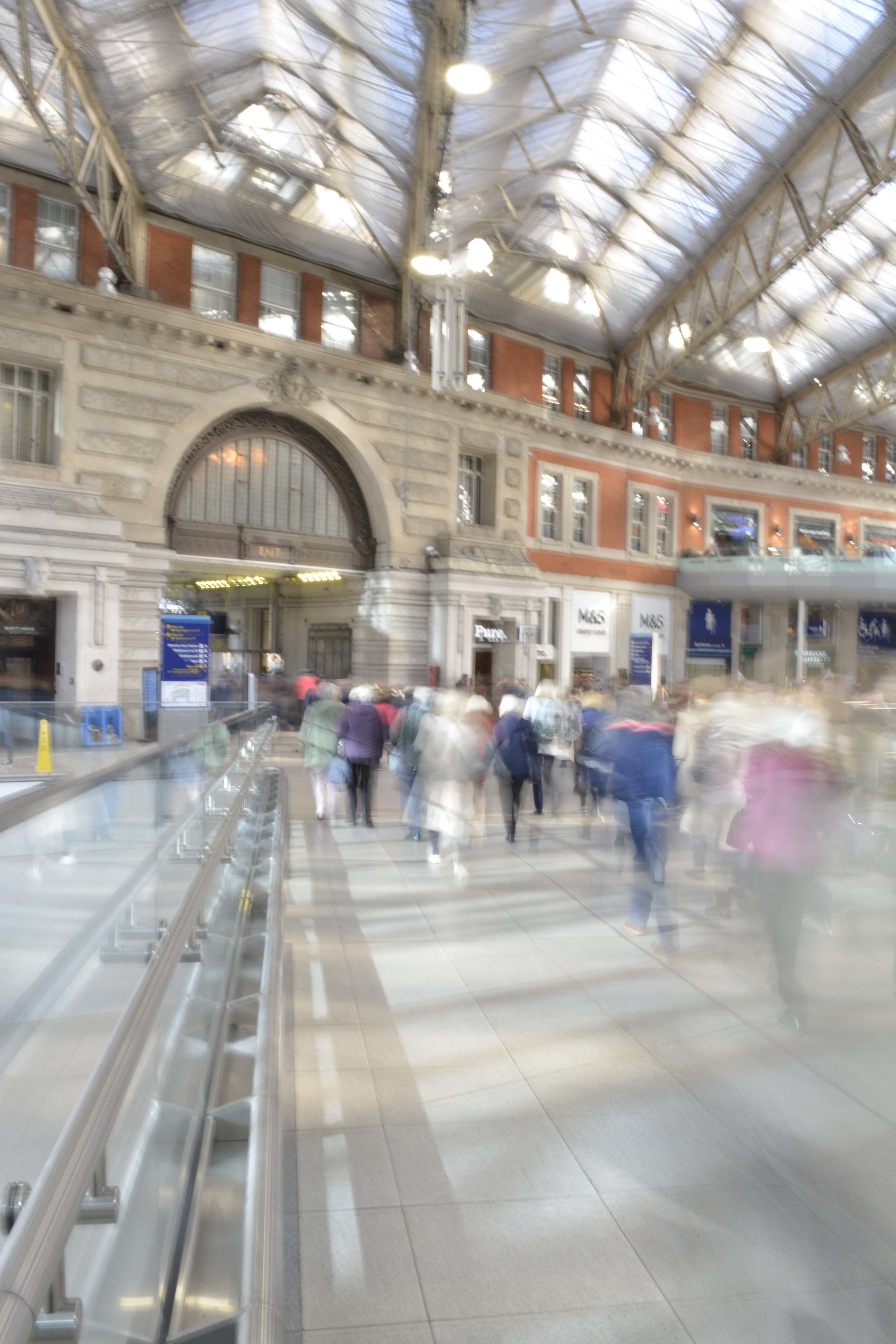
Waterloo Station
I knew that in Waterloo station I wouldn’t be able to set up my tripod but I wanted to try and get some shots to see what would work. Moving to the side of a walkway I tried to steady the my camera on a rail to reduce the camera shake.
I managed to capture some motion blur from the passengers however still incurred some camera shake, so the background wasn’t sharp enough.