P2, P3, P4
I like to take someone with me when I’m travelling up to London, I never want to go by myself. But then I always feel guilty when I keep them waiting while I’m taking photographs. Today I decided to go on my own for this recce trip to Central London. The weather was bright and dry.
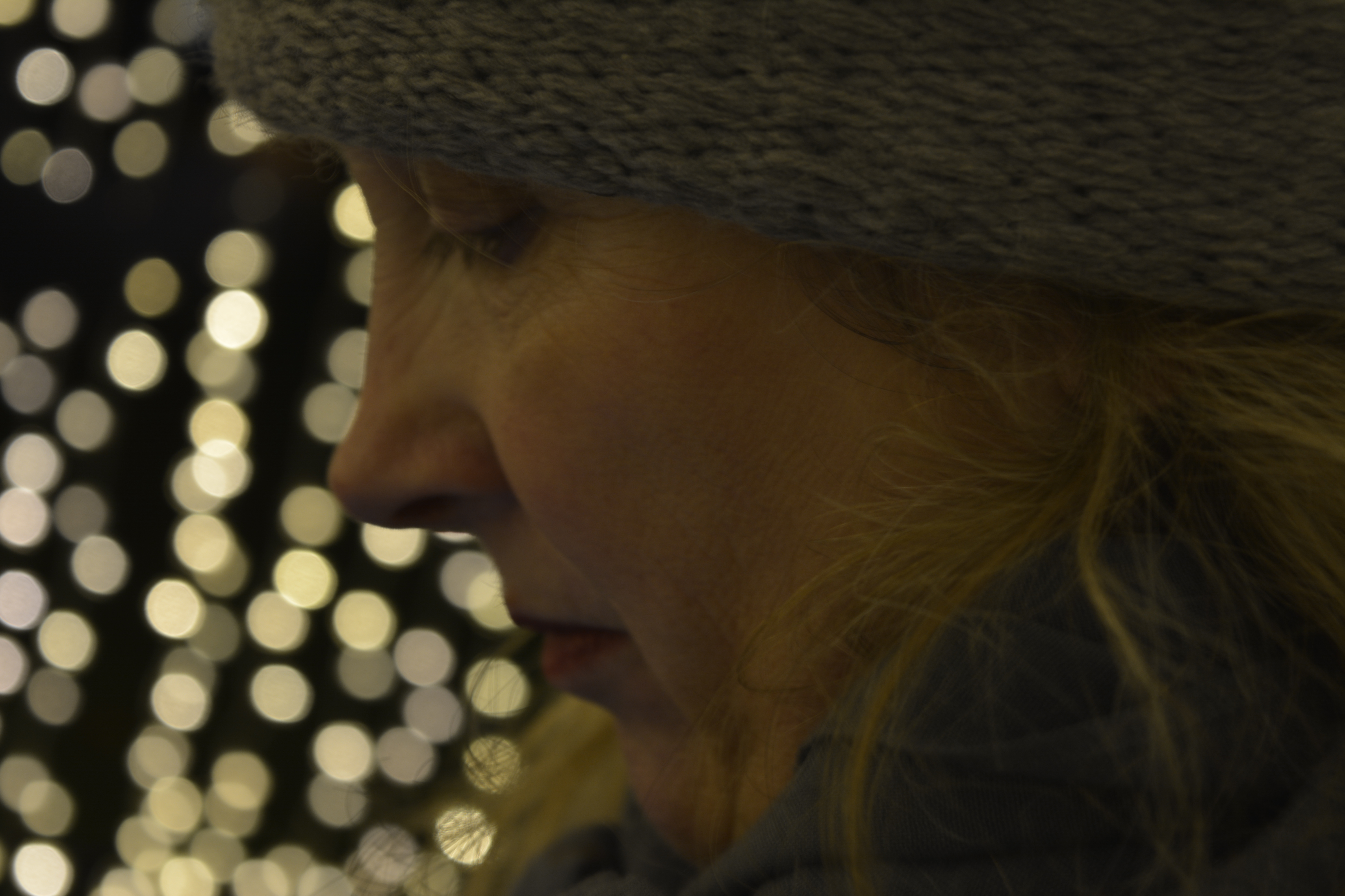
I pushed myself to go it alone, as I remember the other times when I bring someone with me. I’m so glad I made the trip on my own, I have the freedom to really work on getting the correct photograph.
On this recce I made a total school boy error! Should have fully charged my battery for my camera before I left home!!!!! The first thing I have learnt during this project.
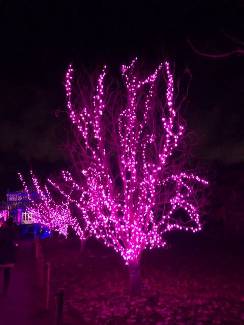
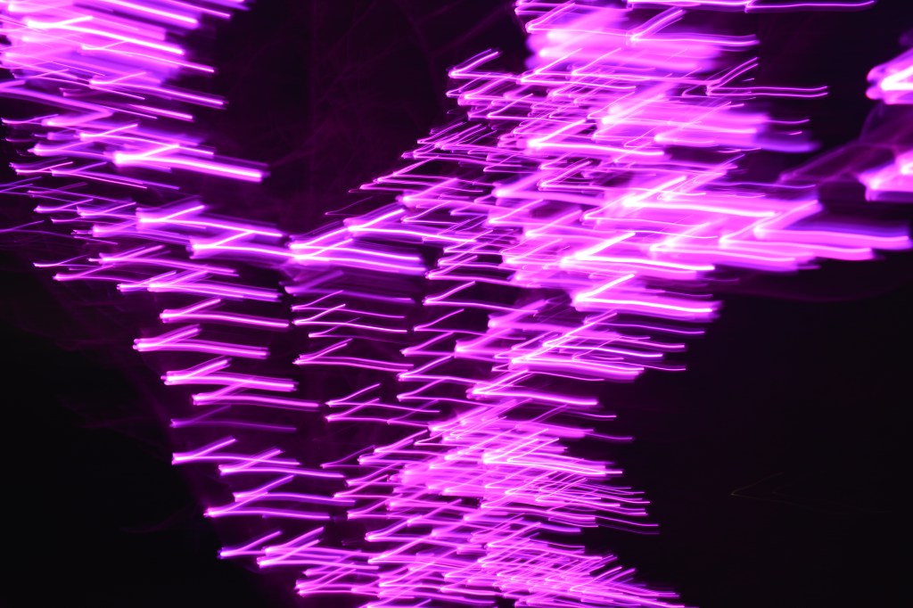
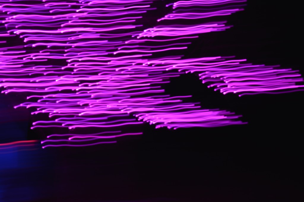
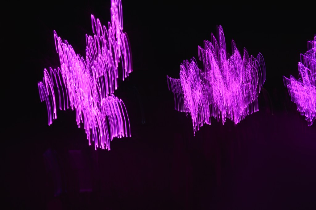
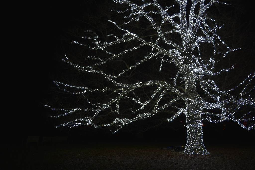
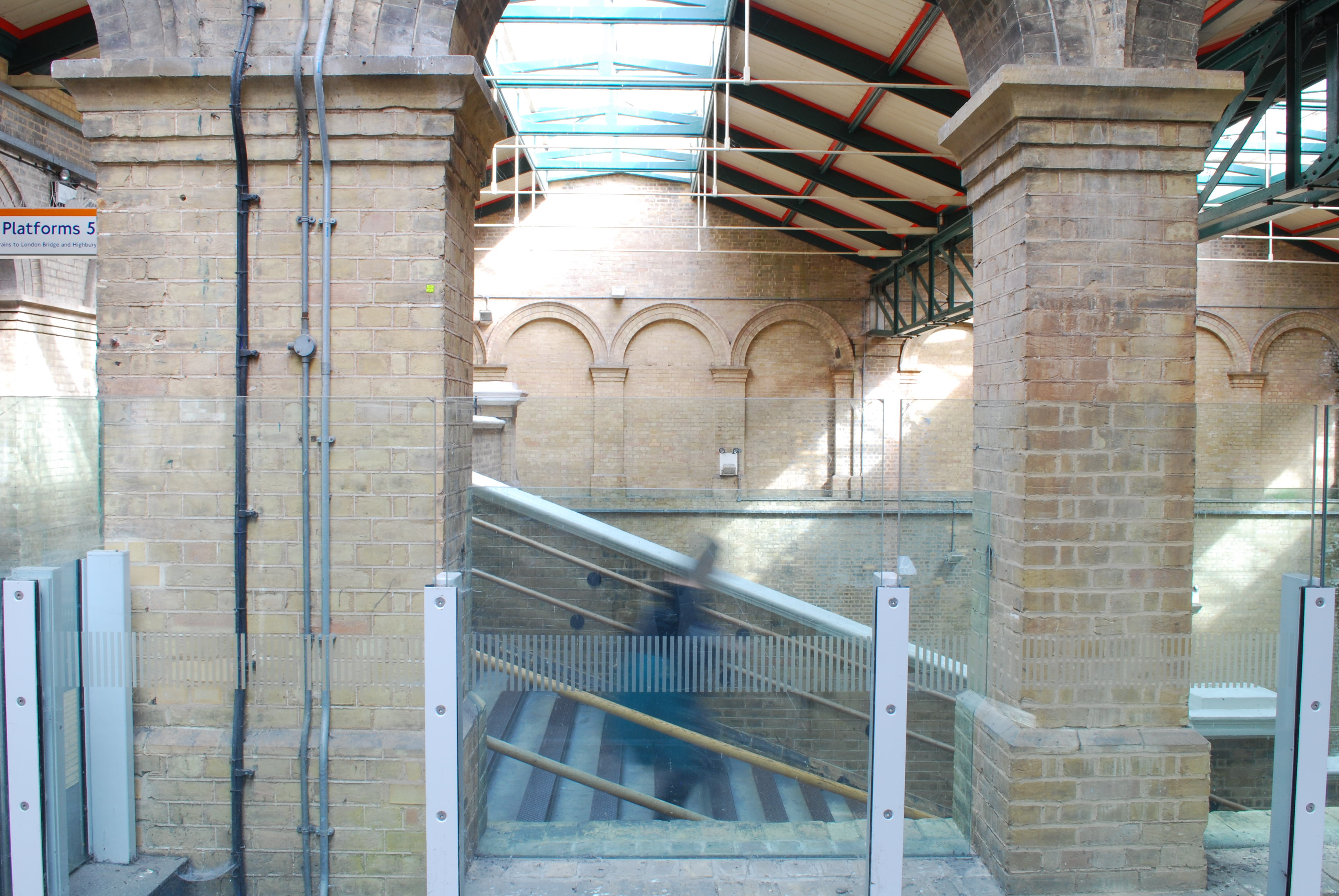
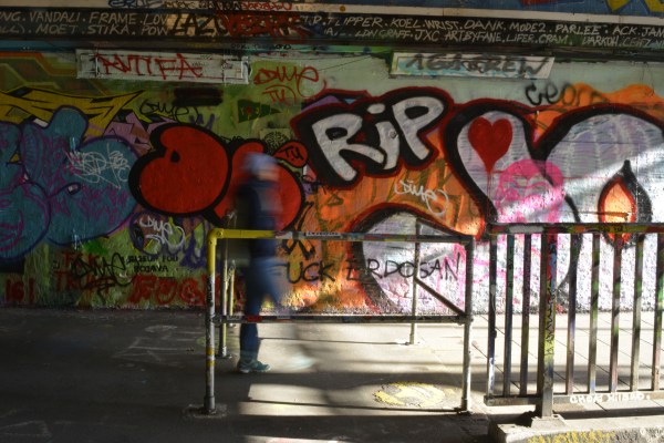
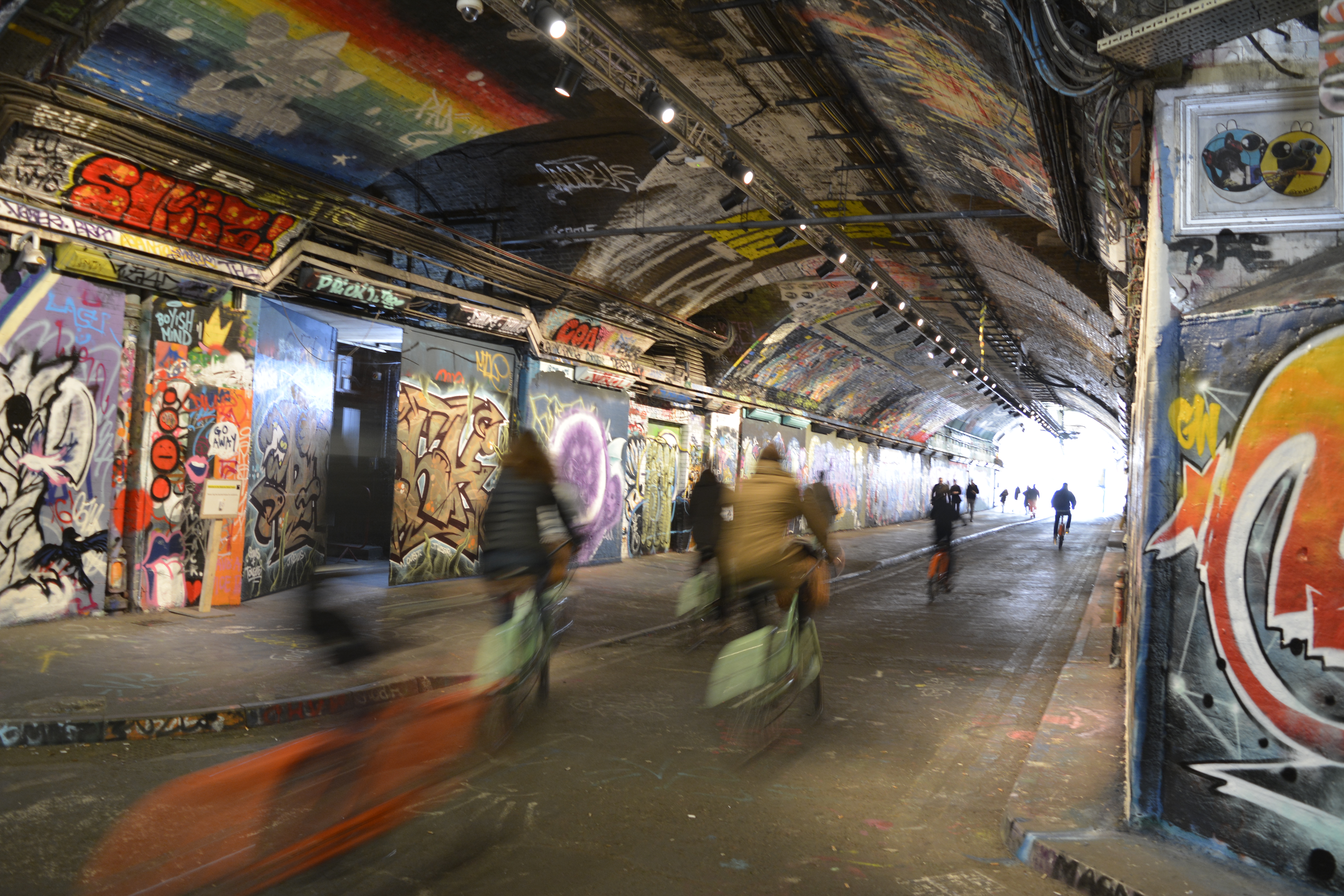
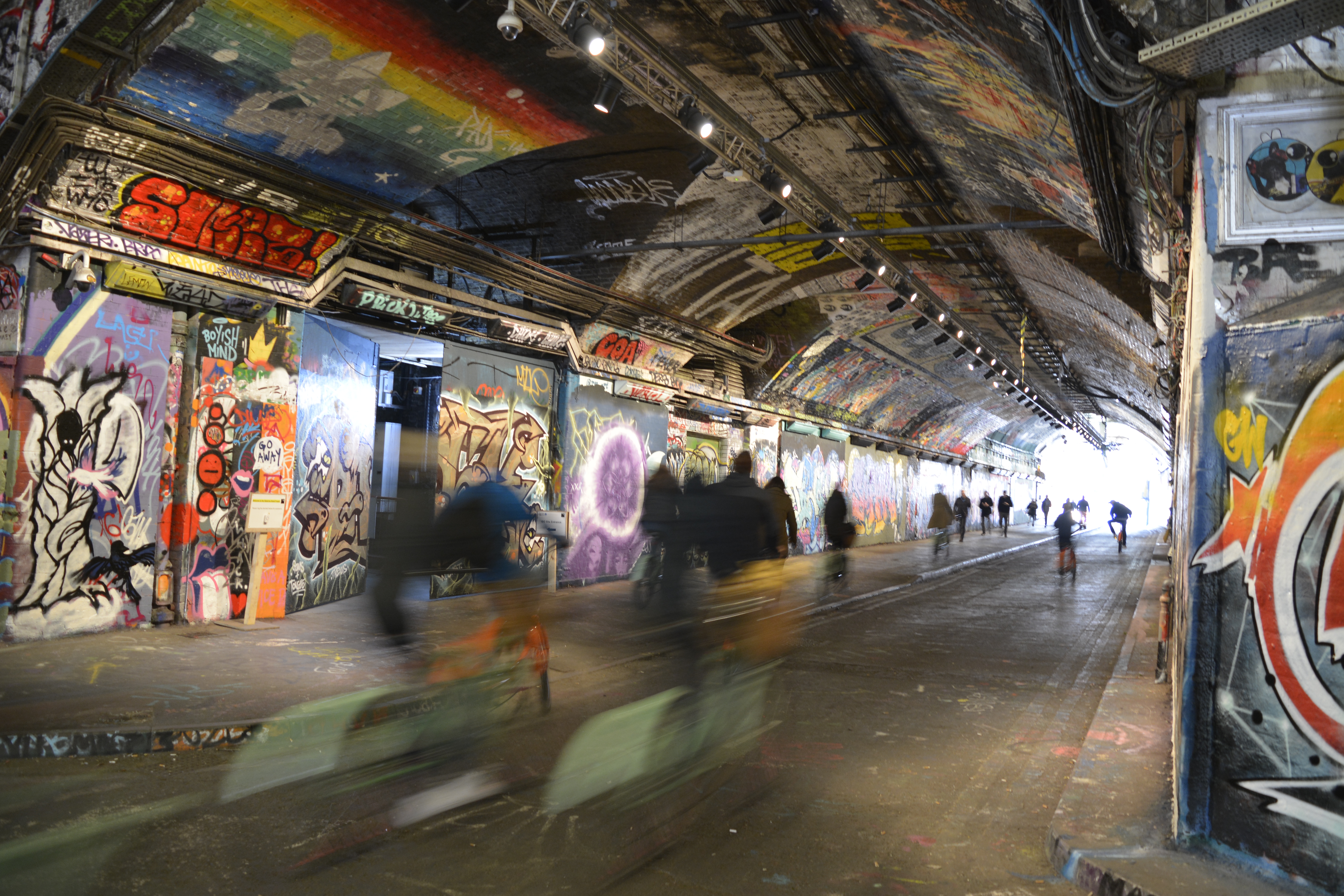
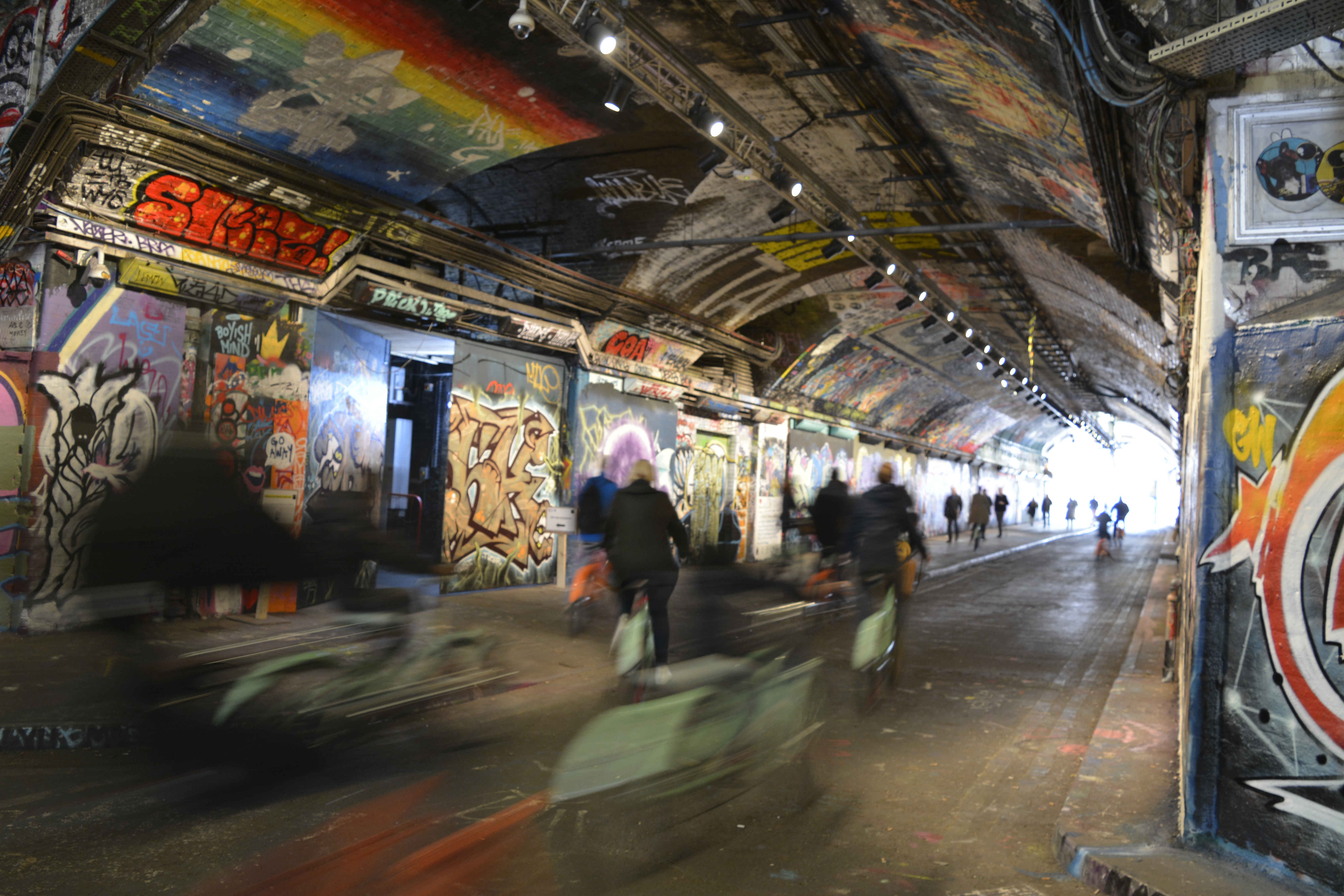
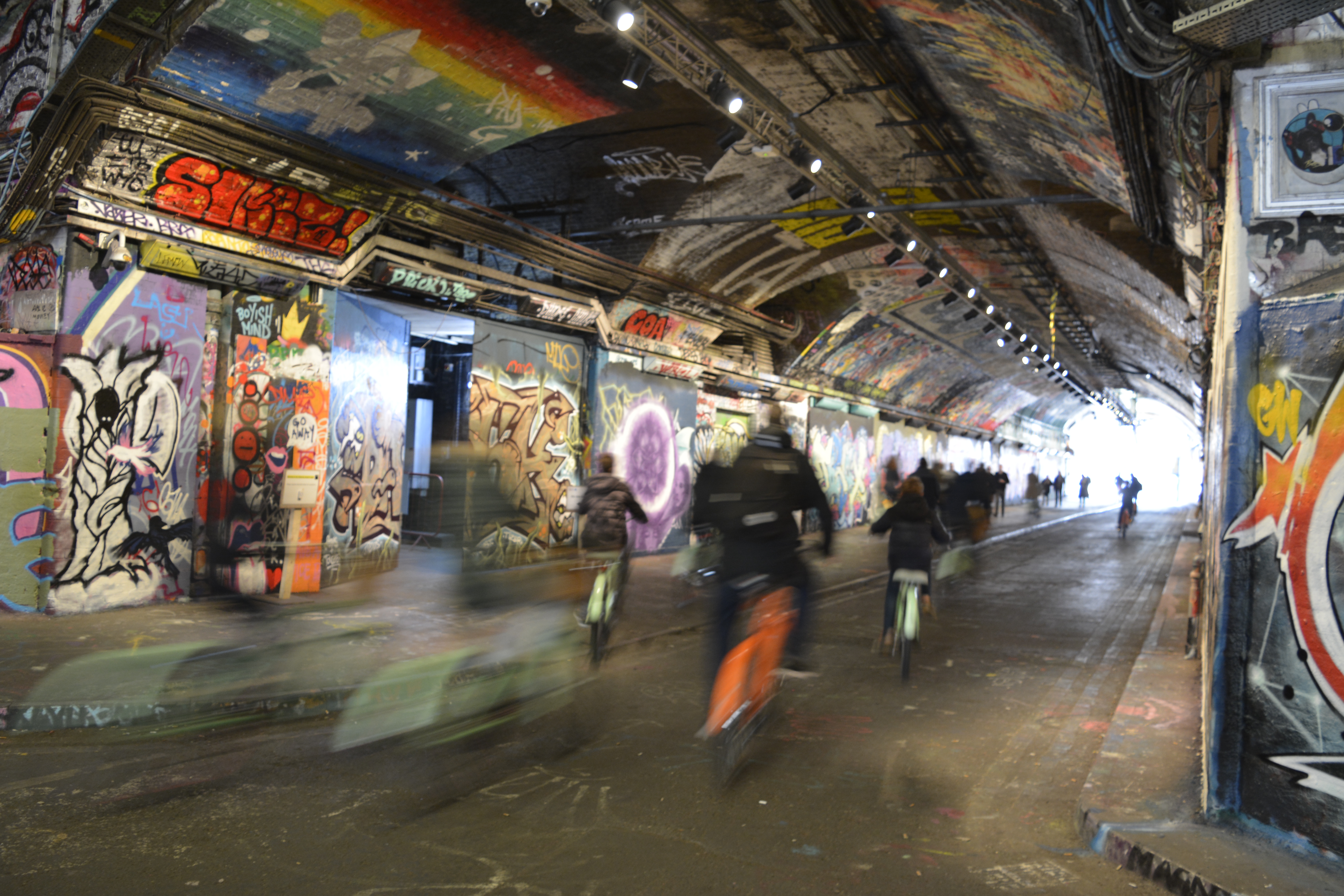
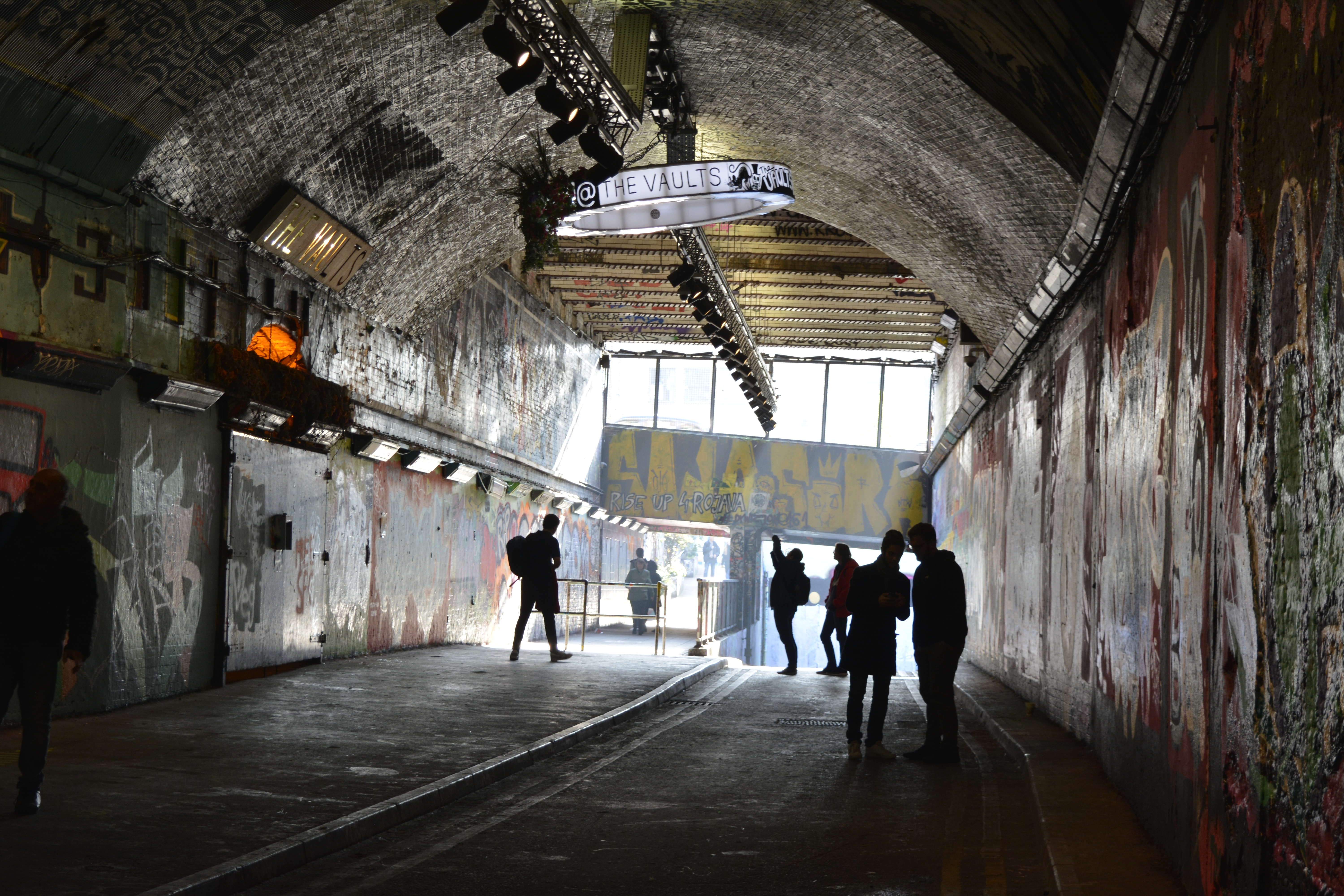
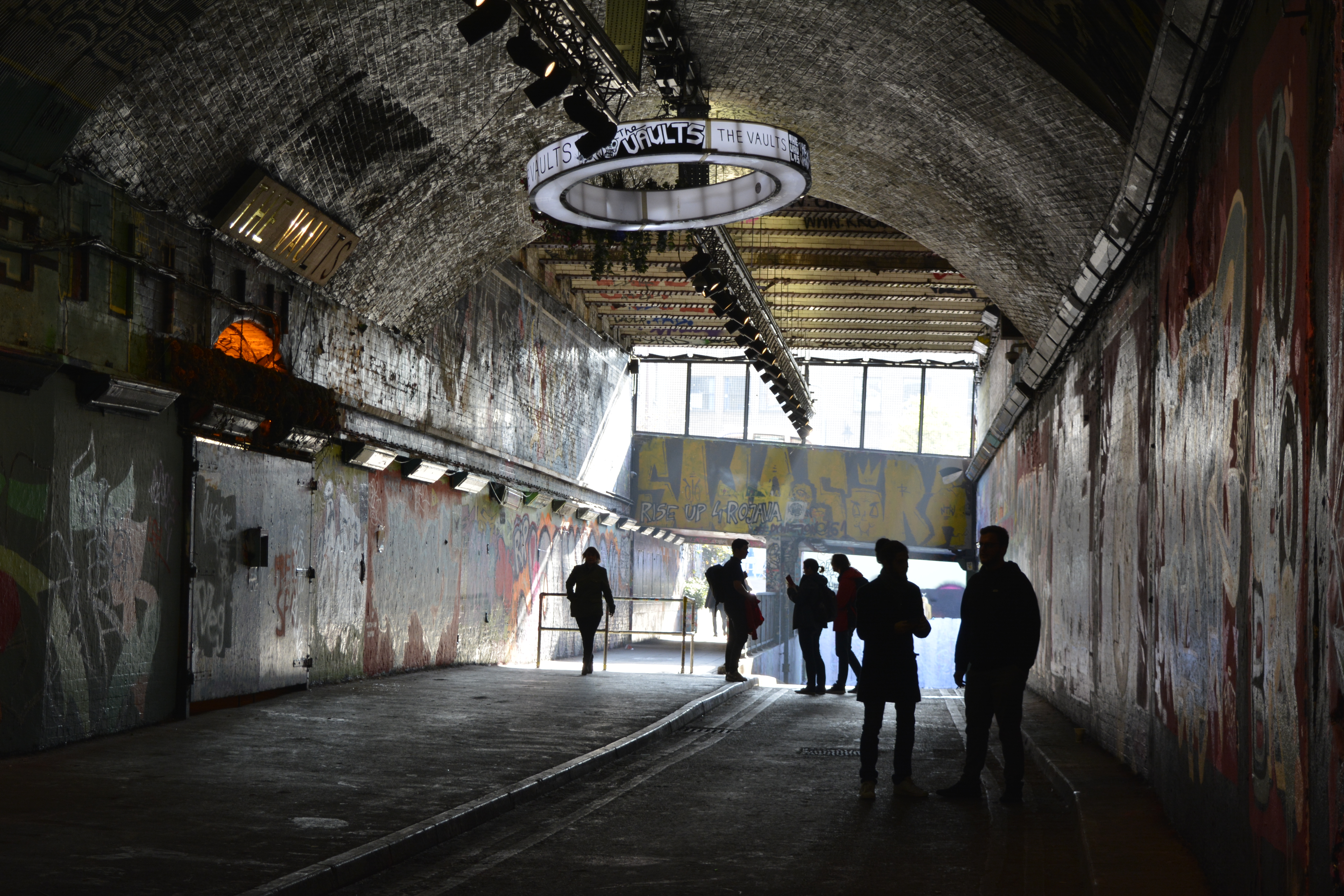
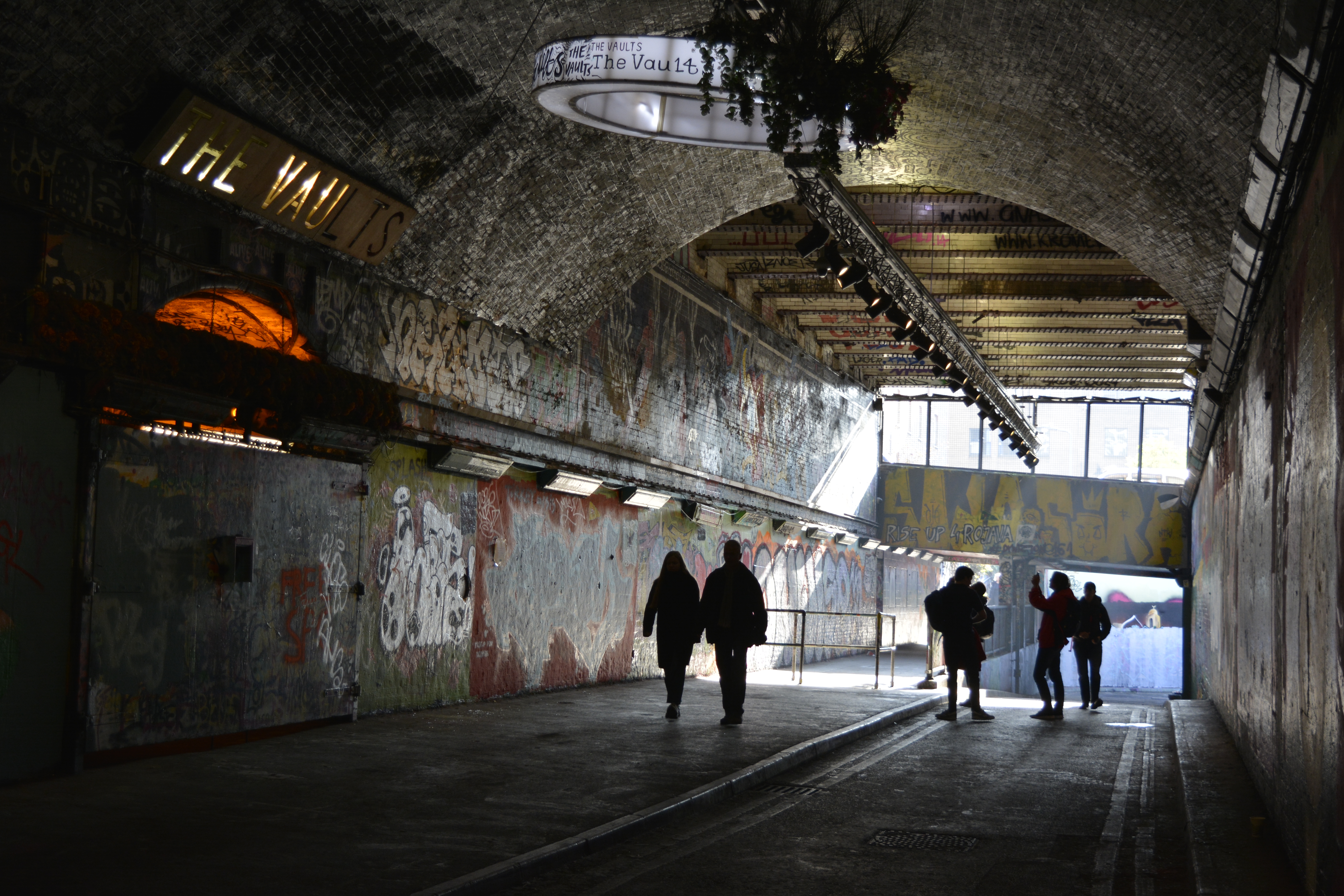
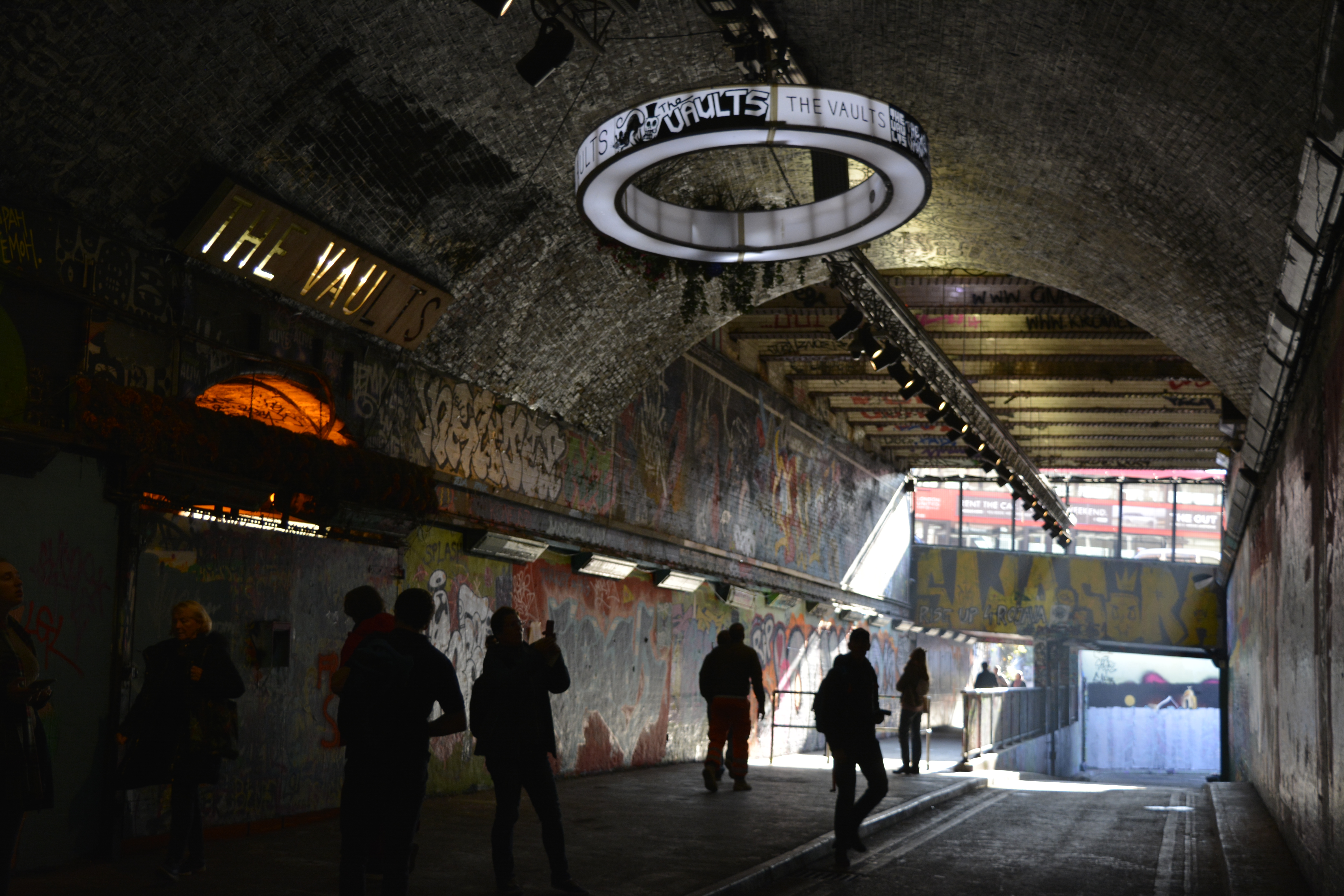
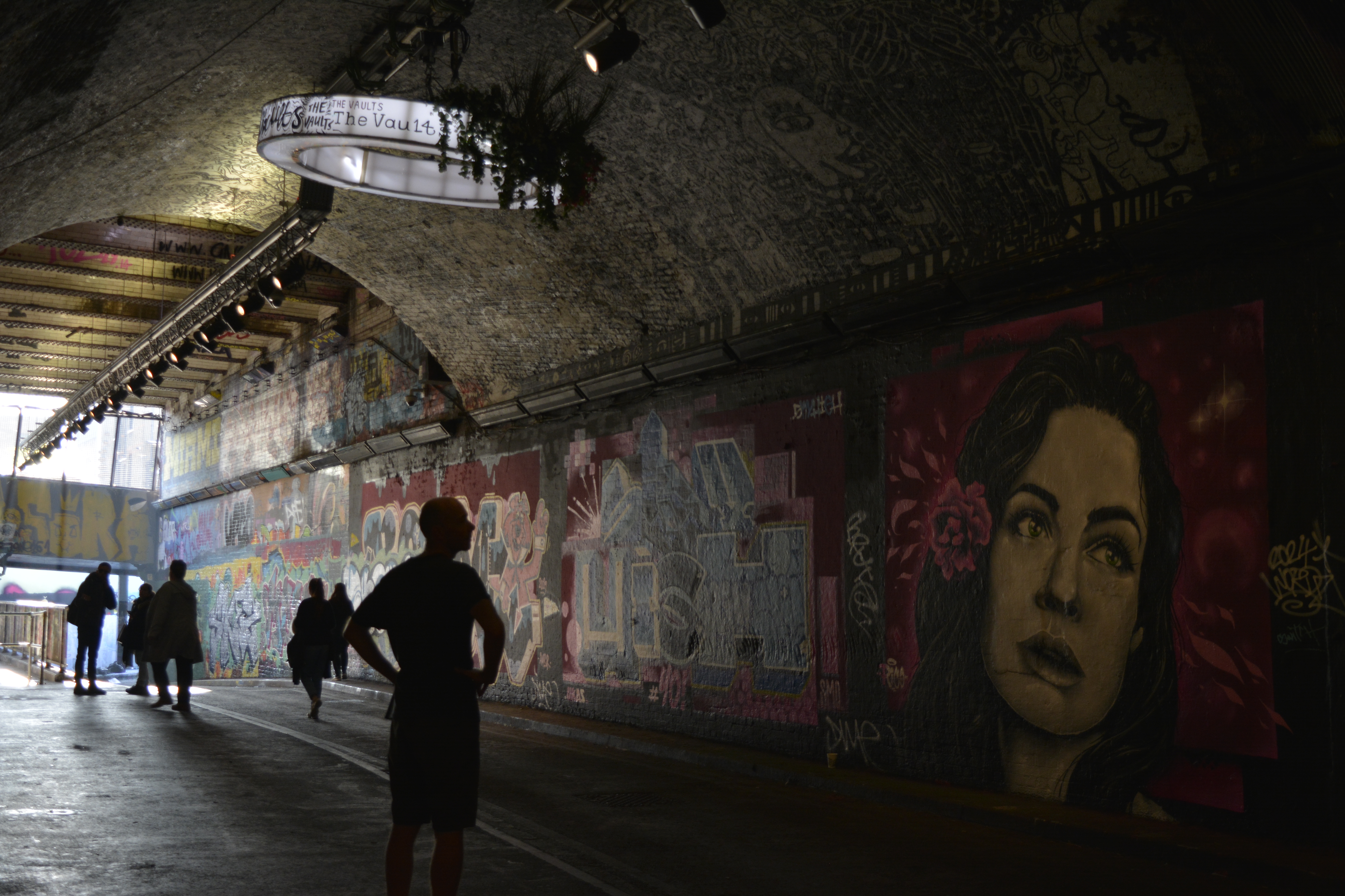
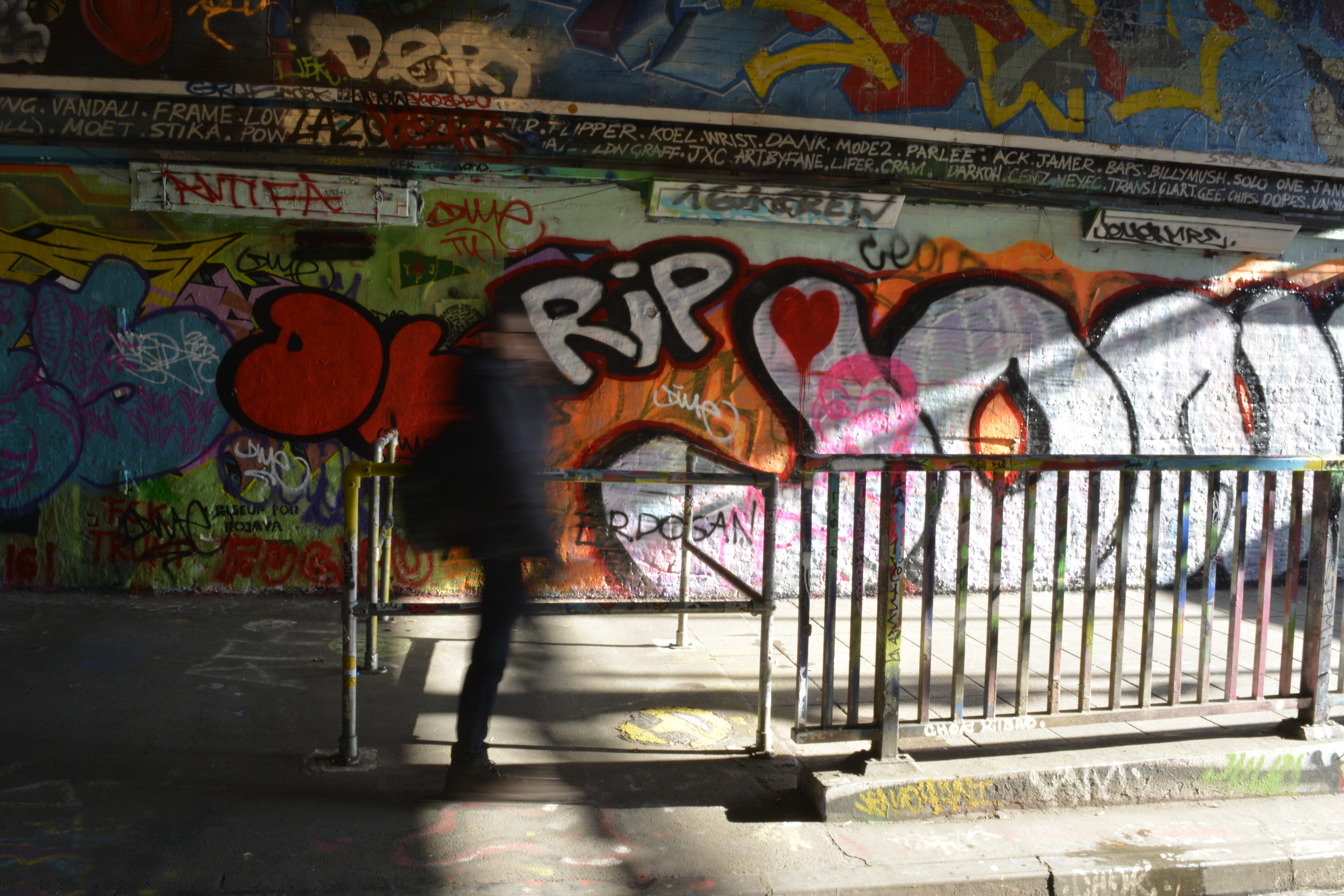
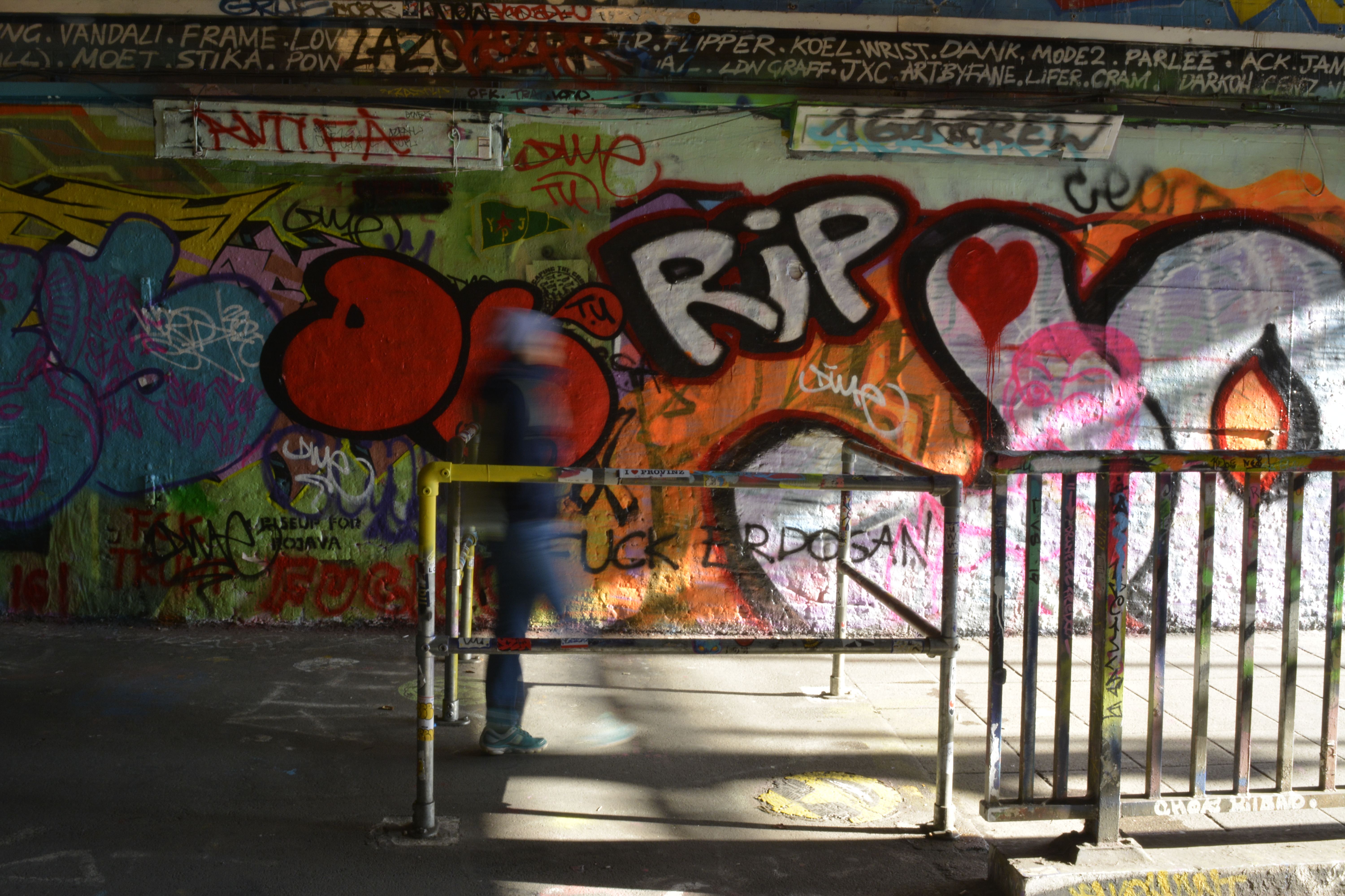
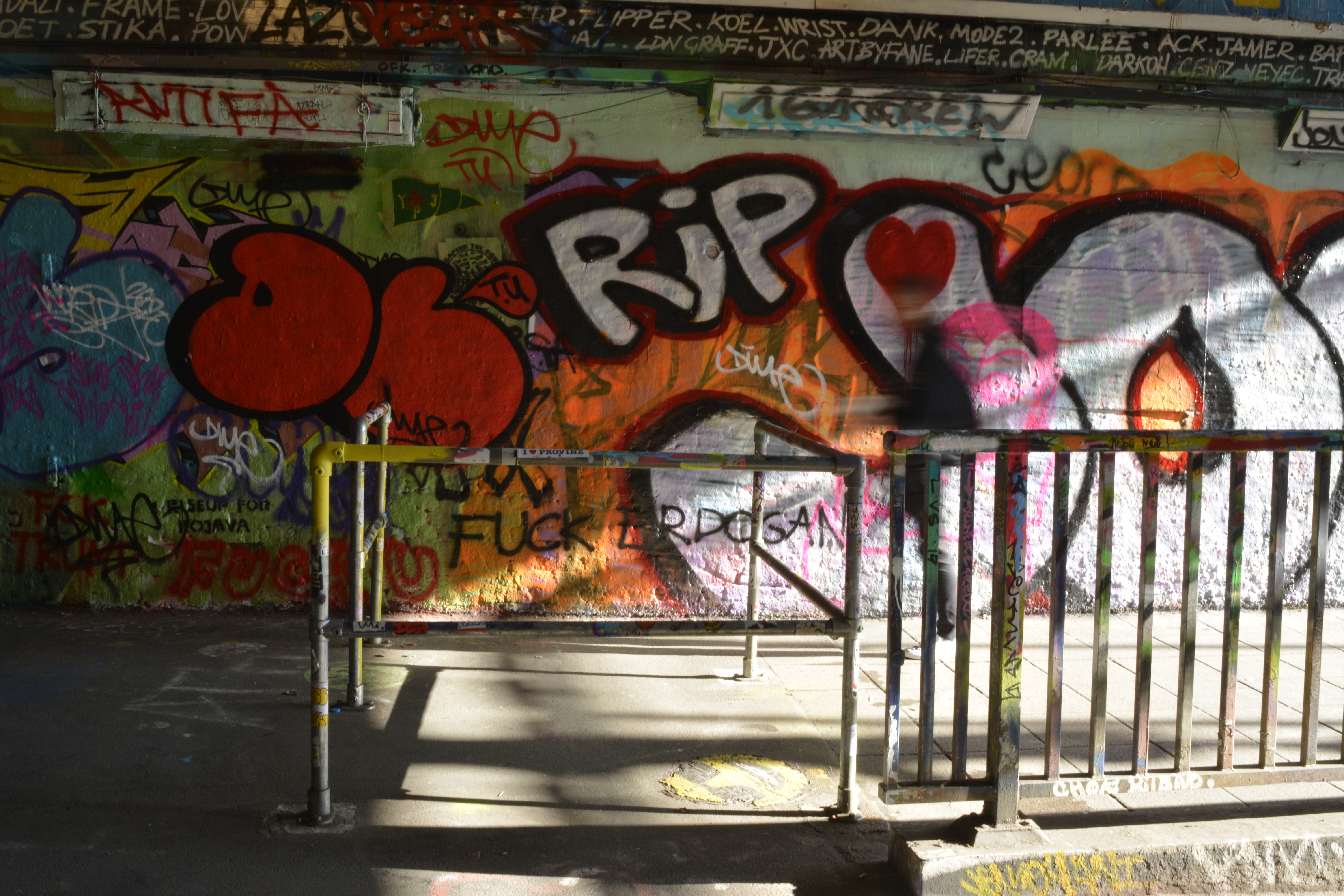
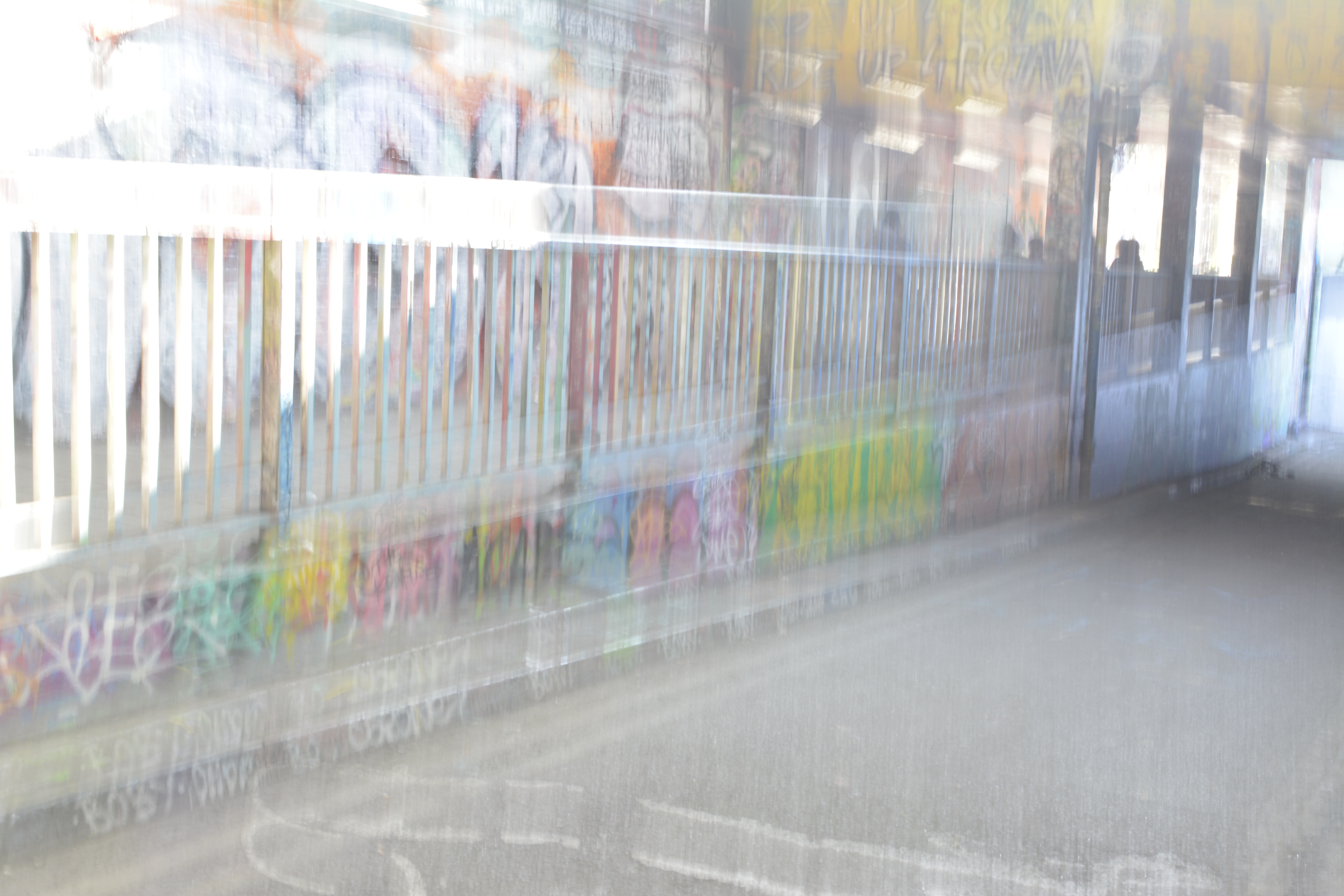
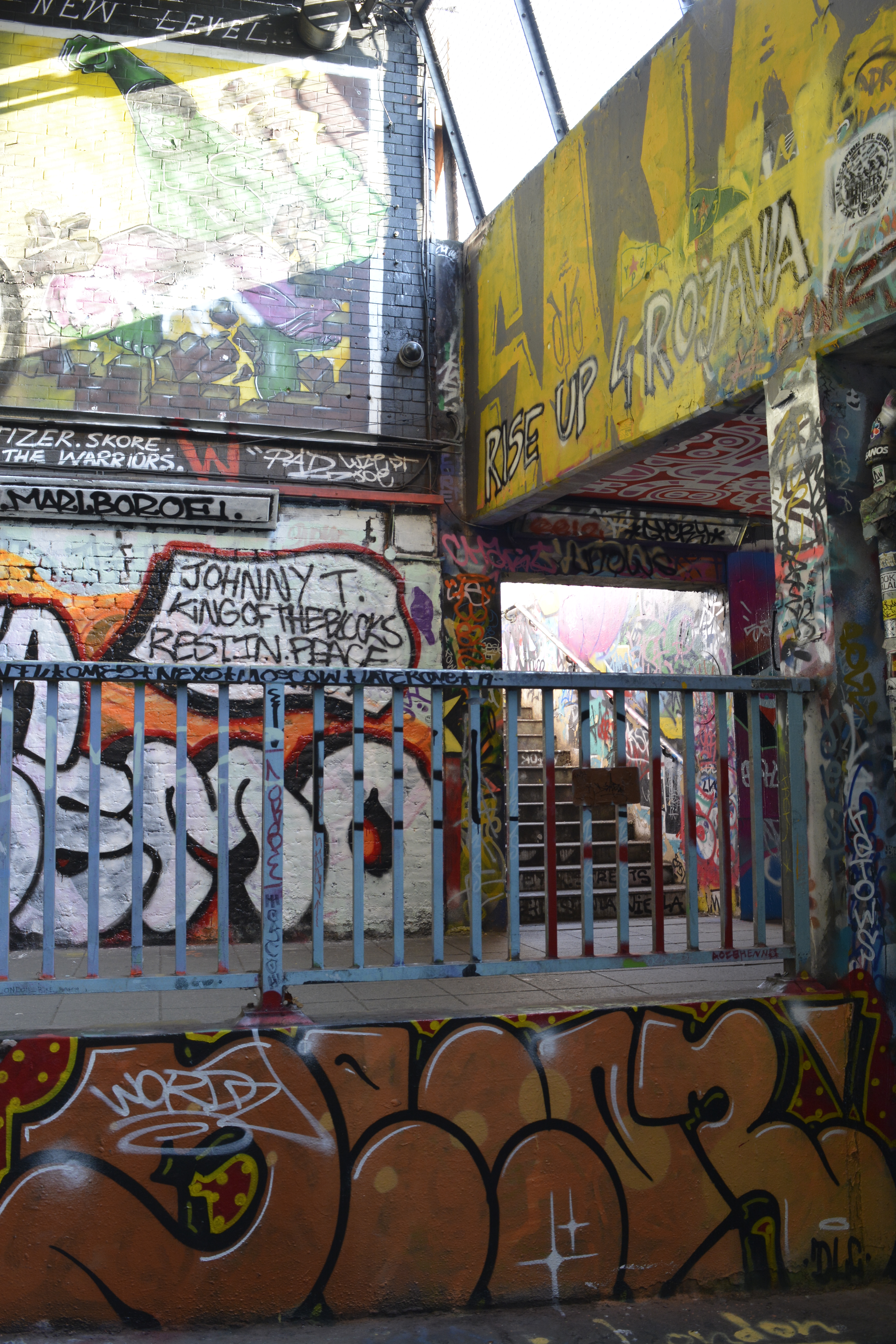
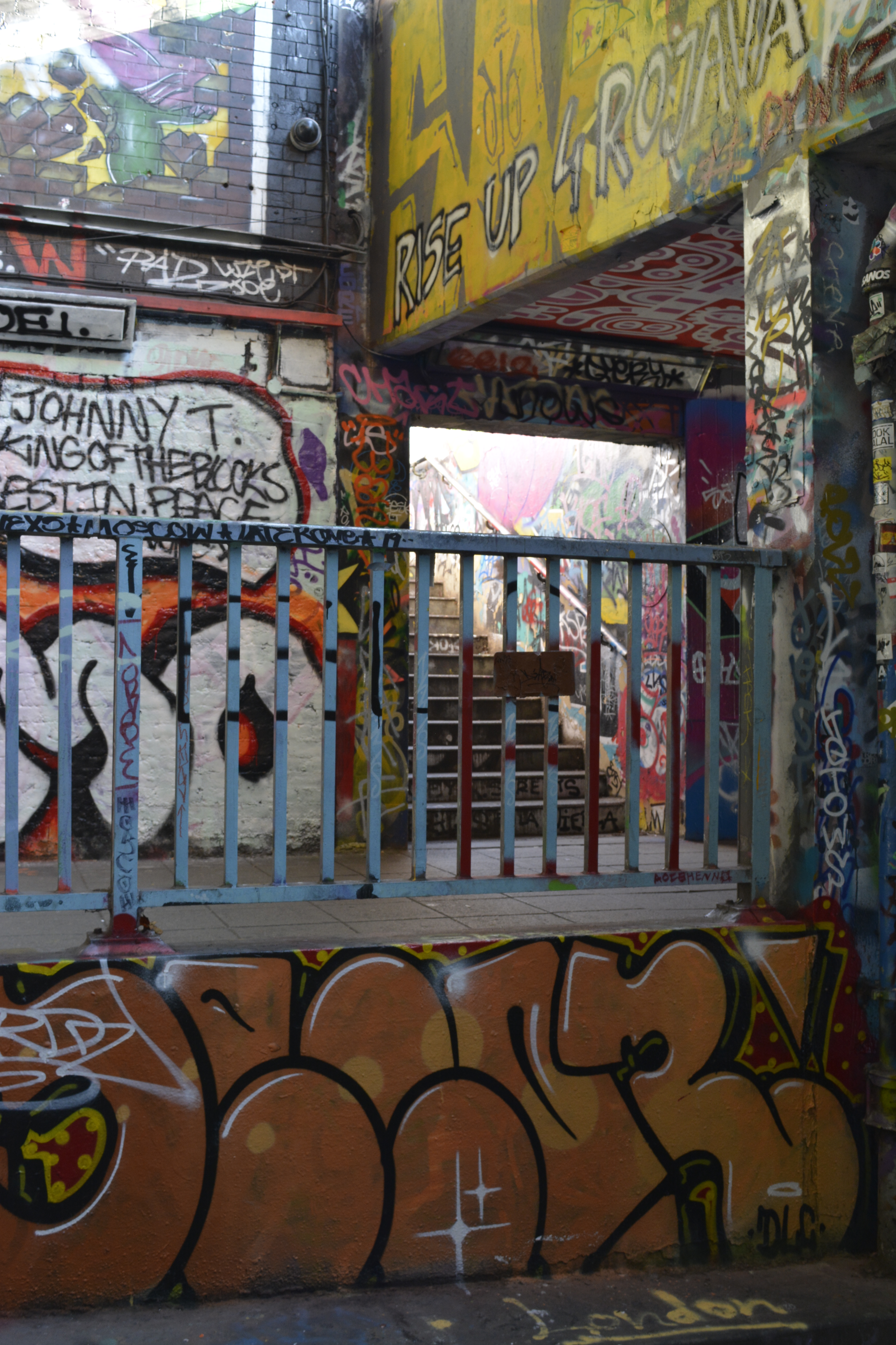
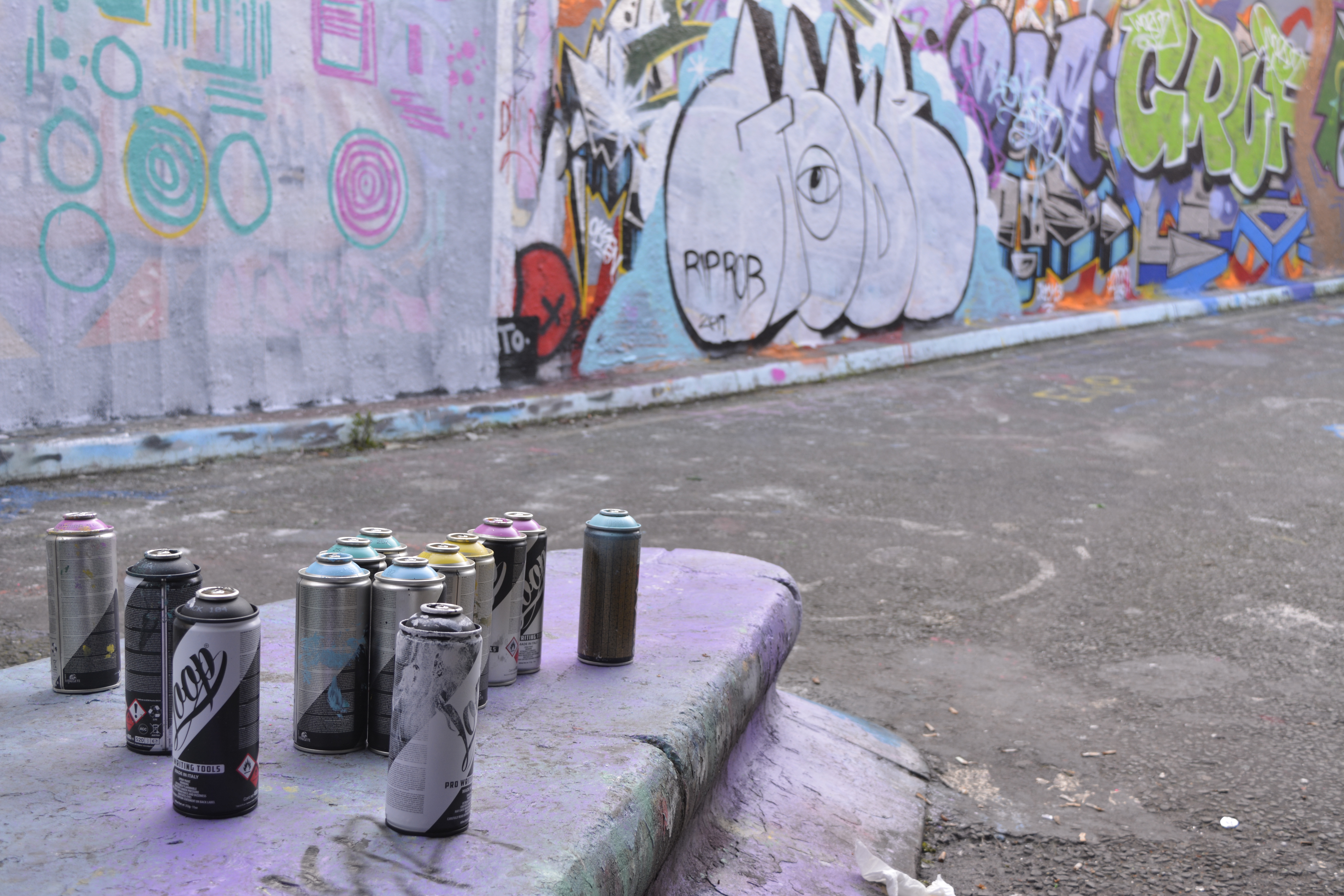
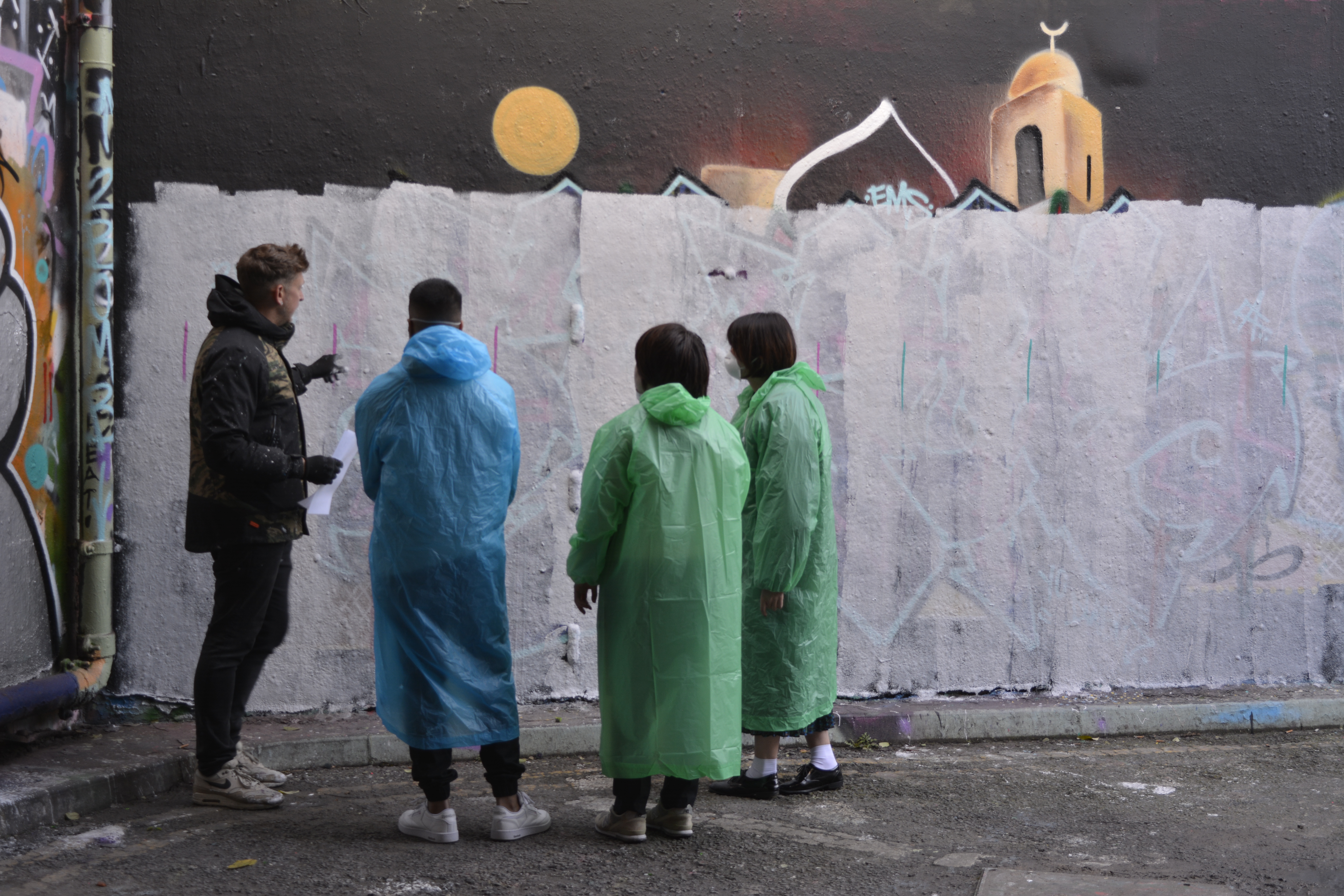
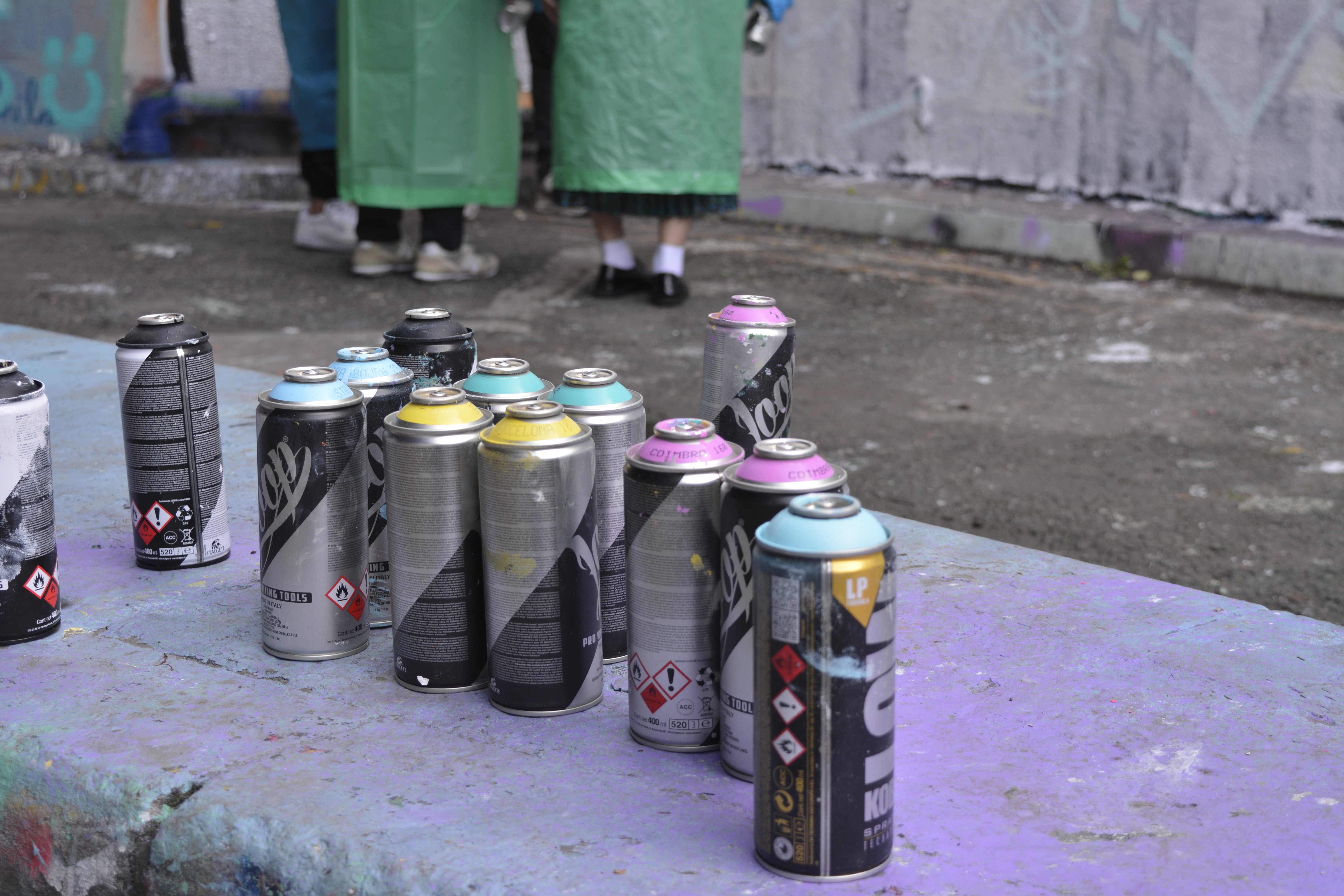
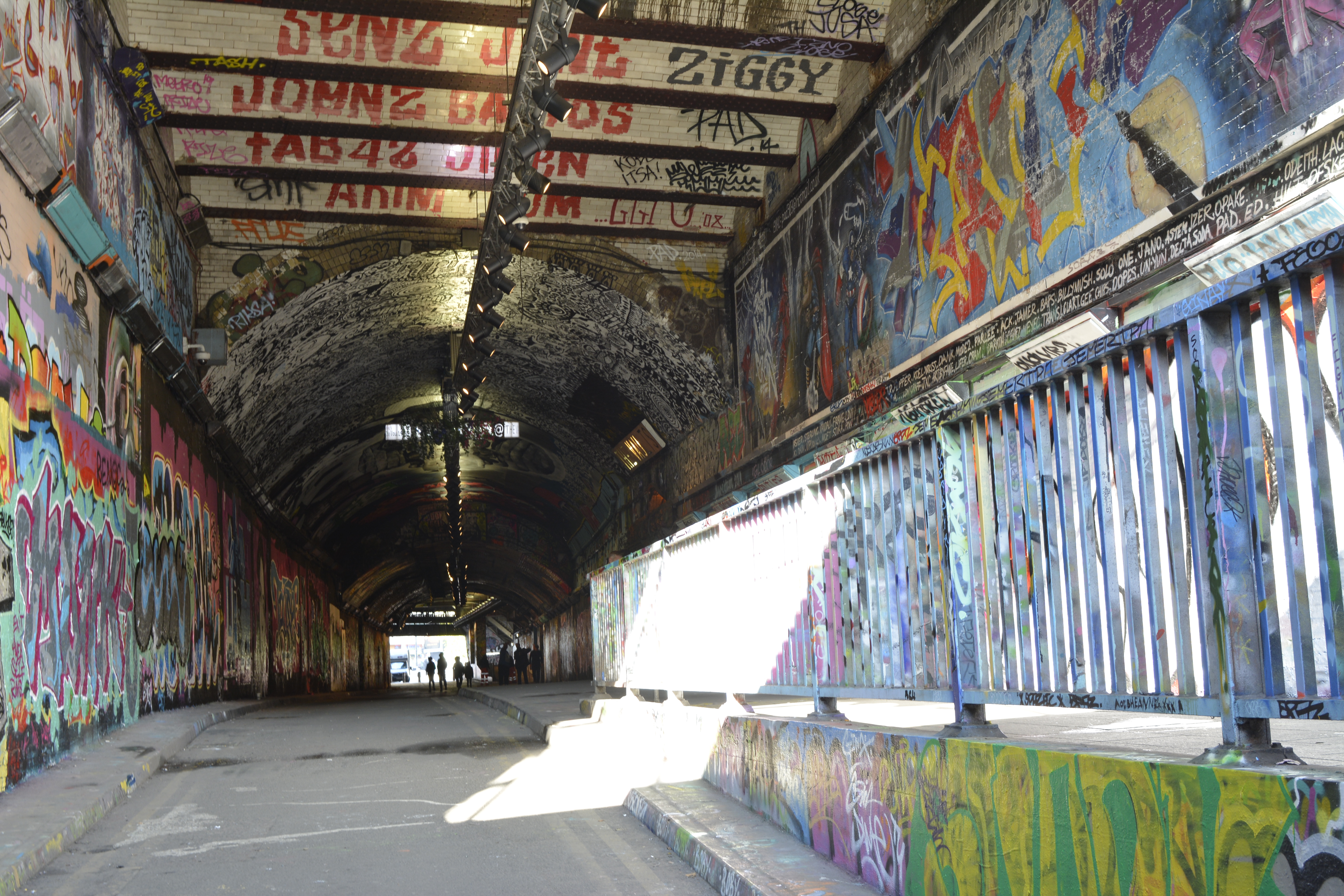
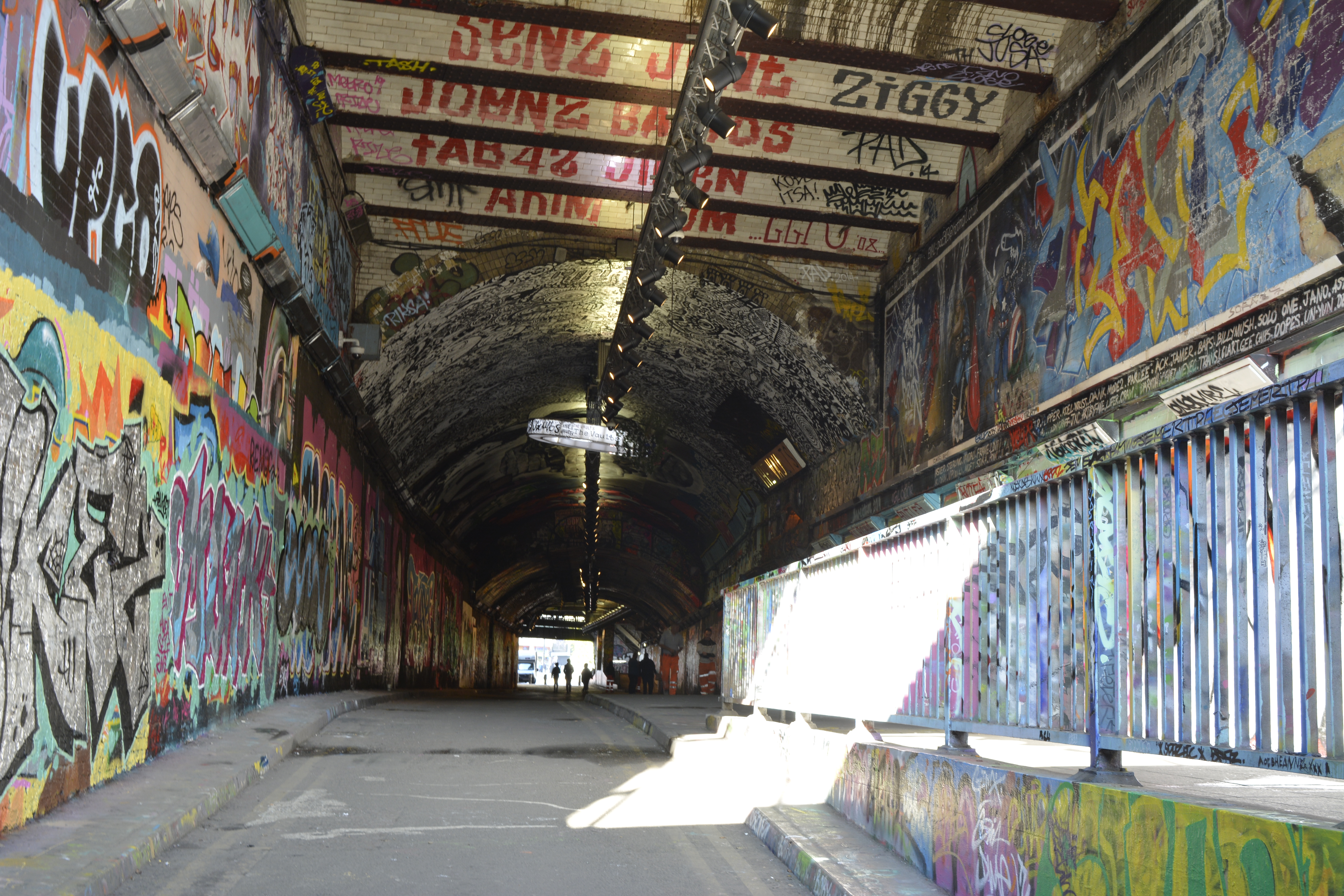
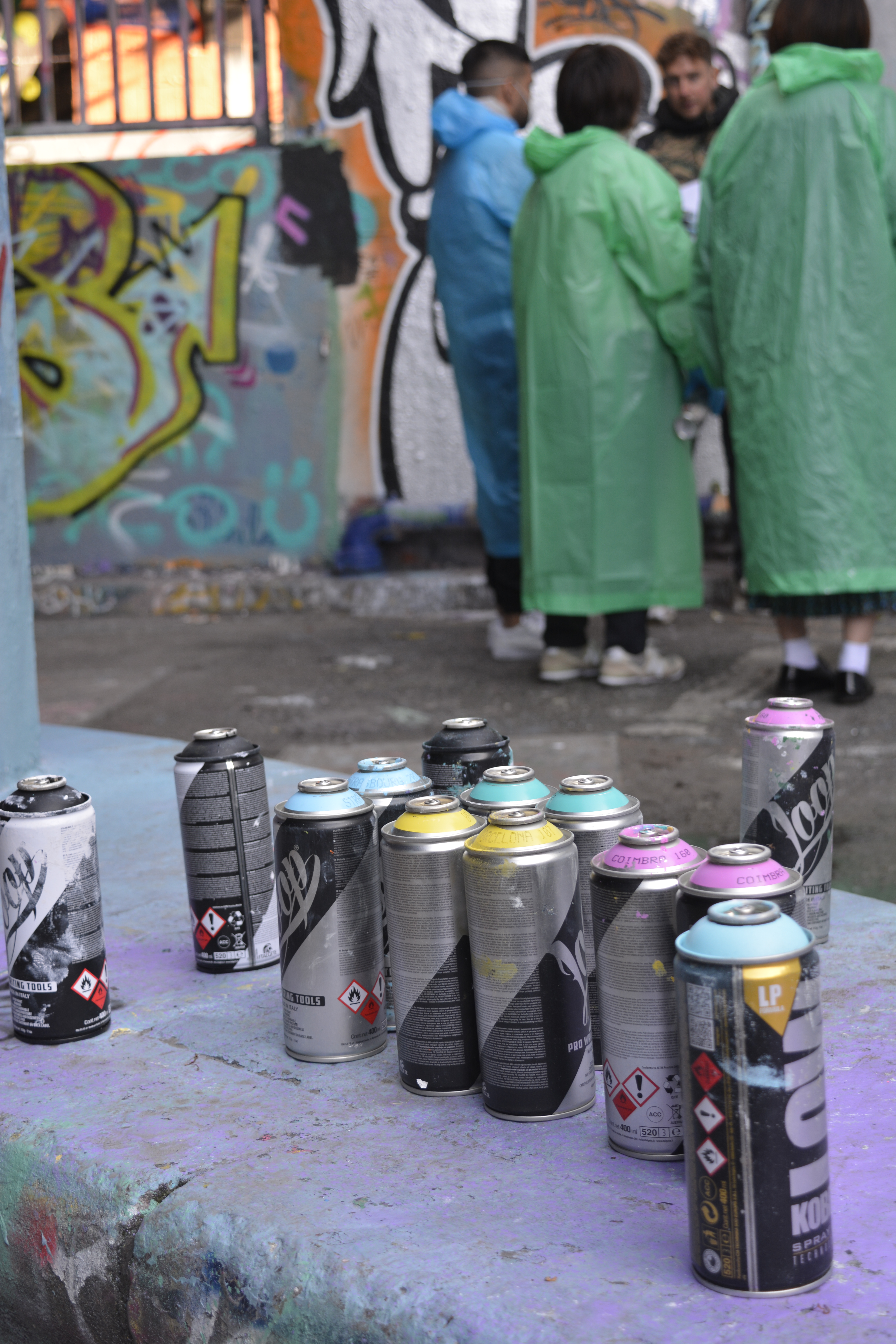
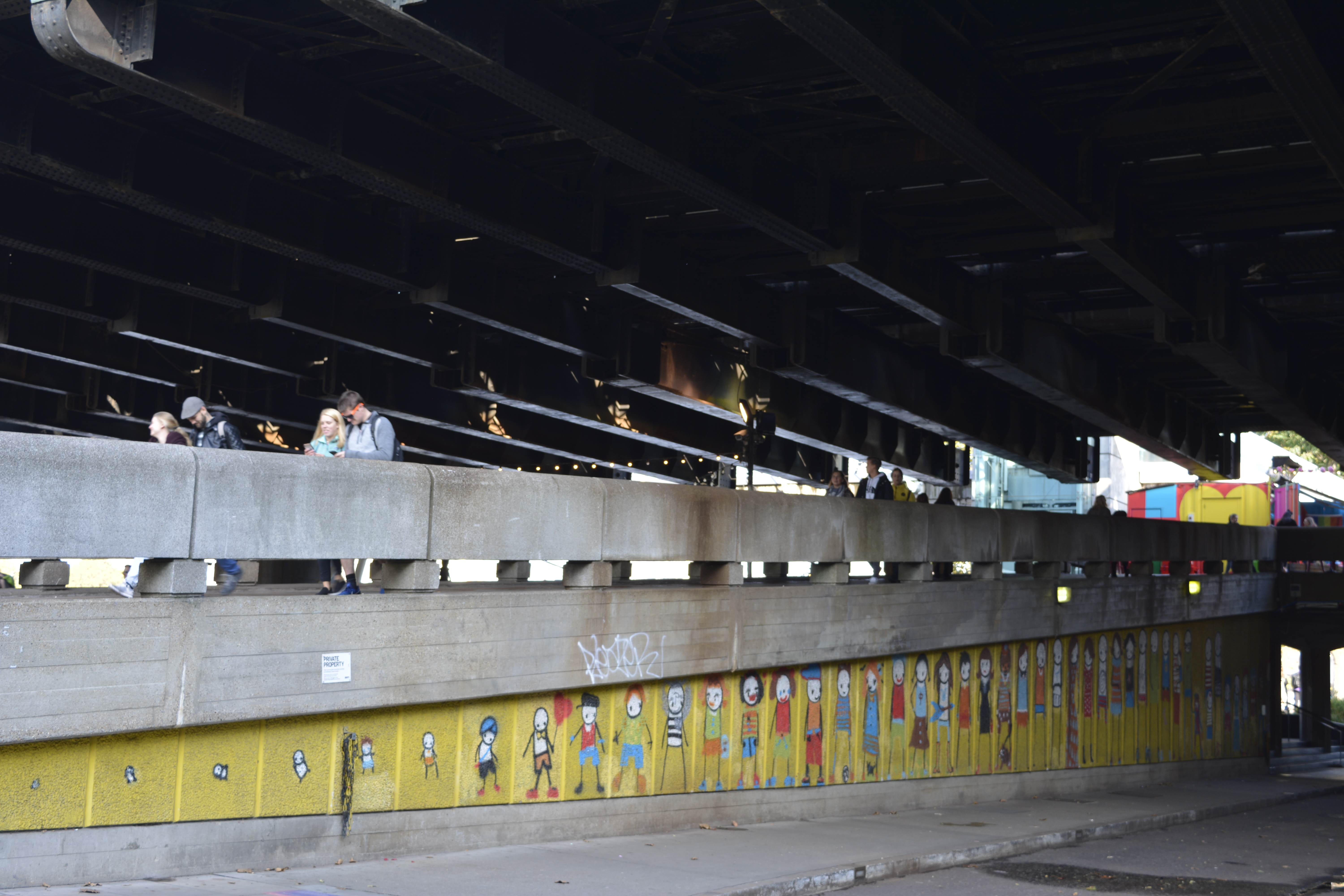
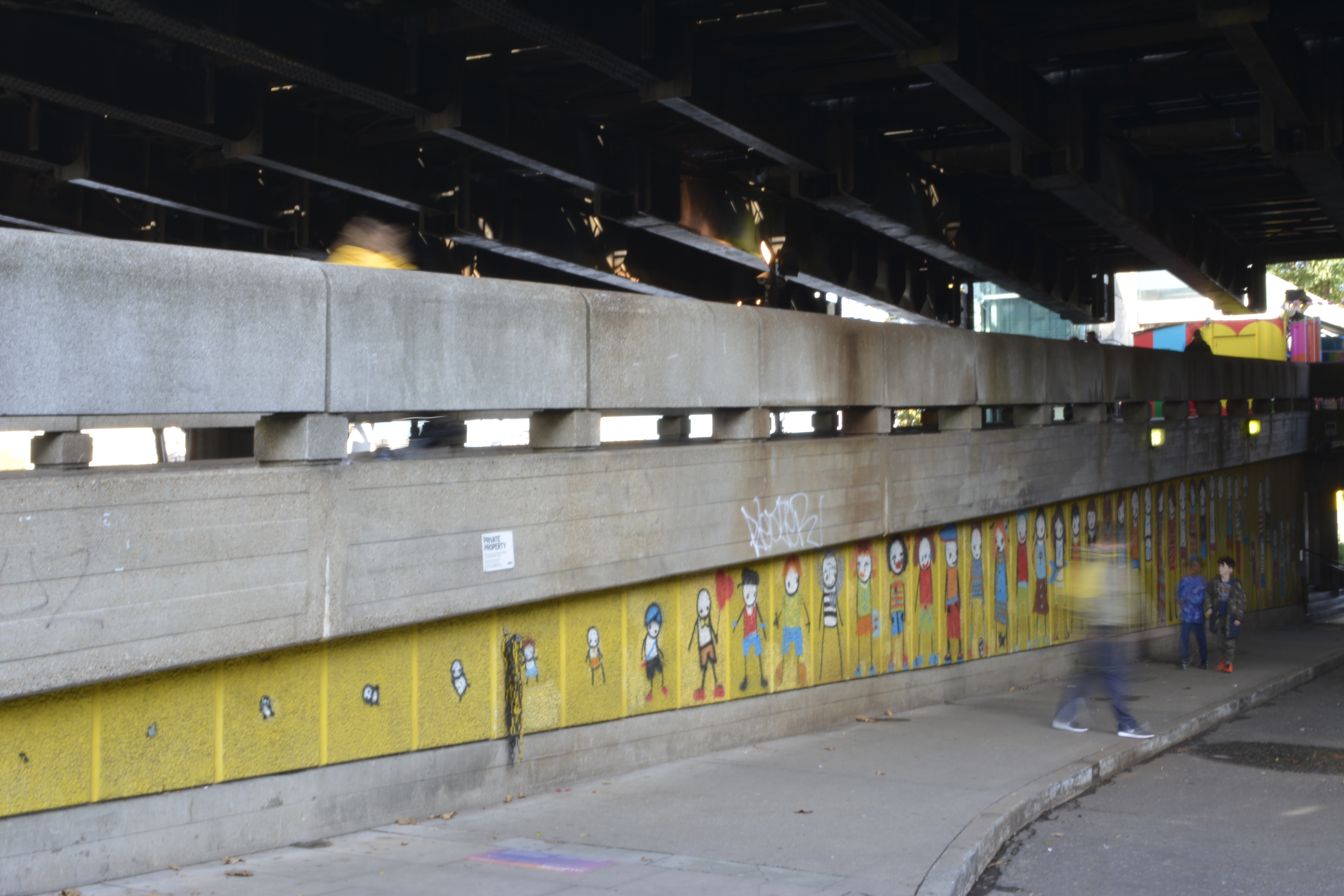
Leak Street Arches
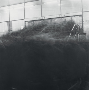
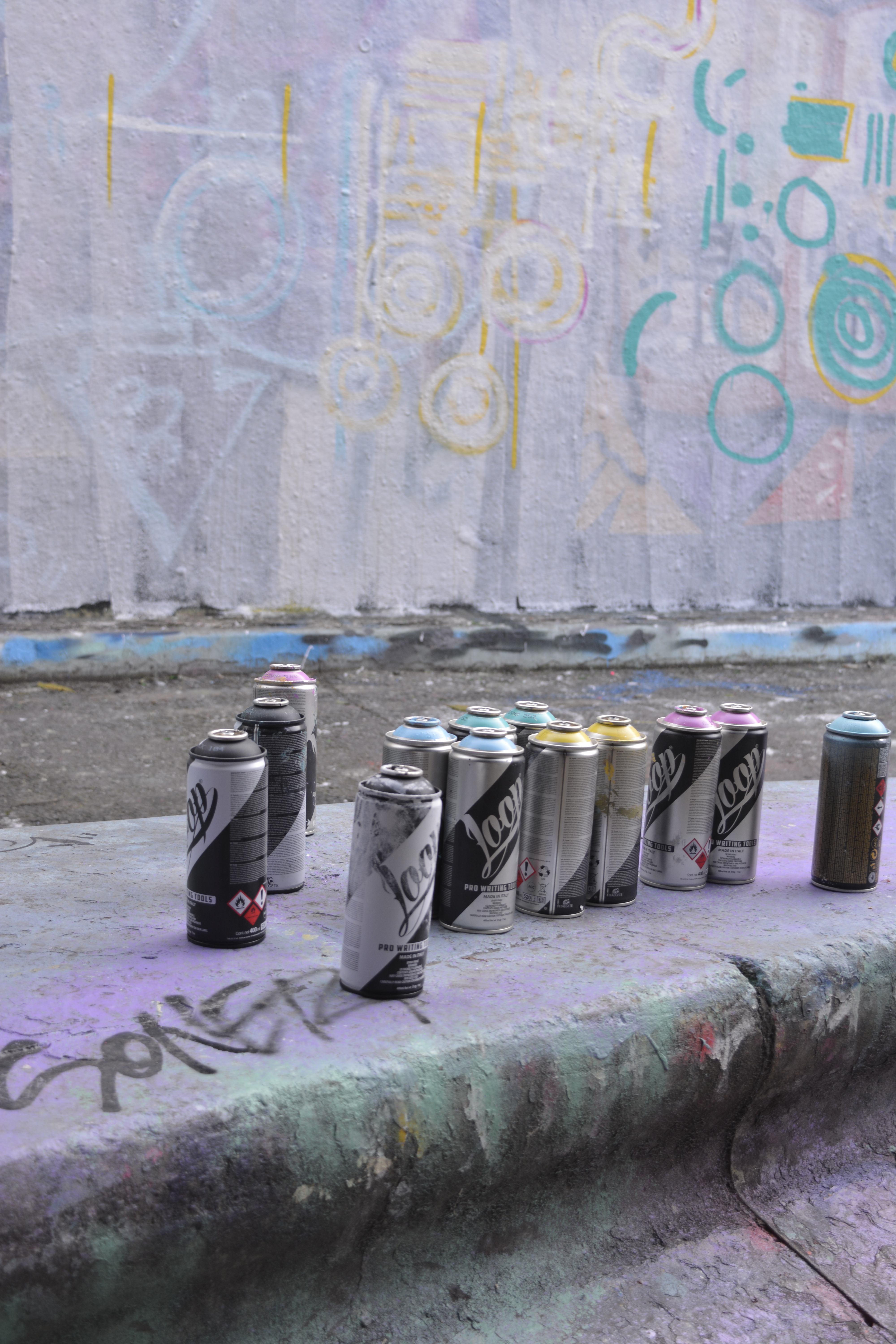
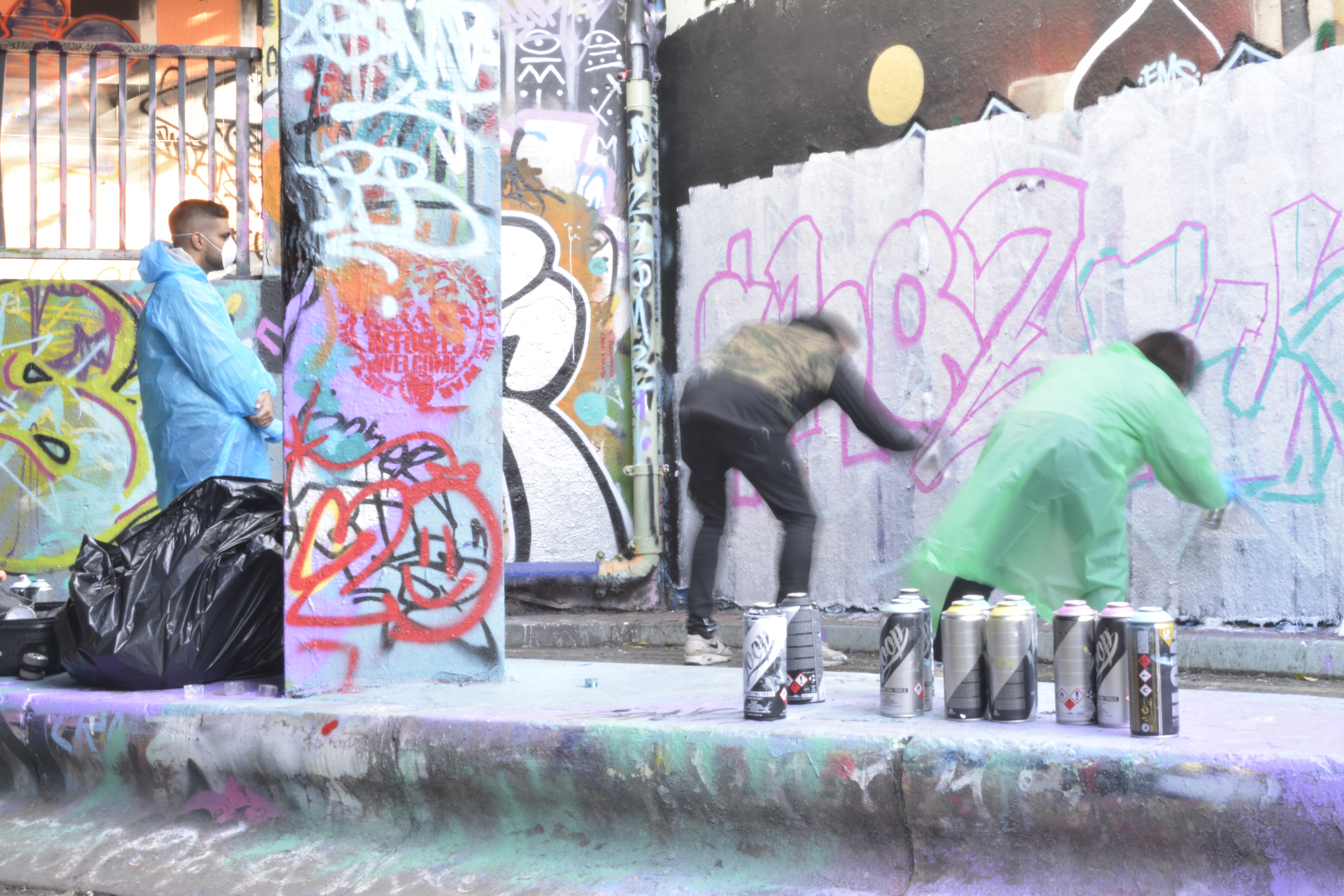
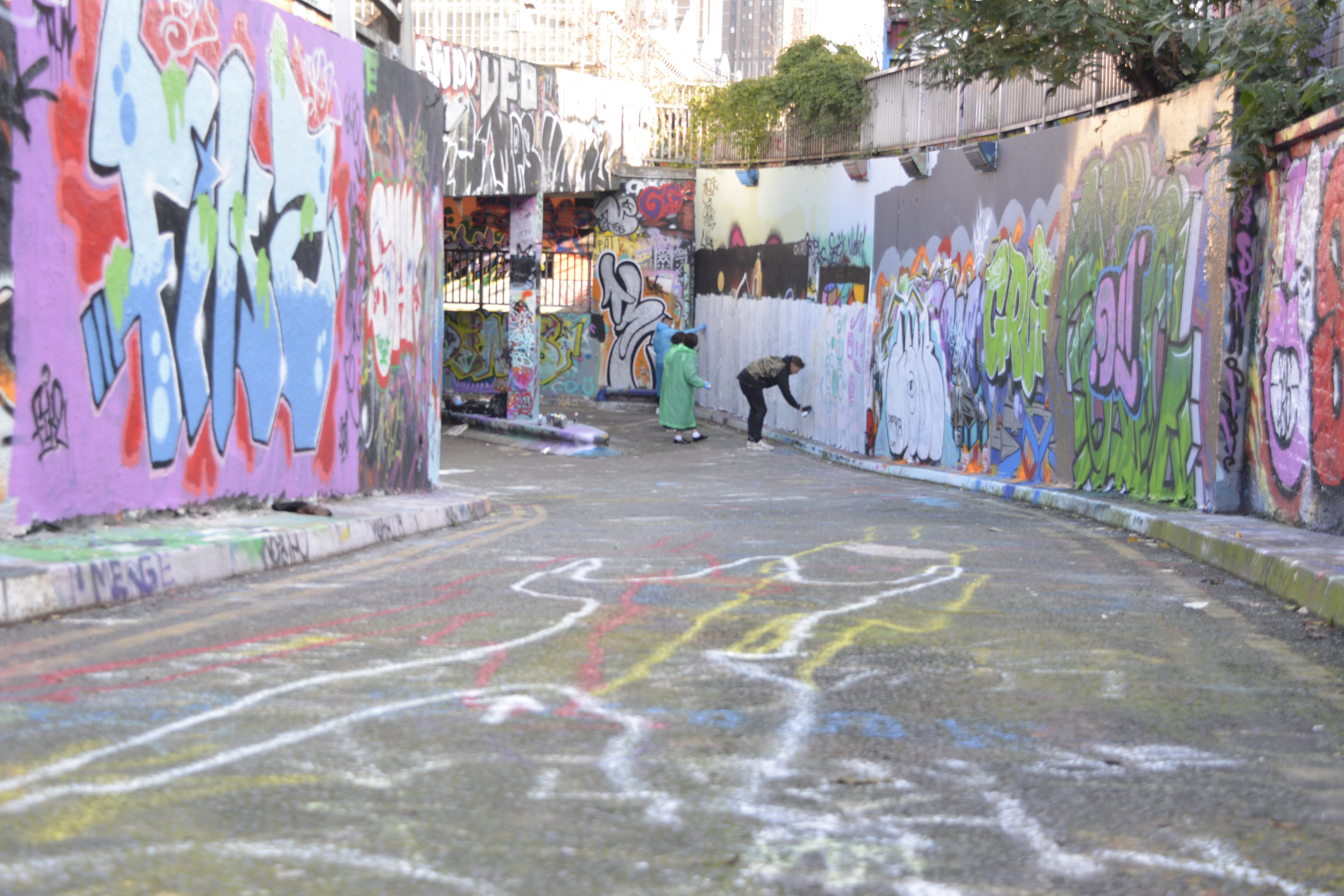
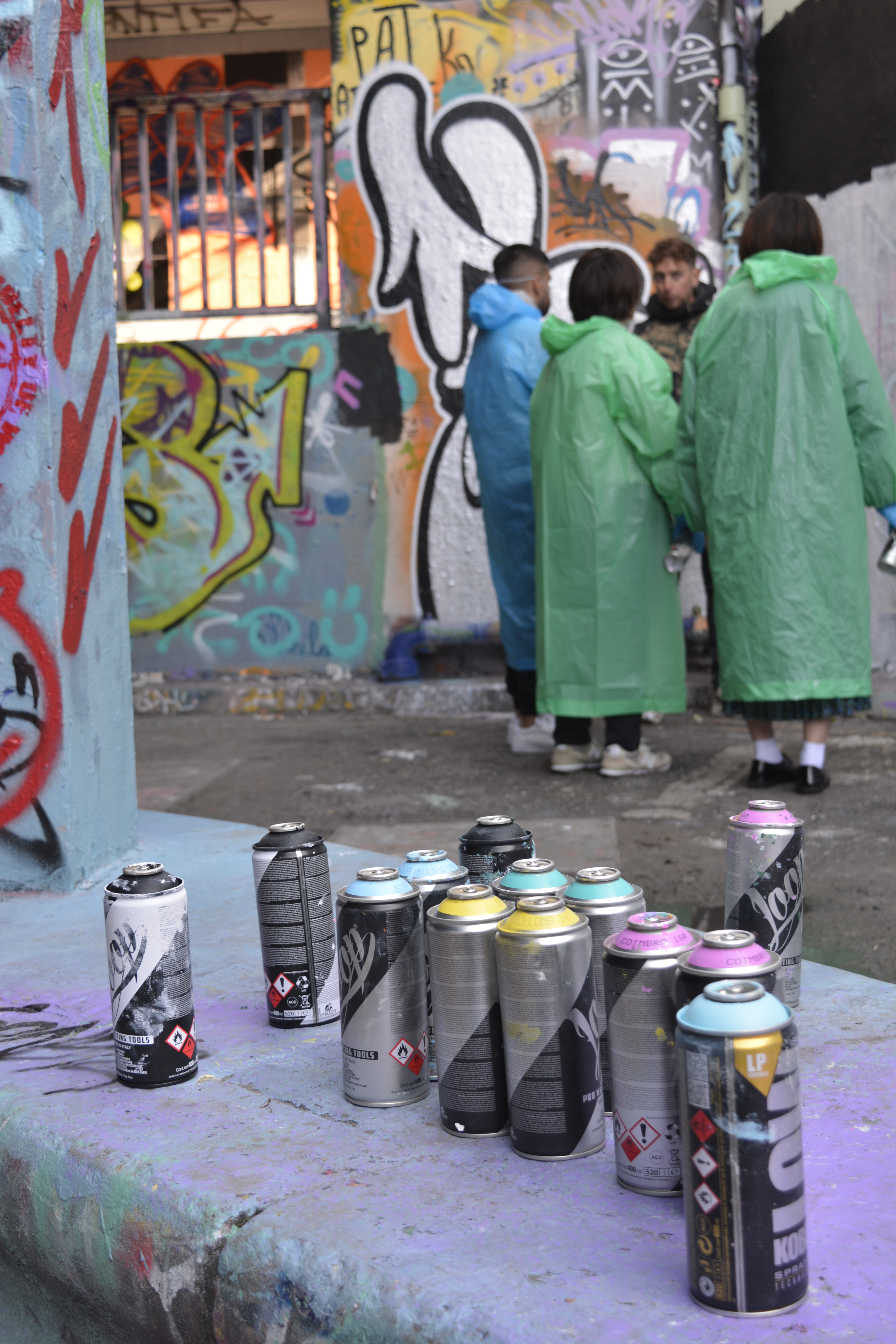
Street art and graffiti have always interested me. I love the colours and the freedom of expression that often comes with graffiti. Leak Street Arches is a great place to go and see the ever changing canvas of art.
Thinking about the brief, People in the Environment, looking at people coming especially to see or work on the environment. But also how people walk through the arches to get to work and pass the beautiful art work all around.
Gained a little confidence being on my own and asked permission to take photographs of the graffiti artists teaching a group of people.
Embankment
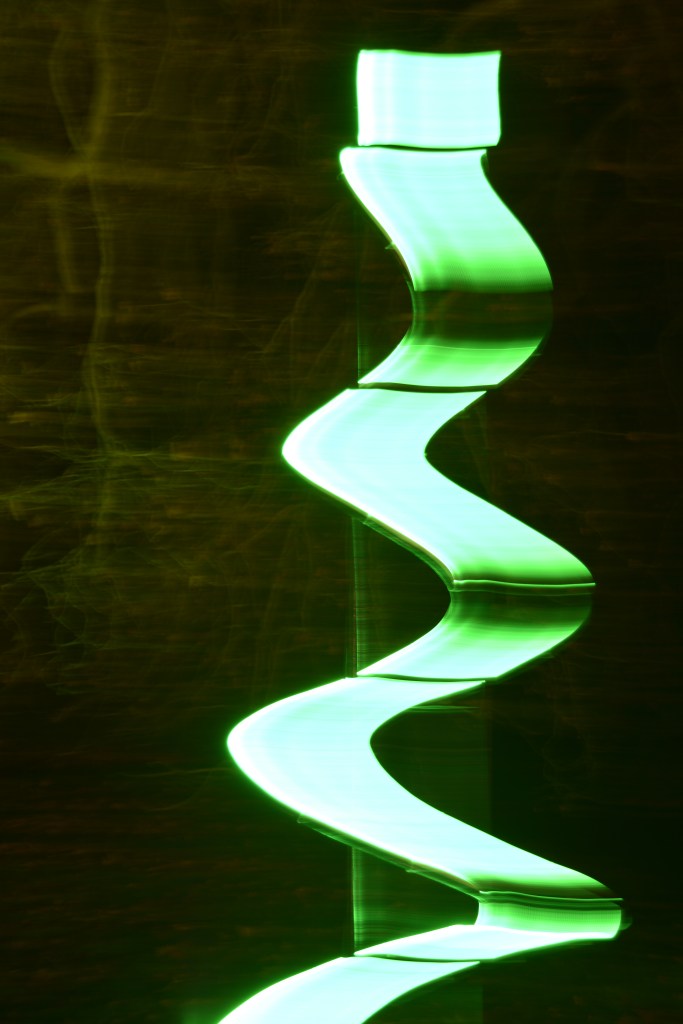
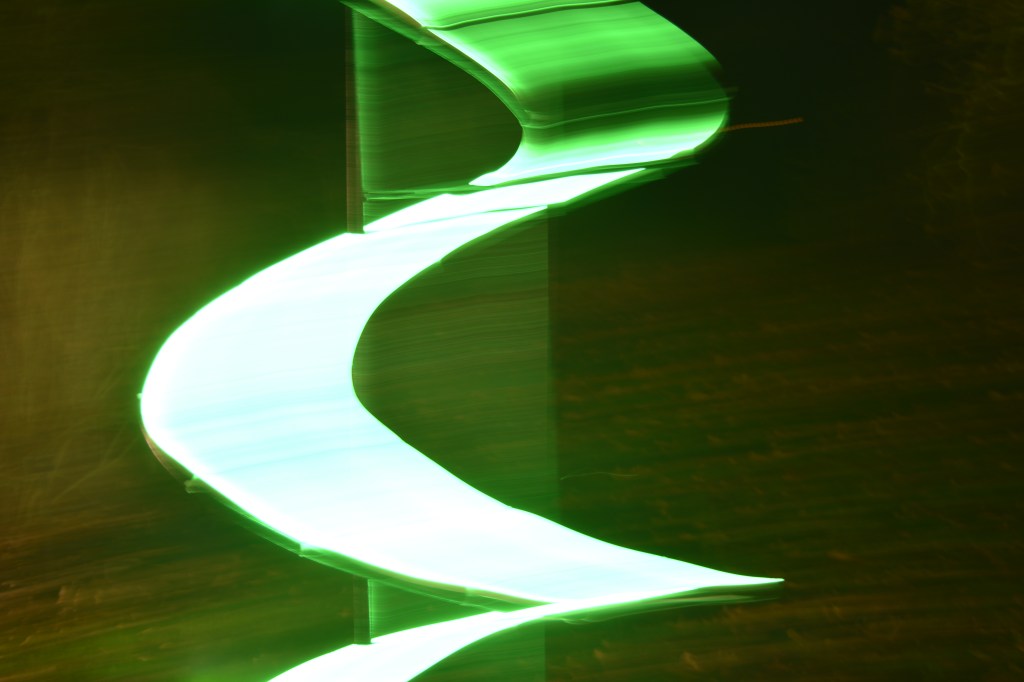
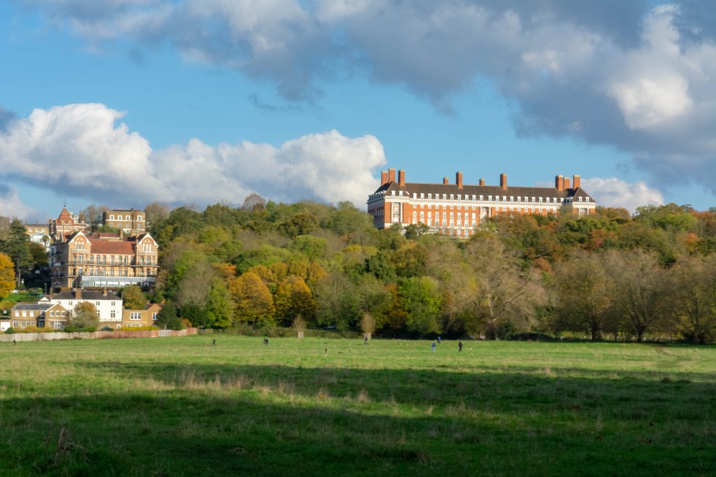
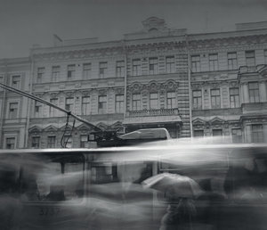
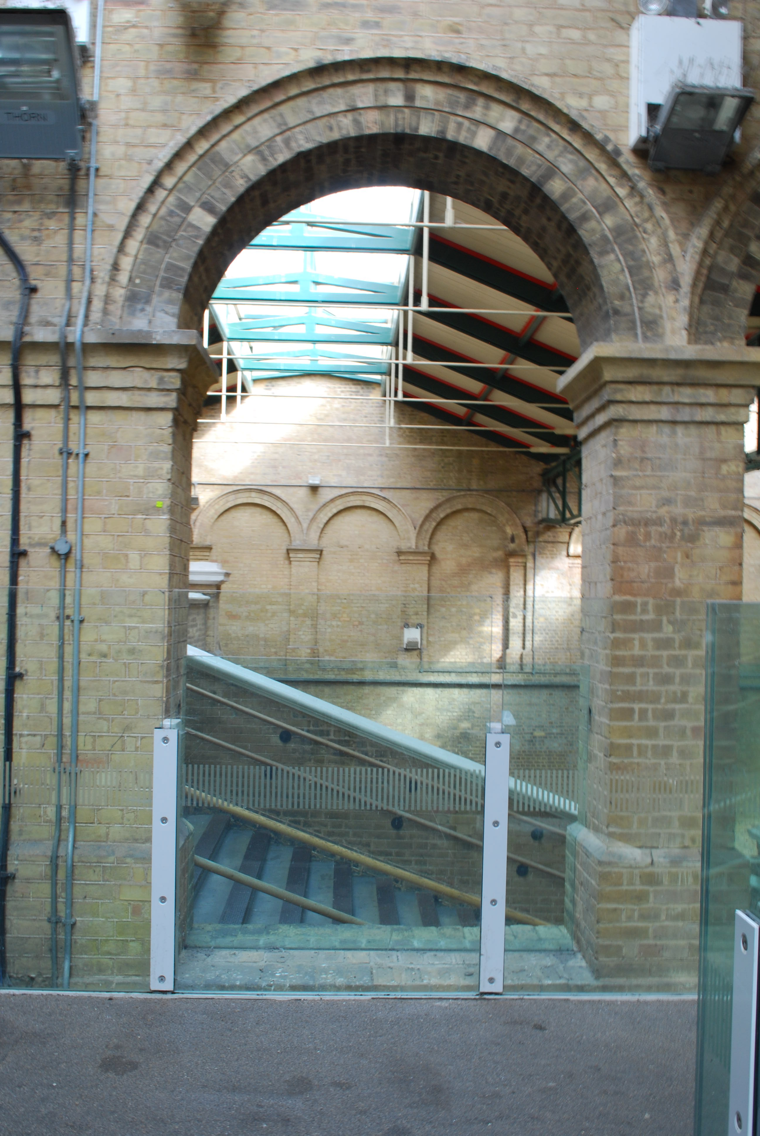
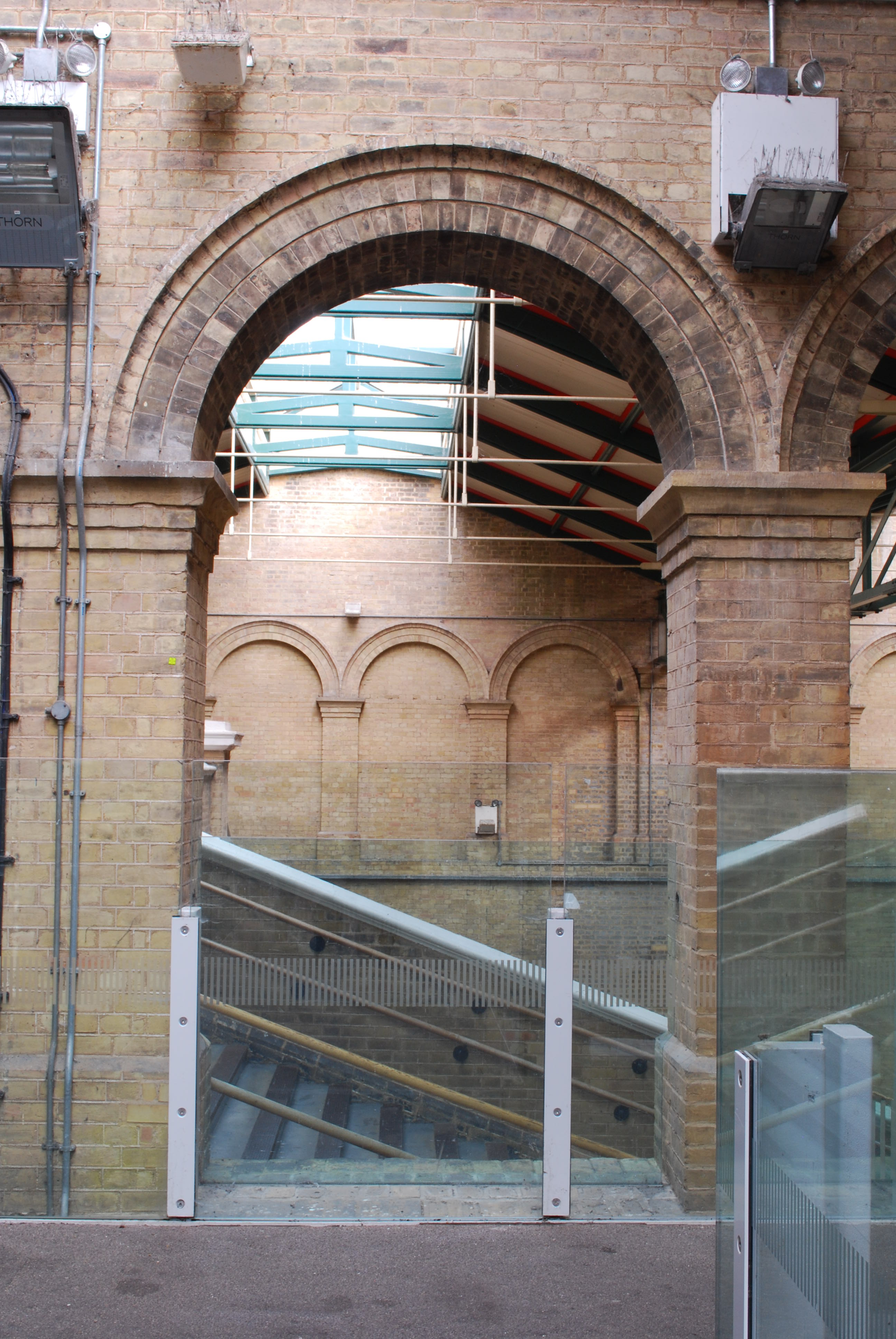
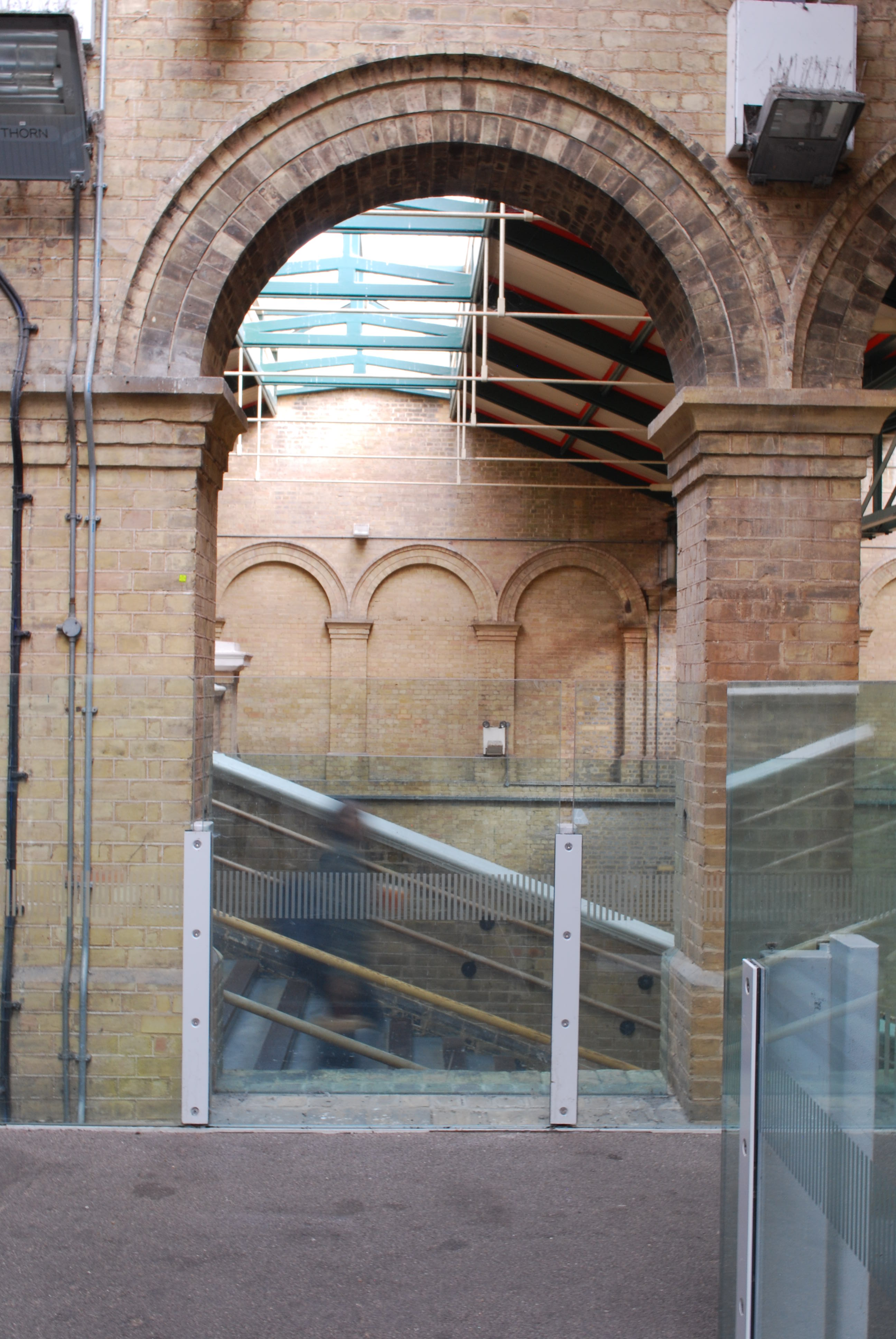
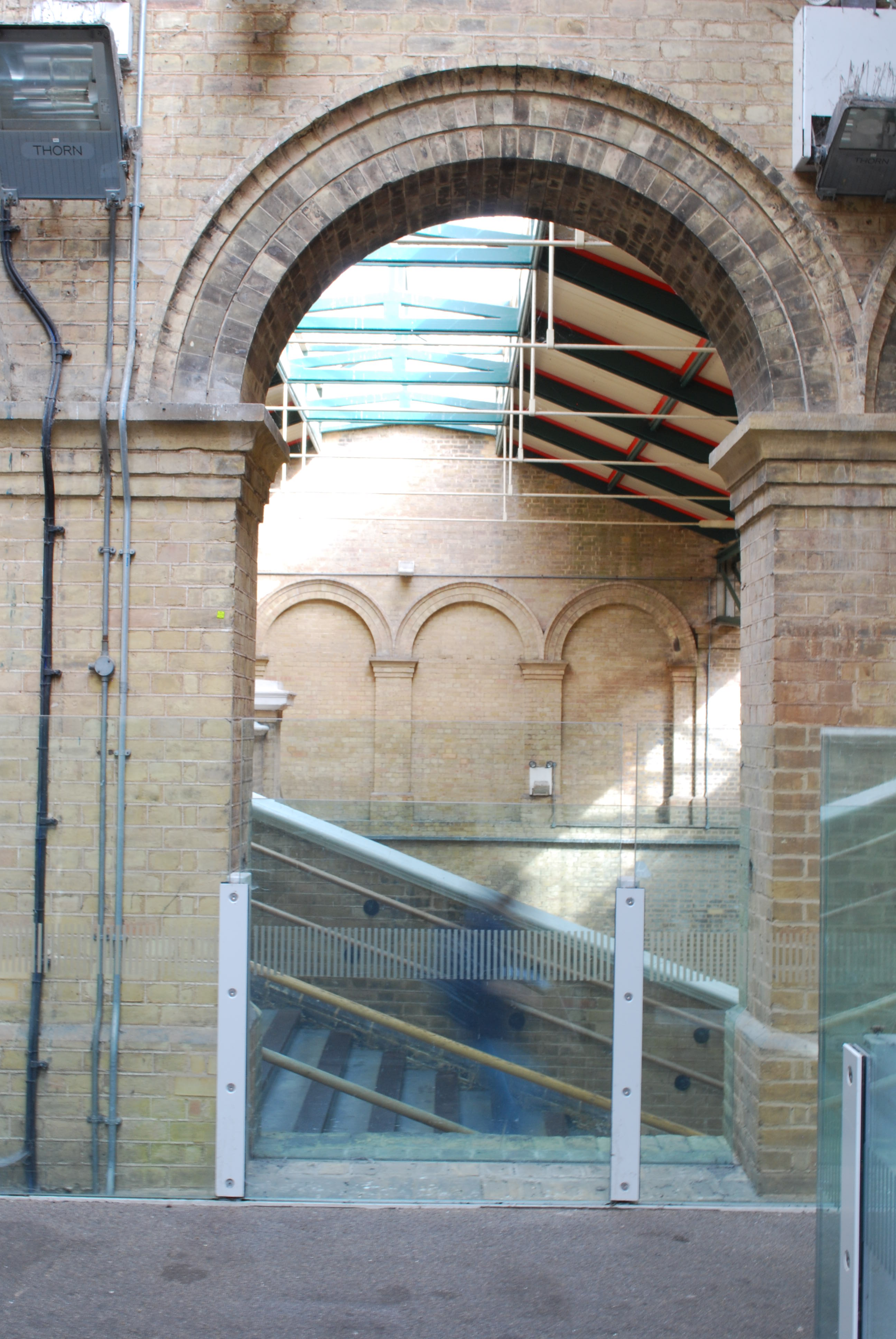
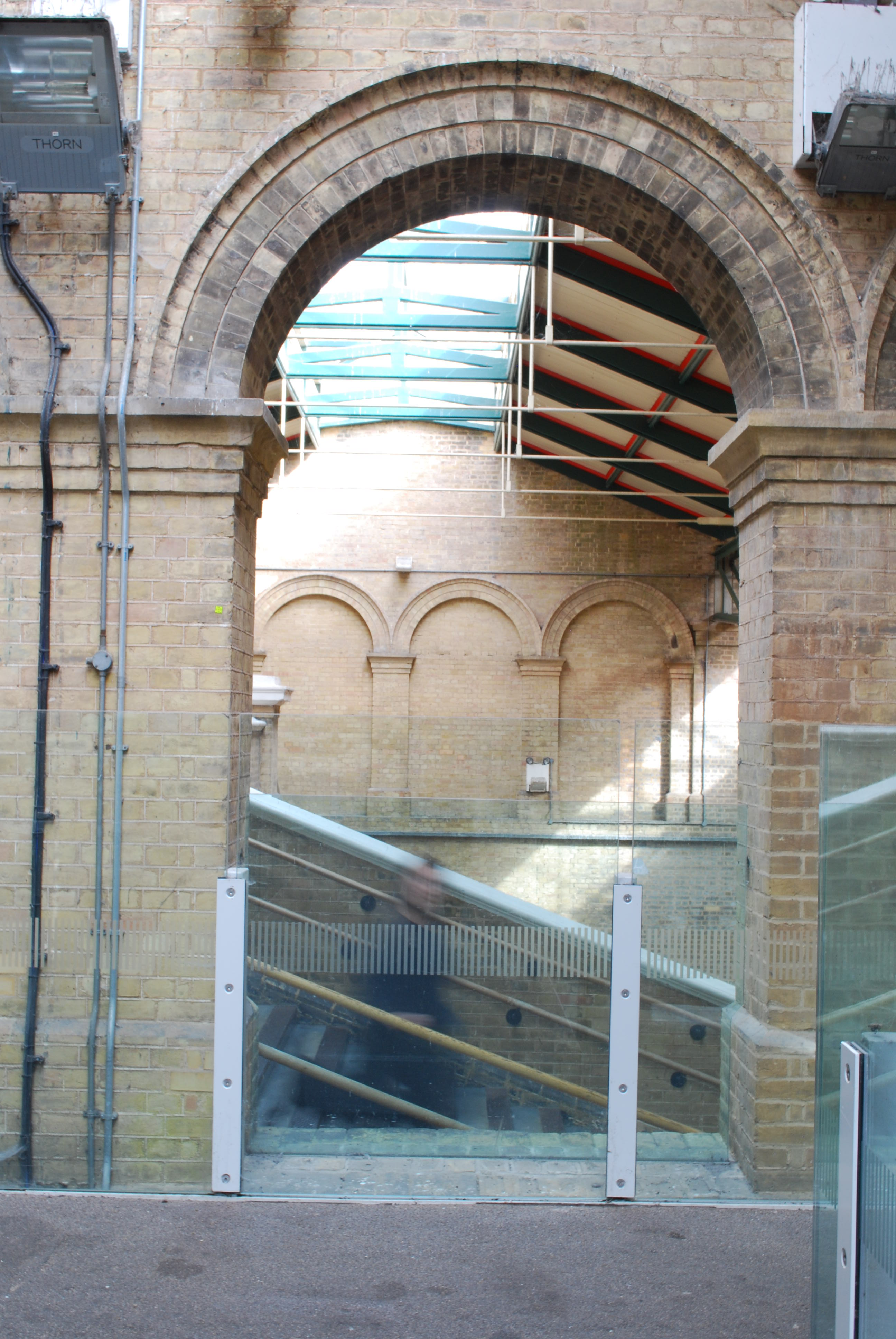
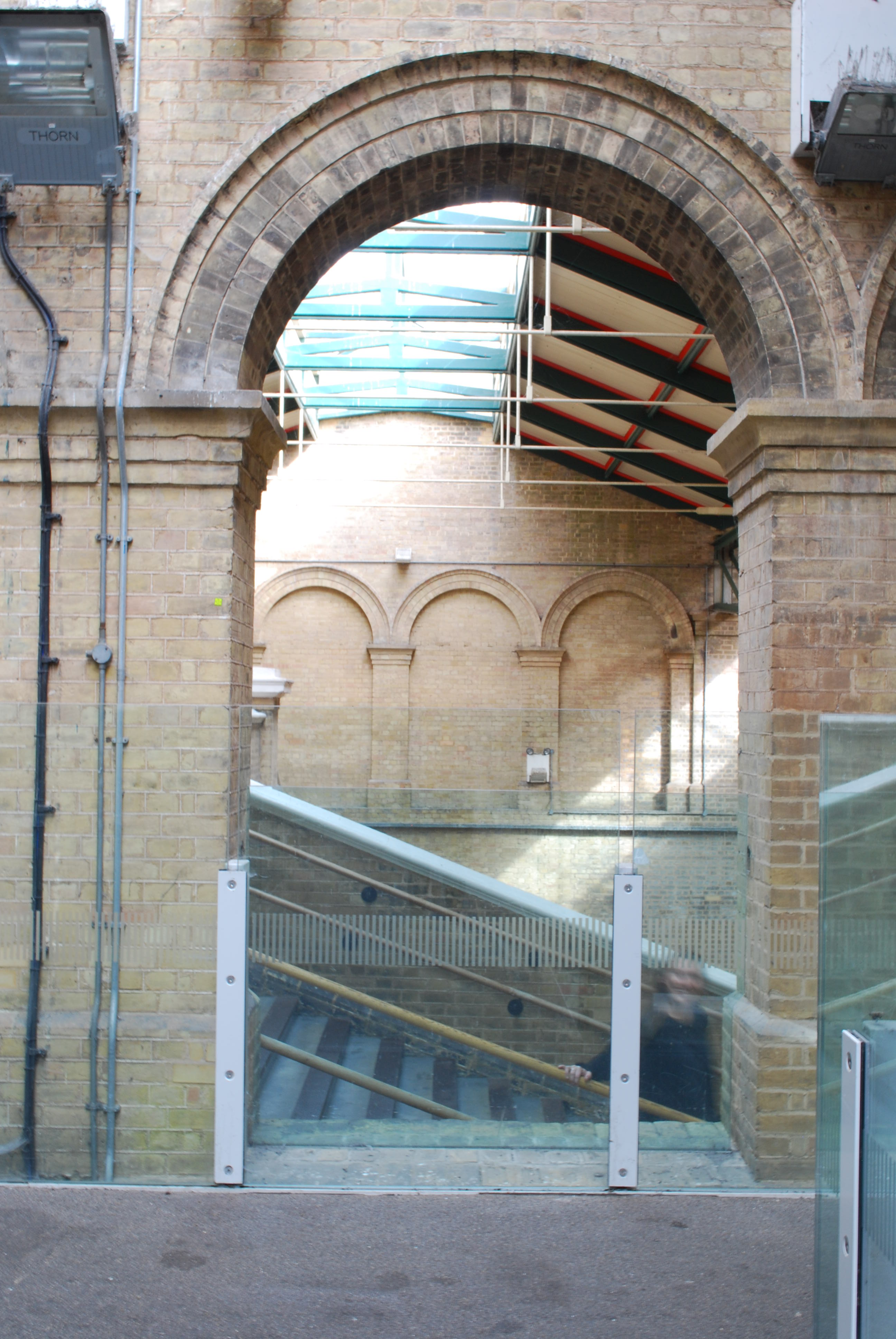
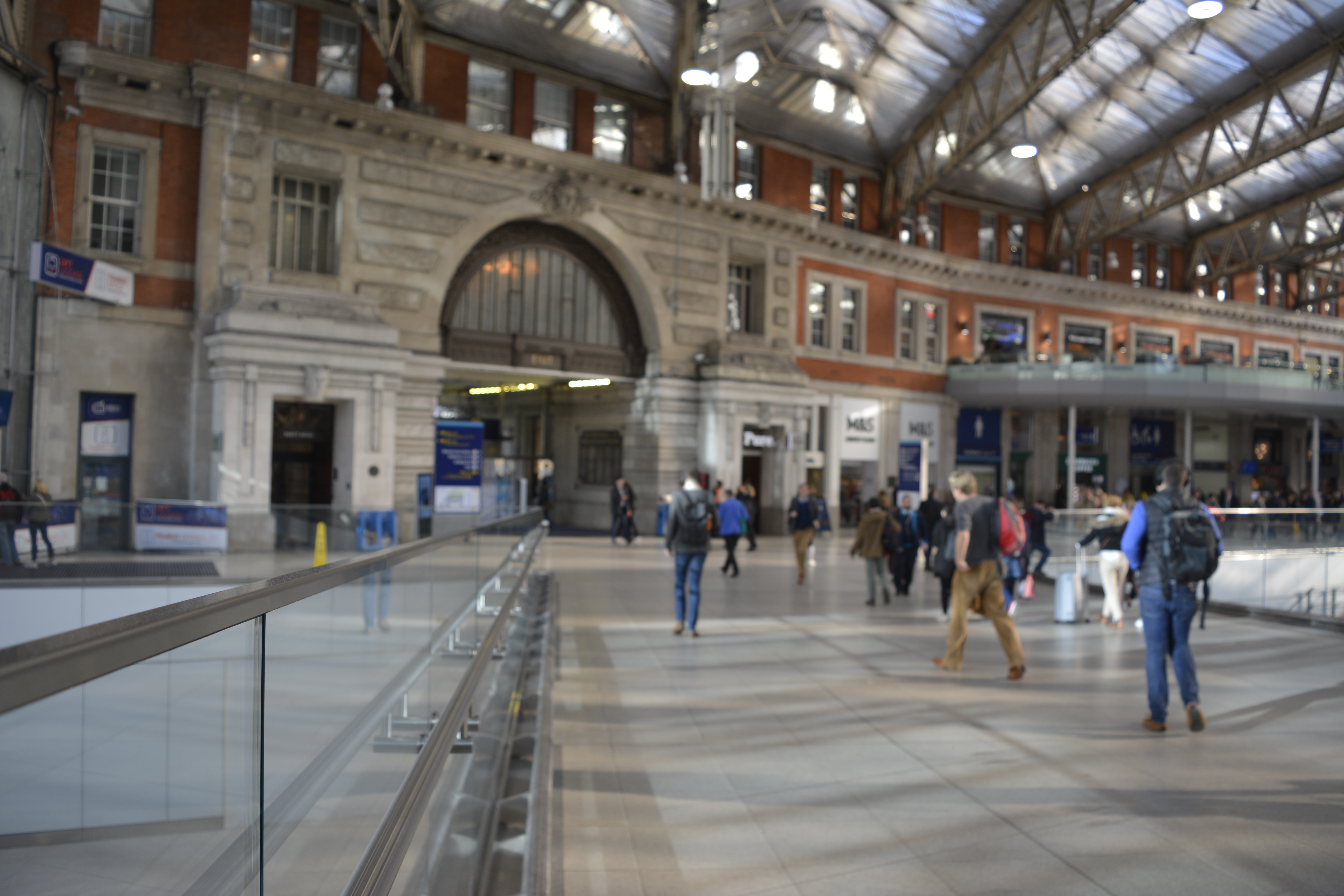
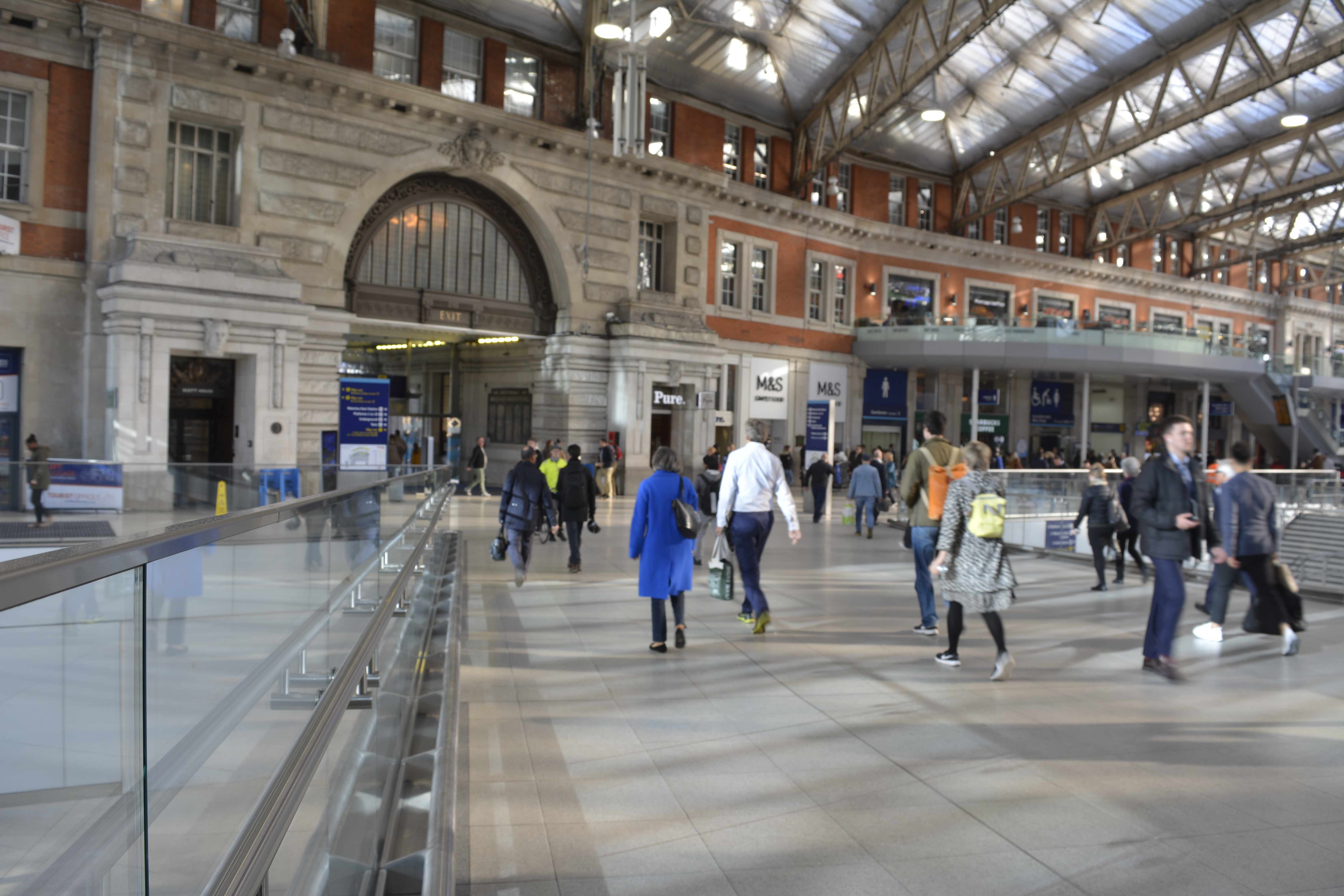
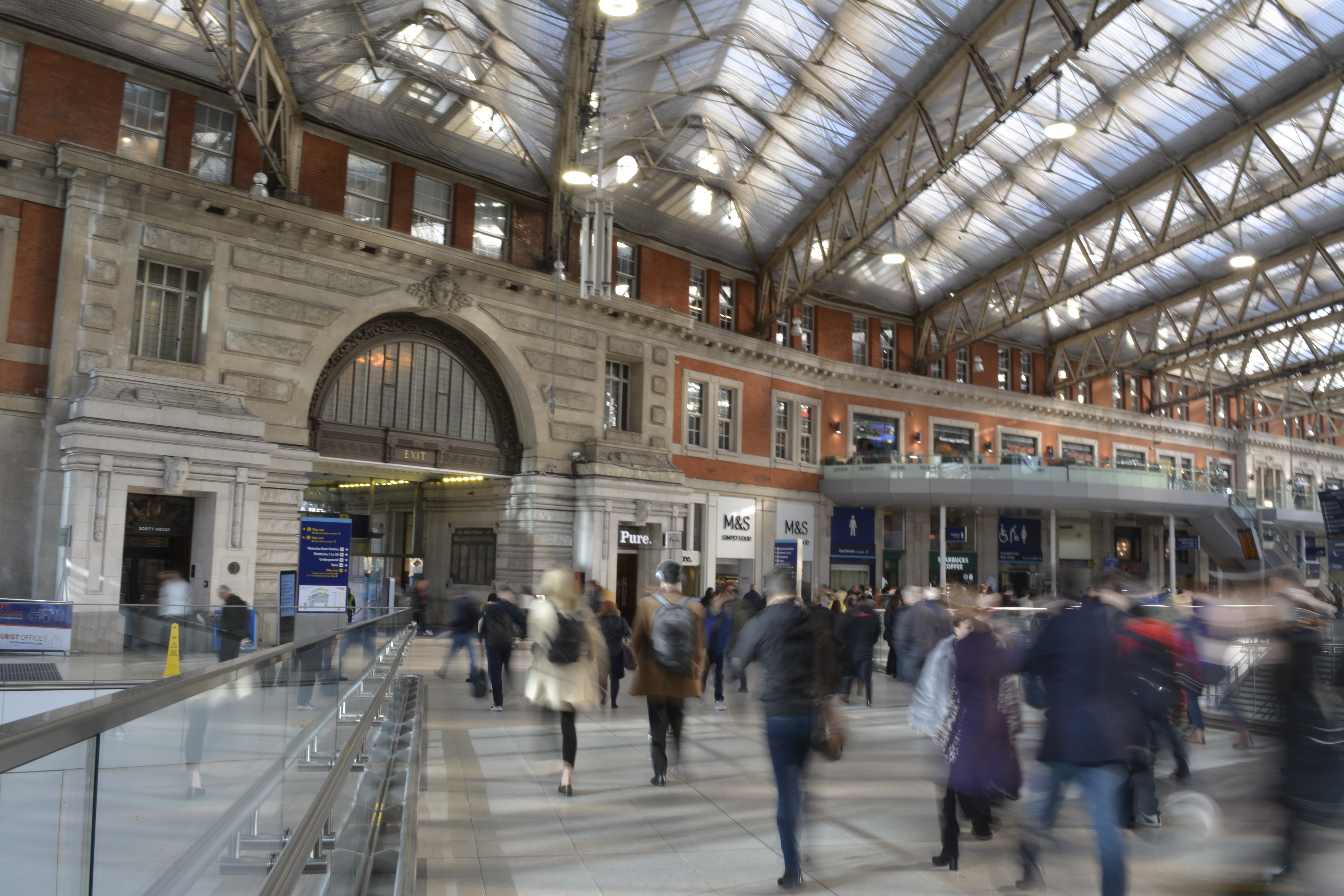
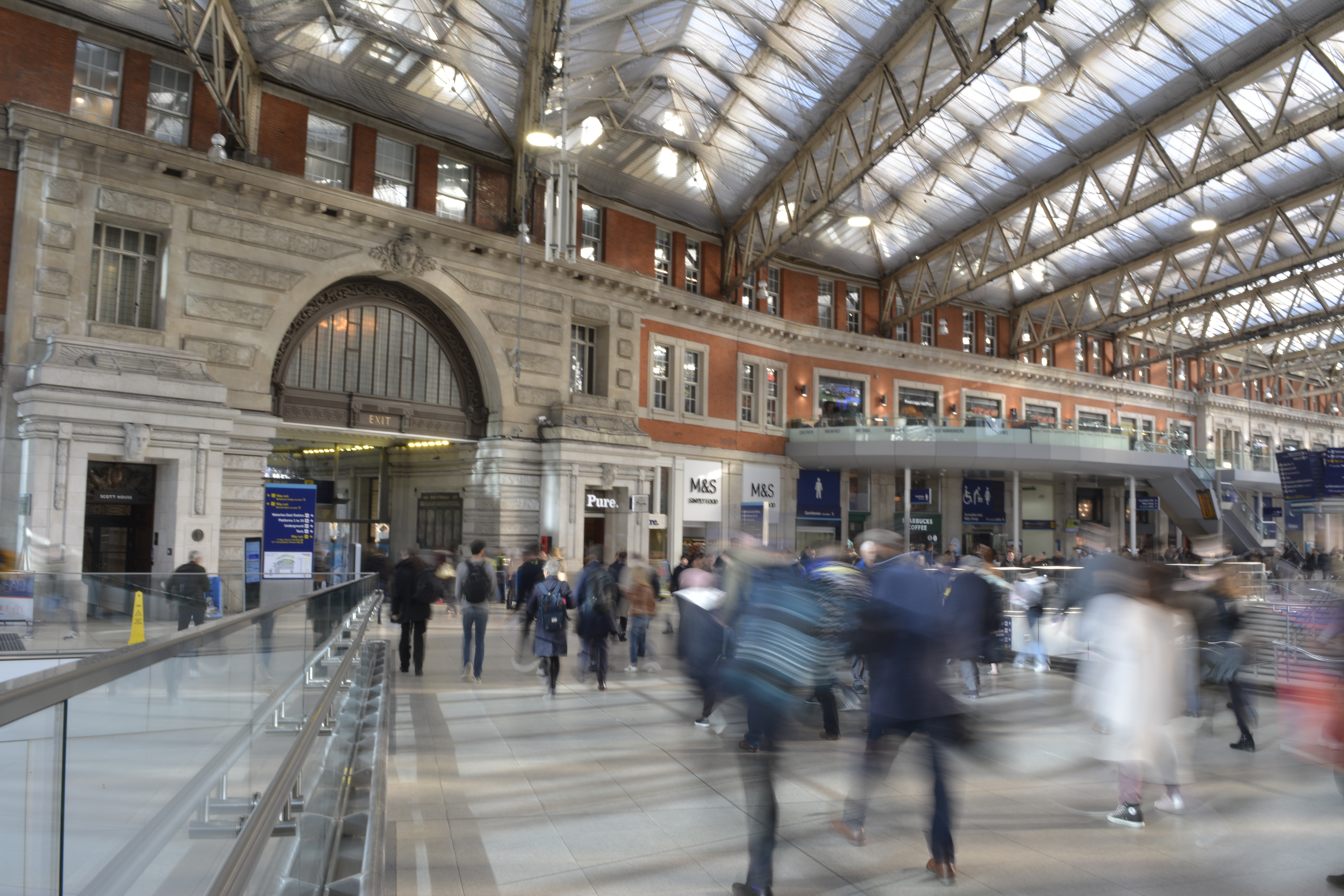
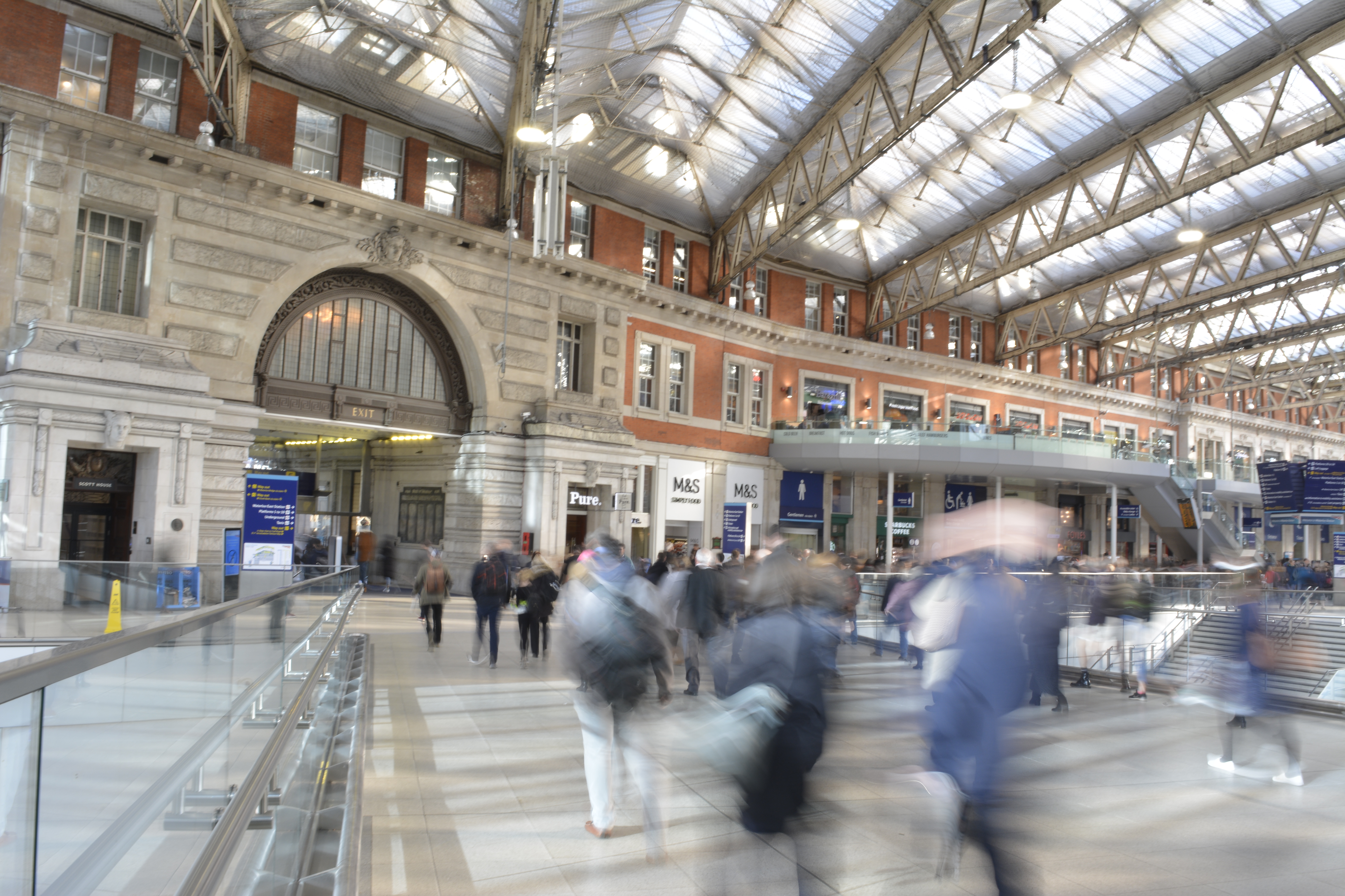
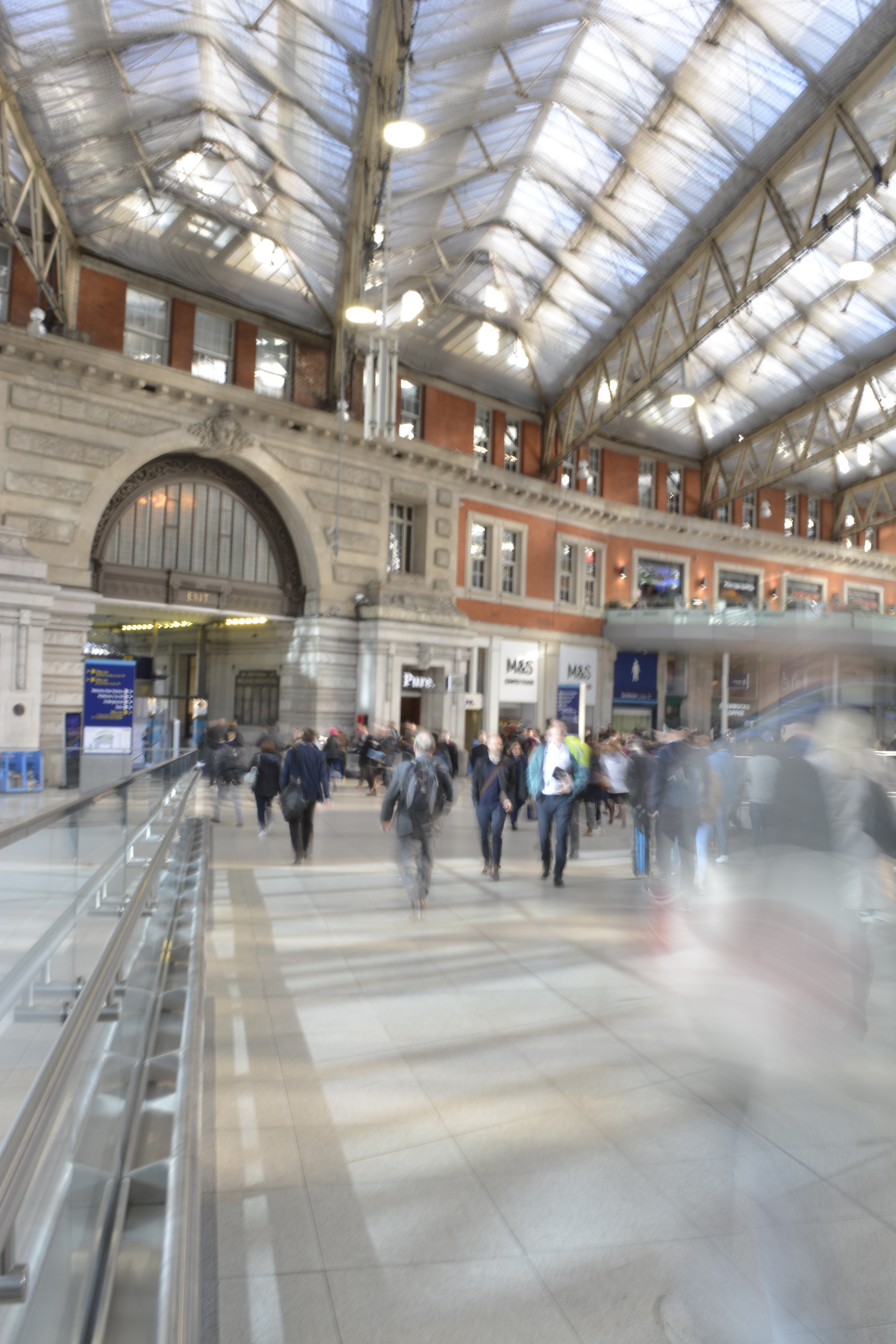
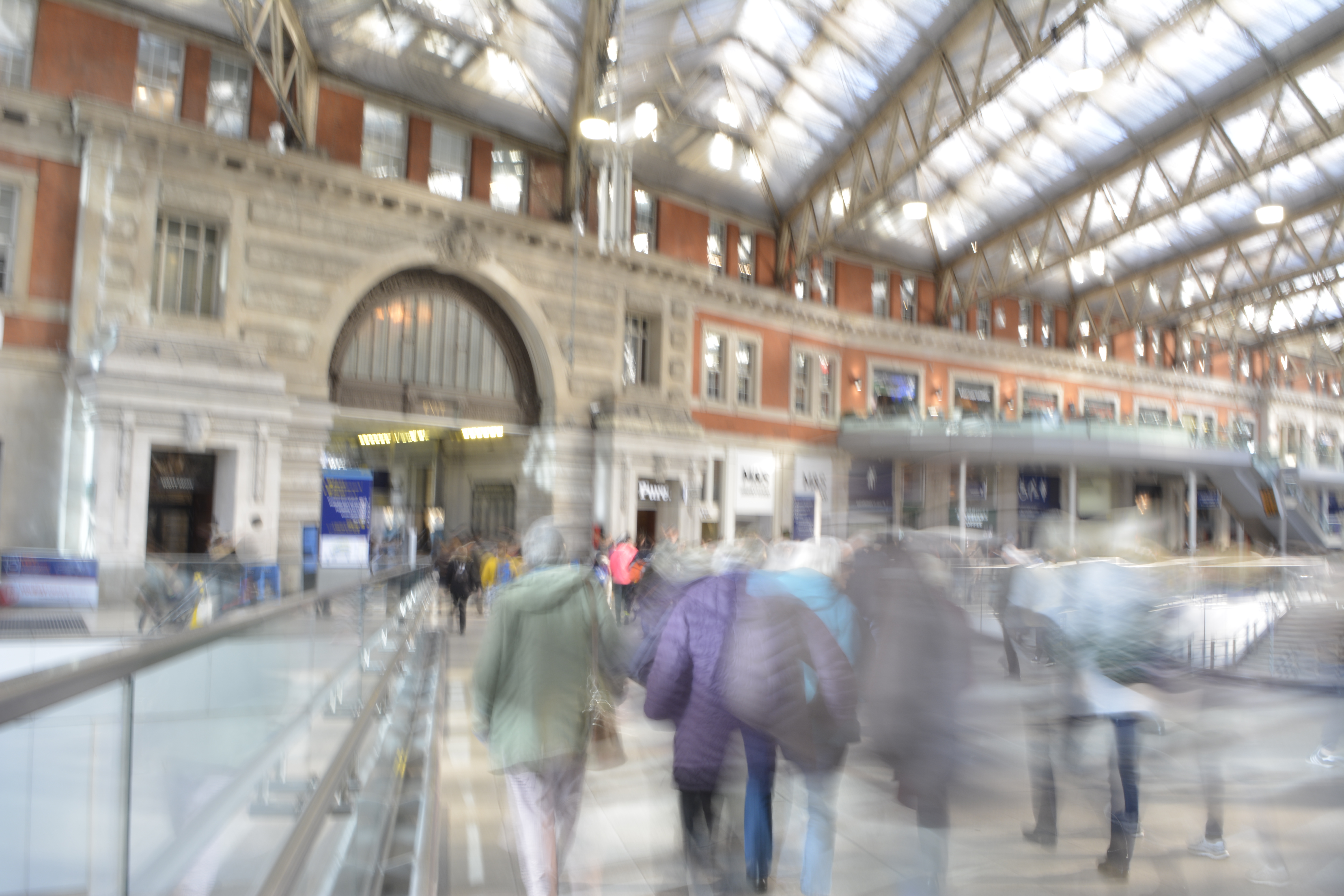
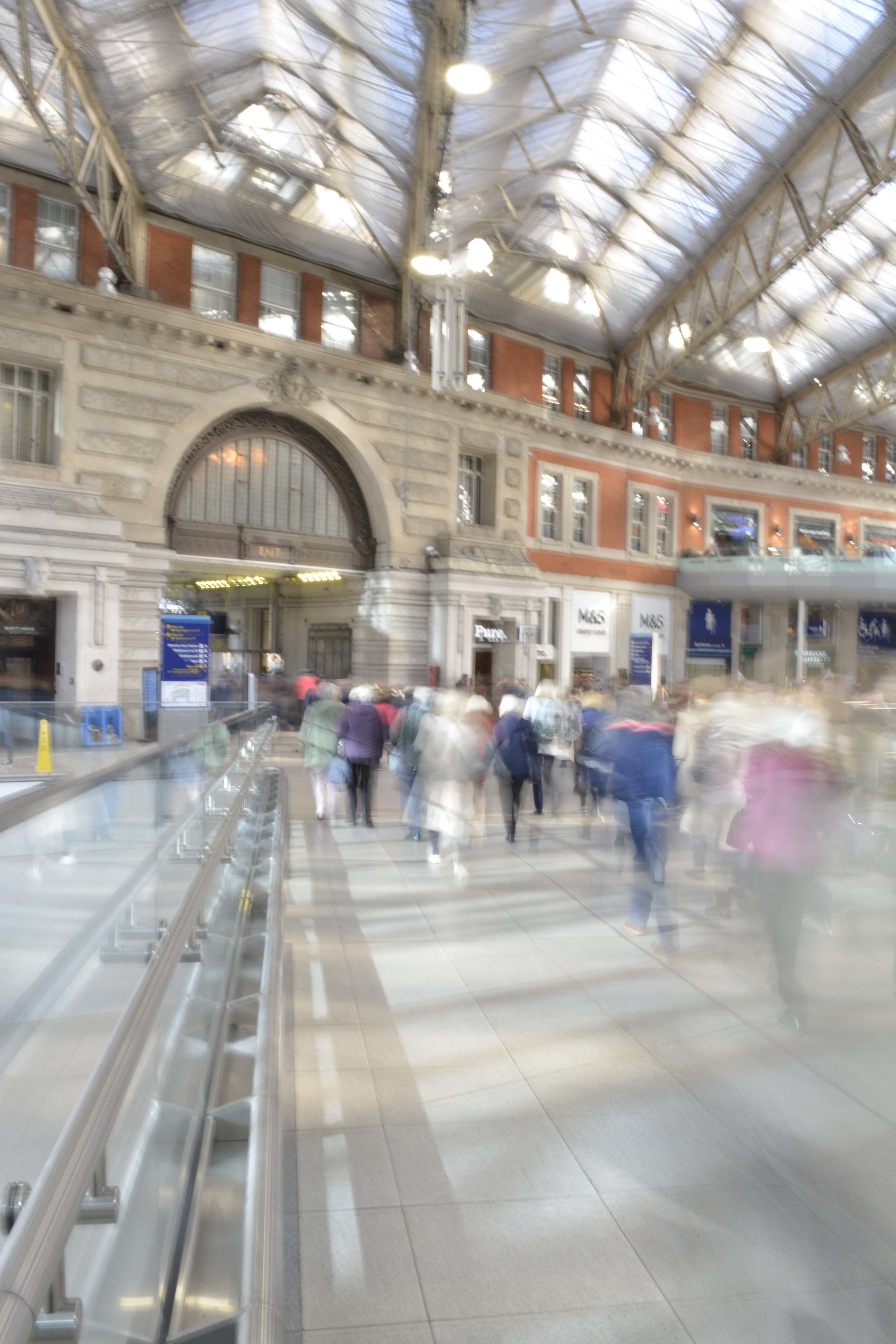
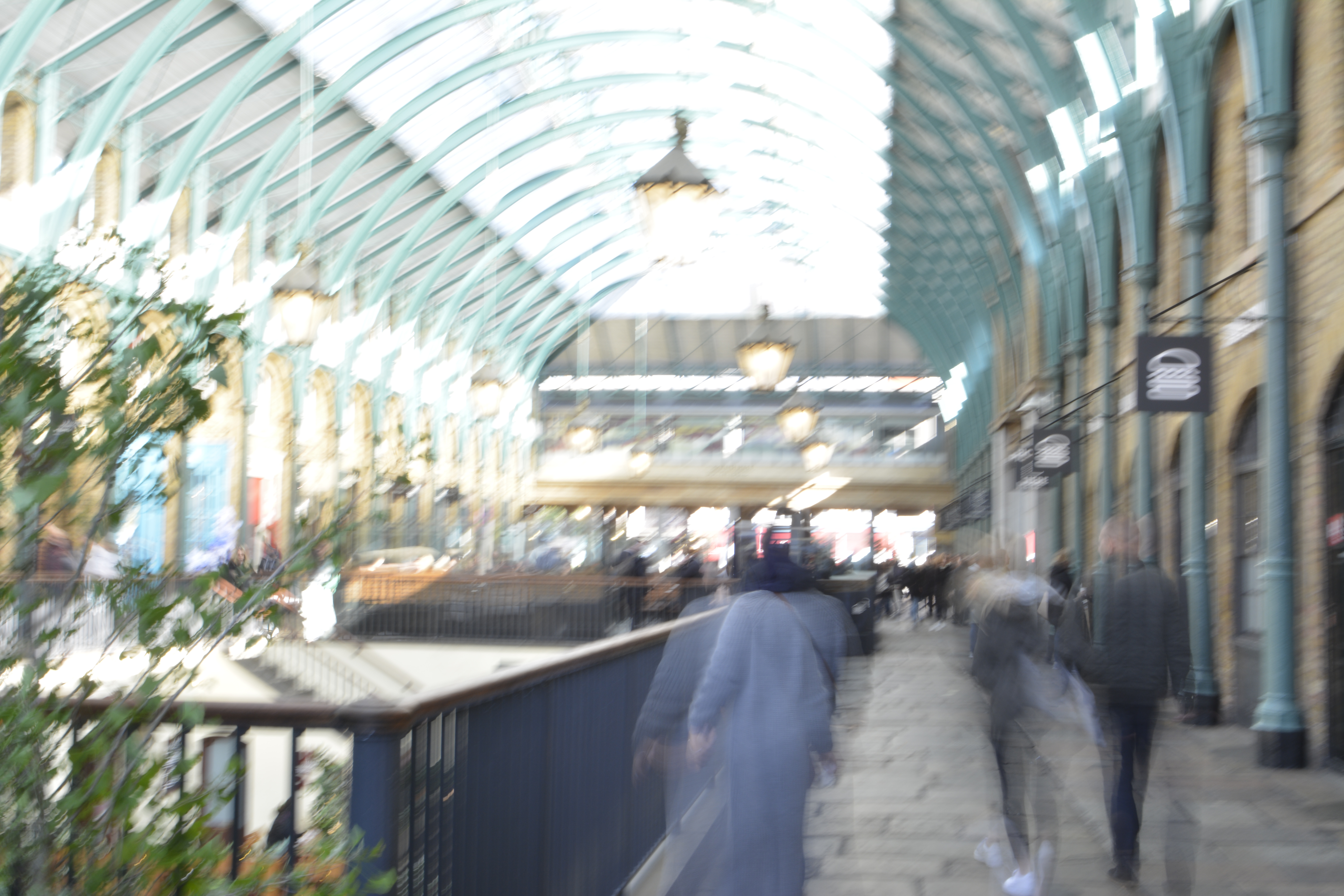
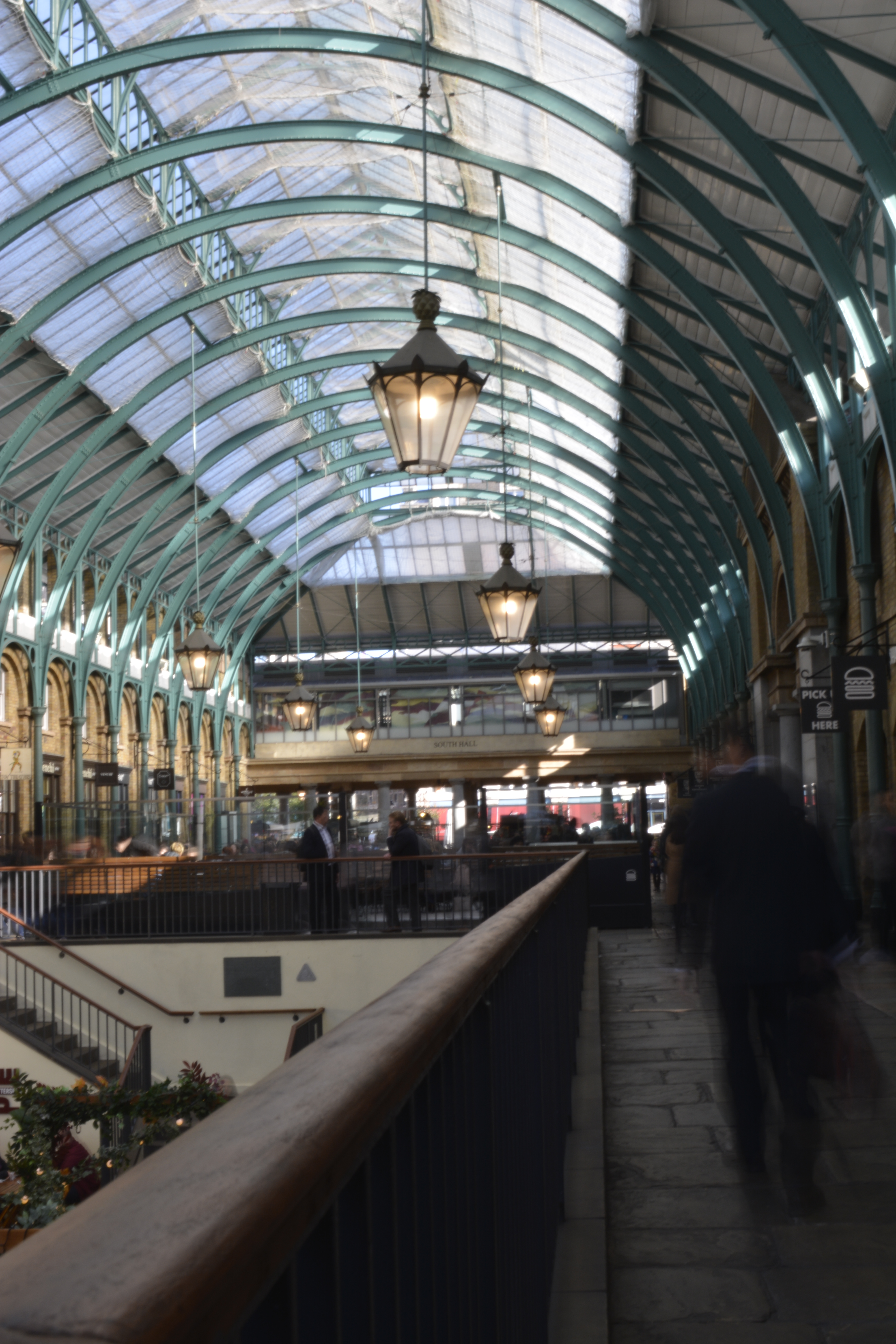
Covent Garden
Coven Garden has always been a favourite place of mine. I love the constant busyness of people shopping, working or passing through. With the different levels, walk ways and structure I thought this was a great place to photograph.
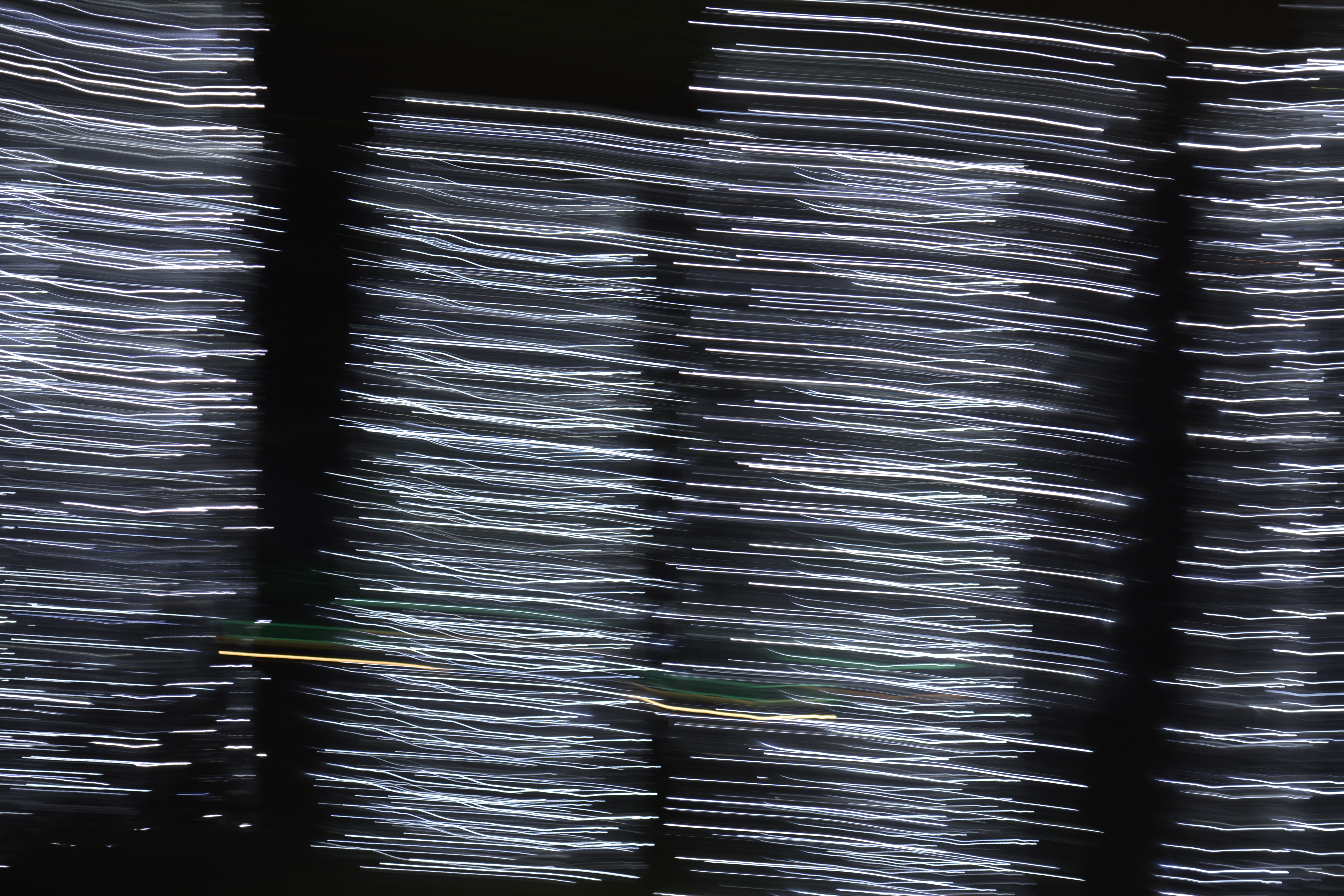
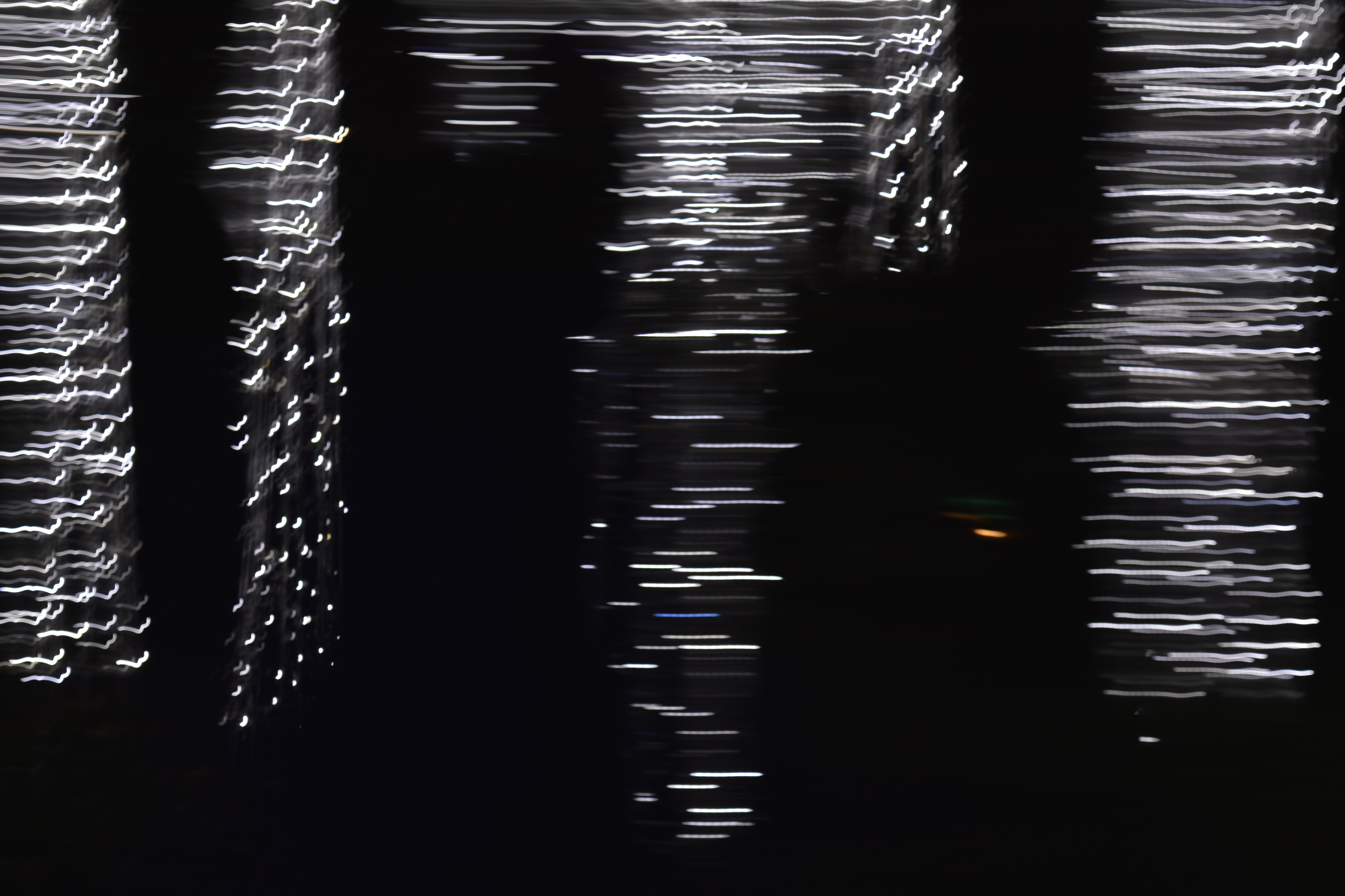
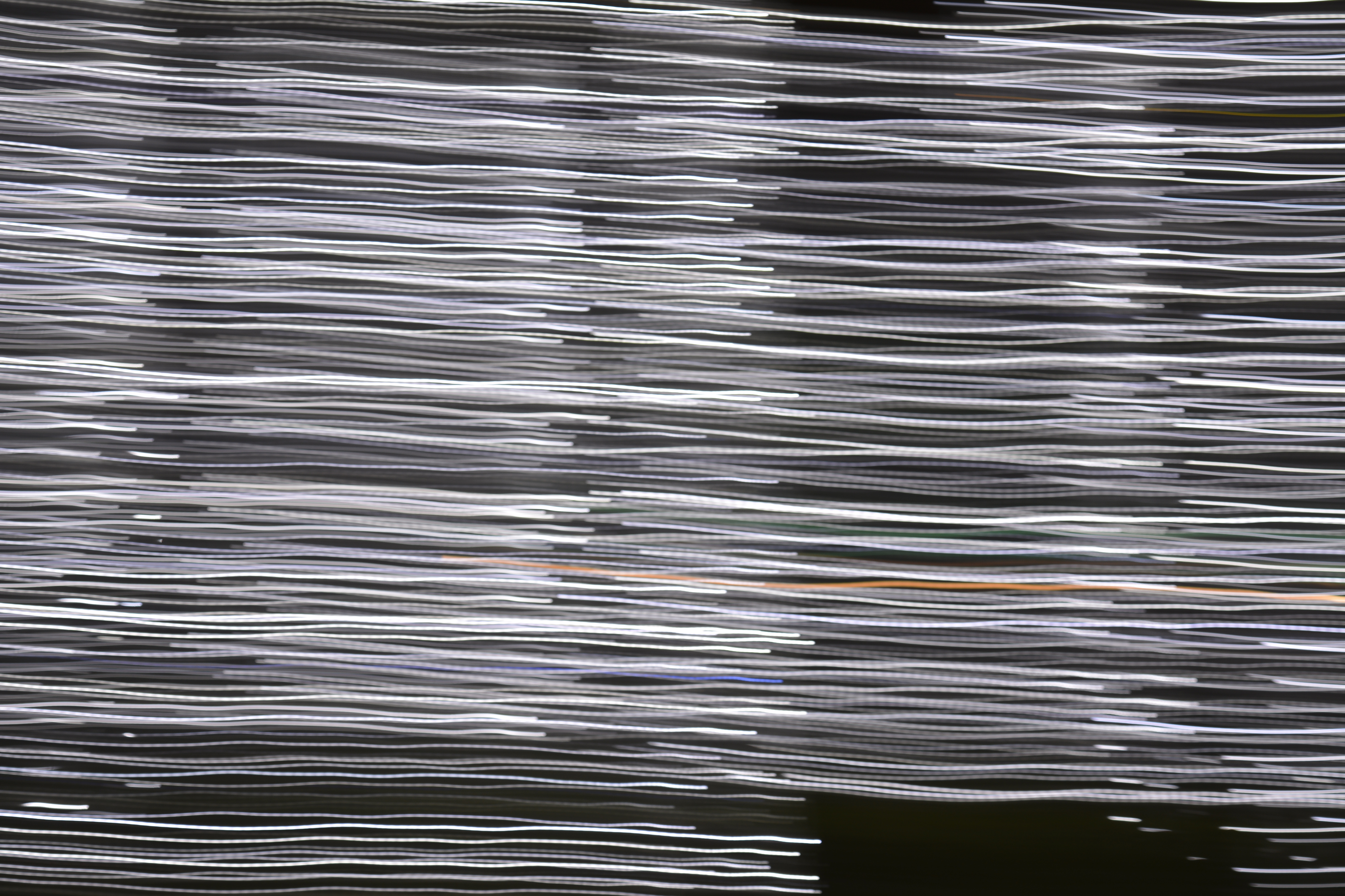
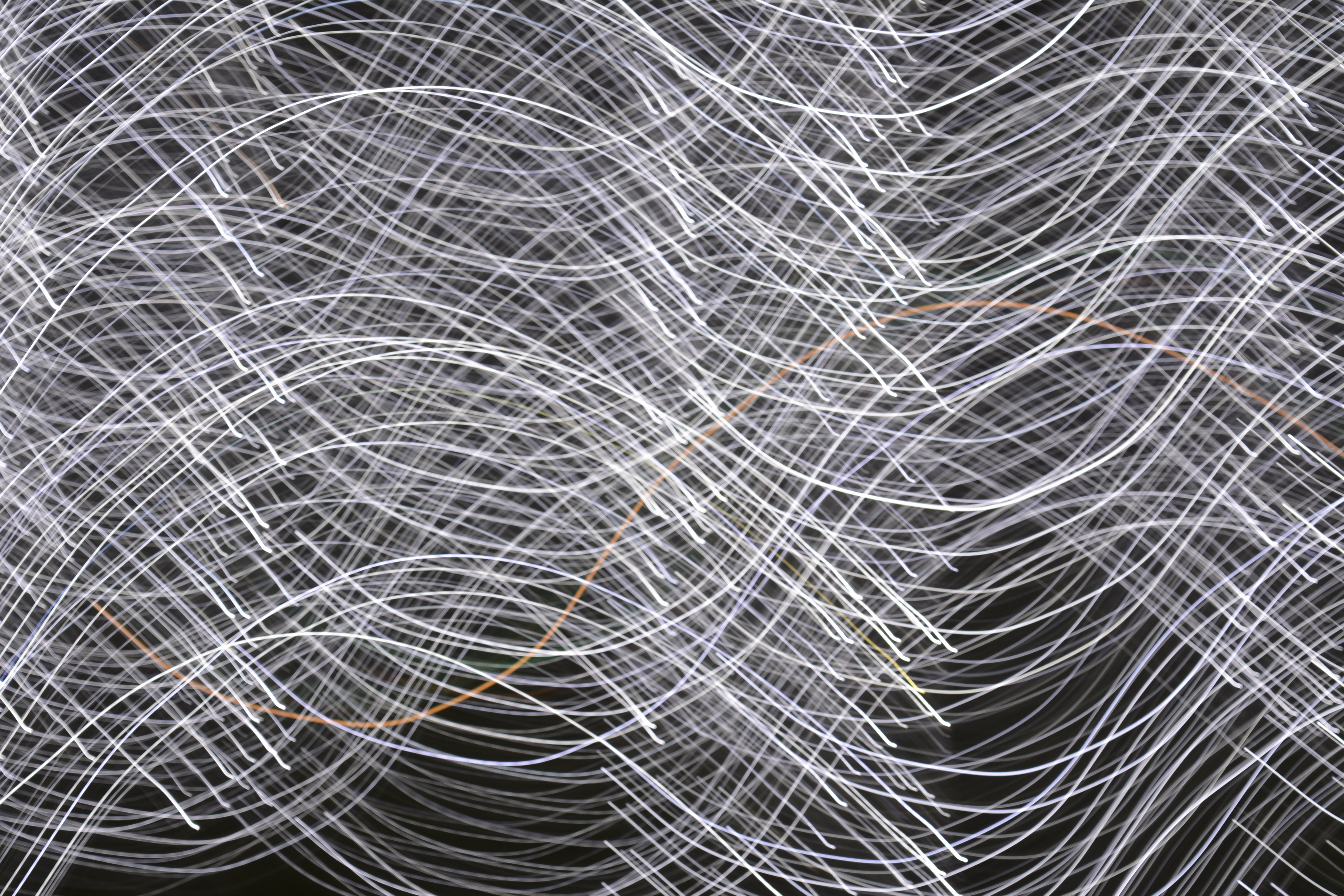
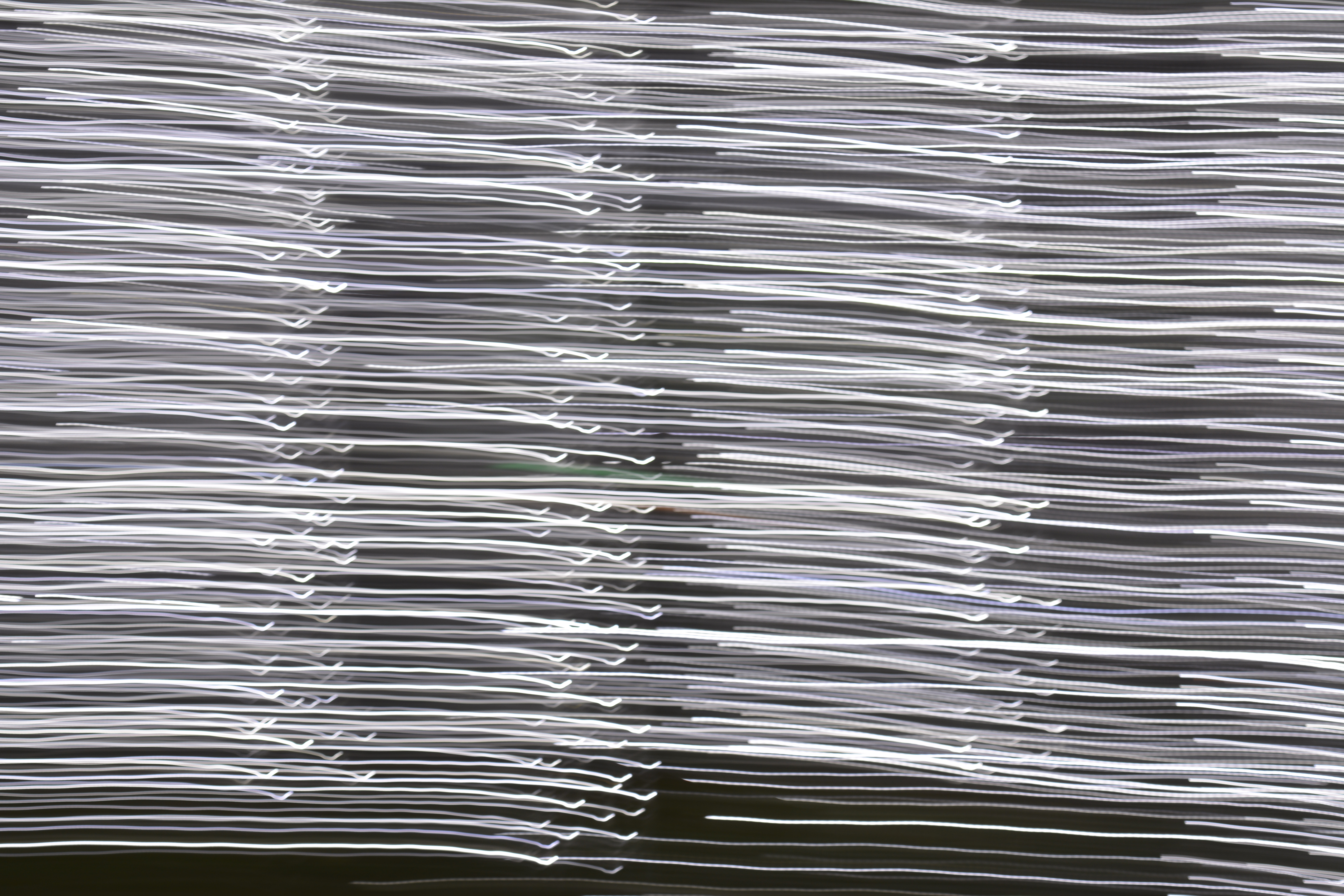
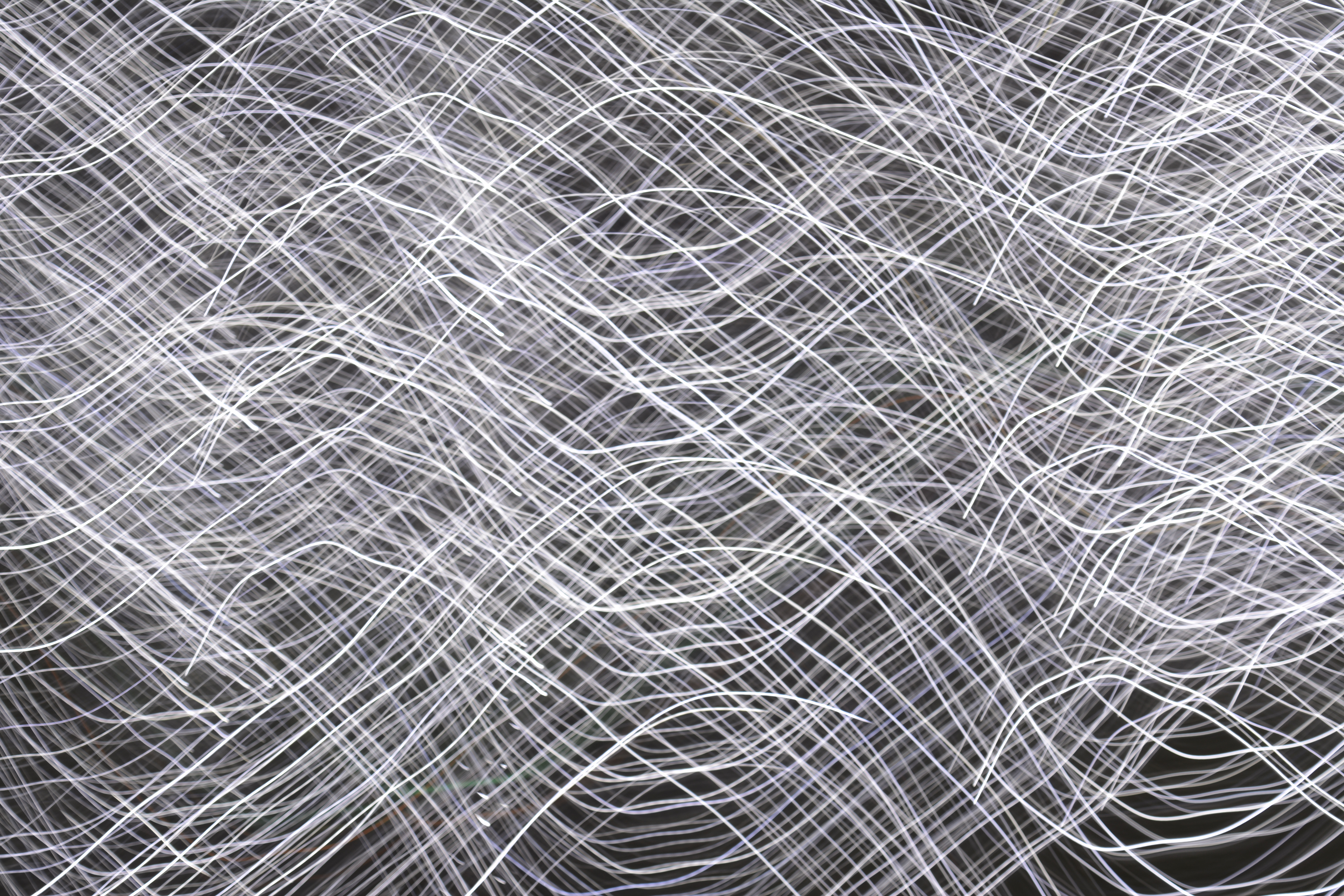
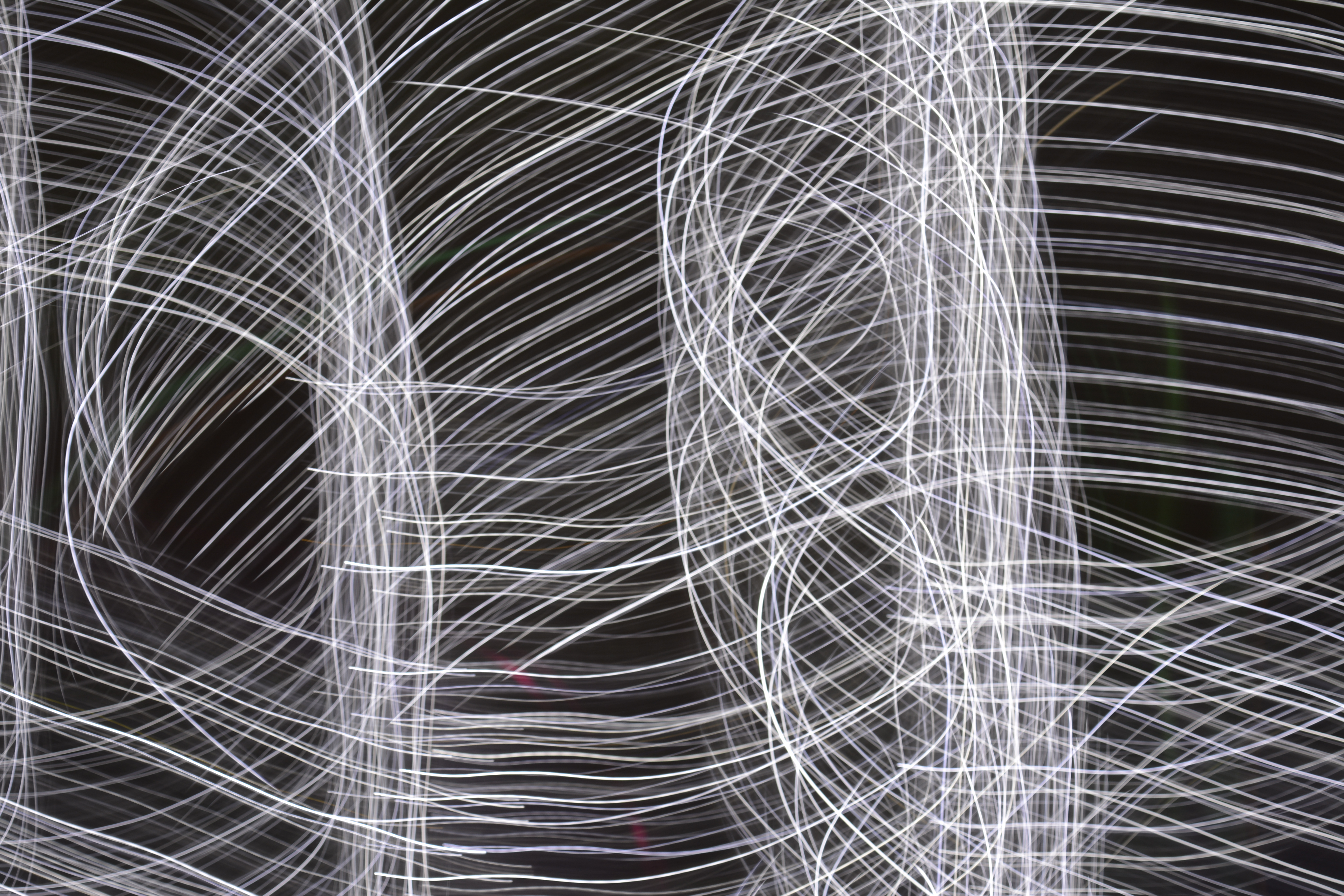
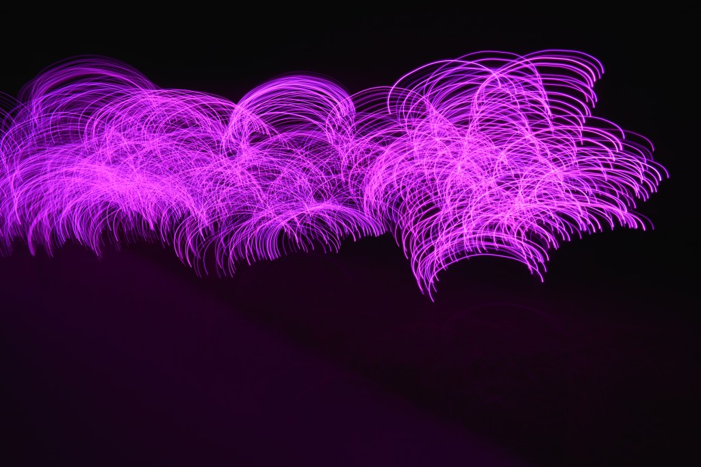
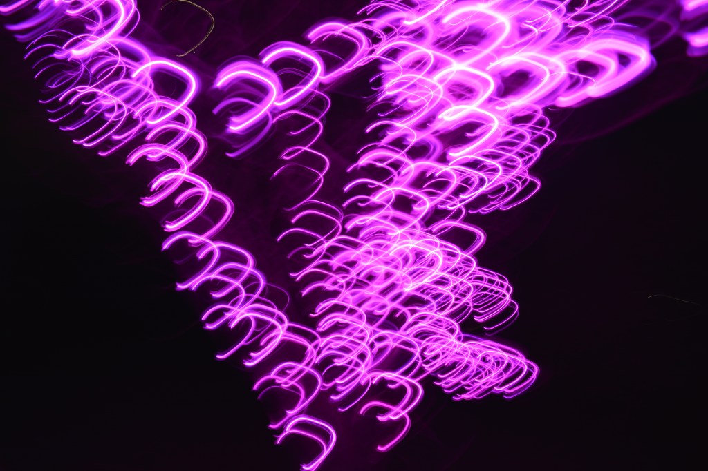
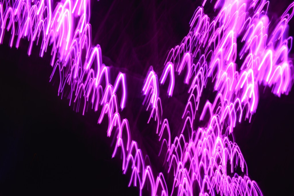
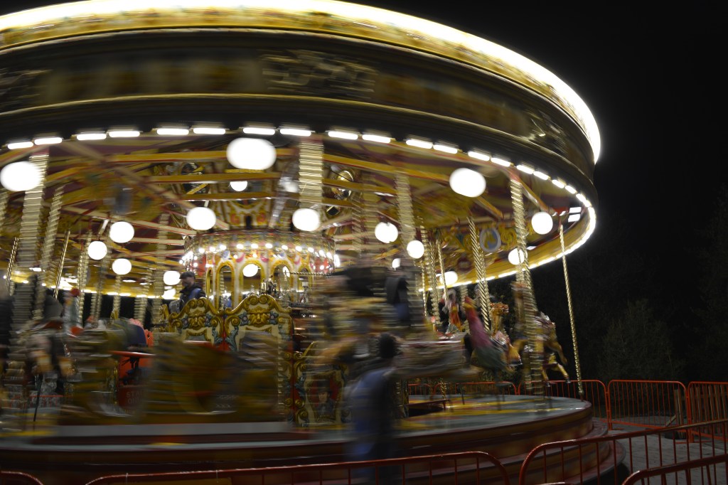
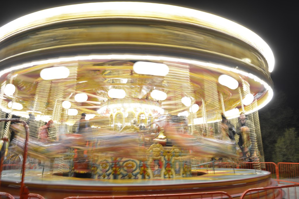
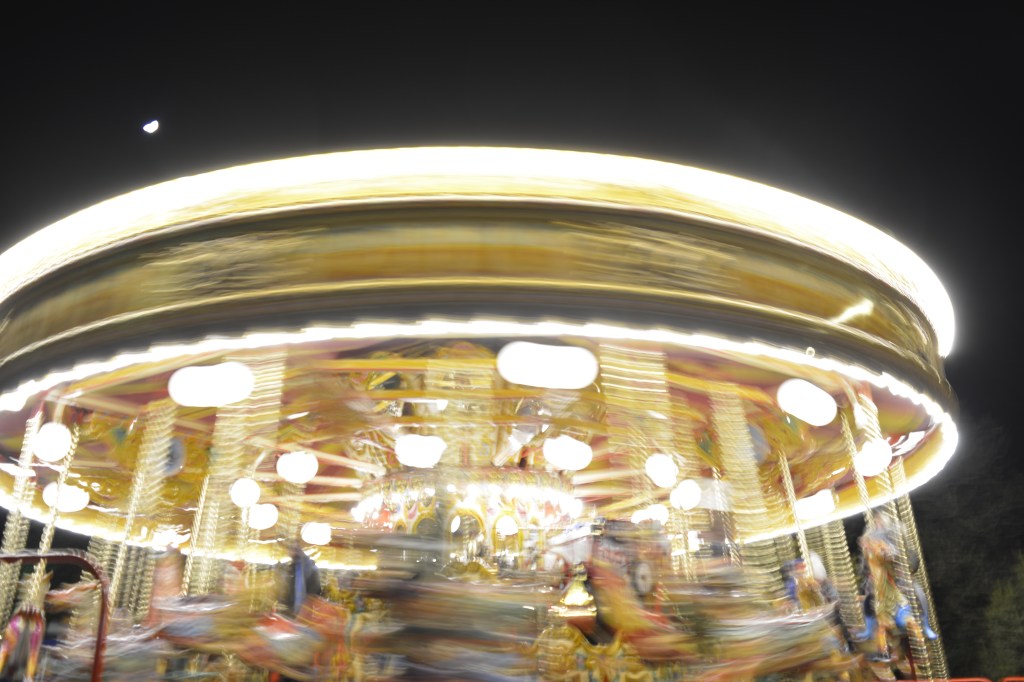
When taking photographs with long exposures a tripod is essential. I walked around Covent Garden setting up my tripod in several places, trying to get the right setting within my frame. Always keeping to the edges of walls or railings so my tripod wasn’t a trip hazard.
However I did get approached by a security guard that asked me to pack away my tripod as it is on private property and a trip hazard. By that time my camera battery had died so I couldn’t take anymore that day.
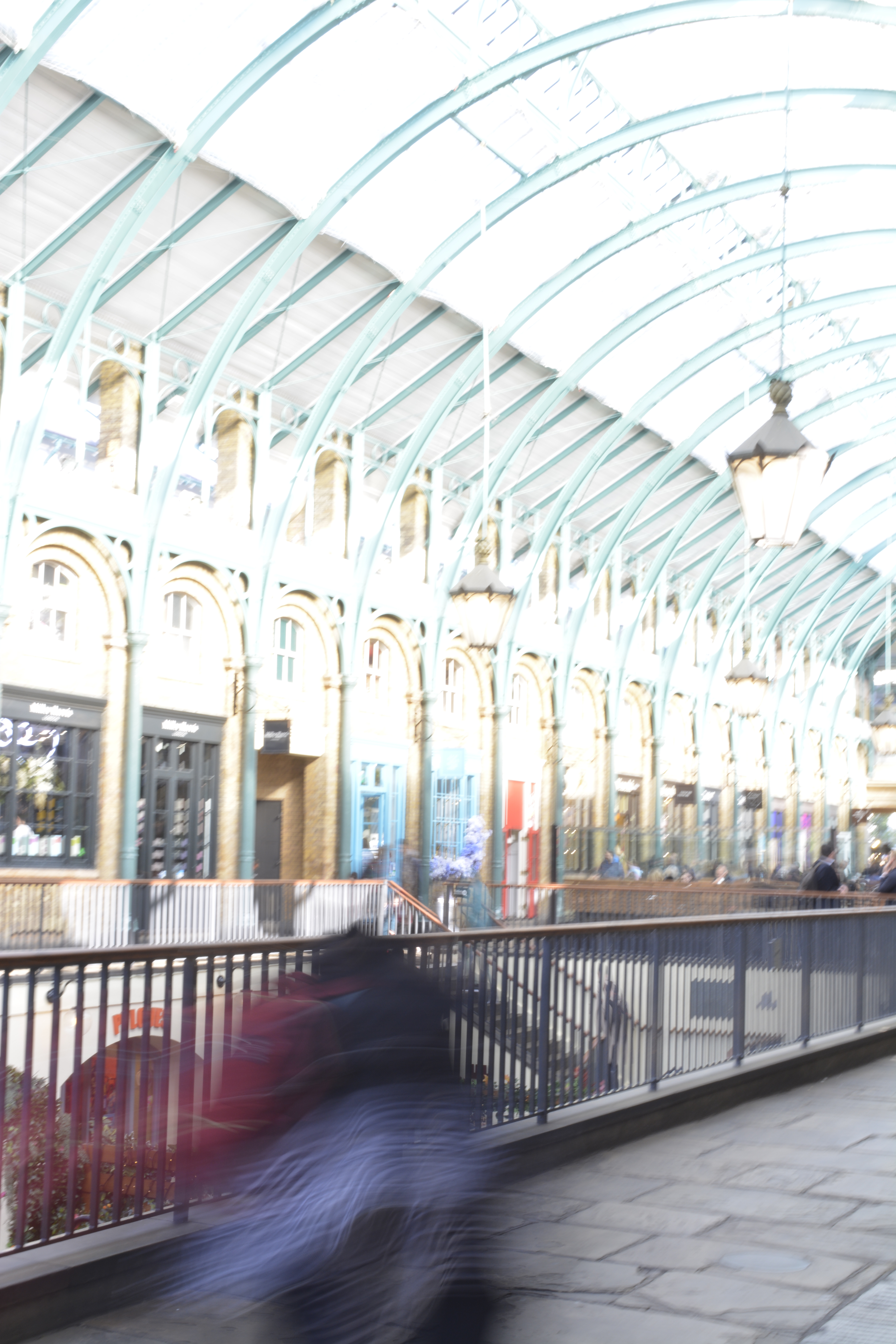
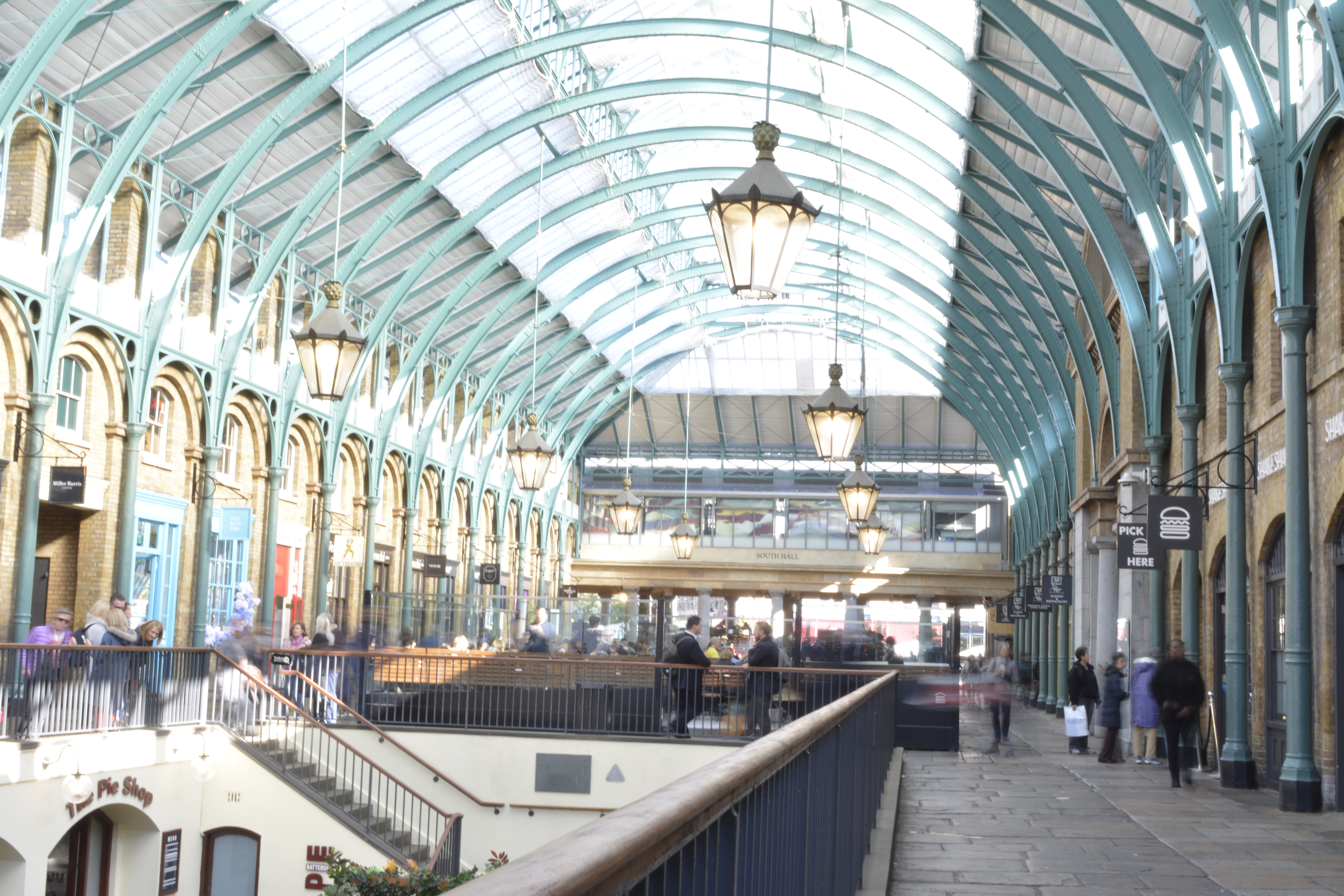
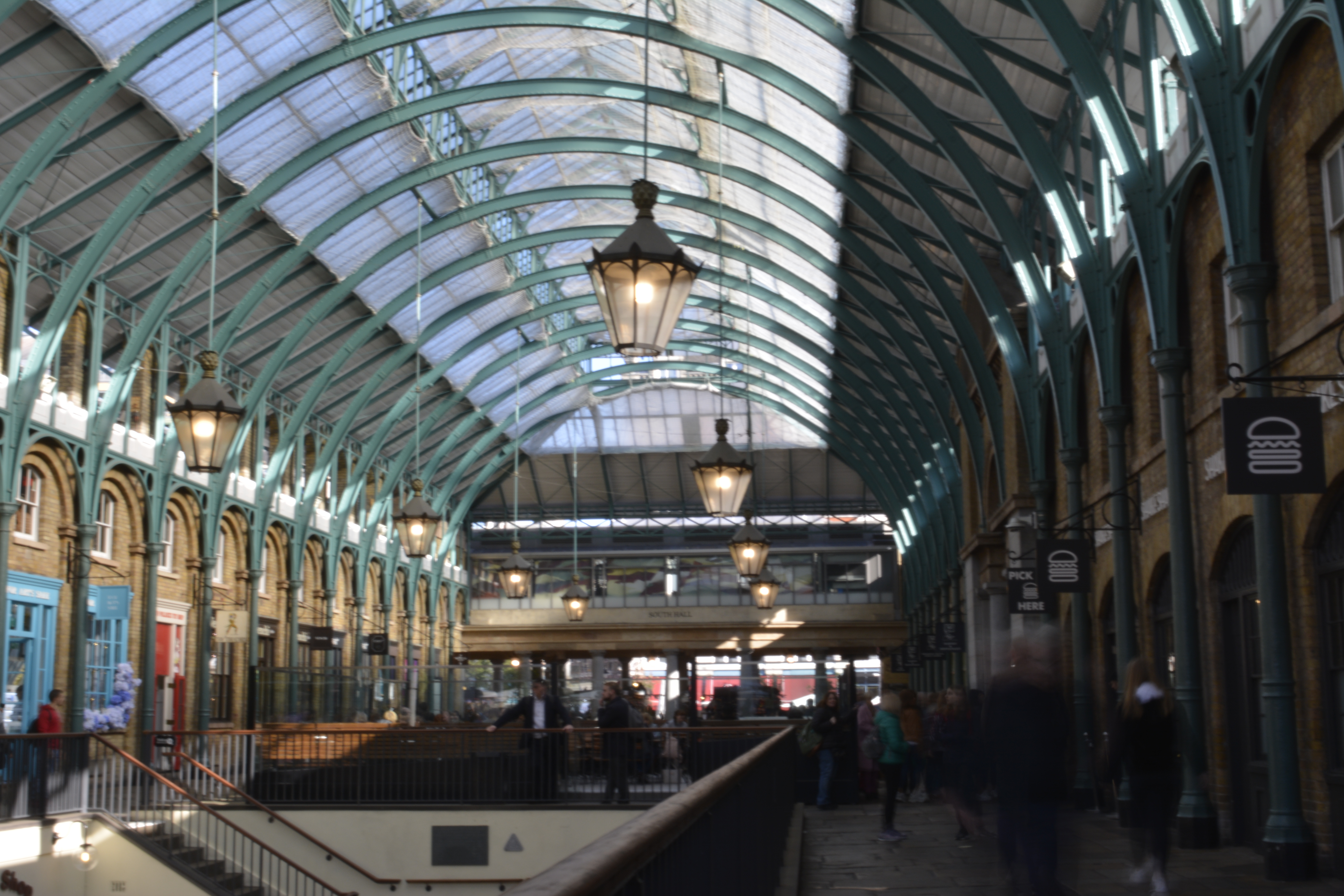
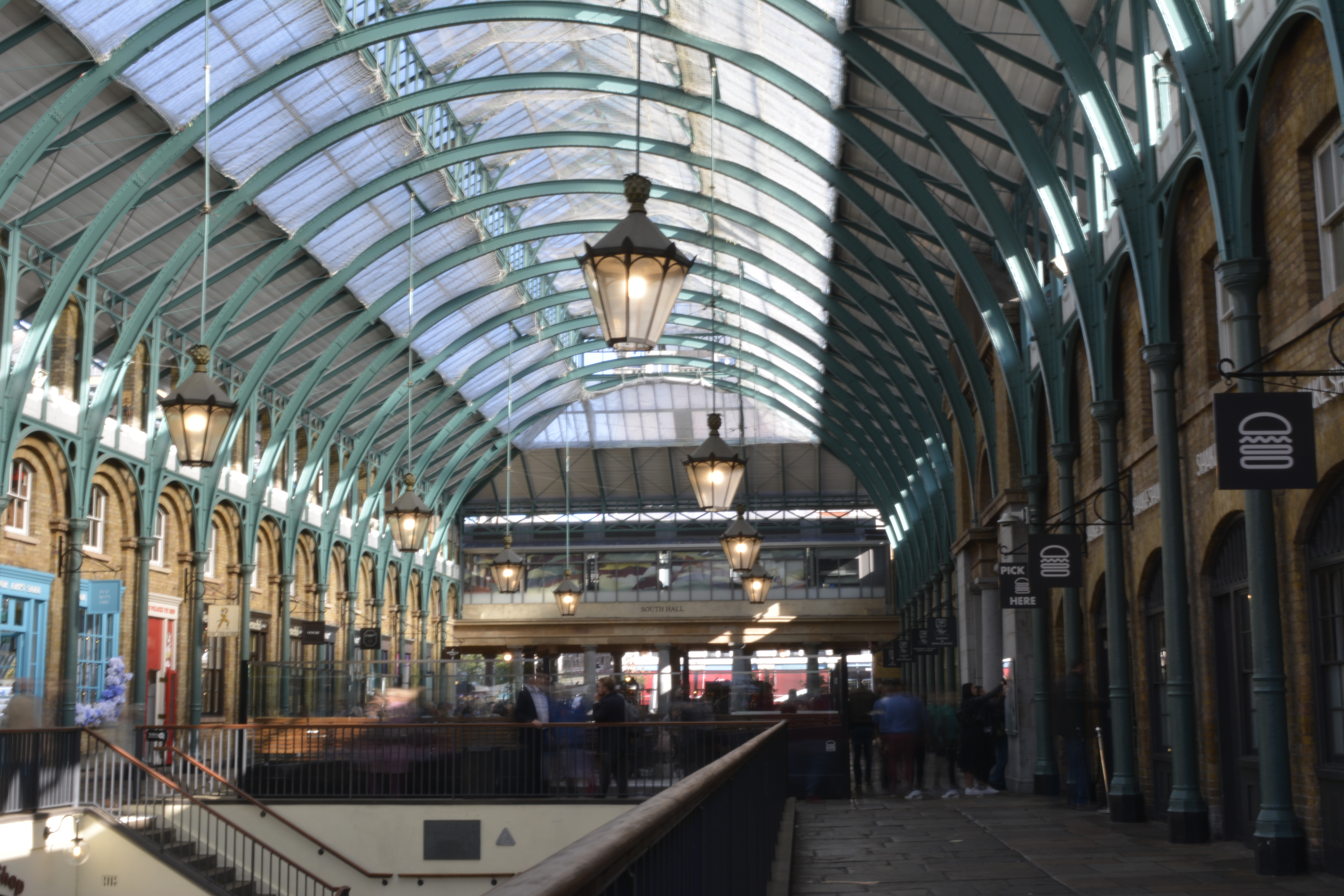
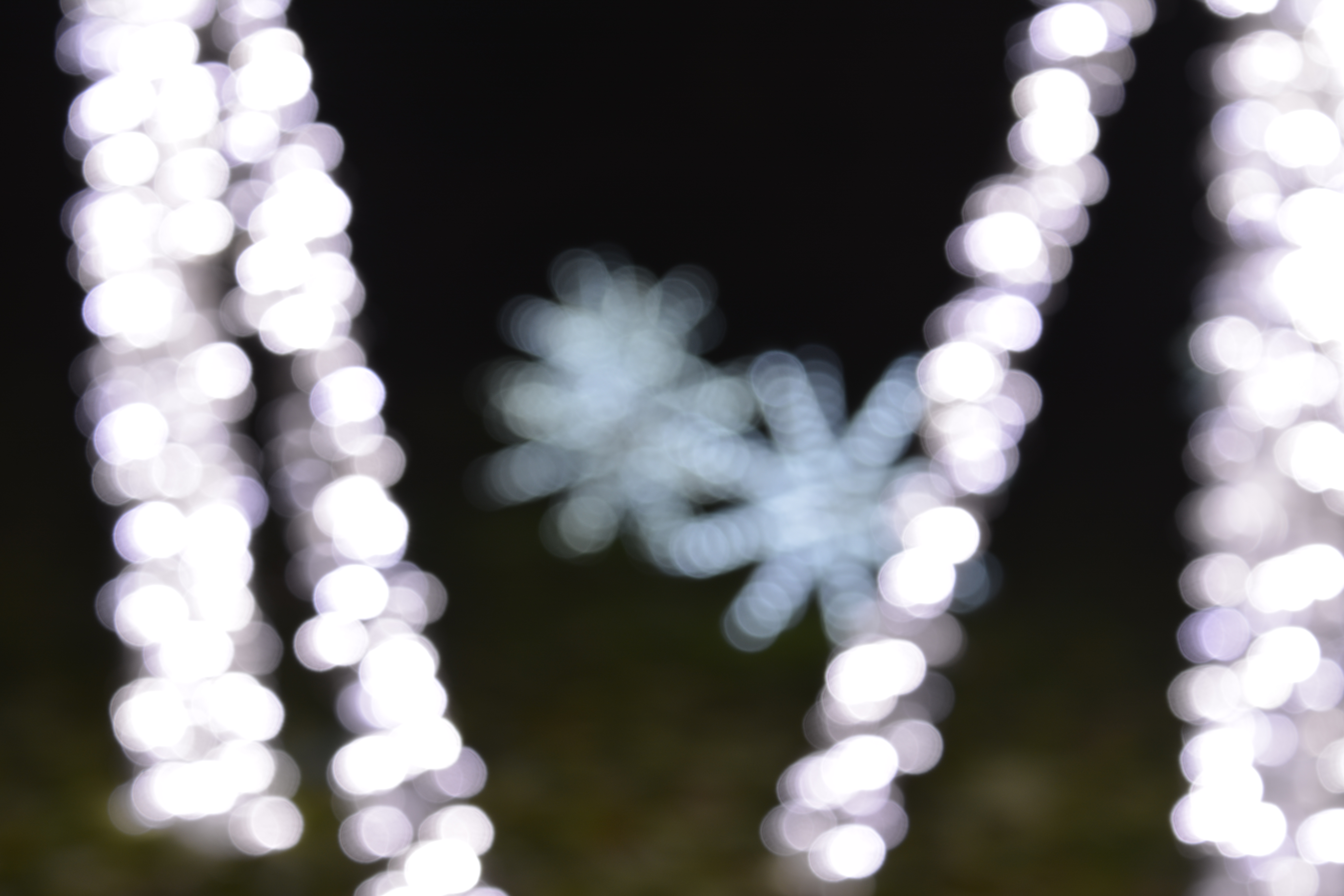
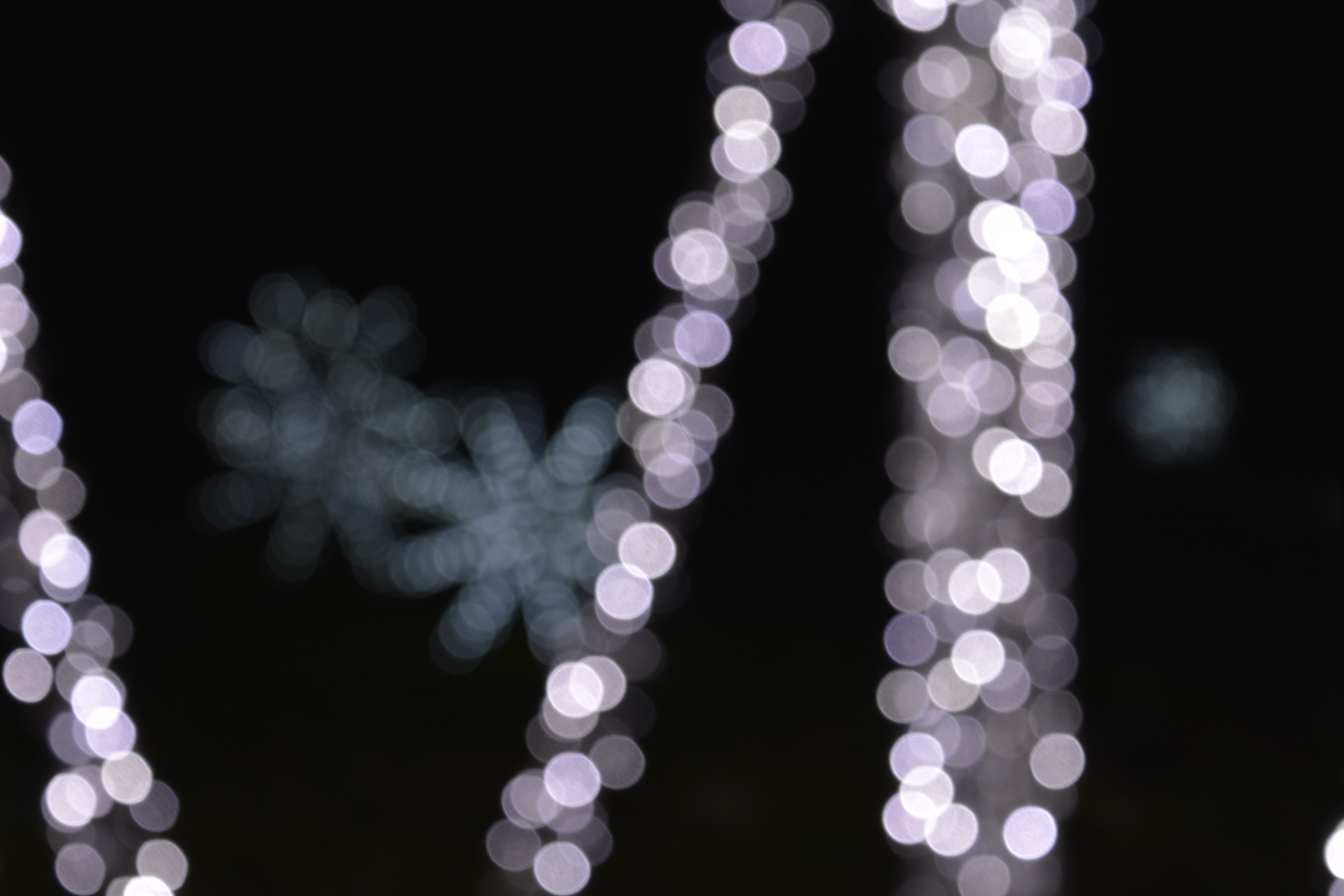
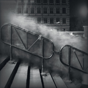
Before my camera battery ran out I managed to try a ND 8 Filter to stop over exposing the shots of Covent Garden when I was using longer shutter speeds (1 seconds).
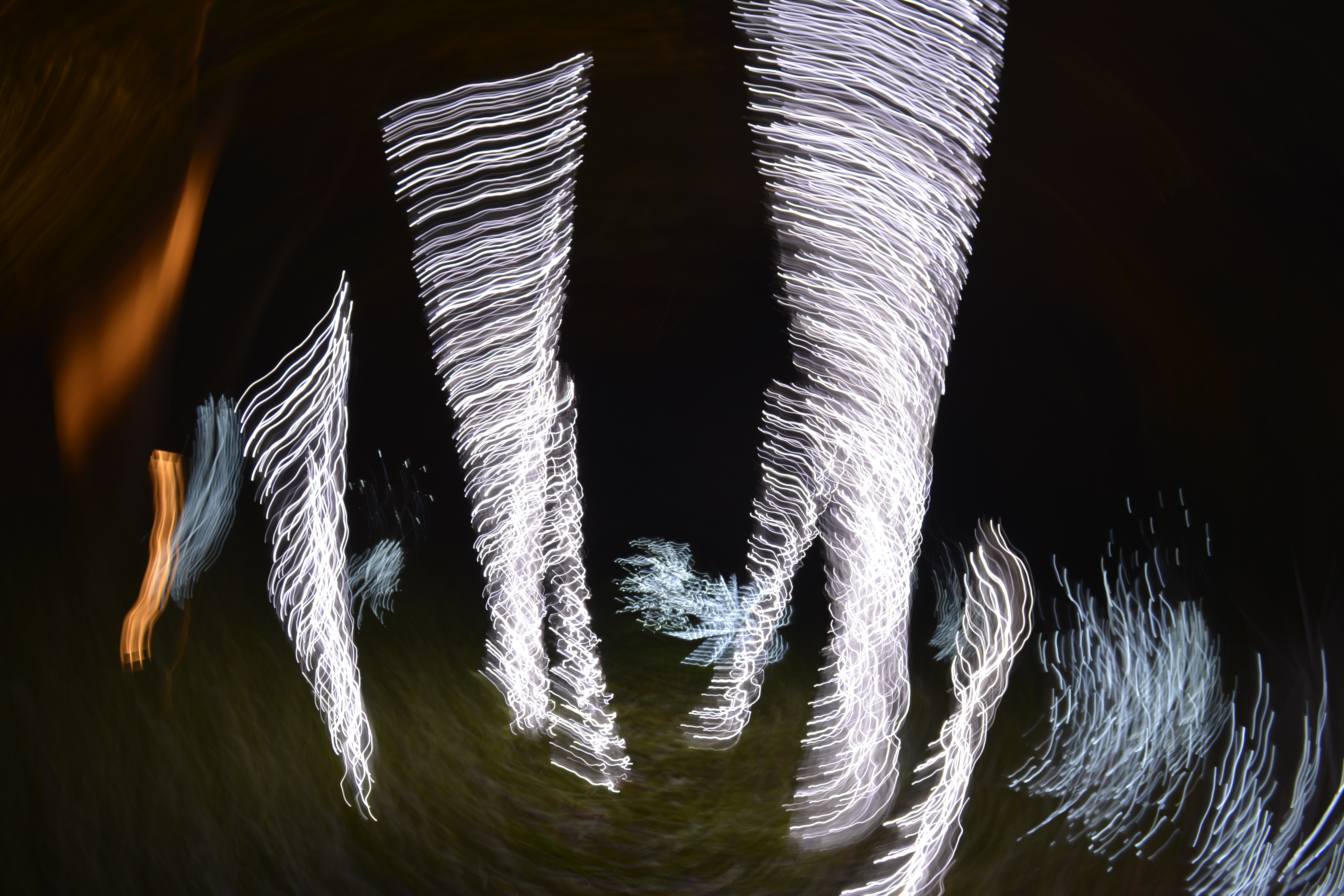
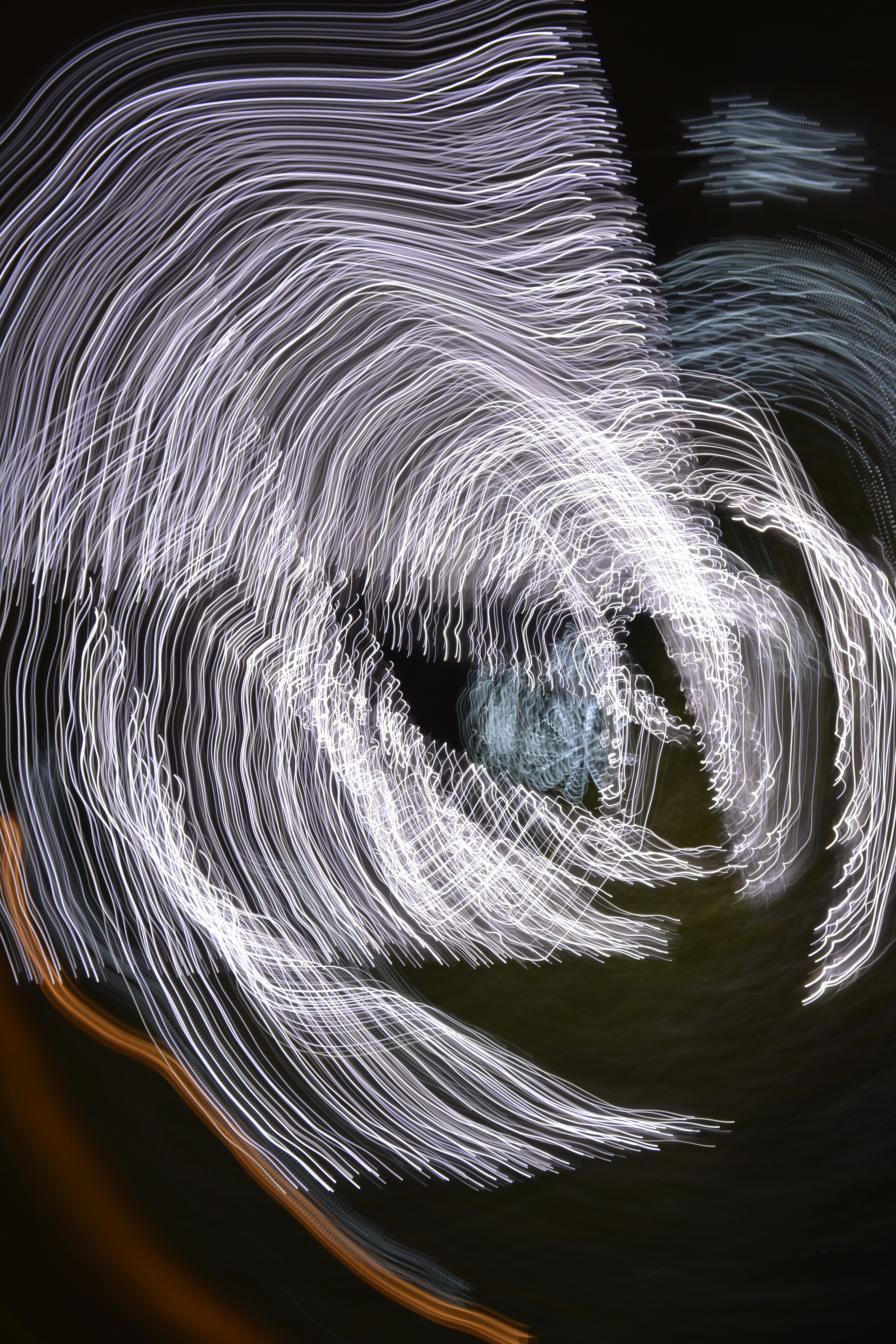
I was trying to do some long exposures of the market hall roof. I didn’t quite get the opportunity to get the photo I was looking for so knew I had to re-think how to keep the camera still without the use of a tripod.